Critiques, please!
-
Hello!
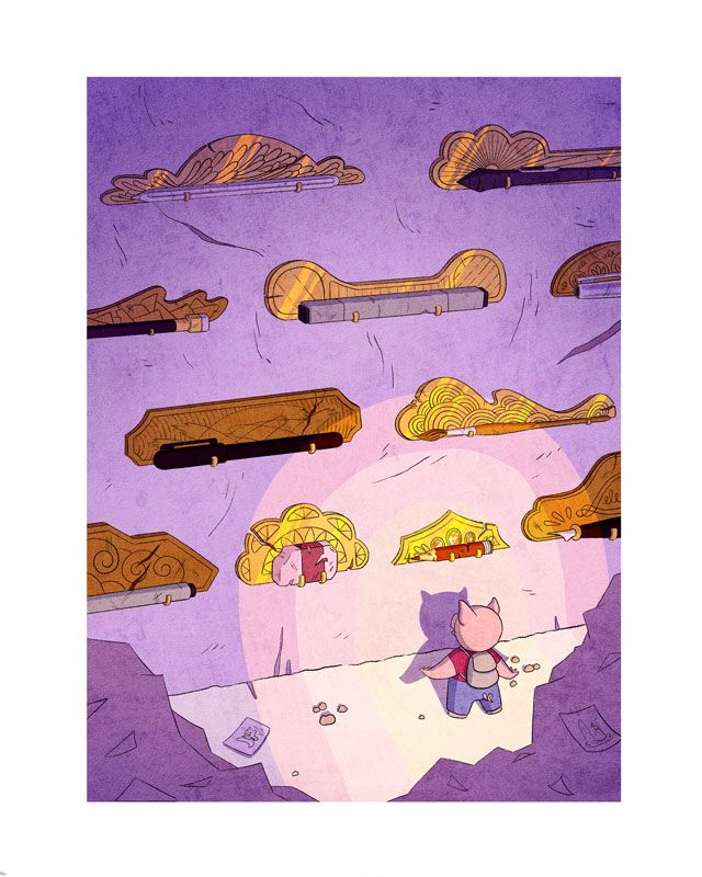
I recently finished this piece, and it didn't turn out as great as I imagined. What are some things you see that I can improve on? Colors? Composition? Storytelling? Character design? Any help is much appreciated!
The story is that this pig comes to his secret cave to choose his art tool to assist him on his daily adventures.

-
I think it's already perfect as is! I love your concept.
-
@aprilshin Hello! I like it and I think it turned out well (rendering). The only thing I didn't read was that it was his cave; I read it more like he has just found this cave -his gesture stance for me is "like wow" -which is what I feel too. If this is a series/panel than in previous or later images you could emphasis that. If not, I personally would need more. Also the tools are really large -does he just have to think about what he's going to use and poof he'll have them in his hand? I think it's cool how each tool is laid out on it's own precious plaque -speaks to how much he values them.
 Hope this helps.
 -
@Nyrryl-Cadiz Thank you for the encouragement, Nyrryl!

@Heather-Boyd You make some great points! For the size of the tools, I imagined them to be magical and so it wouldn't just be used for drawing, but defeating creatures with different spells/powers, but I guess they don't look too magical as is... lol. I clearly did not think through the story as much as I should have, haha. I've struggled with this before, so it's a good reminder to think of a clear story first. Thank you for your valuable input, Heather! I appreciate it very much!

-
I LOVE this so much--the colors and lighting, the rendering, the concept!!
I agree with Heather that it does read as "discovery of something new" ...and the way the magical tools are arranged reminds me a bit of a museum--so without your explanation, I'd have assumed the pig was some kind of explorer or archaeologist. If the tools are really HIS, and he comes here every day, maybe they wouldn't be arranged in such a formal/imposing way? Maybe the character's attitude would be more comfortable/familiar? But I think it works really well as is, with a slightly different story...
-
This looks really cool! The style is awesome.
What I didn't get from looking at this, was that the pig is an artist choosing a tool. I just thought he was looking at them.
If I wanted to make him come across as an artist, I'd slap a beret on that piggy scalp.

-
great colors and composition! I like the use of foreground elements and shapes. I am guessing the piles in front are a bunch of papers with drawings on them. perhaps add i bit more detail to define that it is in fact, a huge stack of papers, it may add to the story a bit more. also consider more of a thoughtful pose to the pig, if you are going for a "picking which tool to choose" idea. wonderful work!
-
I absolutely love the illustration, but just a tiny detail that I would maybe change is to make the piggy look up - as to looking at all the tools.
-
This is so cute! I adore these textures and colors so much! I also love the variety of plagues with each tool.
I like the light effects and the shadow cast on the wall. Maybe if you bent them at the point where the wall meets the floor, it would emphasize the 90-degree angle there? Also, I second @TamaraDomuzin about making the piggy look up more.
Overall, though, this is fantastic.
-
Here is my 2cents
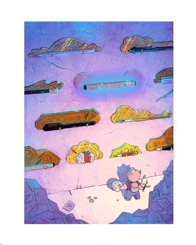
I really like the concept of your illustration, I agree with a lot of the constructive critic given already, I am a visual person so I thought I would do paint over of some ideas that could help you express your idea.
I hope it helps you in any way. I hope it doesn't bother you that I did a paint over of you cool illustration
Thank you

-
@aprilshin I agree with the other feedback that it looks more like a moment of discovery for me. He could be on a ladder picking one out for the day?
-
@aprilshin This looks great! I like that Frank changed the piggie to look up at the wall. Along with that, maybe you could have his hands on his hips instead?
A little more definition on the foreground structure would be nice. I actually read it as rocks from the cave, till I saw the paper and sketches. -
Wowow, thank you all so much for all the great feedback! I'm so thankful for how generous this community is! I appreciate all your time and effort into making me a better artist. Love you all!

@esgoldman Thank you! I was having a really hard time with the posing. For some reason, my brain kept wanting to stick to this pose and couldn't think of a better one, haha. Next time I'll keep pushing! Maybe it's time for me to finally take the gesture drawing class, lol.
@Frost-Drive Lol, omg I love the idea of a little piggy beret!
 And yes, must work on better poses.
@Spencer-Hale Thank you, Spencer! Ah, I see that now. I was trying to make it simplified, but maybe I went too vague.
@TamaraDomuzin It's so embarrassing to say that that's what I was trying to do and yet somehow he still ended up looking at the blank wall in front of him, lol. Thank you for the feedback!
@baileymvidler Yeah, I was having a rough time with the shadow, too. I wasn't quite sure how to make it look like it was angling towards a different direction. I'll have to do more studies in the future for things I get stuck on. Thank you for the feedback!
@franksandovalart Wowowow, thank you so much! So that's how I make him look like he's looking up, lol! And I love the entrance of a new magical color highlighting one item! Thanks for taking the time to do this. I really appreciate it!
@carlianne A ladderrrr yeeess~ that would definitely make it feel like he's familiar with these tools. Thank you for the feedback!
@Neha-Rawat Yeah, Frank did a great job! Ah yes, hands on hips would've been way better, haha. I originally tried to draw stacks of paper but could not get the perspective to look right and so resorted to heaps of paper, which also is not reading right, haha. Thank you for your feedback, it's very much appreciated!