Definition question/advice!
-
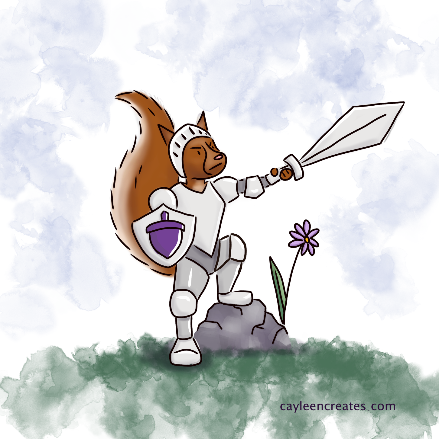
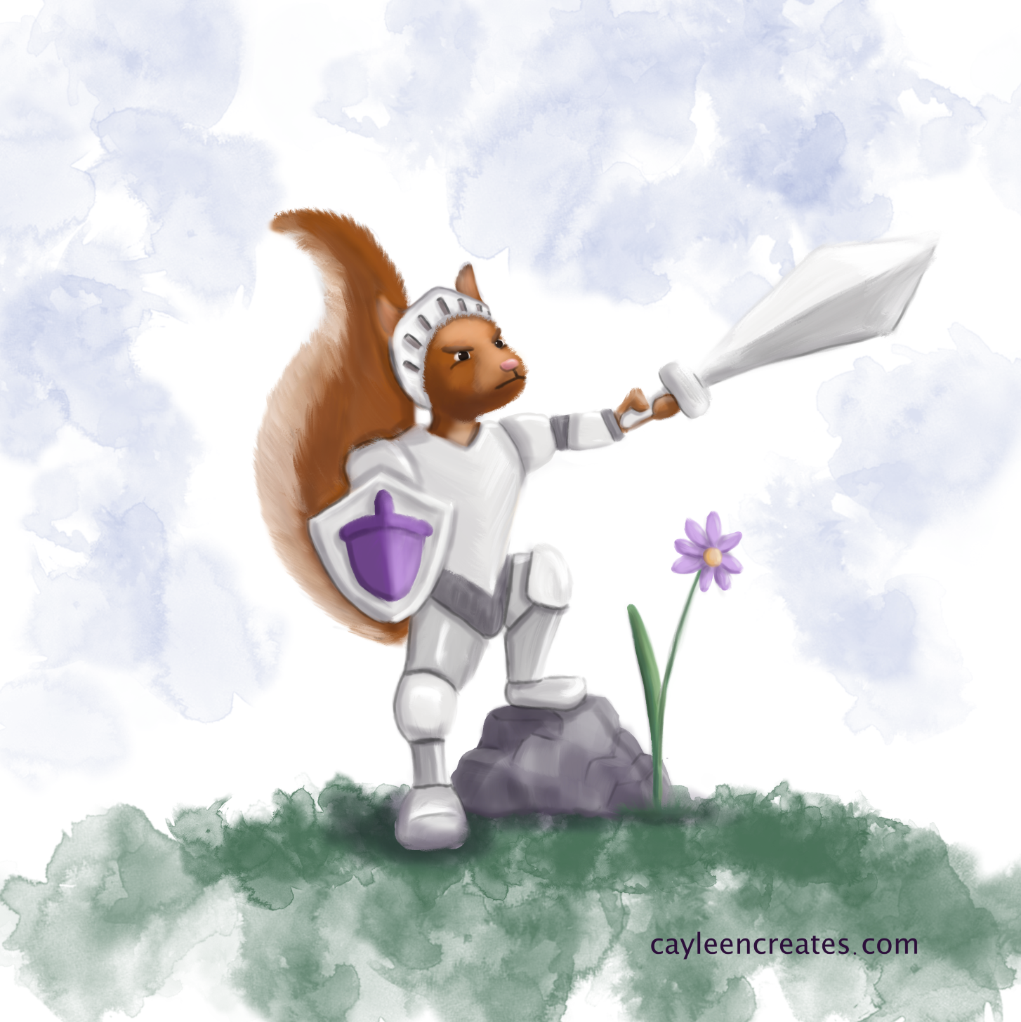
I'm not sure how to word this. I'm experimenting with different styles. One is cartoony and outlined. The other is more brushstroke based. I think I need more definition, somehow, in the brushstroke one. It doesn't seem to stand out on it's own very well. Do I just keep darkening and lightening things? Is there another step (or 5) that I'm missing?
'Cartoony':
'Brushstrokey':
Thanks for any advice!"
Cheers,
Cayleen
cayleencreates.com
https://www.instagram.com/cayleencreates/
https://twitter.com/CayCreates
https://www.facebook.com/Cayleen-Creates-104624494589880/ -
@Cayleen These are great studies! I like the brush strokey one more but I'll agree you'll need a little more definition around the edges.
In the cartoony one, the rendering of the squirrel doesn't match the textured environment. The squirrel is super smooth and blended with an airbrush and the line work is too consistent and thick. If you're working on a tablet, make sure you have your brush settings set to pressure sensitive.
For the brushed one, I like the way it's been rendered. You can go over the whole character again and include line work where you think things are blending in. Try not to have the linework in black, instead choose a darker color of the surrounding area. For eg. the leg the squirrel is standing on, you've done nice linework with a dark grey at the thigs and knees. Similarly, you can choose a dark grey for the line between the rock and grass, and a dark brown between the ear and tail.
Another tip would be to adjust the brush settings a little so that it's not a smooth round brush. Vary the jitter or size of the brush so you'll get a little bit of texture in your line work.
Looking forward to your progress!
")
-
Love the fierce looking squirrel
I'm not an expert in the ''brushstrokey'' technique, but the style reminded me of two illustrators, primarly Francesca Pesci - https://www.instagram.com/francescapesci_arts/, and Aleksandra Szmidt - https://www.instagram.com/olishka_art/. Maybe taking a look into their work can help a bit? -
I personally don't like black outlines in drawings and so I think your second image is much nicer. I think you're getting there with the definition, have you tried using different brushes? It seems a bit like the squirrel and suit of armour have similar textures, maybe adding some hairs on the squirrel might give a bit more definition?