Portfolio Advice Needed
-
Hi guys,
I would very much appreciate any comments on my portfolio, as I'm currently working on updating it and sending it out to publishers . What I can see lacking for myself, is different skin tones and different age groups (parents, grandparents...).
My main interest would be illustrating educational picture books, activity books, nursery rhymes, first words and numbers, and similar. Here are some examples:
http://www.buttercuppublishing.co.uk/book/sad-hippo/
https://www.iamabookworm.co.uk/ourchildrensbooks/peekandseek
https://www.iamabookworm.co.uk/ourchildrensbooks/busy-day
http://littletiger.co.uk/imprint/little-tiger-kids/touch-and-feel-first-words
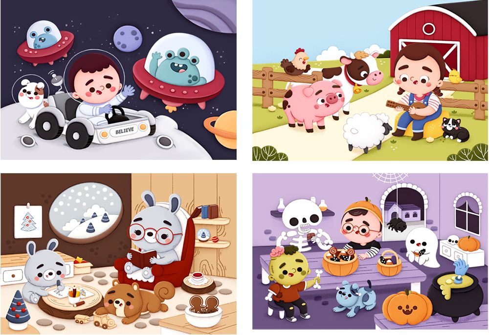
http://littletiger.co.uk/imprint/little-tiger-kids/finding-first-wordsI aim to have 12 ilustrations similar to these, focusing on the subjects I'm mostly interested in (animals, space and Halloween are my absolute favourites
") ).
).
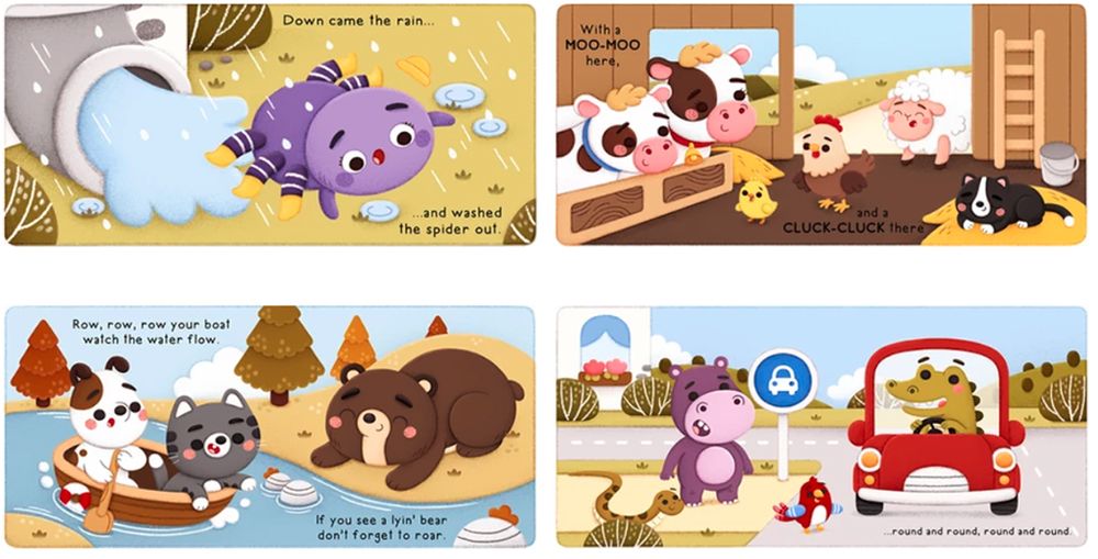
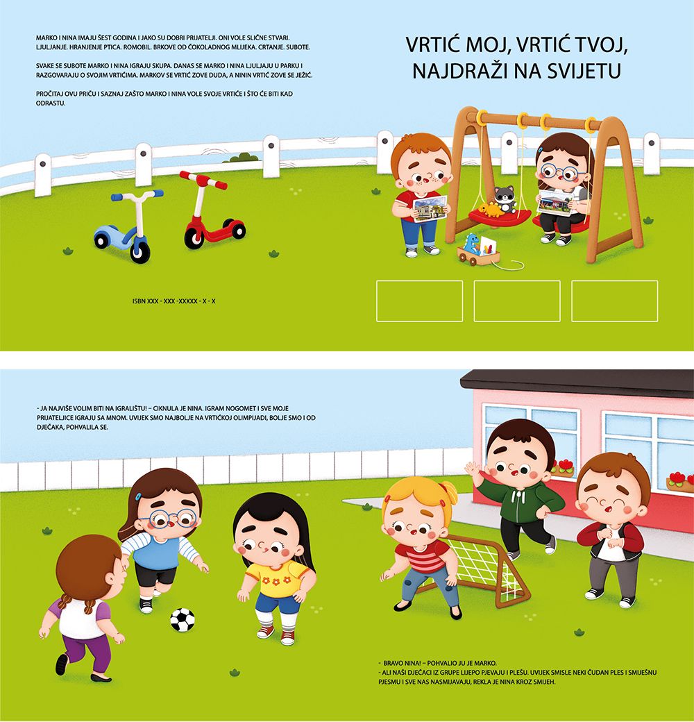
Then, I created illustrations for 4 nursery rhymes - www.tamaradomuzin.com/nursery-rhymes , but I might have made a mistake as I haven't thought of them as spreads, but rather to just show my visual interpretation of them (you can see I've put some elements in the centre and similar). I'm not sure whether I should fix these to be seen as spreads?
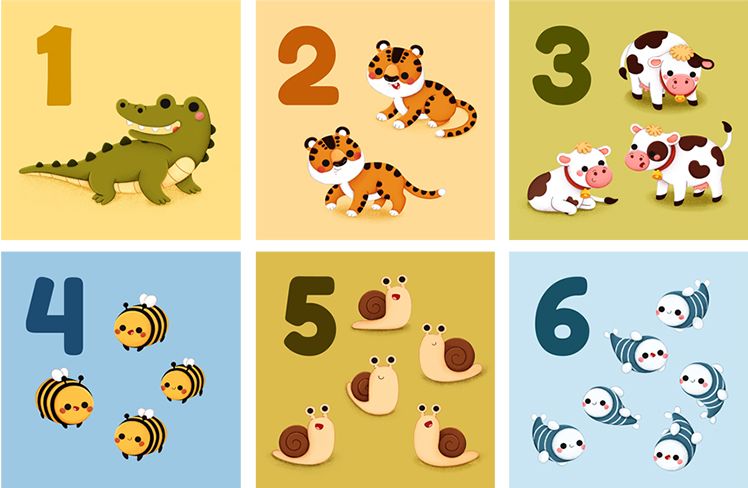
Then I got some simple illustrations, an example of first numbers.
I've recently worked on a non-commercial picture book for a kindergarten, so I'm wondering whether it would be a good idea to put these into the portfolio, or to make my own story for a specific spread illustration where I could include what I'm lacking in my portfolio at the moment.
Thank you for your help, I hope it's okay to put this much images all at once in one thread
. -
@TamaraDomuzin this is so adorable I love you're style, it would definitely work in kids educational books and for cute nursery rhythm books. I wish I could speck more on a professional level on what would need to change but so far from what I see it looks great.
-
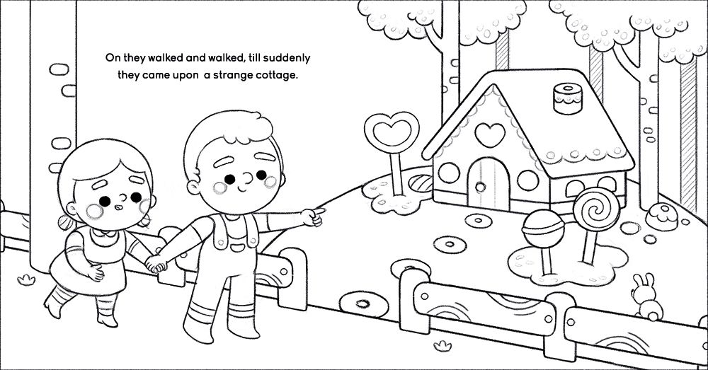
@TamaraDomuzin hi, Tamara! Let me just say how in love I am with your work and your style! Your kids are so adorable! Yes, I do think your portfolio needs more kids of various races and sizes and adults too. Also, try to make a few illustrations from a story to show you know how to illustrate consistent characters. Given your current works, I think you’re already showing that but illustrating let’s say Hansel and Gretel will just further prove your skill and we definitely want that. But aside from all of that, I think your work is perfect. Have you considered applying to agents as well?
-
@TamaraDomuzin Your work is super cute and perfect for the industry you're targetting. I do think you could spend a little time and remove the gutter elements in your spreads.
You already have a good range of topics covered, and I think you also did a good self-assessment to figure out what the portfolio is lacking. -
@TamaraDomuzin you know your work reminds me so much of Pamela Barbieri http://www.pamelabarbieri.com/ and I love it
-
Thank you @Corlette-Douglas and @Neha-Rawat
I will definitely change the Nursery rhymes to be seen as spreads then. @Nyrryl-Cadiz I'll include some older kids, parent and grandparents then (I actually love to illustrate older people, so I'm not even sure myself why I don't have more of them), as well as illustrate a part of a well-known story to show the consistency. As a big fan of Pamela's work, your comment really brought a big smile on my face, thank you  .
.
P.S. I'm definitely considering sending my portfolio to agencies, I have a specific one that follows me on Instagram, so I kind of took that as a good sign .
. -
@TamaraDomuzin I love your style so much! Your work is very beautiful, highly skilled and very cute. Personally I think your biggest weakness is the lack of diversity in your human characters. I don't just mean age and race, which to be sure can be improved, but all the characters have the same face and same body type. If not for colors and hair style, it would be all the same character. You also draw the same face always in the same angle! It's a tight line to walk because for sure you need to be consistent with your style, of course. BUT I do think your style needs to be able to accommodate a variety of face shapes and angles, and a variety of noses, eyes, eyebrows, mouths, etc. Your characters need to look like they're not all copy-pasts of each other. I know you're able to do this, because you have experimented with different face shapes and angles with your animals! They're all very different animals, but still all look like your style. So you got this!
vanessastoilova.com
instagram.com/vanessa.stoilova/Check out my Youtube channel for tips on how to start your career in illustration! www.youtube.com/c/ArtBusinesswithNess
-
Thank you @NessIllustration! I do always try to change the faces a little bit, but I am aware that I always end up having pretty much the same result. I will definitely work hard on this, thank you for bringing it up. My problems with drawing challenging angles is that I always think they don't look just ''right'', but I do have profile and back views in my work projects, so I'll incorporate them in my portfolio as well. Thank you once again for your advice
. -
Ness has a really good point. My first impression when I saw it was circles circles cirlces circles circles. The style looks awesome! but I'd try to add more shape variety
-
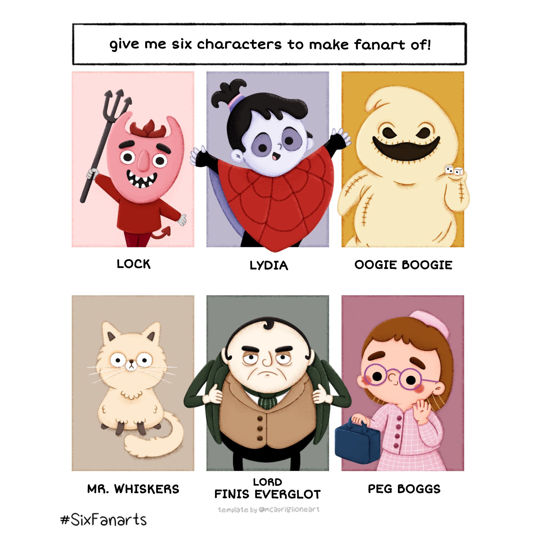
Thank you @Frost-Drive . Funny enough, I think my SixFanarts illustration might show some slight face variety in these three human characters, but again, I can see that the last one is my usual round face. I definitely need to change these things, thank you everyone for bringing it up
 .
.
-
@TamaraDomuzin
I really like your six fanarts!! Especially Lydia, the face is really aesthetic!I just noticed something else too with some of your characters. It might just be an optical illussion, but when girls have long hair, it looks like they're completely bald on the sides of their head.

It still looks great, but I just thought I'd mention it since I saw it.
My Drawing Show: https://www.youtube.com/ArtParlor
Instagram: https://www.instagram.com/frostdrive/ -
@Frost-Drive @TamaraDomuzin Oh wow you're right, I didn't notice that before! That's because there isn't a strand of hair in front of the ear!
-
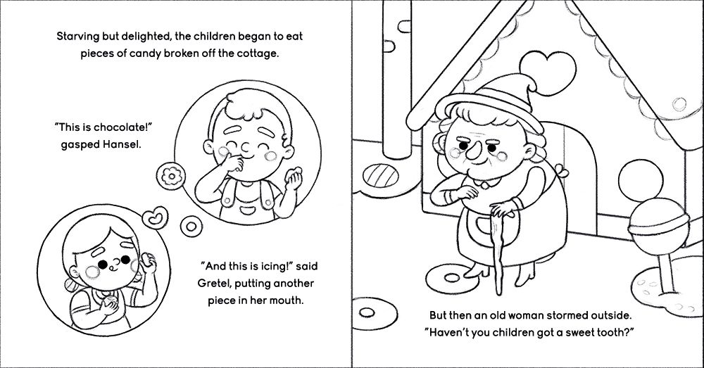
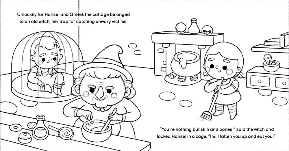
Thank you guys once again for the feedback
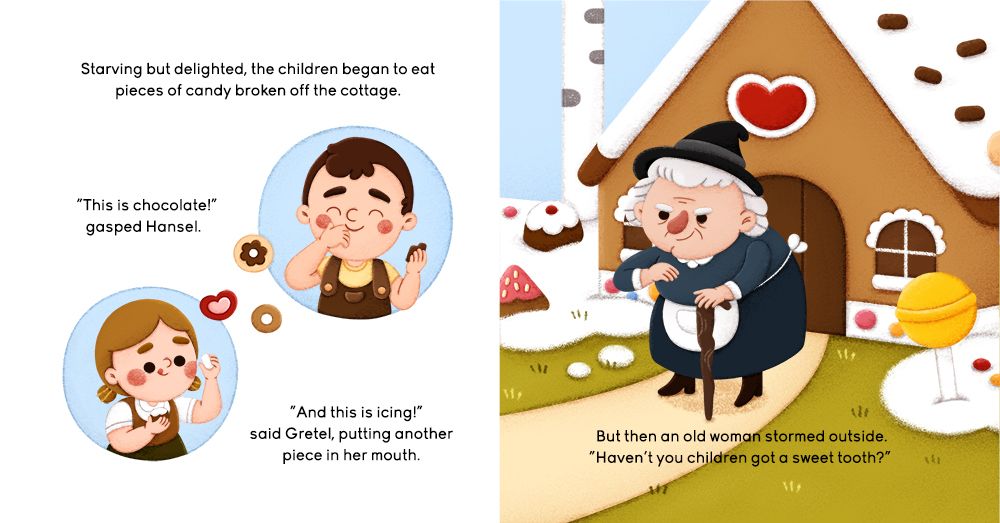
. I decided to do an example of a children story to show more character consistency, and went on to illustrate Hansel and Gretel, as @Nyrryl-Cadiz suggested. I thought it would be better to just continue writing on this post - I did two spreads, one full page and two spot illustrations. Any criticisim would be more than welcome!I have to say that although I did try to change the characters a bit (from my usual round heads, especially on the boy as I wanted to make him a bit older than the girl), this is the most comfortable I felt going at this time.
-
@TamaraDomuzin Hi! I love them. My one suggestion is maybe making the kids people of color.
-
Hi guys, it's been some time since I posted, but a work project came in
.
I finished the piece, but changed a little detail - the path of the house, and I'm not sure whether this would be a problem with the text.
Do you think that the text on the right side of the illustration (with the witch on it) is hard to read?
I know it would be much better if the text was placed just on the meadow, so would this situation be a big no-no?