JULY CONTEST: Design a book cover for the Wizard of Oz
-
@Adam-Thornton thanks! I was wondering if there could be a pixel-width specification so that when everyone uploads their work it looks the same, but maybe that's too techie

-
@Lucky-Platt I'd say that's asking too much from us beginners!

-
@Lucky-Platt We have specifics in inches. Pixels are just another measurement. Am I missing something? I checked before I started and if I remember correctly the size limit made sense when reducing a 300 dpi 8 x 10 or 8.5 x 11 to 72 dpi. Has anybody else checked this out?
-
@deborah-Haagenson so sorry for the confusion, I'm going to try to explain why I was asking about image size.
By image size I meant the size of the image as it appears on a laptop or tablet screen, which is totally variable depending on how the image is saved and uploaded for web viewing. The specs that we were given (5.4" x 8" with .25" bleed) are for print - meaning, if you're working digitally, your document or image size would be 300dpi and 5.4" x 8" plus a .25" bleed. If you're working traditionally, you are creating a drawing/painting/whatever that is 5.4" x 8" with at least 1/4" additional border art on each edge that would cover the bleed and then scanning the artwork at 300dpi. (Of course either way you could work larger than 5.4" x 8", but your work would have to be scalable - proportionally larger, so that when the art was reduced for print, it would meet the specs.) Anyway, I was just hoping that we could see the cover submissions at a uniform size - the ones that have been uploaded so far are many different sizes.
-
@Lucky-Platt Thank you for the information! I didn't realize that the sizing was for print. I'm not very knowledge when it comes to file sizing beyond what we normally submit for this contest.
-
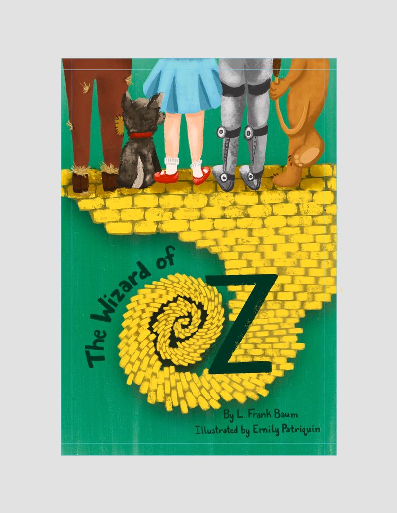
Emily Patriquin
www.instagram.com/emilydabbles -
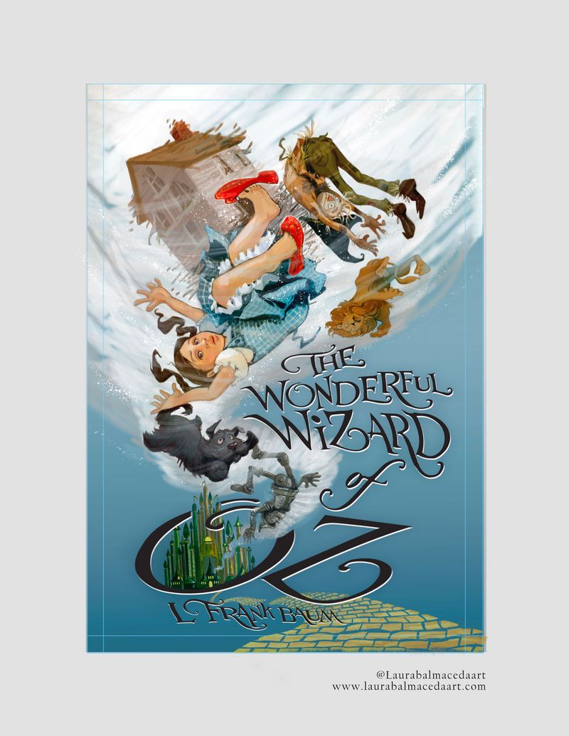
Laura Balmaceda
@laurasketches
@misslaurabalmacedaart
www.laurabalmacedaart.com -
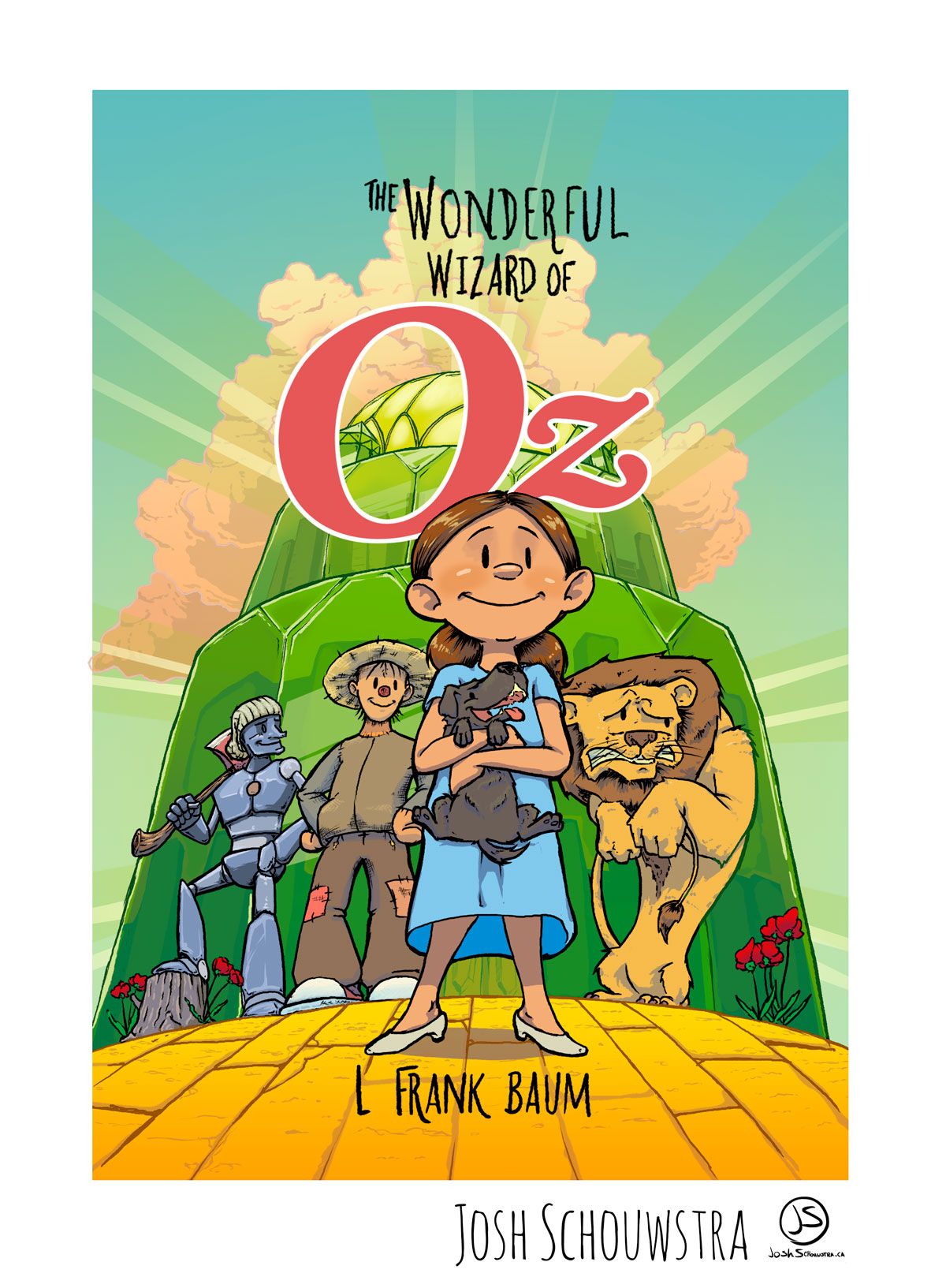
Wanted to go for what The Wonderful Wizard of Oz would look like as a graphic novel/comic.

-
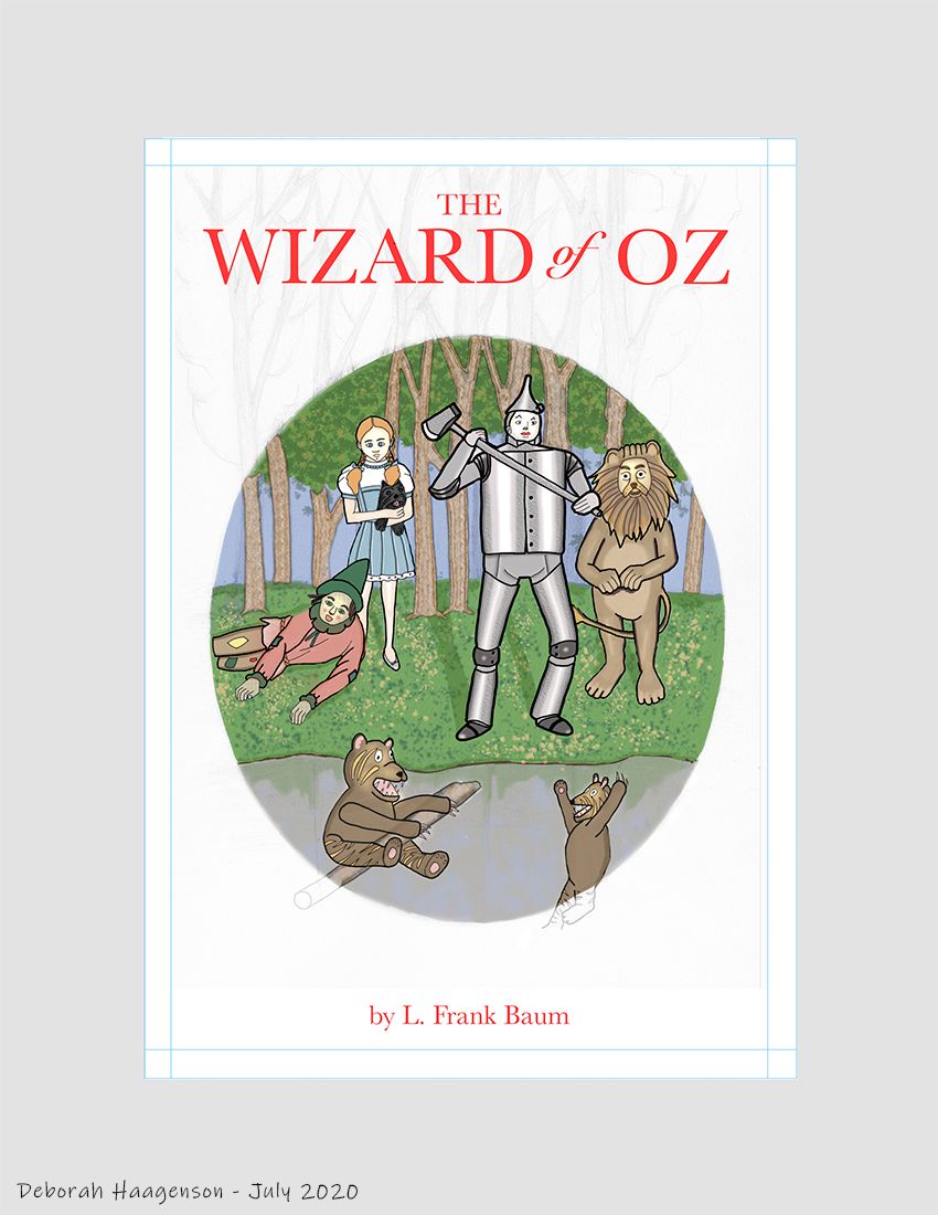
I took a more traditional approach. My Grandparents gave me the 1956 edition of the book in the 1960s. My Grandmother's initial was near this scene in the book.
-
-
-
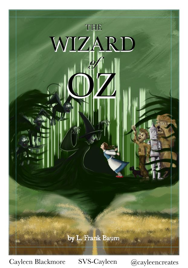
@Chip-Valecek  image url) Hello! feeling a little timid. This is my first post ever. Happy to be here and looking forward to lots of feedback from you all!
 -
This post is deleted! -
Hi everyone at SVS forums,
This was a great contest idea. I'm looking forward to seeing the other submissions. There are already some great ones and all are very unique! - Graham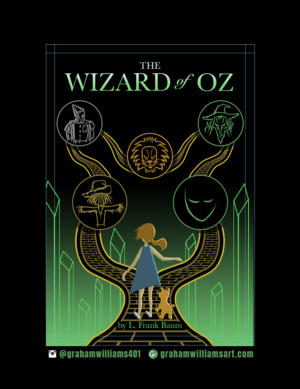
-
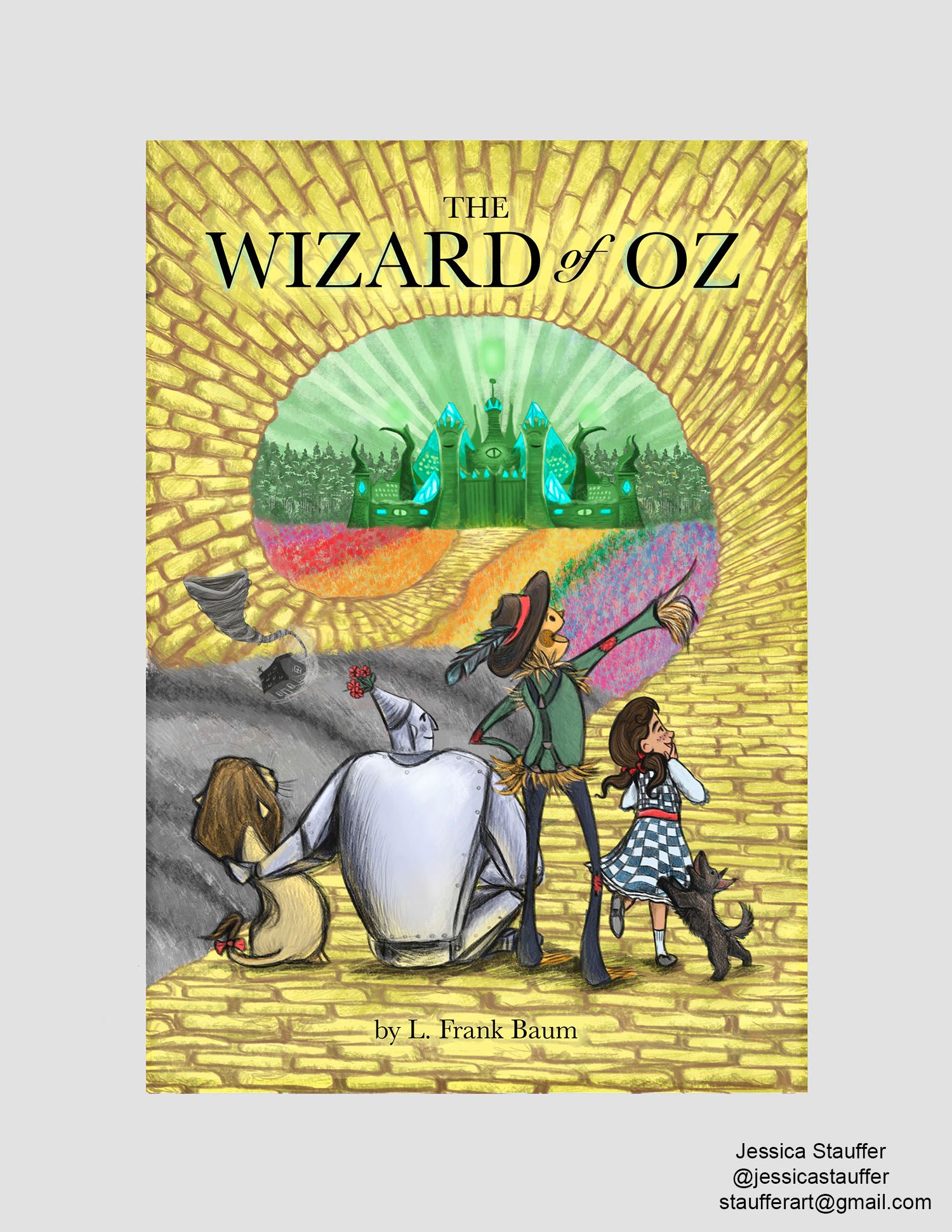
@JessicaStauffer I really love the art style of this. The character design is unique and there is so much to discover!
-
@DKRyland I really love this. I could see this as the cover for a 1930's Futurist re-write of Dorthy's adventures or something. Really beautiful portrayal of Oz. The vintage textures are terrific!
-
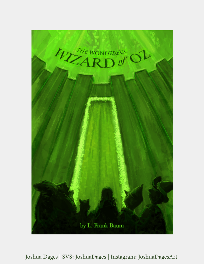
Hi Everyone! Here's my submission this month. I wanted to do something completely different than I've ever seen for an OZ cover. Coincidentally, I've been working on my own version of this story for about a year now, so this was super fun to work on for me! Hope you enjoy!
-
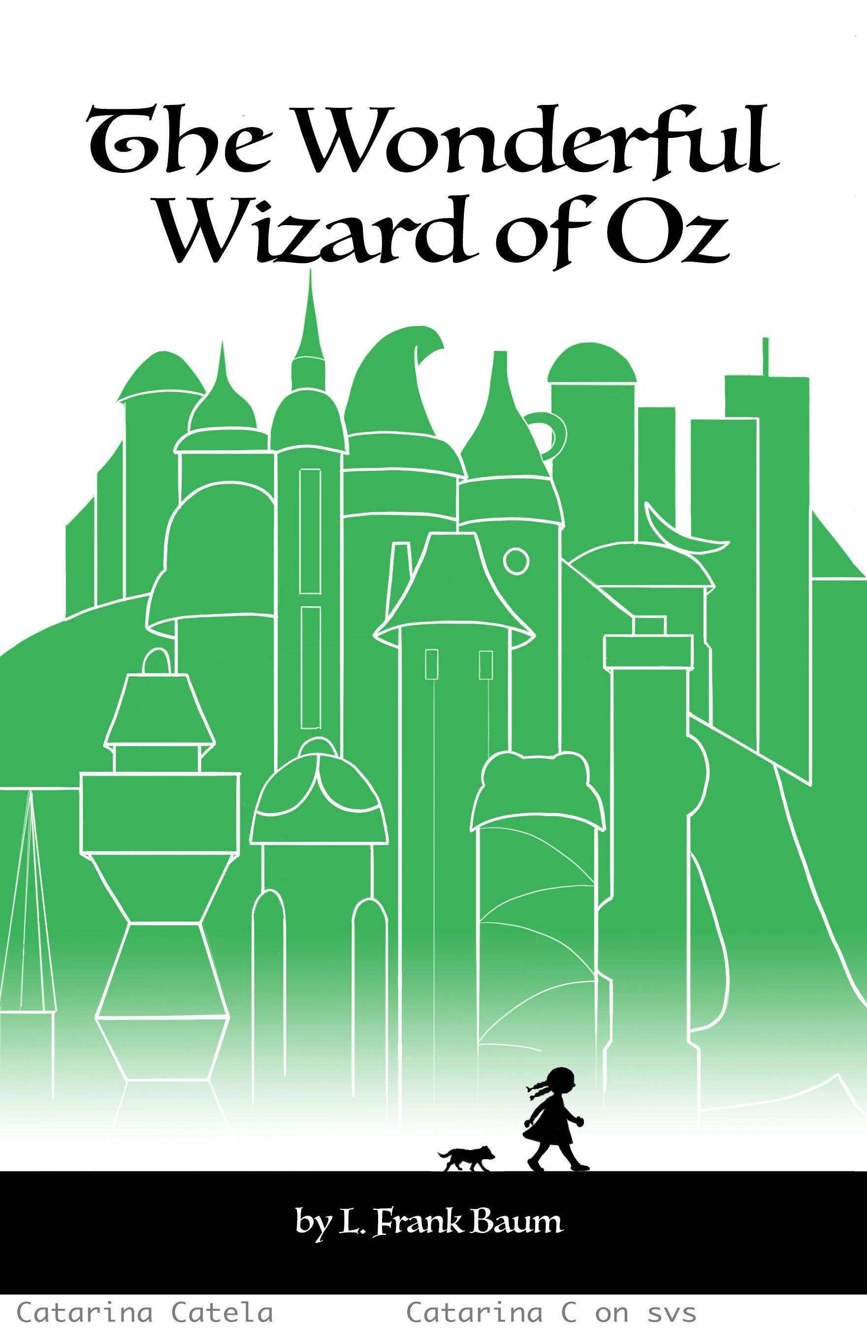
Hi everyone, here is my entry for this month's contest.
-
@JoshuaDages Thank you so much! I really love the green glow of everything and the texture on your piece, it just makes it feel like there is something beyond !
-
@JessicaStauffer LOVE the tin man and the Lions posture!