Critique or fresh eyes needed
-
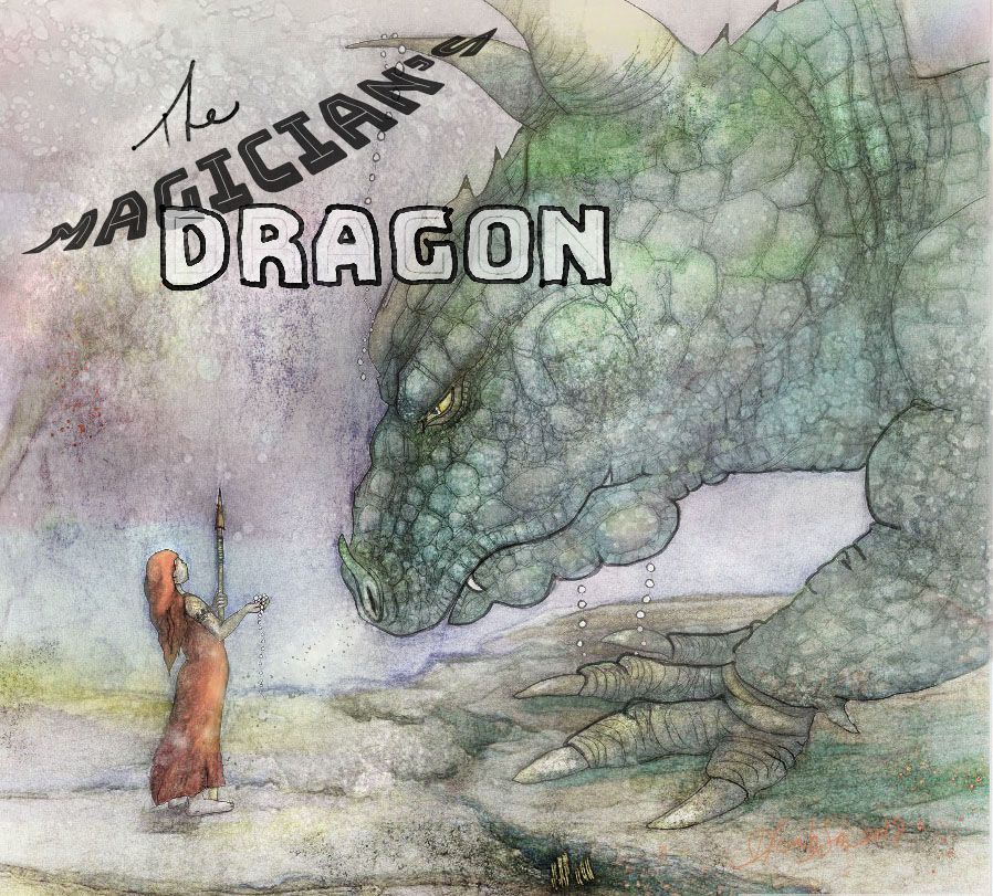
Hi guys..I'm thinking of adding this to my portfolio as a middle grade book cover mock up. Can I get your thoughts please?
-
@Deborah-Cantlon-Lambson The illustration is so lovely, but the text is quite bad and ruins it! I think if you take it out it would improve this image so much. I know it's supposed to be a cover mockup, but first of all the illustration isn't tall enough (middle grade books are portrait almost all the time) and the typography does not look professional. You can include text in your illustration portfolio, but I think only if it doesn't hurt you. In this case, I think the text definitely hurts you more than it helps you. Again though, the painting itself is gorgeous. I love the soft eerie feel. The way you use watercolor fits your theme perfectly. It reminds me of Kay Nielsen's work - and that's quite a compliment!
-
@NessIllustration thanks so much for that honest opinion..text is difficult, I guess I need to study that a bit more. Yes it never occurred to me until you say it that this needs to be a portrait..I'll work on that and maybe add the text to that added space.
-
and forgot to mention that actually this is all digital but with many layers of my own water color for textures!
-
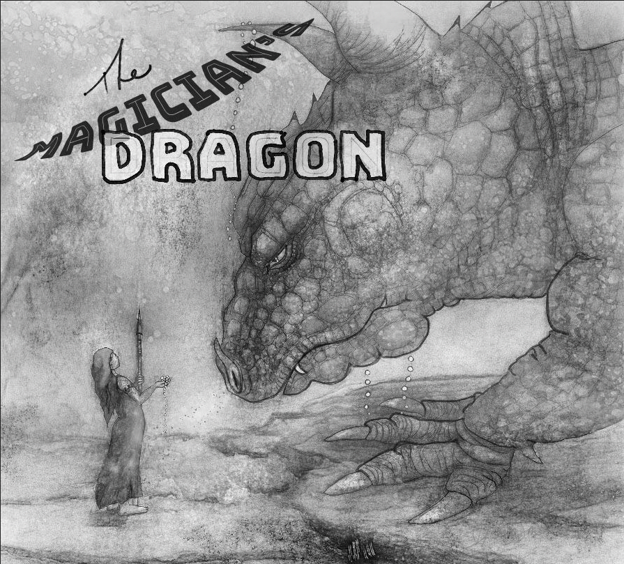
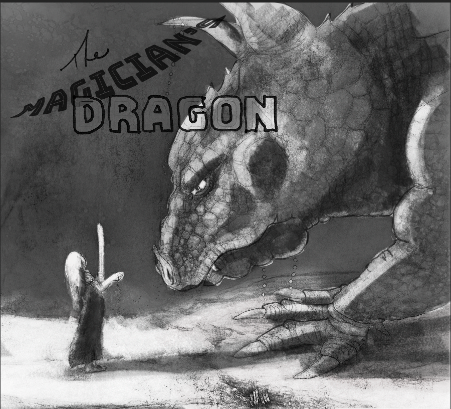
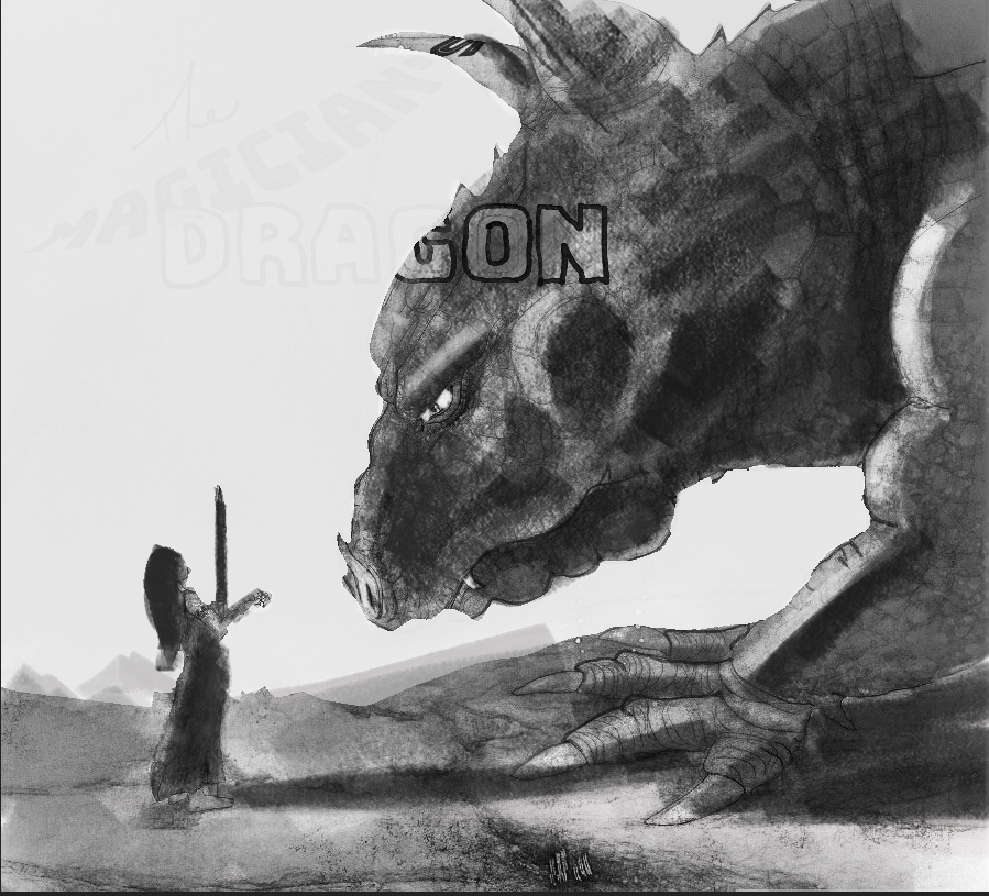
Something else I'd like to suggest is that currently the texture used across the whole piece is very even/all over. This means that the wonderful texture on the dragon, is actually feeling kind of lost because the same texture is found everywhere else.
I also feel that you could push the value structure much more. Where is the light coming from? If you figured out where your light source was you could really make some great lighting for this scene. Right now there's no strong focal point/Direction for the viewers eyes. If you turn this black and white the values are all pretty even in the background and the foreground. So figured out what you want the viewer to look at... Is it the dragons eye? The girl? What do you want the viewer to see first, and what do you want them to see second?
vs.
Or something likewise.
Just play around until you get something that feels right for the story
")
-
Thank you both for such great observations and the time you took to re work it @EliaMurrayArt!
I don't know that I would ever have seen that @gavpartridge ..great eye. Thanks. This is why SVS is such a great resource..no man is an island.
-
Hi! I like the soft, ethereal quality of your piece. It reminds me of David Christiana's work.
-
@baileymvidler Oh my gosh..I LOVE his work. Thank you so much for that link..I'd never heard of him! That put some steam behind my work at the drawing board today.
very nice compliment, thank you. -
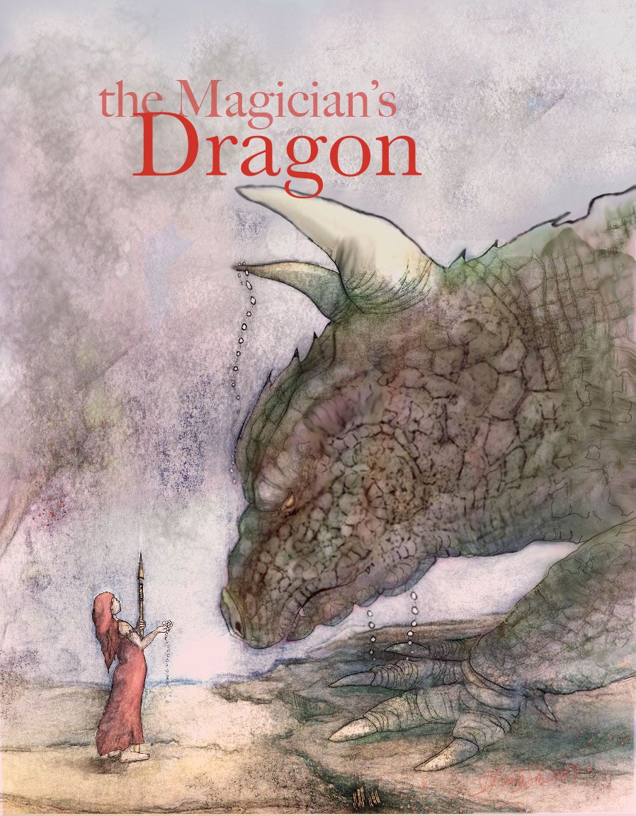
I dont know if its me or is that leg is still at odds with the body.

-
@gavpartridge Thank you for your suggestions..I like the addition of brilliant light and your suggestion of more use of ambient which could be added with a bit of breathing fire. Another time!