Society of Visual Storytelling

    SVSLearn Forums

    • Register
    • Login
    • Search
    • Recent
    • Tags
    • Popular
    • Users
    • Groups
    • Search

    Welcoming critiques!

    Artwork
    6
    15
    615
    Loading More Posts
    • Oldest to Newest
    • Newest to Oldest
    • Most Votes
    Reply
    • Reply as topic
    Log in to reply
    This topic has been deleted. Only users with topic management privileges can see it.
    • frankiiij
      frankiiij last edited by

      alt text

      I live by an idea that I don’t know what I don’t know. Some I’m looking to hear from all who would like to share their thoughts! Thanks for your time and patience.

      Much love and God bless!

      Kevin Longueil carlianne 2 Replies Last reply Reply Quote 1
      • Kevin Longueil
        Kevin Longueil SVS OG @frankiiij last edited by

        @dafoota this looks good! One thing though is that in the book the wicked witch has only one eye 😉

        Portfolio: kevinlongueil.com
        https://www.instagram.com/kevinlongueil/

        frankiiij 1 Reply Last reply Reply Quote 1
        • frankiiij
          frankiiij @Kevin Longueil last edited by

          @Kevin-Longueil oh wow! I didn’t know that! Thank you! Was it like a patch?

          Much love and God bless!

          Kevin Longueil 1 Reply Last reply Reply Quote 0
          • frankiiij
            frankiiij last edited by

            @gavpartridge respect! Thank you for your time and honesty! Sometimes I look at a piece and knows something is off but can’t really tell or assume I’m just doubting too much. Thank you! Thank you! This is perfect! Much love! ONE!

            Much love and God bless!

            1 Reply Last reply Reply Quote 0
            • Kevin Longueil
              Kevin Longueil SVS OG @frankiiij last edited by

              @dafoota No patch is mentioned in the book...the book is very different than the movie ..i find it a bit dark...i'm thinking we need to steer clear of imagery from the movie - the green skin is a an invention of the movie also - the witch did not have green skin in the book ...also no ruby slippers - they are silver 🙂

              Portfolio: kevinlongueil.com
              https://www.instagram.com/kevinlongueil/

              1 Reply Last reply Reply Quote 1
              • TessaW
                TessaW last edited by TessaW

                I think @gavpartridge gave an excellent critique. He hit the points I was thinking as well. It is a really striking image overall, so I think you are on to something @dafoota!

                @Kevin-Longueil I started listening to the audiobook, and was wondering if the silver slippers were going to turn to ruby at some point! It will be interesting to try to catch all the differences. The blue and white gingham dress sounds like it's still a go.

                Website: www.tessawrathall.com

                Instagram: www.instagram.com/tessawrathall_art/

                frankiiij 1 Reply Last reply Reply Quote 1
                • carlianne
                  carlianne @frankiiij last edited by

                  @dafoota Have you considered making the text white instead of using an outer glow?

                  Check out my art and tutorials :)

                  Instagram: www.instagram.com/carliannecreates/

                  Youtube:
                  https://youtube.com/c/CarlianneCreates

                  Shop: www.carliannecreates.com

                  1 Reply Last reply Reply Quote 1
                  • frankiiij
                    frankiiij @TessaW last edited by

                    @TessaW Yes it was spot on...Ive been letting it marinate for a while...It was so wholesome and delicious. Also right to the point. Much Love. ONE!

                    Much love and God bless!

                    1 Reply Last reply Reply Quote 0
                    • frankiiij
                      frankiiij last edited by

                      alt text

                      @Kevin-Longueil @gavpartridge @TessaW @carlianne

                      Much love and God bless!

                      Jonathon B Baker 0 carlianne 2 Replies Last reply Reply Quote 0
                      • Jonathon B Baker 0
                        Jonathon B Baker 0 @frankiiij last edited by

                        @dafoota This revision is looking good. I'm glad you toned down the halo around the lettering. I thought that was a bit distracting but it looks good now. I'm wondering if you could put a little of the green glow from the city into the eyeballs. Might make it punch more.

                        Jonathon Bee

                        frankiiij 1 Reply Last reply Reply Quote 1
                        • carlianne
                          carlianne @frankiiij last edited by

                          @dafoota Oh yeah, that glow is much better, looks more like part of the scene! I think I might still change the text color though, it's getting a bit lost when you squint at it.

                          Check out my art and tutorials :)

                          Instagram: www.instagram.com/carliannecreates/

                          Youtube:
                          https://youtube.com/c/CarlianneCreates

                          Shop: www.carliannecreates.com

                          frankiiij 1 Reply Last reply Reply Quote 1
                          • TessaW
                            TessaW last edited by TessaW

                            I think it's much improved, but there are 2 issues that give me pause.

                            1. For me the biggest issue is that the text looks like an after thought. The title has very little impact due to a combo of color and size. If you haven't done so- I would make a bunch of small, rough mock ups, playing with the text and with secondary elements . Example:

                            dafoota.png

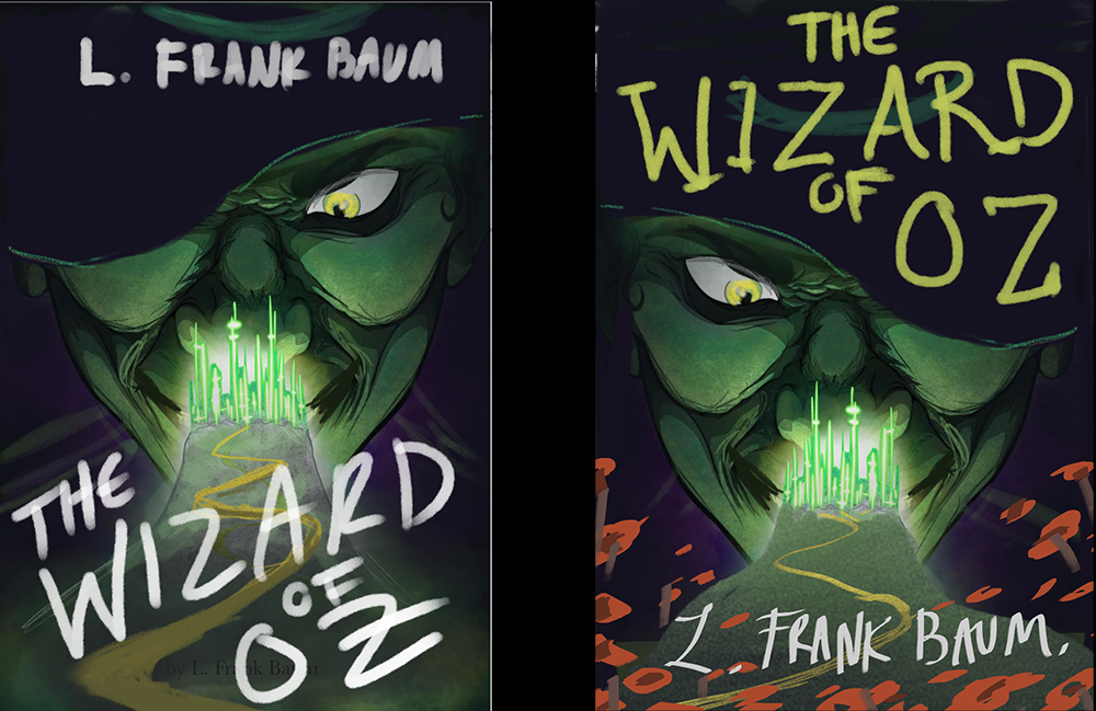
                            2.The way you've rendered the nose and around the mouth is very interesting- you've made small detailed strokes to divide between the light and shadow, but you haven't used this same method elsewhere. My eye wants to focus right on her nose, despite her eyes being so intense. I'd either carry this kind of rendering elsewhere, or simplify the shadow and light division in nose/mouth area in order to unify the rendering of the cover.

                            Website: www.tessawrathall.com

                            Instagram: www.instagram.com/tessawrathall_art/

                            frankiiij 1 Reply Last reply Reply Quote 2
                            • frankiiij
                              frankiiij @Jonathon B Baker 0 last edited by

                              @Jonathon-B-Baker-0 nothing but gratitude

                              Much love and God bless!

                              1 Reply Last reply Reply Quote 0
                              • frankiiij
                                frankiiij @carlianne last edited by

                                @carlianne thank you for your time and patience

                                Much love and God bless!

                                1 Reply Last reply Reply Quote 1
                                • frankiiij
                                  frankiiij @TessaW last edited by

                                  @TessaW Those are awesome. thank you for your time and patience. Thank you for being patient with me responding. I just happen to not even see the notification for when you did comment. Yeah I should have done something with the eye and the lettering. I might have naturally fixed the nose focused in my submission. I really enjoy honest feedback and enjoy reading critiques throughout the forum to learn what i can. Thank you. Much love. ONE!

                                  Much love and God bless!

                                  1 Reply Last reply Reply Quote 0
                                  • First post
                                    Last post