New Book Cover - Thoughts?
-
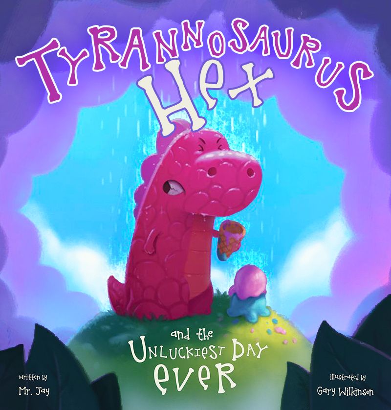
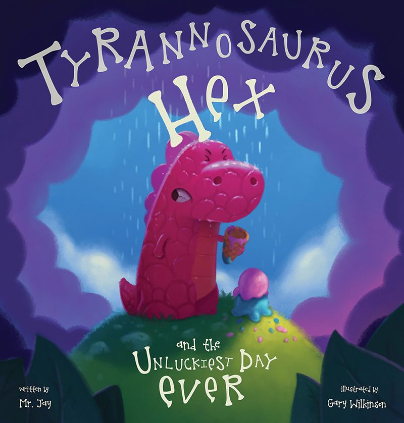
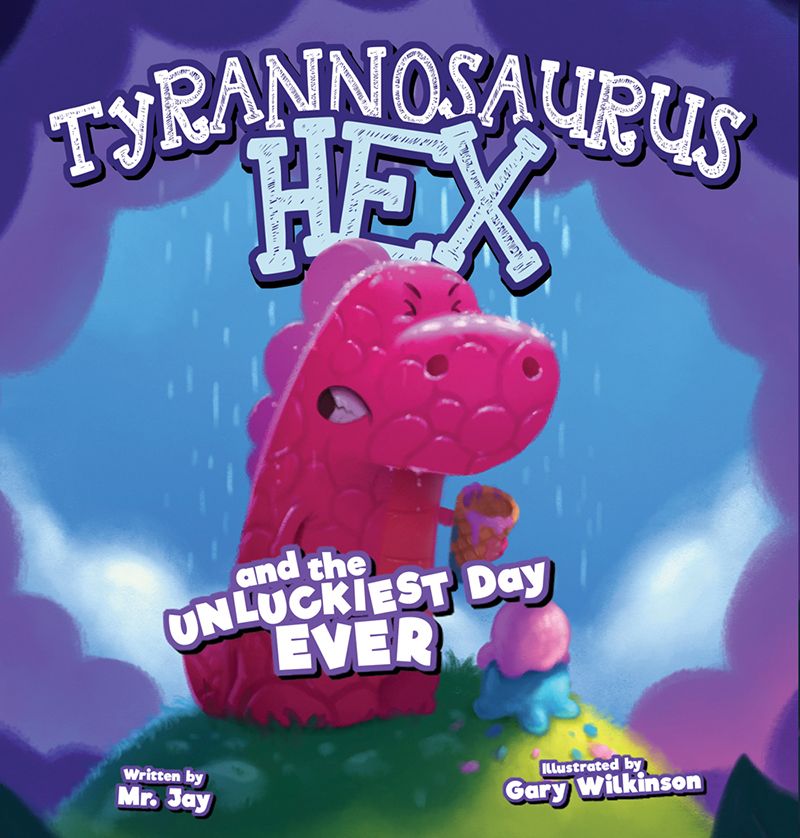
So I have a new book that will be coming out next year and we are trying to find the right front cover design. 1 and 2 are the same with a change of font and a more zoomed look, whereas the 3rd is part of one of the inner spreads.
I also wanted to ask, who is in charge of choose the font and it's placement for the cover?
The first version is the one I feel is the strongest as I designed the illustration based on this layout, but the author/publisher feels that the dinosaur should be larger and the text bigger to help sales when seen as a thumbnail which im not so sure about. What are your thoughts?
-
@Gary-Wilkinson Hi.
So I like the first one as well because I find the text in the last 2 overpowering the dinosaur like their fighting for importance and the dinosaur is loosing (less in the second and definitely more so in the third). Perhaps adjust the size of the text to make it smaller and the dinosaur larger. The text in the 2nd one already is bold because of the extra flare it has and I don't know if it needs to be quite so massive. Maybe also place the 2nd text on the first dinosaur cover. I think the text in the 1st one lacks some punch; I like the bone look so maybe add in the extra outline effect that the 2nd text has but clean like in the first.
-
Hi @Gary-Wilkinson, congratulations on the book! Based on the cover design, it looks really cute. I like the color palette and character design of Hex.
Regarding your question, i would say the author/publisher has ultimate decision on the final cover since he is wearing many hats as a self-publisher.
However, you’re doing the right thing by offering your opinion and giving constructive feedback.
Personally, I like the first layout design but like the main text on the 2nd option. I’m not keen on the 3rd option as there’s a lot going on and feels congested.
Maybe you can offer thumbnail versions and see which looks best?
If you were working with a traditional publisher, the final cover design would be up to them, not the illlustrator. I believe that’s how it works.
Good luck! Let us know which one you guys decided on and when it gets published!
-
Even if the 3rd one is cluttered, I think as a kid I would get most excited by that one. DINSOAUR RIGHT IN YOUR FACE!!!
Also, I saw an optical illussion with his mouth, I saw that as an eye looking to the left at first, and it really confused me. When I saw the 3rd version, I got it though.
My Drawing Show: https://www.youtube.com/ArtParlor
Instagram: https://www.instagram.com/frostdrive/ -
@Gary-Wilkinson i love the illustration in one. I also love placement of the subtitle. However, I think it would do better if you use the font style of 2 along with 1’s illustration and subtitle.
-
@Frost-Drive I agree with this post. I'm thinking maybe a little more definition for the mouth, like a little line showing where his mouth closes. But the little side hole did make more sense in 3.
-
Just popping in to say I love this t-rex. He reminds me of a gummy bear and that makes him the best kind of t-rex ever. I want a stuffed version of him to hug, since he looks like he needs one.
Excited to see the finished cover! (I like #1 the best, layout font, etc. It is a quick read, gets the point across. Though I think to get the "Hex" part across maybe a BIG crack of lightening could be flashing in the background.)
-
@Gary-Wilkinson Congratulations on the book project! I prefer #1, but would want to definitely see these three as thumbnails to make a more informed decision. #1 draws me in more and makes me think "Aww, poor cute T-rex:)". You want the text to be legible, but not too overpowering. Maybe find thumbnails of other books and see how your covers compare next to them. When working with a traditional publisher situation, they will usually have a graphic designer place text and choose fonts, and you would be providing the artwork with enough blank space for them to work with. If you feel strongly about choosing the font and text placement, definitely share your recommendations, but if there is a graphic designer involved, I would also suggest presenting the artwork without text so it's clear that you welcome collaboration on achieving the best possible cover. Good luck!
-
Hey @Gary-Wilkinson,
Congrats on the book!
I would agree a bit more with the author/publisher on this one. While the first is pretty classy, after zooming out on the image, I was able to read the second one better. I also find the second one to be more potent of a concept, since, in my opinion, dropping one's ice cream is MUCH worse than being caught in the rain (though that could just be my sweet tooth") ).
).As for you question on who has final decision on the cover, I back what @Jeremy-Ross said, that the publisher ultimately has the final decision, unless talked about previously.
Hope things go well with the book!
-
My assessment is the same as what @Nyrryl-Cadiz said.
-
@Gary-Wilkinson
So much awesomeness!!!I really like this character!
I agree with a lot been said here already, here is my two cents
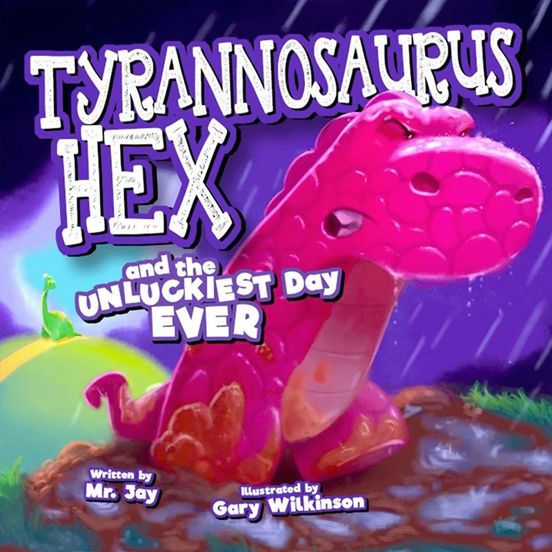
I did a paint-over using the first cover idea, increased the size of the character, updated the contrast of the character and background, added water splash on the character to help the character silhouette stand out more and have better readability from a distance, some atmospheric perspective to separate the front leaves from the hill and character
mess around with the title changing color and adding stroke lines
I hope this helps give you more ideas for your cover and finish with a product that both you and your publisher could enjoy.
Thank you!!