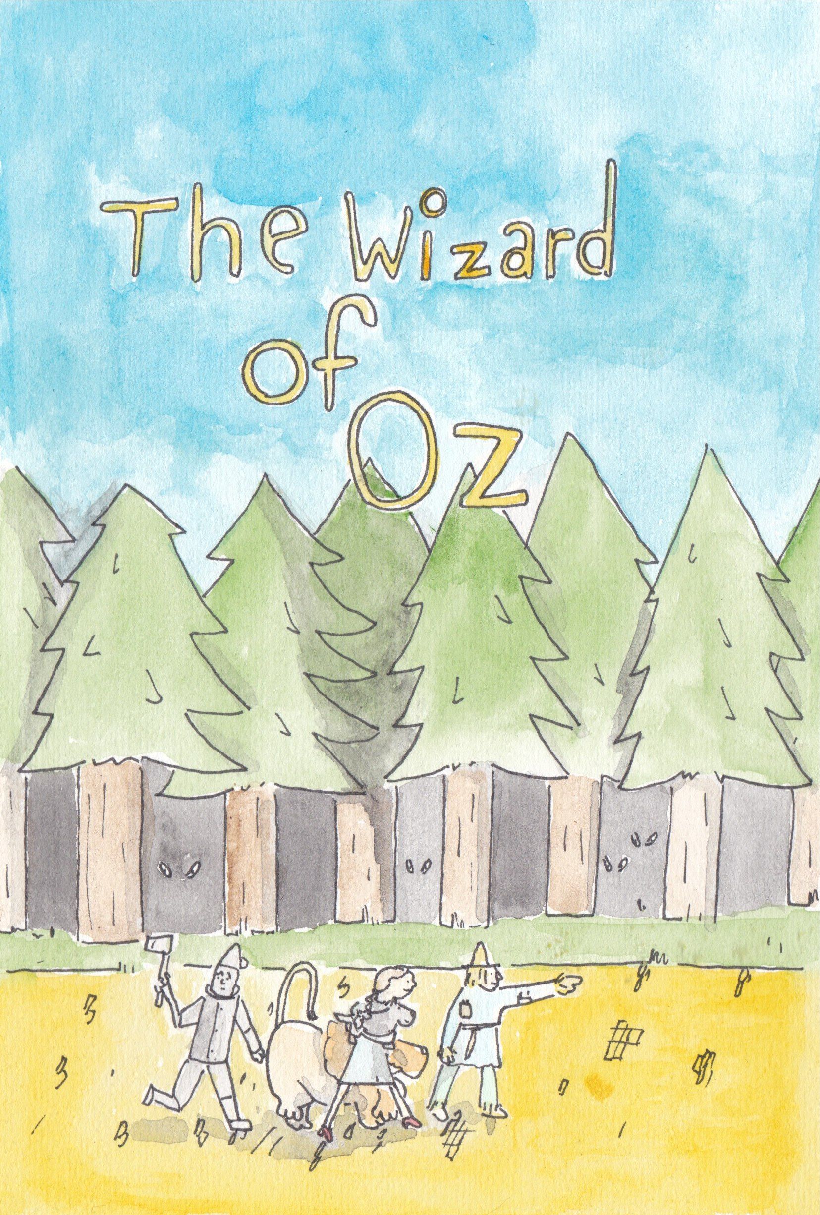
WIP July prompt book cover- Feed back on colour/style
-
-
The way I often start with critiquing a piece is taking a step back and looking at it from a distance to see how well it reads.
When I do this with your piece a few things show need of adjustment.
First I would focus on creating a more dynamic composition. The image is very linear at the moment, we want our viewers to look at an image and have their eyes easily flow through it and making a dynamic composition will help with that. To create that composition I would suggest making a bunch of thumbnails, I would aim for about 30. Lee white has a video on his YouTube channel about thumbnails you should check out if you haven’t already.
Secondly I would suggest making the characters more readable. The characters appear to be the subject but they’re very small and overlap in ways that make them hard to read.
This ties right in with thumbnails, make some thumbnails that really change up the character positions and put more emphasis on them. A good trick to make sure they are easily readable is making them into silhouettes to see how clear their poses are. This doesn’t work every time, you can have a clear image with unclear silhouettes but it certainly wouldn’t hurt to try. -
It's cute! I'd punch up the contrast a little in an editing program to bring out the line work and crop the top and the right side a little. Maybe it's my monitor, but it's looking a little washed out. Are you supposed to have the author's name included for the contest?