Book cover thumbnails
-
Hi y'all! Hope you are doing well! I'm working on what it would be another story for the Red Riding Hood so I made some thumbnails for the cover and I would like to know your feedback.
The story is quite different even though the main elements are still there (red riding hood, wolf, granny, lumberjack). So my point is that I want it to look like the regular story but with a different detail which is the wolverine.
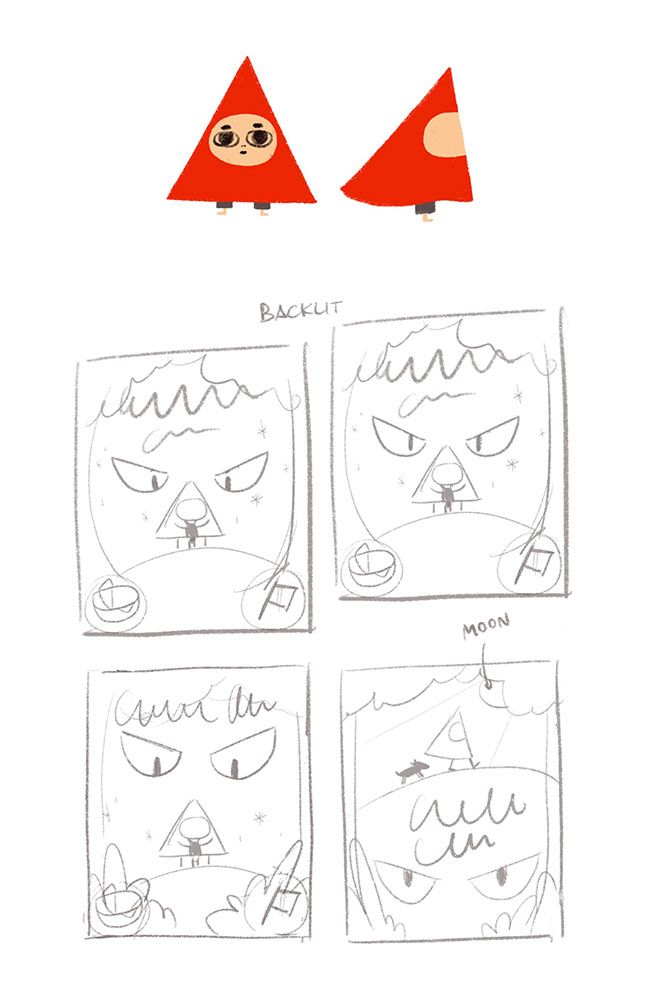
The tiny thing she's holding on the thumbnails is a wolverine.
I added a couple sketches of the character so you can understand what you are looking at and the wiggly line is for the title. Also about the "backlit" note I'm considering to be lightened it by the moonlight from the back.
Thank you in advance!
-
I love your style for Little Red Riding Hood! I recently did a minimalist RRH version book cover as well, and loved the challenge of it.
I think your fourth version (bottom right) is the most interesting. I really get the feel that she's on an adventure and that the wolverine is lurking. The other three are interesting, but seem very similar and I'm confused about Red's angle. Is that her from the front or back? Are we seeing through her hooded cape because it is backlit? Maybe I'm not understanding the thumbnail completely, but either way, I love the composition of the fourth one!
Can't wait to see the progress!
-
I also like the 4th one, feels very dynamic! I’m excited to see how it turns out. I love your character design, you should check out Bethan Woollvin’s work if you haven’t already. She also has a really interesting use of shapes and I think you might like her work! She illustrated a version of red riding hood a few years back
Instagram and Twitter: @eriberart
Website: www.erinmcclean.com -
@eriberart Thank you! I will check her work too.
-
@JoshuaDages Thank you! Oh, sorry! All of them are from the front so she's holding the wolverine in 1, 2, 3 and in 4 they are both walking.
-
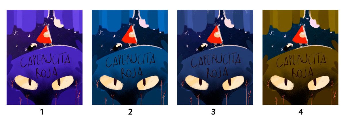
Well! Here are some color tests. My first choice was 1 but now I also like 2 and 3. The green one is my least favorite because I don't think it works as well as the other ones in this case.
I'm playing with the blueish / red duality so she pops into the moody forest.
The color of the title is not yet decided I only placed it so you know where it's supposed to be placed.
Which one you like more? Thank you!!
Also if you'd like to suggest another color scheme that you think may work better do not hesitate!