July 2020 Wizard of Oz cover concepts – comments, feedback, critiques welcome
-
Looking for some comments, feedback, and critiques on two cover concepts for July 2020 Wizard of Oz book cover.
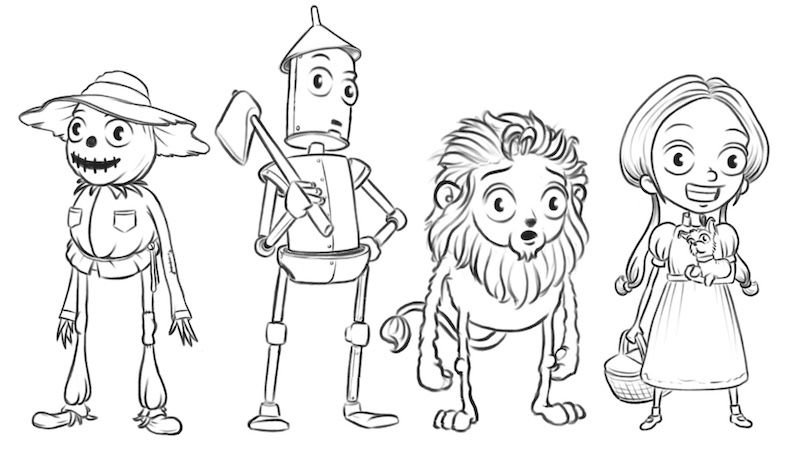
There were a number of ways I thought of going with this, but in the end I wanted to focus on the characters. I just don't think my art style works quite as well when trying to convey something metaphorical or symbolic (if that makes sense). So, I first drew my versions of the four main characters.
Then I created a couple of mockups.
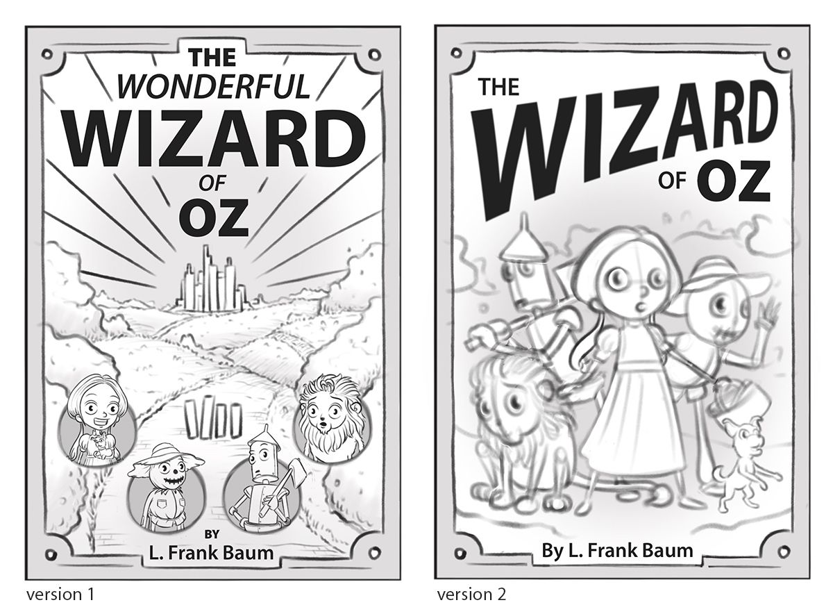
(In version 1, the tall rectangles on the path would be the four characters facing away and walking on the yellow brick road towards the Emerald City.)
Thanks!
Shawn Turek
Website: http://www.drawnbyshawn.com
Instagram: http://www.instagram.com/drawnbyshawn
Twitter: https://twitter.com/drawnbyshawn
Facebook: http://www.facebook.com/drawnbyshawn -
@drawnbyshawn I like your idea of leaning into your character design. I think that can be a big differentiator.
I like both of your thumbs but I think the second would let you showcase your characters more. Adding more energy and life to each of them. I think you would be able to lean more into the personality of each.
-
@drawnbyshawn woah! They both look awesome! Great job. I honestly have not critiques
-
This looks great! I personally like Version 2 the best. It puts more emphasis on your character designs. I like how dynamic the poses and typography are in Version 2.
-
I like version 2 as well. And I love that you did the characters first. Such a good idea. They look so consistent too.
-
Thanks for the feedback @theprairiefox, @Nyrryl-Cadiz, @baileymvidler, @Pamela-Fraley! I was leaning towards the second one as well, and it's good to hear others are thinking the same thing.
@Pamela-Fraley I'm working on a comic, and I'm finding that it's easier for me to get my head around it if I take significant characters and objects and design them out individually first. I suppose that makes sense for characters, but even ships, vehicles, etc. Initially I just went in and figured I'd work it out as I drew the entire thing, but it just felt a bit overwhelming. So, I'm carrying that idea over to this project too.