Character Consistency Critique Please! 👻
-
Hey guys! I don't have much experience doing the same characters over multiple pieces and I don't really have a style locked down either . . .I also have the urge to style the characters a little differently depending on the piece, so I've been struggling on character consistency for a series I'm doing.
In retrospect I should have tried to do a character turn around sheet or something.
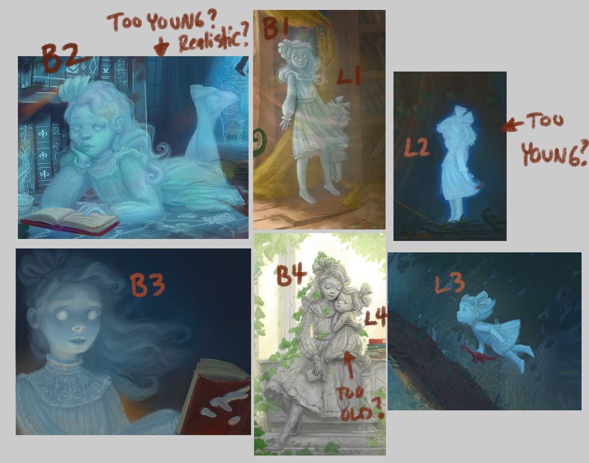
Can you guys chime in on if my 2 characters look like the same people across the pieces? Do they look consistently stylized?
-
Hi Tessa! You already know that I love these characters! They have peaceful, attractive features that seem fairly consistent, and I just love their flow-i-ness, which seems appropriate to ghosts.
 ️
️I mainly notice two things: One is that in B1, the older girl's face is thinner than in the other images. It's mostly around the right side of the cheeks (her left). This makes her face look more like she's 15 or so, whereas in in B3, I'd say she looks more like 13. (Of course, there is a lot of variation at these ages, so I'm going with my own perception.) In fact, I'd say in B2 she still looks like she hasn't hit puberty, so again I'd say it's the face but also a bit the overall proportions. Maybe it was hard to make her look willowy as she does in B1 when she's foreshortened. But something as small as narrowing the face and sleeves and lengthening the neck might help.
The other thing is that the little girl's neck, in L2, it too far down into her shoulders. The pose is cute, and I can see that she has her shoulders up in a sort of bashful gesture, but we still have to be able to imagine her neck behind the shoulders, and here I can't seem to. I'd draw her first without the arms to get the passage from neck to shoulders, and then add them with the shoulders slightly raised. But I'd say that across the board she looks like she's 3-4.
One last thing: Take a look at the feet in B1. I know she's ghostly, but those feet aren't quite planted on the ground. Probably they need a bit more foreshortening, or to be turned up a bit at the ankles.
But I say all this because I know you are perfectly capable of fixing these things! I love the whole set, and would love to read this book!
-
Wow, thanks @LauraA! You pinpointed out such specific details, which I think are spot on to get the characters looking more consistent (if I can pull it off
 ). You really do have a knack for nailing down character subtleties of design and gesture, as demonstrated by your work. What a great critique!