July contest - critique please :) if you have a sec
-
Here is my final sketch with a value/color study. I am thinking really muted tones everywhere but the road and the green circle. I was inspired by art noveau book covers as this was originally published in 1900. The hand is awful - will redo that. Thank you!!  image url)
 -
what a beautiful design, and a great idea to do it in that style. It's a little hard to tell what the values actually will be, so i don't quite know what you expect it to look like. In that case, I only have a couple things that I can point out: the darker crystal in the upper left isn't quite like the others, and the women's hair don't conform to an invisible body shape the way Dorothy's does, so maybe they can serve a clearer decorative function, like adding to the borders somehow.
I think art nouveau has zero negative space, everything is filled with ornament, so maybe the framed areas can have lots of ornament, and the white oval can have more negative space? that might give you a focal point.
-
@Mairin-Kareli I have to say, I'm not sure about the composition. There's a lot of elements, all floating around disembodied, with no real organization or prioritization. They're all a same-ish size. What is the main focus?
vanessastoilova.com
instagram.com/vanessa.stoilova/Check out my Youtube channel for tips on how to start your career in illustration! www.youtube.com/c/ArtBusinesswithNess
-
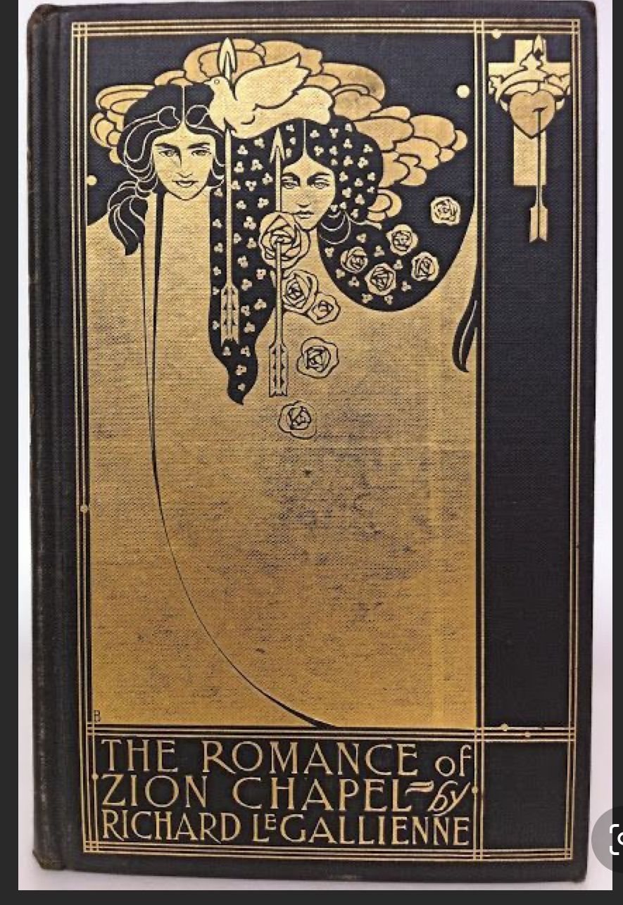
@carolinebautista This was the main book cover I was looking at (from 1898). You are right about the good witch not having a sensical body shape. She really should, yeah. And that one crystal. I wanted the good witch kissing her to really point to Dorothy in the whit oval as the focus - but the good which needs more contrast to direct you to her. Thanks so much for taking the time to comment, thank you!
-
@NessIllustration I was trying to make the main focus Dorothy. All the lines in the road radiate to/from her and all the other characters are looking at her. I tried to make her the area of highest contrast. I wanted the column of characters on the far right to be a second read area. You are correct a lot of the elements are a similar size - I totally didn’t notice that. I wanted Dorothy to seem child size compared to the two witches, and all the characters in the column to seem equal in importance to each other - like that whole area is a pattern with no focus. But they are all indicating Dorothy with their focus or shape/ line. I did really put thought/effort to organize things - bummed that isn’t coming across at all, clearly didn’t get that right. Thanks so much for commenting!
-
@Mairin-Kareli I'd like to suggest it's more than possible to have Dorothy be much bigger in size, and still have her look like a child if you get her proportions right. This is done in many book covers or movie posters to emphasize the main character, for example the Home Alone poster underneath. You do not have to rely on size to communicate which characters are children
") But all in all, my main problem with the composition is the witch on the right, which is not well integrated in the composition and makes things both busy and confusing.
But all in all, my main problem with the composition is the witch on the right, which is not well integrated in the composition and makes things both busy and confusing.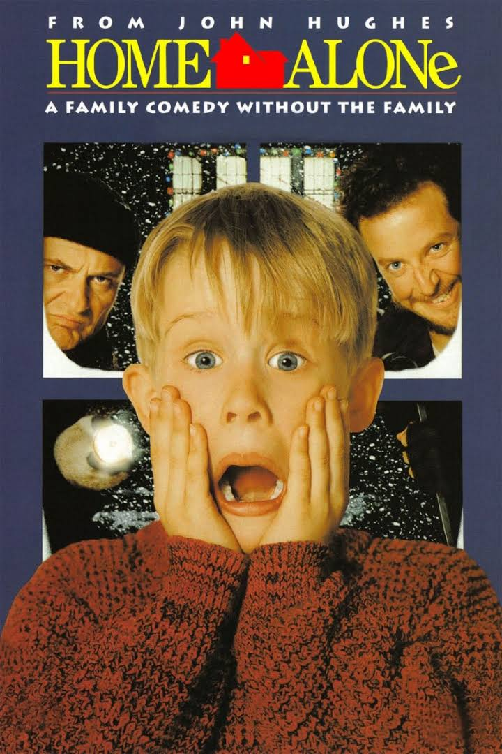
vanessastoilova.com
instagram.com/vanessa.stoilova/Check out my Youtube channel for tips on how to start your career in illustration! www.youtube.com/c/ArtBusinesswithNess
-
@NessIllustration yes - I agree about the wicked witch. And you are totally right about the child being any size and still looking like a child. Thanks so much much for the feedback - I am reworking it now. It helps so much to have someone else look at something you have been staring at so long long you can’t see it anymore.