Society of Visual Storytelling

    SVSLearn Forums

    • Register
    • Login
    • Search
    • Recent
    • Tags
    • Popular
    • Users
    • Groups
    • Search

    Gabby's DragonFly WIP thread

    Artwork
    13
    35
    1885
    Loading More Posts
    • Oldest to Newest
    • Newest to Oldest
    • Most Votes
    Reply
    • Reply as topic
    Log in to reply
    This topic has been deleted. Only users with topic management privileges can see it.
    • Anna Lindsay
      Anna Lindsay last edited by

      I like A the best, I think the big shadow casting on the kids does a good job of showing the dragonfly’s scale. Maybe if you had some regular sized dragonflies or other insects/animals in the image it would emphasise that the dragonfly is big rather than the children being small?

      Gabby Correia 1 Reply Last reply Reply Quote 0
      • amlilui
        amlilui last edited by

        I like the way you've done your thumbnails! πŸ™‚
        @Freya-Chakour has a good idea here;

        @Freya-Chakour said in Gabby's DragonFly WIP thread:

        If you want the dragonfly in the foreground maybe you need to add some objects in the foreground that the viewer knows the size of and can compare it to the size of the dragonfly

        Website: www.amberleighluecke.com
        https://www.instagram.com/amberleighluecke/

        1 Reply Last reply Reply Quote 0
        • Gabby Correia
          Gabby Correia @Freya Chakour last edited by

          @Freya-Chakour thank you for your feedback it really helps x

          https://linktr.ee/gabby_correia

          1 Reply Last reply Reply Quote 0
          • Gabby Correia
            Gabby Correia @Anna Lindsay last edited by

            @Annabishop that's a good idea, thank you πŸ™‚

            https://linktr.ee/gabby_correia

            1 Reply Last reply Reply Quote 0
            • ?
              A Former User @Gabby Correia last edited by

              @Gabby-Correia let him carry a other kid which he captured in the sea, this way you can establish the size in each perspective. ☝ 😬

              Gabby Correia 1 Reply Last reply Reply Quote 0
              • Gabby Correia
                Gabby Correia @Guest last edited by

                @Molambo AWESOME idea!!! Think I will steal that πŸ˜‰ thank you

                https://linktr.ee/gabby_correia

                1 Reply Last reply Reply Quote 0
                • Chris Perry 0
                  Chris Perry 0 @Gabby Correia last edited by

                  @Gabby-Correia Omit the last one. People like to see faces. I like the circular composition of the 2nd. Perhaps pushing the kids a bit away from the bottom of the page and creating the dragonfly's shadow over them. In a combination of your first and second images. Have the Dragonfly over them gives a more threatening feel.. if that is what you are going for.

                  1 Reply Last reply Reply Quote 0
                  • M
                    Mara Price @Gabby Correia last edited by

                    @Gabby-Correia I like A it has a nice perspective.

                    1 Reply Last reply Reply Quote 0
                    • Nyrryl  Cadiz
                      Nyrryl Cadiz SVS OG last edited by

                      i like the combination of A and B

                      Portfolio: nyrrylcadiz.com
                      Instagram: https://www.instagram.com/nyrryl_cadiz/
                      YouTube: https://www.youtube.com/channel/UCbJCF1Im8ZO7hpGWTKOJMuA

                      1 Reply Last reply Reply Quote 0
                      • Gabby Correia
                        Gabby Correia last edited by

                        dragonfly sketch.jpg

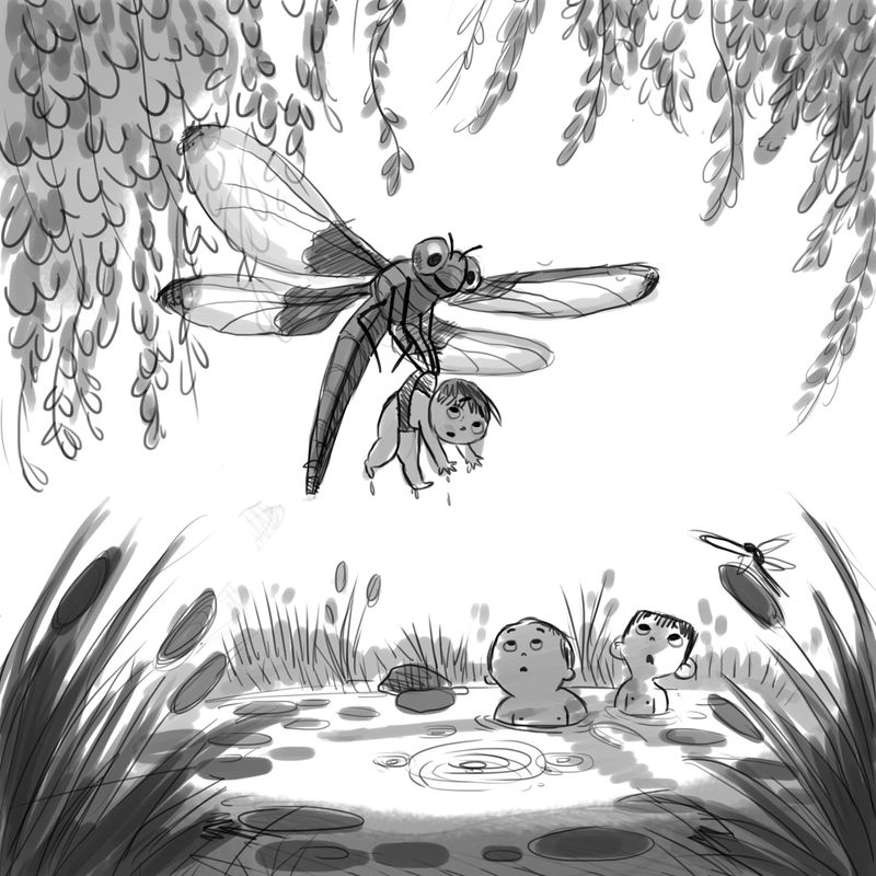
                        I have taken your advice and made a new sketch. I put the dragonfly closer to the children and added a normal-sized dragonfly in the foreground to help with the scale. Is it working better?

                        https://linktr.ee/gabby_correia

                        M Elliot Nyrryl  Cadiz ? 4 Replies Last reply Reply Quote 6
                        • M
                          Mara Price @Gabby Correia last edited by

                          @Gabby-Correia Super cool 😊

                          1 Reply Last reply Reply Quote 0
                          • Elliot
                            Elliot @Gabby Correia last edited by

                            @Gabby-Correia This is a great combo of the A and B thumbnails. It made me smile immediately too - the dragonfly looks friendly and playful, not menacing. And the kids' expressions are subtle but very well done.

                            1 Reply Last reply Reply Quote 0
                            • Nyrryl  Cadiz
                              Nyrryl Cadiz SVS OG @Gabby Correia last edited by

                              @Gabby-Correia lovely

                              Portfolio: nyrrylcadiz.com
                              Instagram: https://www.instagram.com/nyrryl_cadiz/
                              YouTube: https://www.youtube.com/channel/UCbJCF1Im8ZO7hpGWTKOJMuA

                              1 Reply Last reply Reply Quote 0
                              • ?
                                A Former User @Gabby Correia last edited by

                                @Gabby-Correia
                                nicely done. one detail you could add for some dynamic is the wings and the interaction of it to the enviroment. could be a small breeze from it or a strong one and depending on it do some ripple effect on the water, let the flowers in the background be "blown" away, same for the hair of the boys.

                                here a video about a rc heli over water to see how it could affect the water
                                https://youtu.be/A-71MNuae20

                                1 Reply Last reply Reply Quote 0
                                • Gabby Correia
                                  Gabby Correia last edited by

                                  dragonflyWIP.jpg 
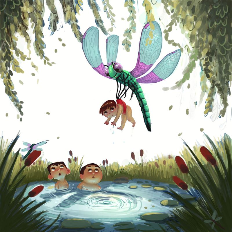
HELP! The colors are off???

                                  https://linktr.ee/gabby_correia

                                  Eric Droke Nyrryl  Cadiz 2 Replies Last reply Reply Quote 4
                                  • Eric Droke
                                    Eric Droke @Gabby Correia last edited by

                                    @Gabby-Correia, i like the colors you are using, I don't think that's the problem. There does seem to be a little bit of confusion about your light source though. You have an all white sky, which is super bright. Your dragonfly appears to be lit to match that lighting (top down, high noon lighting). But your children seem to have an ambient lighting. There's a lot of light coming UP from the water. Is the water glowing? (That's a really cool effect, by the way, but it may not be consistent with the rest of the piece.) Maybe try lighting the kids from the top to match the dragonfly and see if that helps.

                                    In short, I don't think you have a color problem, but a lighting problem. Nail down your main light source and that might bring everything together for you.

                                    Gabby Correia 1 Reply Last reply Reply Quote 1
                                    • Gabby Correia
                                      Gabby Correia @Eric Droke last edited by

                                      Thanks @Eric-Droke ! I'm trying to make it seem like the children are in the shadow of the dragonfly so the only light they are getting is bounce light from the water. Maybe I should tone it down a bit...

                                      https://linktr.ee/gabby_correia

                                      Eric Droke 1 Reply Last reply Reply Quote 1
                                      • ?
                                        A Former User last edited by A Former User

                                        or you could larger the shadow a bit up. one thing i dont like in the newest version are the wings of the dragonfly. it looks as if it falls down instead to lift up. i personally would go back to the bw version.

                                        Gabby Correia 1 Reply Last reply Reply Quote 0
                                        • Eric Droke
                                          Eric Droke @Gabby Correia last edited by

                                          @Gabby-Correia, I totally see that now. I like the idea of the huge shadow, but I'm not sure why I totally missed the shadow in the color version. I saw it in the BW version. I think one thing that helps is how the shadow only falls on part of the one boy's face in the BW version. Makes the shadow more "readable". Rather than changing the lighting in the whole pic, maybe just light up part of that boy's face in the color version... as if the shadow is only falling on part of him. See what that does. I think that will really look good. Could possibly be a simple solution so that you keep all that interesting color work.

                                          Gabby Correia 1 Reply Last reply Reply Quote 1
                                          • Gabby Correia
                                            Gabby Correia @Eric Droke last edited by

                                            @Eric-Droke YES! I had that same idea in mind with lighting half of the one boy's face. Thank you so much for your input!

                                            https://linktr.ee/gabby_correia

                                            1 Reply Last reply Reply Quote 1
                                            • First post
                                              Last post