Feedback on character design
-
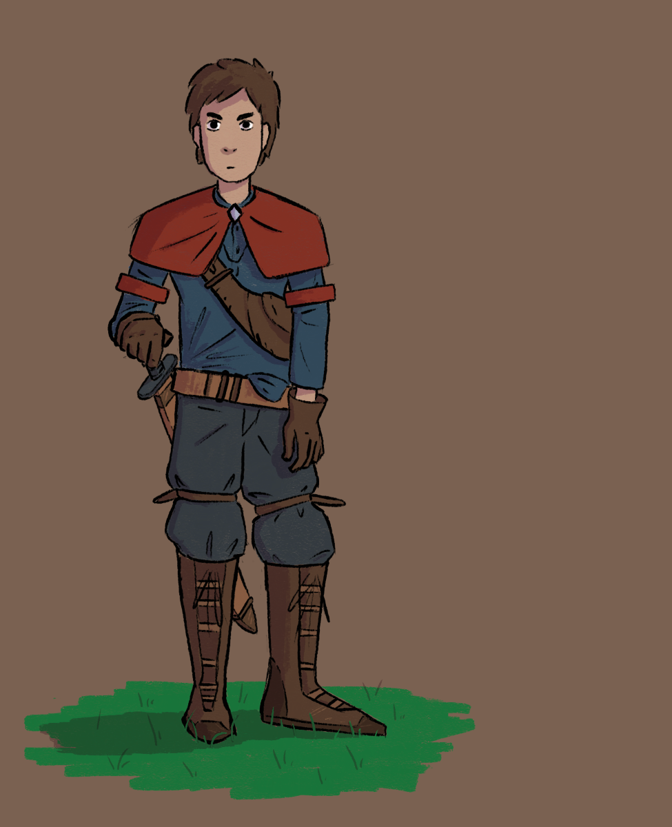 This is my first character design in a looong time. I’m pretty happy with it but with that happiness I think there can also be blindness sometimes so I want you to be my eyes!
In the first few seconds of looking at it what stands out as needing improvement?
After looking at it for a longer time what are some of the more secondary things that could be improved?Also does anyone have tips for building a good color palette? Colors are TRICKY
-
@Griffin My first look assessment is that the costume design is great but the proportions in the anatomy are off.
A bit more detail: the thighs look too short (compared to the length of the lower leg) which means the arms are too short and his left elbow is way too high. Elbows come down to the waist, wrists come down to the bottom of the pelvis see reference for basic male proportions
Also consider the size of his feet compared to his hands. To me it looks like you may not have drawn the anatomy before adding the clothes.. but I think the folds in the clothing look realistic (with the exception of that untuck in the shirt) and you did a good job on foreshortening his right arm
I would like to see a bit more gesture in the pose, I think there would be a lot more twist in his torso and a more obvious transference of weight to one leg with his hand on the hilt of the sword like that.
As for colour, it might be a bit dull but that is also kind of appropriate to the subject. The background you chose is fairly dark, I would probably start with a lighter tone and use a less saturated green for the grass, it draws too much attention. -
hi @Griffin !
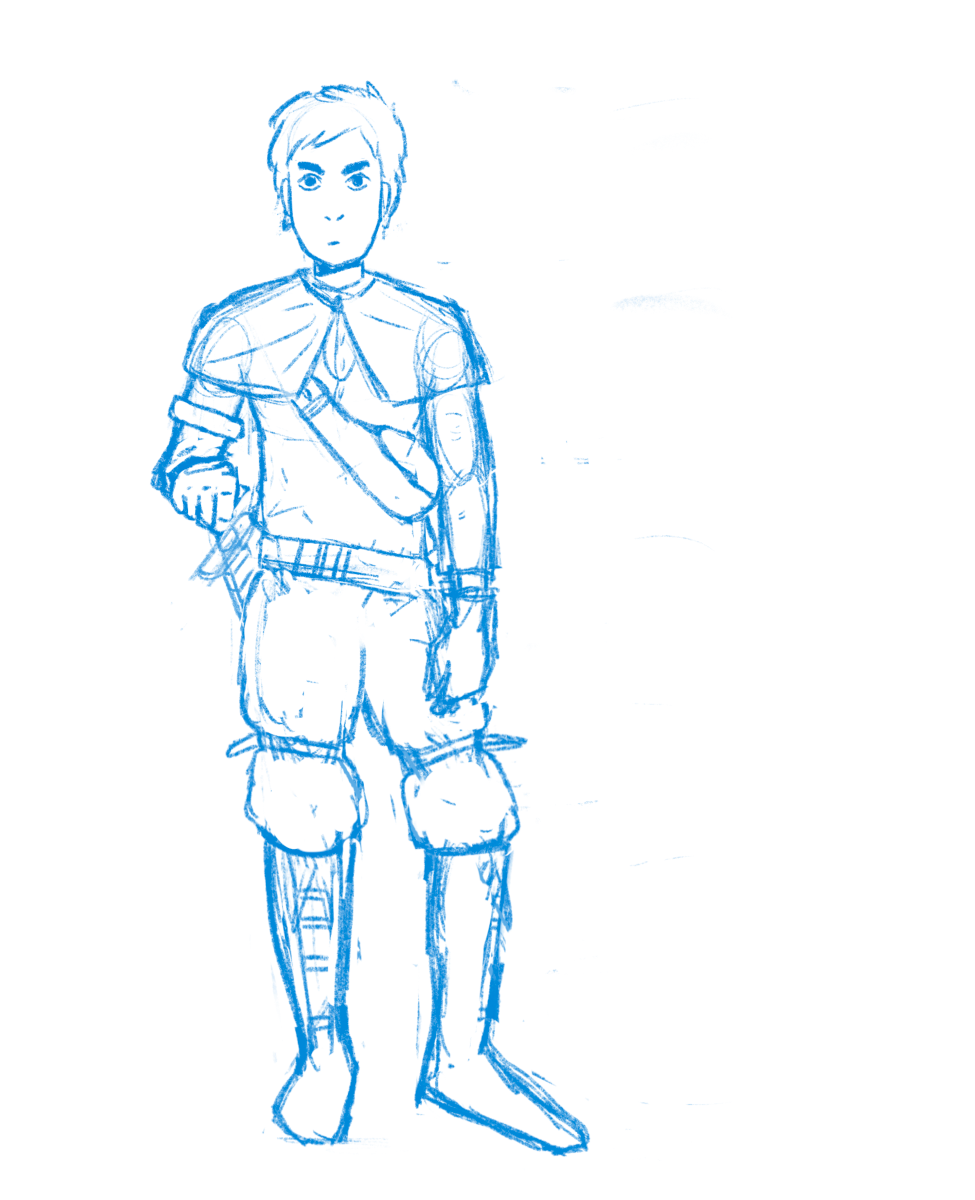
what I saw...the left arm is to rigid is like he has been injured or something, I did a fast sketch changing a little bit the pose, you can see in the silouette if it works better or not! I flipped the image and for me looks more interesting. I did a sublte color changes, it was to much saturated for me, a little more desaturated I think it fits more the mood and the style of the character!

Overall I think its a cool design and I love the style, it has good accesorys, and the pose holding the sword its really cool, the only thing as I said is the rigid arm and maybe the legs can be little less rigid too.
-
@Lovsey lots of great points, thank you! How would you recommend giving this pose more gesture because that is something I particularly struggled with. I want the pose to be casual but I don’t think that should mean uninteresting but right now there is still something to be desired there.
-
@Jordi-Ventura thanks for showing how you would approach this drawing! Always super helpful to see another artists take on things. You’re right about the arm, it just isn’t looking right. @Lovsey pointed out the proportions being off so I am going to adjust that and maybe that will correct the awkwardness. I like the pose that you sketched out but I still want to try to make the original pose work. I want the pose to look pretty casual and I know I can make it work I just have to figure out how exactly
-
@Jordi-Ventura @Lovsey I made some adjustments based off of your feedback. Lengthened the legs which I think helped a lot. Tried to make the legs a bit less stiffed as well as that arm.
-
@Griffin Great, you’re making progress! The proportions are looking much more balanced in this updated sketch, although his left arm could possibly be even a fraction longer, the elbow still seems a bit too high and the wrist too but that depends on whether or not his fingers are pressing into his thigh and essentially propping his wrist up higher as it seems in the sketch (hopefully you understand, it’s hard to describe)
As for improving on gesture, if you’re subscribed, I highly recommend the Introduction to Gesture SVS course. Failing that, I suggest you use a suitable reference and draw the figure over a line of action (think of the curvature of the character’s spine and showing where he is leaning his weight). Also do the pose yourself observing form in the mirror, paying attention to where you feel are placing the most weight and tension in the pose that matches the sentiment you want to portray. Draw a few iterations with different levels of exaggeration..you’ll know when you have the perfect gesture when it communicates the mood instantly - after a lifetime of observation we are THAT proficient in reading human body language..which is also why people are so difficult to draw
Initially I wasn’t sure if he was in a relaxed stance or if he was alert and readying to pull his sword at a moments notice. Also consider what you want to say with his facial expression - it’s very blank at the moment I can’t tell if he is bored or mildly suspicious.
-
@Lovsey it’s not an extreme pose which is what makes the gesture tricky I think. He is patrolling a market to dissuade thieves and other criminals and he has just made eye contact with someone who seems a little suspicious. I actually just finished up the gestures class a couple weeks ago. I have reference photos of myself as well. I actually exaggerated the weight on the leg a bit more and I shifted his bent leg farther out as well. I found that pushing the pose in any other way just doesn’t end up fitting the characters mood. It’s tricky but great practice to capture subtle gestures!
-
@Griffin said in Feedback on character design:
@Lovsey it’s not an extreme pose which is what makes the gesture tricky I think. He is patrolling a market to dissuade thieves and other criminals and he has just made eye contact with someone who seems a little suspicious.
So true about those subtle poses being trickier, I find the same!
With the character’s context in mind, it sounds like he is more on the alert side of relaxed so you could give him more of a power stance or more of an untrusting expression. There are lots of examples if you google images of ‘guard’ because they do have a particular way of standing