Society of Visual Storytelling

    SVSLearn Forums

    • Register
    • Login
    • Search
    • Recent
    • Tags
    • Popular
    • Users
    • Groups
    • Search

    Dragonfly WIP

    Contest
    9
    17
    1088
    Loading More Posts
    • Oldest to Newest
    • Newest to Oldest
    • Most Votes
    Reply
    • Reply as topic
    Log in to reply
    This topic has been deleted. Only users with topic management privileges can see it.
    • baileyvidler
      baileyvidler last edited by

      Hi, Kyle! This is super cute! I love the concept; it's very clearly conveyed. I also really love your color palette with the greens and browns.

      Here are my suggestions:

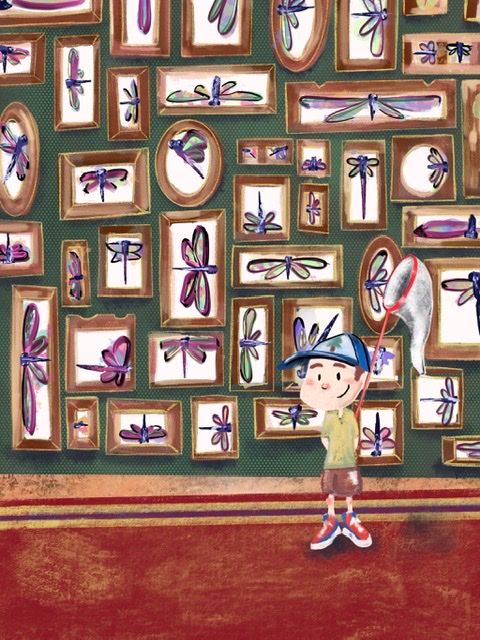
      • The character gets a little lost in the frames behind him. Maybe increase the contrast between him and the background for more visibility. Or maybe space the frames out a bit, so he has some white space breathing room around him.
      • I like the variety you have in your frames, some tall, some wide, some square, some round. It feels eclectic, which is fantastic. I feel like you could push that even further. Maybe different colors or some wild shapes would add some more visual interest.

      Hope this helps! 🙂

      Bailey Vidler
      Portfolio: baileyvidler.com

      Kyle Tobey 1 Reply Last reply Reply Quote 0
      • Nyrryl  Cadiz
        Nyrryl Cadiz SVS OG @Kyle Tobey last edited by

        @Kyle-Tobey this is actually a great concept

        Portfolio: nyrrylcadiz.com
        Instagram: https://www.instagram.com/nyrryl_cadiz/
        YouTube: https://www.youtube.com/channel/UCbJCF1Im8ZO7hpGWTKOJMuA

        Kyle Tobey 1 Reply Last reply Reply Quote 1
        • Kyle Tobey
          Kyle Tobey @Nyrryl Cadiz last edited by

          @Nyrryl-Cadiz thank you so much!

          1 Reply Last reply Reply Quote 1
          • Kyle Tobey
            Kyle Tobey @baileyvidler last edited by

            @baileymvidler this definitely helps! I see the need for more contrast completely. Im just glad the concept is working at all! I tried it with some different perspective but the head on works best, strangely. Thank you for the feedback!

            1 Reply Last reply Reply Quote 0
            • Kyle Tobey
              Kyle Tobey last edited by

              This post is deleted!
              1 Reply Last reply Reply Quote 0
              • Kyle Tobey
                Kyle Tobey last edited by

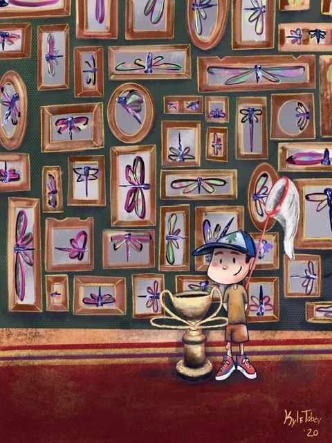
                Update: almost there! !163027C7-7178-439C-AFB8-7C76AD232701.jpeg

                JoshuaDages carrieannebrown 2 Replies Last reply Reply Quote 3
                • JoshuaDages
                  JoshuaDages @Kyle Tobey last edited by

                  @Kyle-Tobey Love this concept and your textures really make the image. Can't wait to see the final!

                  Joshua Dages
                  https://www.instagram.com/joshuadagesart/
                  https://joshuadages.com/
                  https://www.etsy.com/shop/JoshuaDagesArt

                  MyArt Multiverse 1 Reply Last reply Reply Quote 0
                  • MyArt Multiverse
                    MyArt Multiverse @JoshuaDages last edited by

                    @JoshuaDages this is so cute, and i love the colors on the dragonflies!

                    Stephanie
                    https://www.instagram.com/my_art_multi_verse/?hl=en

                    1 Reply Last reply Reply Quote 0
                    • carrieannebrown
                      carrieannebrown @Kyle Tobey last edited by

                      @Kyle-Tobey This is really cool! I still think the boy isn't standing out enough though. Maybe if you added more detail to him and move him forward a little, and maybe take out the frame directly behind his face so the green wall contrast with his pale skin? Or you could even consider changing his skin colour.

                      www.instagram.com/carrieannesdesigns/
                      www.carrieannebrown.co.uk

                      Kyle Tobey 1 Reply Last reply Reply Quote 0
                      • Chris Perry 0
                        Chris Perry 0 @Kyle Tobey last edited by

                        @Kyle-Tobey Nice concept. I would find a way to tone down the background and give more detail to the boy. Perhaps not so full color for the background. Look at how Daumier would just hint at the background and add more contrast to the foreground characters.

                        1 Reply Last reply Reply Quote 0
                        • Kyle Tobey
                          Kyle Tobey @carrieannebrown last edited by

                          You’re right! It was getting muddy around the neck too. I tried adding more shadows. Well see how the contest page takes it! Thank you for your feedback!

                          1 Reply Last reply Reply Quote 0
                          • Kyle Tobey
                            Kyle Tobey last edited by

                            Does anyone know why it shows up blurry? Or is that a me problem? D24436FD-8108-4678-A54B-96EE5E16864B.jpeg

                            1 Reply Last reply Reply Quote 1
                            • Chris Perry 0
                              Chris Perry 0 last edited by

                              The contrast look sharper on the foreground character.

                              1 Reply Last reply Reply Quote 1
                              • Gary Wilkinson
                                Gary Wilkinson last edited by

                                I like the concept of your painting, but I think there are some things that I would take a look at to improve it:

                                Each dragonfly in the frame looks almost the same to me aside from some size variation . I think having having a bit more variety would make them more interesting.

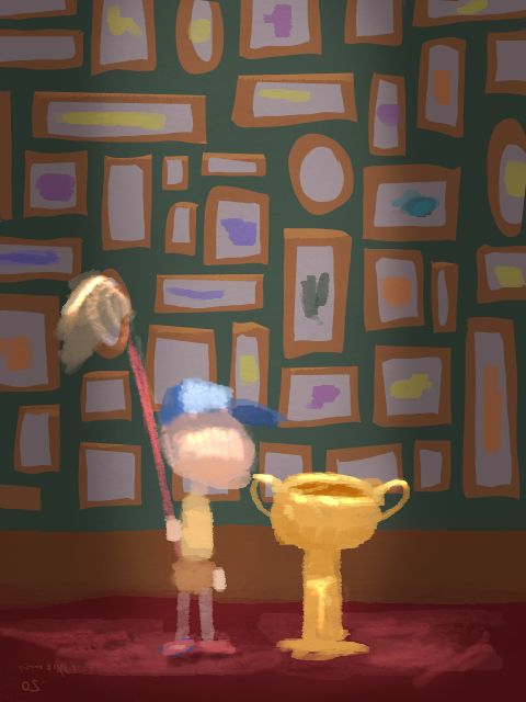
                                Your lighting in the painting is quite confusing as i'm not sure where the light source is coming from. This is also a point due to having yellow outlines for the frames which make them feel like highlights, but there are highlights on every side. If you focus the light on the boy and the trophy then it would help tell the story better and help tone down some of the business in the scene.

                                You have draw quite a strong outline on the boy, however i'm not seeing that in any other area of the painting, which I think conflicts with the style of the painting. The same could be said about the texture on the wallpaper which is quite sharp and therefore may make the rest of the image feel somewhat blurry.

                                I did a quick painting to illustrate some points I mentioned. I hope it might help you in some way
                                sm.jpg

                                www.garywilkinsonart.com
                                www.instagram.com/gwillustration/
                                www.twitter.com/GWillustration

                                Kyle Tobey aBullfrogArt 2 Replies Last reply Reply Quote 5
                                • Kyle Tobey
                                  Kyle Tobey @Gary Wilkinson last edited by

                                  @Gary-Wilkinson this is all very, very helpful. Some things were learning and trying to get back in the swing, so all these tips will absolutely help going forward.

                                  Also- looked at your work and I love it!

                                  1 Reply Last reply Reply Quote 1
                                  • aBullfrogArt
                                    aBullfrogArt @Gary Wilkinson last edited by

                                    @Gary-Wilkinson Thanks for sharing this mockup. As a beginner in these areas, you've help me a lot with the way you illustrated your points.

                                    1 Reply Last reply Reply Quote 1
                                    • First post
                                      Last post