Society of Visual Storytelling

    SVSLearn Forums

    • Register
    • Login
    • Search
    • Recent
    • Tags
    • Popular
    • Users
    • Groups
    • Search

    WIP July Book Cover - Help me choose!

    Artwork
    18
    23
    1605
    Loading More Posts
    • Oldest to Newest
    • Newest to Oldest
    • Most Votes
    Reply
    • Reply as topic
    Log in to reply
    This topic has been deleted. Only users with topic management privileges can see it.
    • idid
      idid last edited by

      For whatever reason, I love 10 most. and if you can combine #3 and #10, that would look fantastic! In option #2 of your more detailed mock up cover, Dorothy looks great, but other people seems like a bit random and strange to her, so using pathway in #10 as visual guideline can help.

      My second favorite is #4, as it has a sense of simplicity/being minimal. This could be a personal preference though 🙂

      1 Reply Last reply Reply Quote 0
      • Laurasketches
        Laurasketches last edited by

        If I look at your influences--then I think Option#3 will be most satisfying. But, great work! My personal fav is Option #2..but that is because it would be fun to do the character design of all those figures. Looking great!!

        1 Reply Last reply Reply Quote 0
        • j.sienkowski
          j.sienkowski last edited by

          @carriecopadraws you are killing it! I love the text treatment from #1, but I think #3 is more exciting and "feels" more like the tone of the book. I would love to see the other characters incorporated into #3...I'm not sure how.? Maybe silhouetted in the foreground or in the distance looking back towards Dorothy? I love the use of non-movie elements too!

          www.instagram.com/jsienkowski
          www.jtsienkowski.com

          carriecopadraws 1 Reply Last reply Reply Quote 0
          • carriecopadraws
            carriecopadraws SVS OG @j.sienkowski last edited by

            @j-sienkowski Thanks! I was thinking the cover would wrap around and the other characters would be looking toward her from the back cover. I might mock that up too.

            Carrie Copa
            https://carriecopadraws.com/

            1 Reply Last reply Reply Quote 1
            • carriecopadraws
              carriecopadraws SVS OG last edited by

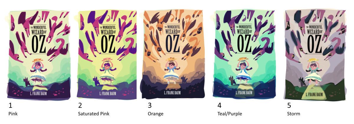
              UPDATE: COLOR STUDIES!

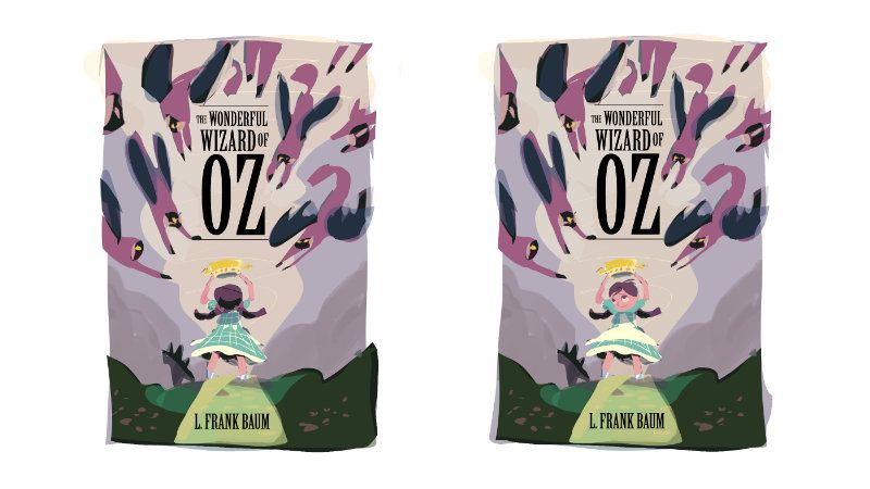
              @mag though I did make a thumbnail with Dorothy facing the viewer and didn't care for it (#8 in the top post) because she looked oblivious to the danger, I tried it again in the color studies, and you were right - the cover is better with her facing the audience. Thank you for your feedback on that!

              front-vs-back.jpg

              So here are my color studies, does anyone have a clear favorite? I'm still working on the monkey placement and Totos' pose, but this is mostly to check colors.

              oz-color-studies-svs.jpg

              Carrie Copa
              https://carriecopadraws.com/

              Jacy13 S Kevin Longueil carrieannebrown Nyrryl  Cadiz 5 Replies Last reply Reply Quote 1
              • Jacy13
                Jacy13 @carriecopadraws last edited by

                @carriecopadraws My favorite is number 4 🙂

                Deviantart: https://www.deviantart.com/jacy13
                Instagram: https://www.instagram.com/jacy13draws/?hl=en
                Portfolio: https://jacy13.artstation.com/

                1 Reply Last reply Reply Quote 1
                • S
                  Shyam Sailus @carriecopadraws last edited by

                  @carriecopadraws Number 3

                  1 Reply Last reply Reply Quote 1
                  • Kevin Longueil
                    Kevin Longueil SVS OG @carriecopadraws last edited by

                    @carriecopadraws Wow! These are awesome! This is great moment from the book too. Number 4 stands out to me but number 1 is a close second. Very nice!

                    Portfolio: kevinlongueil.com
                    https://www.instagram.com/kevinlongueil/

                    1 Reply Last reply Reply Quote 1
                    • JessicaStauffer
                      JessicaStauffer last edited by

                      Wow I'm super impressed with all of the thumbnails and color schemes! Number 2 catches my eye. I like all the color in it! I like 4's colors as well.

                      1 Reply Last reply Reply Quote 1
                      • carrieannebrown
                        carrieannebrown @carriecopadraws last edited by carrieannebrown

                        @carriecopadraws I would go for 4, the purple and green with a yellow/gold road and cap. Gorgeous design. I would try making the words wonderful, wizard and oz into one column of the same width and make 'the' and 'of' smaller and move to the sides, or of could go next to the O of Oz in the top left space.

                        www.instagram.com/carrieannesdesigns/
                        www.carrieannebrown.co.uk

                        1 Reply Last reply Reply Quote 0
                        • Nyrryl  Cadiz
                          Nyrryl Cadiz SVS OG @carriecopadraws last edited by

                          @carriecopadraws it's so hard to choose! 😅

                          Portfolio: nyrrylcadiz.com
                          Instagram: https://www.instagram.com/nyrryl_cadiz/
                          YouTube: https://www.youtube.com/channel/UCbJCF1Im8ZO7hpGWTKOJMuA

                          1 Reply Last reply Reply Quote 0
                          • baileyvidler
                            baileyvidler last edited by

                            These are so good! I think my favorite is 1 (because it has the strongest contrast between monkeys and bg), but... I like how 2 has a "greener" background since green is obvs an important color in the story. That being said, Oz is a very whimsical setting, so you definitely could swing with the more saturated colors on this one.

                            Bailey Vidler
                            Portfolio: baileyvidler.com

                            1 Reply Last reply Reply Quote 0
                            • First post
                              Last post