Society of Visual Storytelling

    SVSLearn Forums

    • Register
    • Login
    • Search
    • Recent
    • Tags
    • Popular
    • Users
    • Groups
    • Search

    Dragonfly feedback

    Artwork
    6
    10
    543
    Loading More Posts
    • Oldest to Newest
    • Newest to Oldest
    • Most Votes
    Reply
    • Reply as topic
    Log in to reply
    This topic has been deleted. Only users with topic management privileges can see it.
    • holleywilliamson
      holleywilliamson SVS OG last edited by holleywilliamson

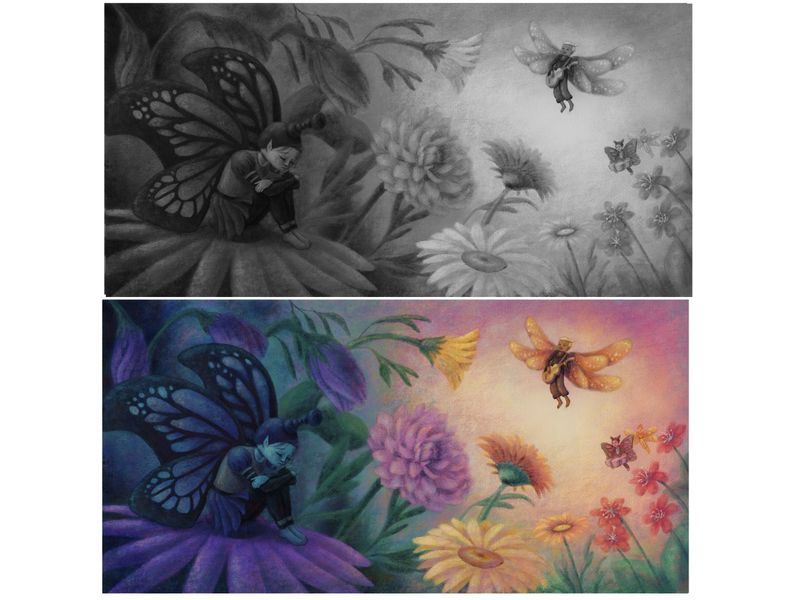
      Hey guys just finishing up this piece and I am wondering what you think about the values and the focal point. I think I do this to myself more often than I should where I have two focal points that are fighting for the attention. I was trying to have a triangle with the smaller butterfly and dragonfly in the background but maybe they are blending in to everything else too much. Let me know what you think, thanks

      98C217F6-6F5B-4FE7-8A8D-57178BD7B922.jpeg

      https://www.instagram.com/holleywilliamsonart/
      http://holleywilliamson.com

      Jeremy Ross 1 Reply Last reply Reply Quote 4
      • holleywilliamson
        holleywilliamson SVS OG last edited by

        Btw I do not know how to make my uploaded pics clear. If you click on it, it looks clear in another window, but in the post it looks fuzzy. Any help with this would be greatly appreciated 😩

        https://www.instagram.com/holleywilliamsonart/
        http://holleywilliamson.com

        1 Reply Last reply Reply Quote 0
        • Jeremy Ross
          Jeremy Ross @holleywilliamson last edited by

          Hi @holleywilliamson, I think it looks amazing!

          https://www.instagram.com/jeremyrayross
          https://www.jeremyrayross.com/
          https://twitter.com/jeremyrayross
          https://jeremyrayross.substack.com/

          holleywilliamson 1 Reply Last reply Reply Quote 1
          • Gary Wilkinson
            Gary Wilkinson last edited by

            I think your painting works quite well, but if you want the flying guy to be a stronger focal point, I would change the color of the yellow flowers to be more purple or at least away from the color of his wings. If you darkened the one at the bottom it would help the composure too by continuing the curve you have going on (currently it is breaking that line). You could also add some small hanging leaves/flowers to the top right which might help frame the border and avoid leaving empty space.

            Another suggestion would be to add some rim lighting to the sad butterfly which might help stand out a little more.

            It's a good painting though, so these are only just thoughts 🙂

            www.garywilkinsonart.com
            www.instagram.com/gwillustration/
            www.twitter.com/GWillustration

            holleywilliamson 1 Reply Last reply Reply Quote 1
            • holleywilliamson
              holleywilliamson SVS OG @Jeremy Ross last edited by

              @Jeremy-Ross thank you!

              https://www.instagram.com/holleywilliamsonart/
              http://holleywilliamson.com

              1 Reply Last reply Reply Quote 0
              • korilynneillo
                korilynneillo last edited by

                @holleywilliamson Oh this is so soft, I love it a lot! I agree with Gary that adding some rim lighting would really help the character on the left - it took me a couple of reads to tell that there was something going on besides flowers.

                instagram: instagram.com/korilynneillo
                Twitter: @korilynneillo
                Portfolio/shop: korilynneillo.art

                holleywilliamson 1 Reply Last reply Reply Quote 1
                • holleywilliamson
                  holleywilliamson SVS OG @Gary Wilkinson last edited by

                  @Gary-Wilkinson thanks, good things to think about

                  https://www.instagram.com/holleywilliamsonart/
                  http://holleywilliamson.com

                  1 Reply Last reply Reply Quote 0
                  • holleywilliamson
                    holleywilliamson SVS OG @korilynneillo last edited by

                    @korilynneillo thank you, it is good to hear from fresh eyes.

                    https://www.instagram.com/holleywilliamsonart/
                    http://holleywilliamson.com

                    1 Reply Last reply Reply Quote 0
                    • Mike Mirfin
                      Mike Mirfin last edited by

                      Looks wonderful! Gives off a very spiritual atmosphere. Values. I feel are just a little too dark on the left hand side maybe try lifting values/colour up a little with some highlights maybe 👌

                      1 Reply Last reply Reply Quote 0
                      • JoshuaDages
                        JoshuaDages last edited by

                        I love so many things about this piece! The colors are beautiful and your style is something that I would be happy to create half as well.

                        I see what you're saying about the two focal points fighting. One thing I noticed is that the color split feels like it's right down the center (bright on the right, dark on the left). If you move the color split closer to a third, or maybe blend it a little more, it might ease the "two-sides" thing that's happening.

                        I also wonder if moving the dragonfly down into the center of the light (or moving the light up) might help add focus to him. Right now it kind of looks like his feet are the focus and that you want the viewer to see those instead of his torso/head/wings.

                        Just some thoughts. I am so excited to see the final product of this! Really beautiful job.

                        Joshua Dages
                        https://www.instagram.com/joshuadagesart/
                        https://joshuadages.com/
                        https://www.etsy.com/shop/JoshuaDagesArt

                        1 Reply Last reply Reply Quote 0
                        • First post
                          Last post