September ink fairy potential submission
-
@dafoota first off i think this is beautiful so far! In response to the questions:
- The tattoo gun didn't read to me but that could be because I don't know what one looks like
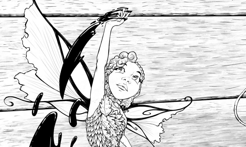
- The fairies face while I love how it looks she does look a bit bored and unfocused to me. I feel as though it would read better if she was looking up to her hand that has the ink on it
- I don't know that I know enough on that to comment or give feed back other than her face expression it looks wonderful to me

-
@ambiirae Thank you for taking the time out to share your insights. I enjoyed the thought about her facial expression.
-
Hi @dafoota, this is nice work, excellent quality inking and hatching. I agree with @ambiirae on her face expression. Also, I feel there’s to much open space in the top right. I think your gut regarding the tat gun is correct. What if you swapped the gun for a bunch of different style ink pens and perhaps have the fairy taking one?
-
@dafoota This is so well done, and it looks great with her looking at her hand where she is leading the ink. I think you should emphasize her more with a different background. The details of her wings and her hair and her dress shouldn't be lost. would you consider negative space as the background?
-
@Jeremy-Ross ...GREAT INSIGHTS! An idea is brewing now where I think it will answer all of your points. Thank you. I am super-hyper-ultimately grateful!
-
@carolinebautista YES!!!! I was feeling that, about her design and the background, but it was one of those feeling where I couldn’t quite read it...you know? Thank you. I was initially thinking of bolding her outline, but I really do not want to do that. Thank you so much for your time and insights.
-
@ambiirae @carolinebautista @Jeremy-Ross
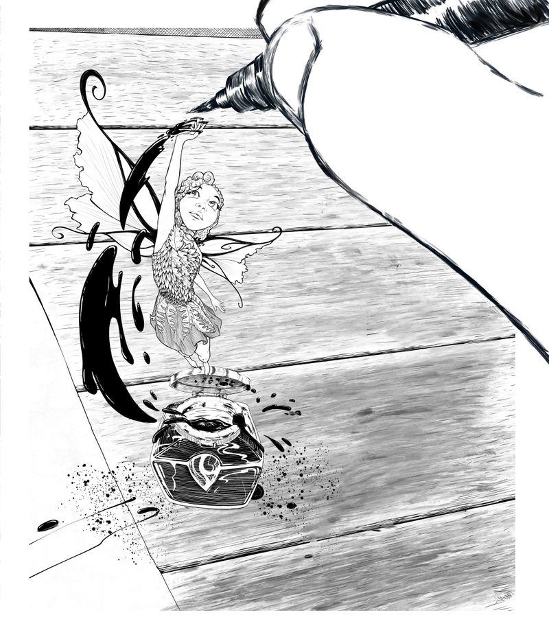
When with a brush pen and hand to replace the tatt gun.
I’m trying to go for that blur effect.
Gonna throw the pen lid in that open space on the bottom right possibly.
Much love and God bless!
-
Very nice @dafoota!
-
The composition and the character design on this... I love
 ️. I was wondering though about the part of the prompt about snapping a photo...that’s not represented unless I’m missing something.
It’s really very appealing though! Really love it! -
@Coley I think you could read it metaphorically: The photo snap could be the grasp of inspiration?
-
@Coley
 I was thinking the same thing. I was trying to ignore it, but huh...I think that would bet me. I’ma see what i can do. Thanks for the social confirmation.
 -
@Julia Yea i think I might go with that. i thought of adding a iphone frame, but i think it would just be too much. Thank you all.
-
First of all, wonderful use of forced perspective; I feel like she's about to do a loop-de-loop or a mid-air flip!
Also, amazing detail throughout!One question that I do have deals with the ink jar lid: Is the fairy standing on/stepping off of it? Or is she flying above/in front of it? I can't really tell and it's kind of messing with my head a little.
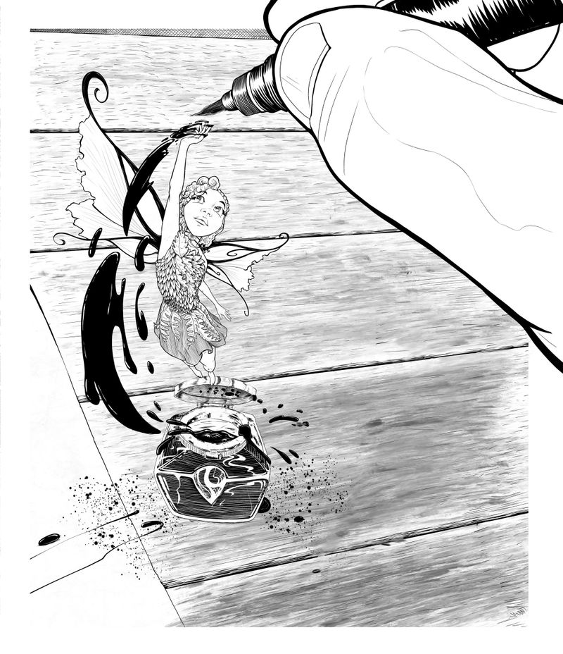
Another suggestion: when you added the hand with the brush pen, is the top image the concept idea sketch? You mentioned you were going for a blur effect and, to me, the top image feels more blur-like (I appreciate the crispness of the linework in the bottom image for the hand and pen, but I end up focusing on the hand instead of the fairy. I don't know if this is due to the lack of value in that area, or the added detail on the hand, or if it's just me.)Lastly, as it is right now, the ink jar looks as if it's just "floating," per say, on the wood rather than resting on it. It might help to add a cast shadow (the size of which depends on the light source, of course), but it may also make the image look too busy.
It's looking really nice so far; can't wait to see it when it's finished!
Edit: Just saw that you posted the finished image on the contest post and it looks great!
The use of the black colored border really unites the whole image, and I think what you did to the hand works out nicely; My focus is now back on the fairy again!
-
I saw the final image on the contest thread, I suddenly realized it was from Ellie's perspective. It made a lot more sense to me! I grasped that before I read what you wrote, it might have been the black border that helped.
I think you have a contender here, it's beautiful!
-
Just a consideration, if you put a white border around to suggest that it was a polaroid, it would maybe look like the photo that Ellie took, it might not work but it's something to try if you want
