Sharing Inktober all month!Say your opinions!
-
Hello friends!
Figured I d share my Inktober with the forums!
I went with digitober this year,since this is the domain I d like to practice more and more.
I ll be updating this thread every day!
Here are the first two days!Share your thoughs. Opinions are much appreciated!
Enjoy!
Giorgos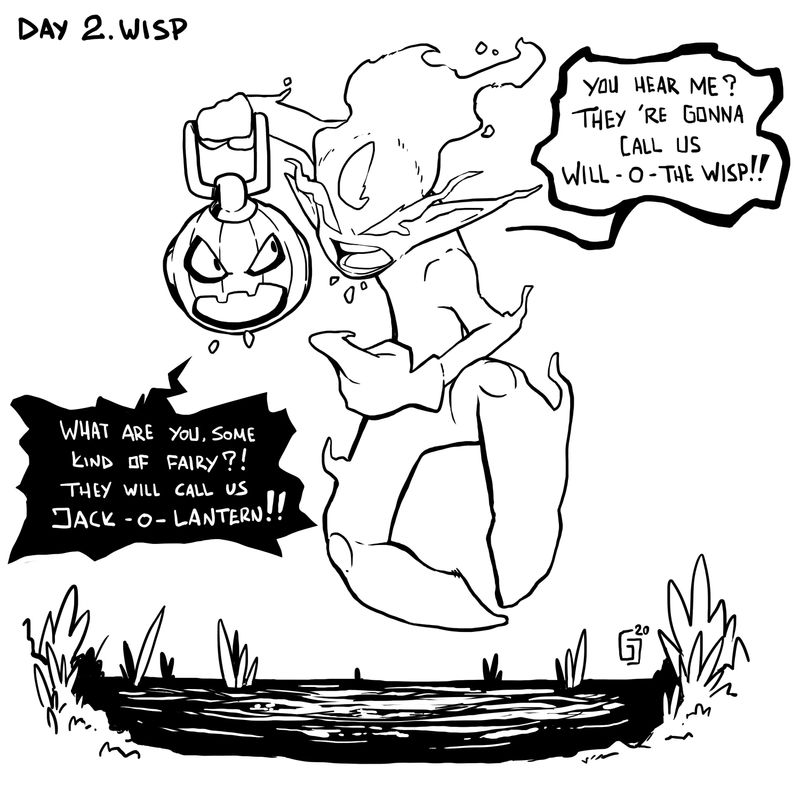
Instagram : https://www.instagram.com/g.chris.artwork/
Deviantart : https://www.deviantart.com/g-chris -
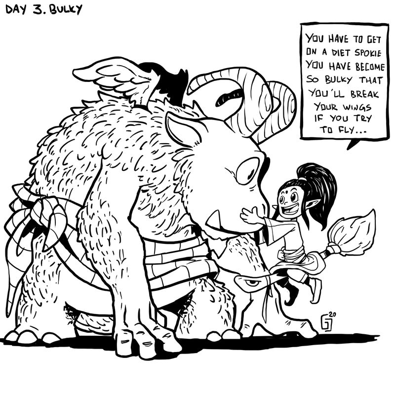
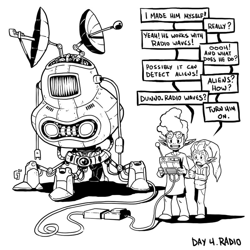
Day 3 and Day 4!!!
-
day 5!
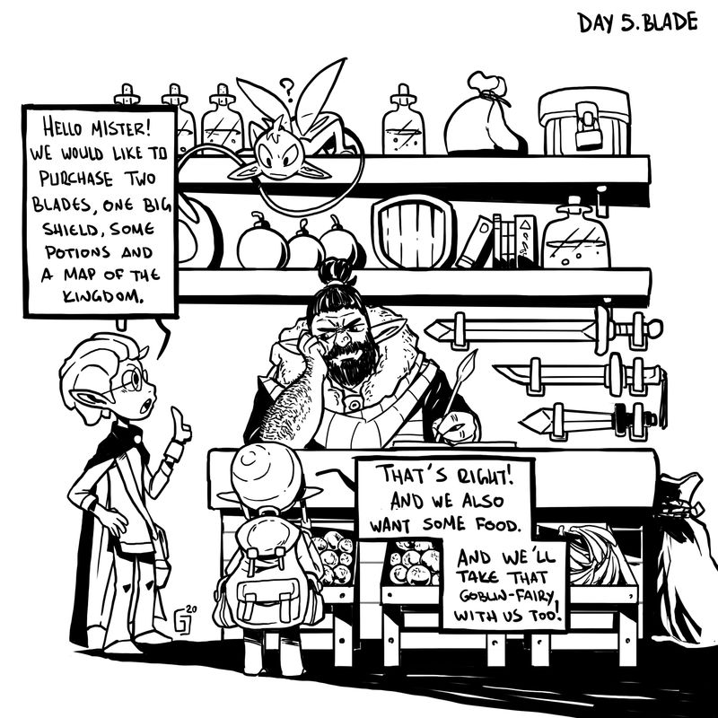
Instagram : https://www.instagram.com/g.chris.artwork/
Deviantart : https://www.deviantart.com/g-chris -
@Georgios-Christopoulos wow these are awesome! Thanks for sharing

-
@Georgios-Christopoulos everything looks amazing!
-
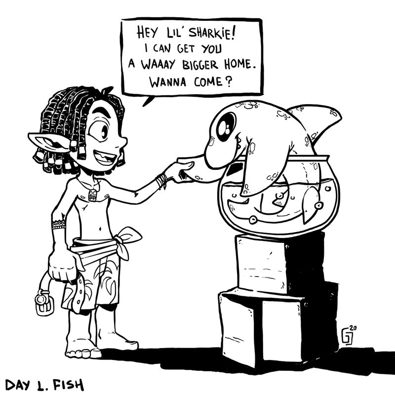
Nice work all around! Plenty of creative concepts (the Fish one is my favorite) and charming character designs. You have a nice style where the elements/figures in each work are rendered just enough so the important details and textures take the forefront (like with the Fish; the character's hair is fully rendered, along with the shadows, but the person is not (despite him being mostly in shadow) which allows the character to still be readable (plus the texture draws the attention of the viewer closer to the face)).
Good stuff!
-
@ambiirae Thanks my friend!Hope you ll like this coming month!
@Nyrryl-Cadiz Thanks so much!Trying new things with shadows everyday now!
@Jonathan-Malski Thanks very much Jonathan! Yes, if oyu check out my work,this is a thing I am trying to do!Trying to make everything readable and not fuzzy and weird.Thanks! -
Wonderful imaginative illustrations..loving that little goblin fairy!
-
@djlambson thanks a lot my friend!!
-
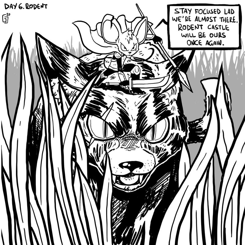
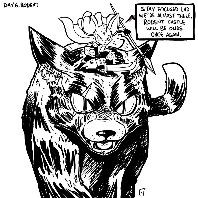
Day 6!A mouse warrior and his trusty companion rady to raid Rodent Castle.
Made two versions with this one!share what you think lads!Giorgos
-
Day 7!
Spoiled princess just wants her fancy tiara..
How is your Inktober going guys?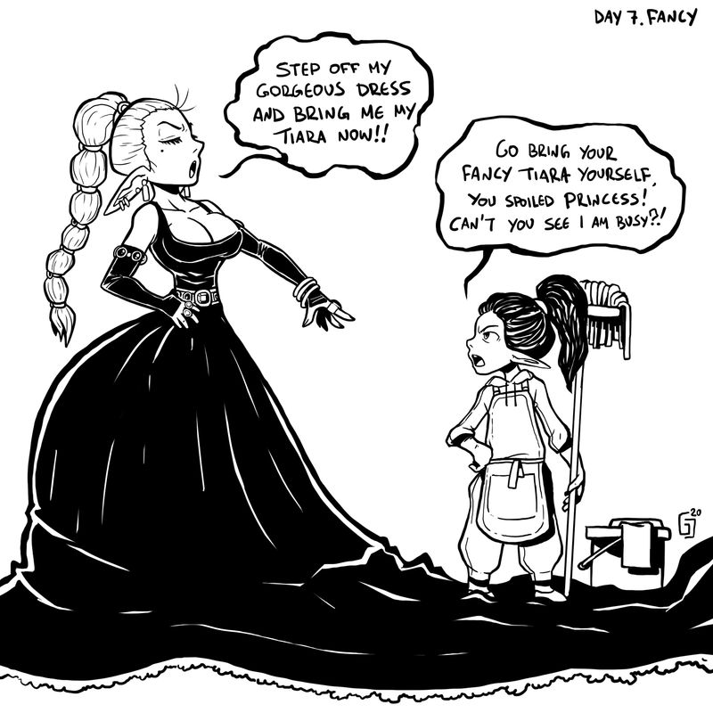
-
Day 8!
Teeth!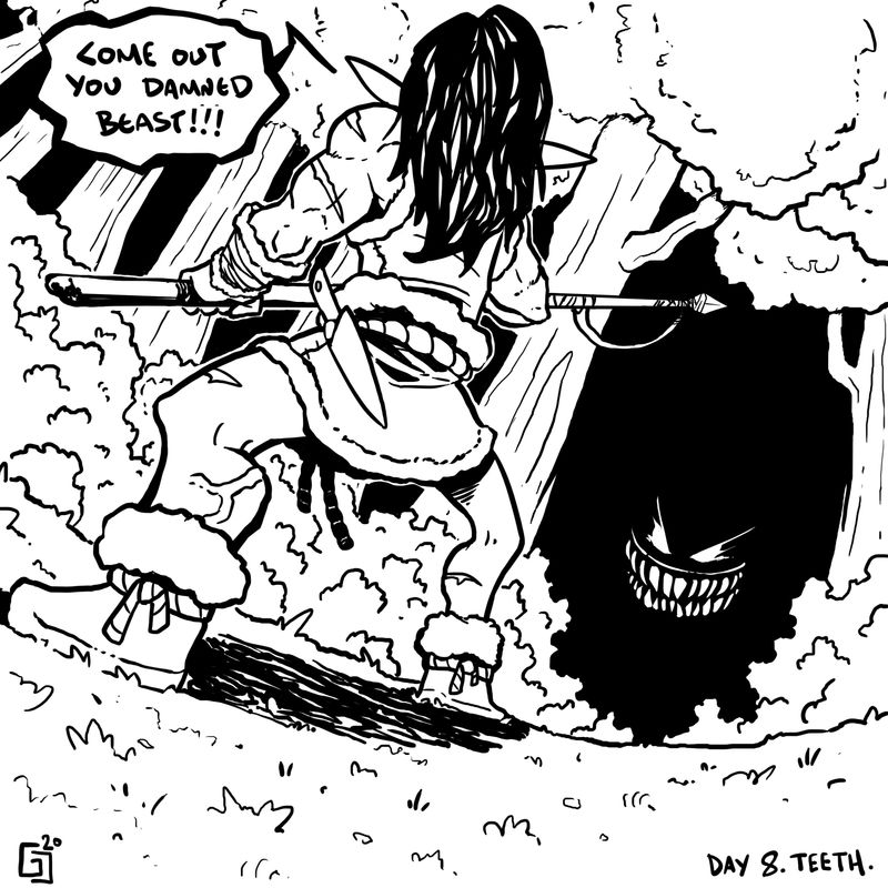
-
@Georgios-Christopoulos Thanks for sharing! Love that each piece has its own story and the characters are gorgeous! Good stuff!
-
@Oriana-Fernandez thanks a lot Oriana!I try to incorporate storytelling elements to each and everyone of those!Also, it s a world that all of them have elvish ears!!!
-
Love all of these. Great drawing and story-telling skills!
Laurie DeMott
instagram.com/demotlj -
@demotlj thanks a lot!!
-
the fairy shop was cute addition. the drawings are very clear and cute.
myself, I like to take the challenge without adding words/speak balloons, and try to convey the whole story just by image.
but that's my preference. -
@arielg thanks a lot! To tell you the truth, Initially I thought of not adding words myself.But When I drew them, my girlfriend suggested to make a collection of single panel comic booky style pictures , and I was certainly entertained by this idea.That was the birth of the ballons!!!
Thanks for your comment lad!Instagram : https://www.instagram.com/g.chris.artwork/
Deviantart : https://www.deviantart.com/g-chris -
Day 9. Throw!
The mutated elf will either succeed in throwing his last fireball, or he ll get sliced by the fearless hero,while falling!
Tried a bunch of stuff with this one!
Critisize it if you wish!!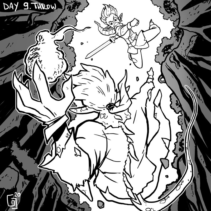
-
@Georgios-Christopoulos These look really good and have a polished style to them. Your storytelling is very good. I personally like the words. It gives them a comic book feel more than a children's book, which is fitting for your style. Its also good practice for knowing where you would leave room for them if you were illustrating a comic.
One critique I would give is to vary your lines more. You have really thick lines for almost everything except for the inside details. Try using finer lines for receding objects like the trees. It will really help you create 3-D space in your work. Use the bold lines only for the closest objects. If all the lines are the same it can get overwhelming and you don't know where to look. Have you done @Jake-Parker 's inking 2.0 class? It is very helpful for inking lines and linework in general.