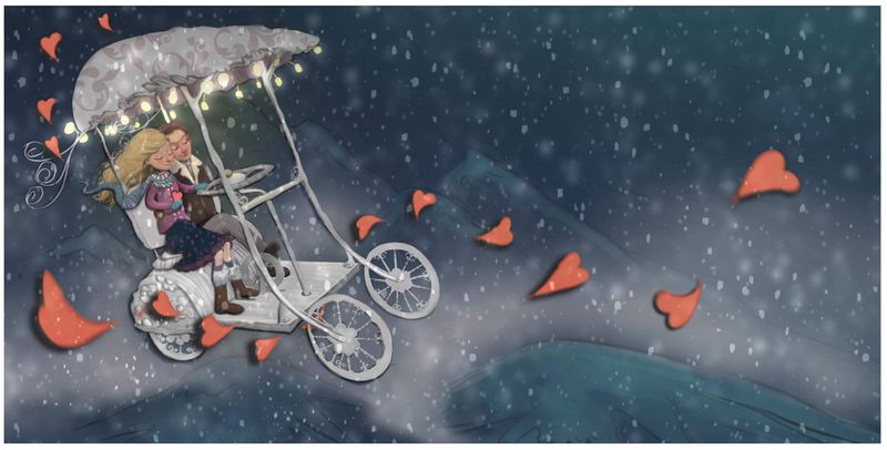
Together wip. The marriage-mobile.
-
@Coley I love this concept and I'm glad you went with the white one.
For some reason my eye is getting trapped on the big heart in the foreground on the right. Maybe since it's so large, red and front and center? Some ideas would be to make the hearts more purple as they go away from the carriage, or get smaller? Or something else to help pump the focal point on your main scene.
I love it overall though, excited to see how it ends up

Check out my art and tutorials :)
Instagram: www.instagram.com/carliannecreates/
Youtube:
https://youtube.com/c/CarlianneCreatesShop: www.carliannecreates.com
-
@carlianne thanks so much. I was thinking the same thing. I have toned the hearts down in saturation in the newer version. I’m also thinking about balance, currently the marriage-mobile is heavy on the left. I may move it a little to the center but not much. It’s good to think about how to manage the focal point. I really appreciate your comment, thank you

-
Update. Having fun with it and slowly picking away. Thoughts always welcome. I know their faces need a bit more contrast. Will get there! I hope
 ️
️ -
@Coley their faces are so sweet. 🥰
Instagram: https://www.instagram.com/eliamurrayart/
Portfolio: www.eliamurray.com -
@EliaMurrayArt
️️️
-
@Coley I love this concept and the colours you've chosen. And the couple are so sweet! I think maybe the shadows on the hearts is a bit too heavy now the background is lighter. But I really like the softer colours.

-
H'update!
Thanks for the feedback on the hearts, @ruth !
I've been playing around with size and saturation. Digital is awesome for playing!
-
@Coley Hi, I have a question. Are you looking to do a cardboard cutout effect? The shadows look like the background is a flat surface and the carriage is floating right above it. If so no worries, if not I would lose the shadows on the background and just put them on the carriage itself.
I love your idea. I look forward to seeing the final! Happy painting!
-
@chrisaakins yes. I was looking for sort of a bas-relief type effect. Maybe it’s too much. Someone else asked me that same question. So maybe it’s a bit over-cooked.....hmmmm. I’m still playing around and the shadows are are in a separate later so I could lose them or fade them. I’d be interested to hear what others think. Because maybe right now it looks like I made shadow mistakes hahaha
-
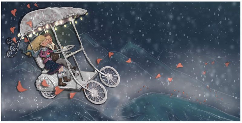
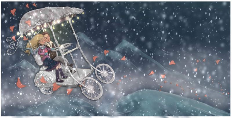
Toning down the hearts and shadows and amped up the snow. I don't know if it's too much snow. I kind of like the softness of it all
-
@Coley Great progress! I think you can try having the snow density somewhere between the current and previous version.
Also see if varying the hue/saturation of the hearts in the foreground and background would make it look better?
I'd like to see a little bit of thickness on the wheels.
And try experimenting with the shape of the hill directly under the carriage. Maybe just have the hill on the right with a long swooping slope down the left? It'll give more atmospheric illusion and make the carriage more float-y.
Love the detailing on the characters! -
@Neha-Rawat thank you so much for those thoughts. I'll definitely try this stuff out!
-
@Coley Maybe play with the positioning of the snowflakes a little to help reinforce movement in the piece, like they're being blown around in the wind rather than simply falling down? More deliberate placing of them will also aid in reducing the "too much" feeling.
Another thing to consider, to pull focus more on the Marriage Mobile, would be to have areas further away from it go a little darker, so the lights on the cart look brighter. Maybe deepening the shadows on the characters too, pulling more contrast to their faces? You don't have to push it too hard, if you're keeping a kind of soft feel to the piece, but just a little more push of the darks will make those lights stand out better.
-
@Carmanda thanks, so good to have fresh eyes on it! I’m going to be busy testing out some of these things on it tonight.