Society of Visual Storytelling

    SVSLearn Forums

    • Register
    • Login
    • Search
    • Recent
    • Tags
    • Popular
    • Users
    • Groups
    • Search

    thumbnails for a book cover - what do you think?

    Projects
    9
    36
    2415
    Loading More Posts
    • Oldest to Newest
    • Newest to Oldest
    • Most Votes
    Reply
    • Reply as topic
    Log in to reply
    This topic has been deleted. Only users with topic management privileges can see it.
    • miranda-hoover
      miranda-hoover @doro_thea last edited by

      @doro_thea Yes! I think the balance is much better. I'd probably tilt the line of the floor a bit more towards the right--but that's probably just me getting nit-picky.

      Looking great 💛

      https://www.instagram.com/mirananemone

      D 1 Reply Last reply Reply Quote 0
      • D
        doro_thea @miranda-hoover last edited by

        @miranda-hoover Thank you! I'll also try the the tilting the floor, as I really like how your feedback influenced my design.

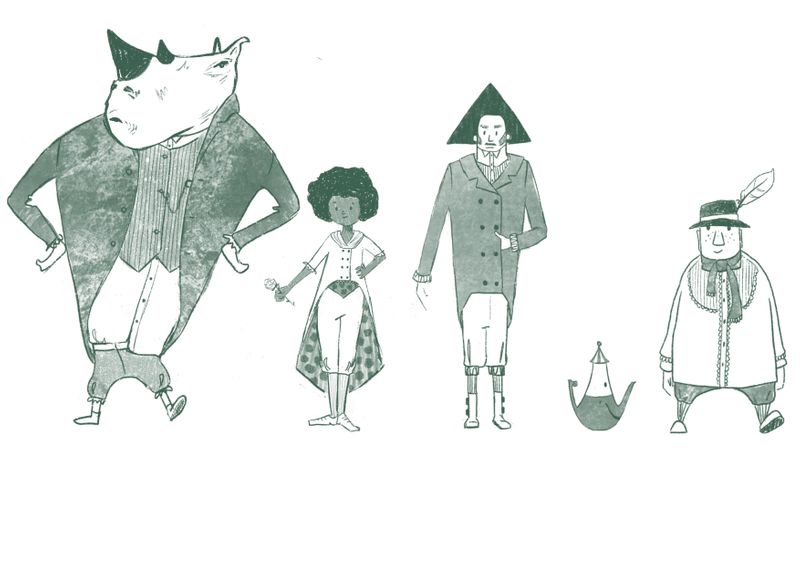
        BTW tried out the rhino beast. And I am actually considering to rethink my line up, as i think it is so much fun 😉 Untitled_Artwork.jpg

        miranda-hoover Kori Jensen 2 Replies Last reply Reply Quote 1
        • D
          doro_thea @Jacy13 last edited by

          @Jacy13 I will look into how to exaggarate the "horns". I think this is really good feedback that the silhouette needs to be more interesting...

          1 Reply Last reply Reply Quote 1
          • D
            doro_thea @krish iyer last edited by

            @krish-iyer Thank you so much for your opinion. What stood out for you on C and D? anything in specific?

            krish iyer 1 Reply Last reply Reply Quote 0
            • miranda-hoover
              miranda-hoover @doro_thea last edited by

              @doro_thea Really cool! Definitely makes it unique!

              https://www.instagram.com/mirananemone

              D 1 Reply Last reply Reply Quote 0
              • Kori Jensen
                Kori Jensen @doro_thea last edited by

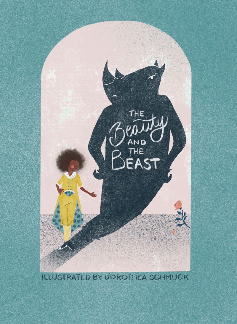
                @doro_thea is it just me or is the best really standing crooked?

                https://daddydudeler.wixsite.com/portfolio

                D 1 Reply Last reply Reply Quote 0
                • krish iyer
                  krish iyer @doro_thea last edited by

                  @doro_thea I liked that they were both simple and like representations of the characters and in a way open to interpretation, I liked the silhouette style of c and how simple and neat d was

                  D 1 Reply Last reply Reply Quote 0
                  • D
                    doro_thea @Kori Jensen last edited by

                    @Kori-Jensen yes, it is. will change 😉

                    1 Reply Last reply Reply Quote 1
                    • D
                      doro_thea @krish iyer last edited by

                      @krish-iyer Thanks for the explanation, I was really drawn to the silhouette style as well, so maybe I will make a second version later on.

                      1 Reply Last reply Reply Quote 1
                      • D
                        doro_thea @miranda-hoover last edited by

                        @miranda-hoover Thanks for the great Idea 😉

                        1 Reply Last reply Reply Quote 1
                        • D
                          doro_thea last edited by

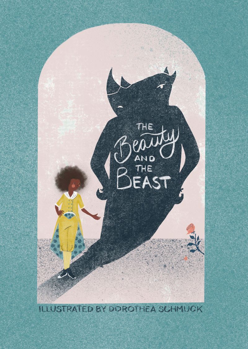
                          I worked some more on it. Any final feedback before I call this finished?
                          bookcoer.jpg
                          And thanks for everyone who commented so far. I really appreciate your feedback!

                          1 Reply Last reply Reply Quote 0
                          • Asyas_illos
                            Asyas_illos last edited by

                            Very nice I like the single rose in the corner

                            Asyasewardillos@gmail.com
                            www.Instagram.com/asyas_illos/
                            https://asyasewardillos.wixsite.com/mysite

                            1 Reply Last reply Reply Quote 0
                            • D
                              doro_thea last edited by

                              @miranda-hoover, @txels, @krish-iyer, @Jacy13, @Kori-Jensen and @powsupermum Thank you all for the feedback. I think this improved so much with all your input. Any last things that you think are irritating or need improving?

                              Jacy13 1 Reply Last reply Reply Quote 1
                              • krish iyer
                                krish iyer last edited by

                                That's looking great! It's simple but so good , It's like the mix of my two favorite thumbnails! Great work!

                                1 Reply Last reply Reply Quote 0
                                • Kori Jensen
                                  Kori Jensen last edited by

                                  looks amazing :D.

                                  https://daddydudeler.wixsite.com/portfolio

                                  1 Reply Last reply Reply Quote 0
                                  • Heather Boyd
                                    Heather Boyd @doro_thea last edited by Heather Boyd

                                    @doro_thea I like G the most and H a bit because you have the silhouette of the beast once again. I just realized how late I am to the feedback party but no worries you've got great help!

                                    Instagram: www.instagram.com/heatherboyd.illustration/
                                    Website: https://heatherboydillustration.ca
                                    Shop: https://www.inprnt.com/search/products?q=HeatherBoydIllustration
                                    Ko-Fi: https://ko-fi.com/heatherboydillustration

                                    Be blessed,

                                    1 Reply Last reply Reply Quote 0
                                    • Jacy13
                                      Jacy13 @doro_thea last edited by

                                      @doro_thea The only last couple of nitpicky things that I see are 1: there is a tangent where her shoes meet the shadow cast and 2: The texture you have kind of starts to make the face of your main character look a bit blurry. Other than those things, I think this cover is great! I think your beast's silhouette looks much better in this version. Perfect for a portfolio piece in my opinion 😃

                                      Deviantart: https://www.deviantart.com/jacy13
                                      Instagram: https://www.instagram.com/jacy13draws/?hl=en
                                      Portfolio: https://jacy13.artstation.com/

                                      D 1 Reply Last reply Reply Quote 0
                                      • D
                                        doro_thea @Jacy13 last edited by

                                        @Jacy13 Thanks. good points. just had a quick touch up. finally I think it is final. 😉 Beauty and beast book cover.jpg
                                        @Heather-Boyd Thanks for sharing your opinion anyways.

                                        Jacy13 1 Reply Last reply Reply Quote 2
                                        • Jacy13
                                          Jacy13 @doro_thea last edited by

                                          @doro_thea Yay! Great work 🙂

                                          Deviantart: https://www.deviantart.com/jacy13
                                          Instagram: https://www.instagram.com/jacy13draws/?hl=en
                                          Portfolio: https://jacy13.artstation.com/

                                          1 Reply Last reply Reply Quote 0
                                          • First post
                                            Last post