Society of Visual Storytelling

    SVSLearn Forums

    • Register
    • Login
    • Search
    • Recent
    • Tags
    • Popular
    • Users
    • Groups
    • Search

    Something is wrong, but idk what.

    Questions & Comments
    critique criticism questions illustration digital art
    8
    12
    1234
    Loading More Posts
    • Oldest to Newest
    • Newest to Oldest
    • Most Votes
    Reply
    • Reply as topic
    Log in to reply
    This topic has been deleted. Only users with topic management privileges can see it.
    • phoenix yip
      phoenix yip last edited by

      8E7B6E5D-DDDD-4A2B-8926-4CF608D358A7.png
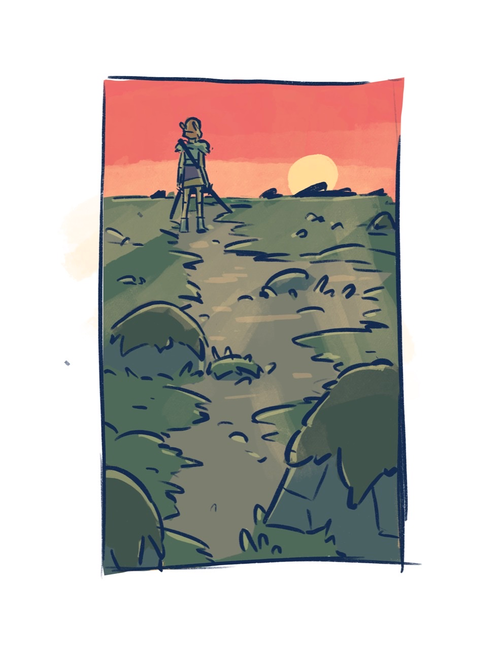
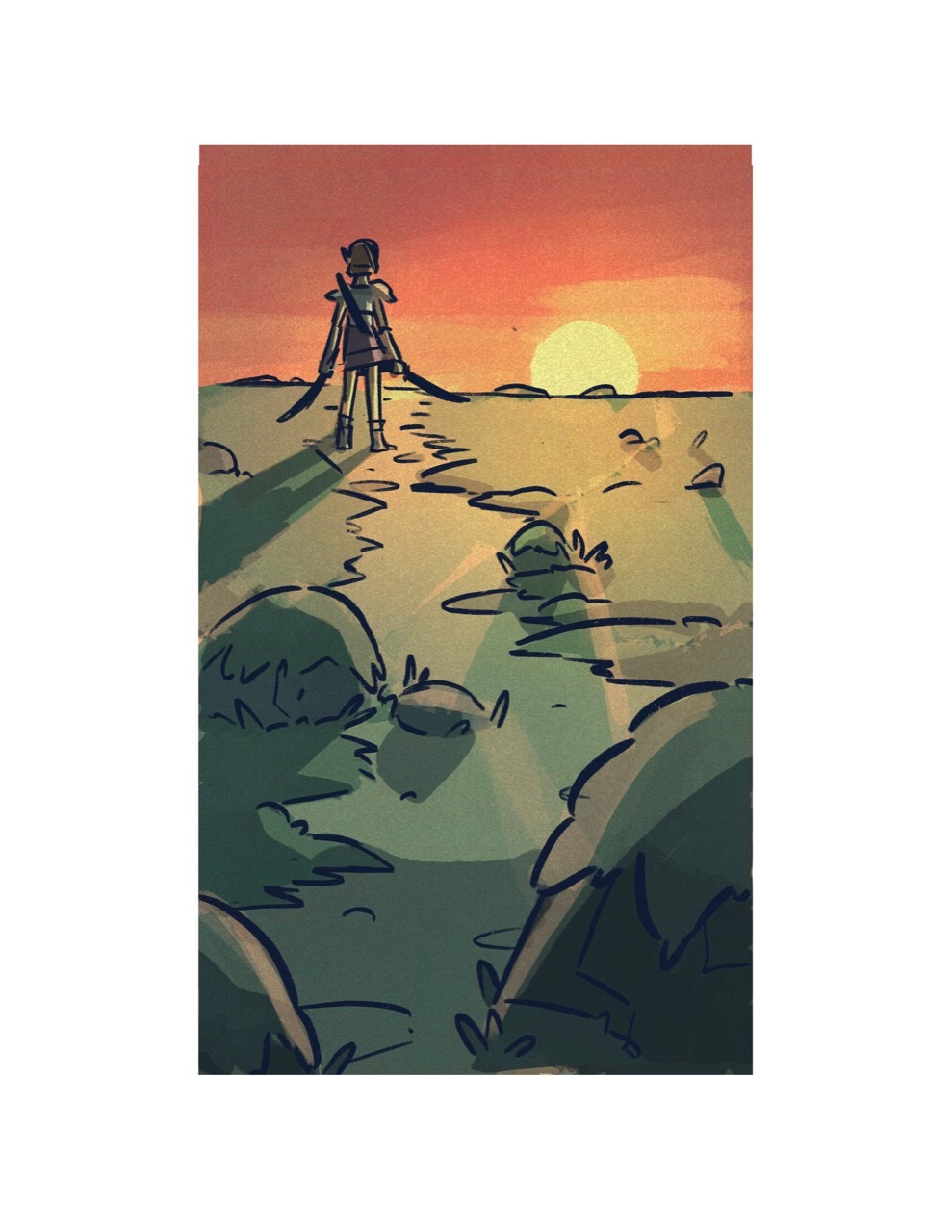
      Hey SVS people, I made this really rough drawing that just feels a little off to me, and I can’t see or pick out what it is. Anyone have any suggestions?

      NessIllustration Heather Boyd 2 Replies Last reply Reply Quote 0
      • T
        Tamisha SVS OG last edited by

        I really like your illustration idea. At first glance I see a large amount of space with nothing happening in the grassy area. The layout is great. Perhaps adding some depth variation to create foreground, midground and background. The larger stones at the bottom should be much darker then the rest of the image. Your character should hold his/her arms out just slightly away from the body to create more division and a strong silhouette. Looking foreword to seeing your WIP!

        1 Reply Last reply Reply Quote 1
        • StudioLooong
          StudioLooong last edited by

          I think that what you have going on with the path is flattening out the composition in an unnatural way. There is great perspective with the rocks getting smaller but that dirt path isnt following the same logic. It's almost as wide up by the person as it is down by the large rock. The rough edges of the grass should scale too, becoming less jagged as it reseeds into the distance.

          1610087918555-8e7b6e5d-dddd-4a2b-8926-4cf608d358a7.jpg

          Quick fix for the path width could be to take out some of the grass in the bottom left.

          1610087918555-8e7b6e5d-dddd-4a2b-8926-4cf608d358a72.jpg

          Taylor Woolley
          (Formerly Taylor Ackerman / StudioLooong)


          Website: www.woolleystories.com
          Instagram: https://www.instagram.com/woolleystories/

          phoenix yip 1 Reply Last reply Reply Quote 1
          • NessIllustration
            NessIllustration Pro @phoenix yip last edited by

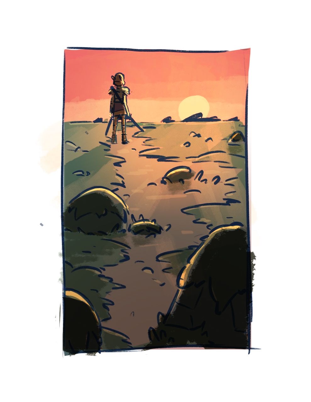
            @phoenix-yip With the character backlit (with a sunset no less) this is a pretty dramatic lighting scenario which I think you've rendered a bit too mildly. This lighting would produce more this sort of effect:

            Lighting.jpg

            vanessastoilova.com
            instagram.com/vanessa.stoilova/

            Check out my Youtube channel for tips on how to start your career in illustration! www.youtube.com/c/ArtBusinesswithNess

            phoenix yip 1 Reply Last reply Reply Quote 1
            • Heather Boyd
              Heather Boyd @phoenix yip last edited by

              @phoenix-yip From first look I might say there is a lot of focus weight and colour at the top. Also maybe the character is larger than he should be in comparison to the size of the sun but I am not sure.

              Instagram: www.instagram.com/heatherboyd.illustration/
              Website: https://heatherboydillustration.ca
              Shop: https://www.inprnt.com/search/products?q=HeatherBoydIllustration
              Ko-Fi: https://ko-fi.com/heatherboydillustration

              Be blessed,

              1 Reply Last reply Reply Quote 0
              • phoenix yip
                phoenix yip @StudioLooong last edited by

                @StudioLooong thank you so much!

                1 Reply Last reply Reply Quote 0
                • phoenix yip
                  phoenix yip @NessIllustration last edited by

                  @NessIllustration FFA7F1AC-6F4B-4DBC-B48A-CFE565EB09E4.png
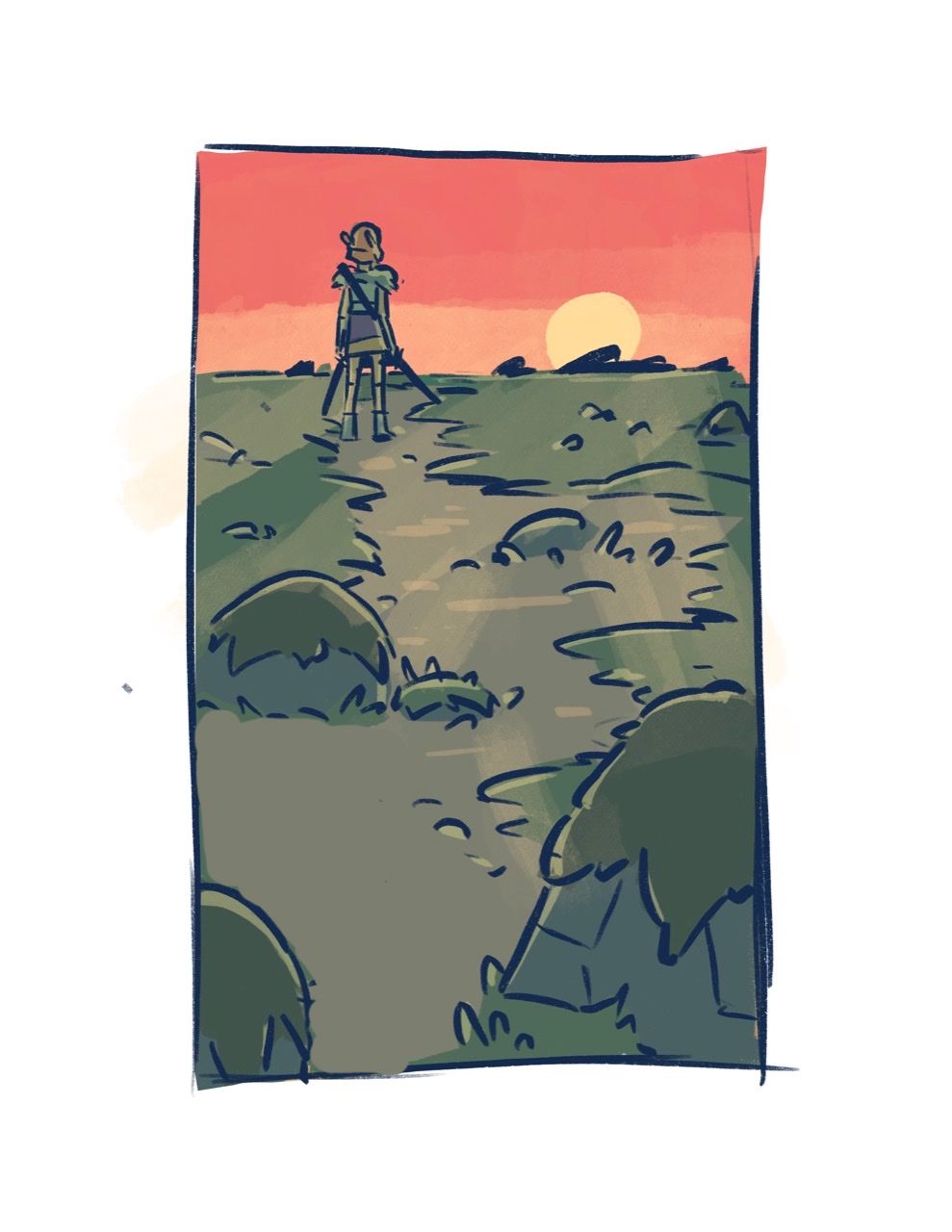
                  Is this better? I took your advice and made the lighting more dramatic

                  NessIllustration 1 Reply Last reply Reply Quote 2
                  • Michael Angelo Go
                    Michael Angelo Go last edited by

                    Okay so my feedback might be biased, but I think the problem here is the horizon line. I know what you were trying to go for, creating a great sense of depth with the foreground taking most of the space of this vertical drawing, but it's a little overkill. I'm basing my feedback on this video, it might help you.

                    https://www.youtube.com/watch?v=upxBGNcryRs&t=699s&ab_channel=BaMAnimation

                    Other than that I don't have much feedback, the others here have given really great feedback.

                    Finis Coronat Opus
                    Instagram: www.instagram.com/madgcartoons/
                    Behance: www.behance.net/madgcartoons
                    Website: https://michaelangelodgo.wixsite.com/madgcartoons

                    phoenix yip Kayla Groening 2 Replies Last reply Reply Quote 0
                    • NessIllustration
                      NessIllustration Pro @phoenix yip last edited by

                      @phoenix-yip I think that's a great improvement!!

                      vanessastoilova.com
                      instagram.com/vanessa.stoilova/

                      Check out my Youtube channel for tips on how to start your career in illustration! www.youtube.com/c/ArtBusinesswithNess

                      1 Reply Last reply Reply Quote 0
                      • phoenix yip
                        phoenix yip @Michael Angelo Go last edited by

                        @Michael-Angelo-Go thanks! Yeah that makes sense, I just wanted to make sure the horizon line hit on the third rather than in the middle

                        1 Reply Last reply Reply Quote 0
                        • Melissa_Bailey
                          Melissa_Bailey last edited by

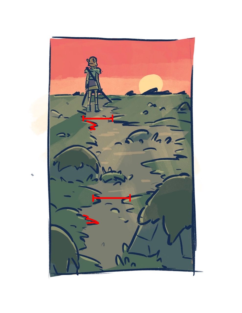
                          Your new color study looks A LOT better! Overall, I really like this sketch. There still seems to be something static to me about the composition, though. Is it the rather flat, straight lines of both the horizon and the path? It raises a lot of questions for me ... why are the rocks so large in the foreground then seem to disappear as the path goes toward the horizon? Does that represent the path getting easier / less obstacles for the character? What is the story behind this composition? Why does the character have both swords drawn? Are they in peril? If so, why do they have a more relaxed posture instead of being poised to fight/defend themselves? Perhaps, if text is meant to be shown alongside the illustration, all that will be answered. But just viewing the illustration by itself, I want to know what the story is. Good job for piquing my curiosity!

                          illustrator - author - smiley person
                          mbaileyart.com
                          instagram.com/mbaileyart/

                          1 Reply Last reply Reply Quote 0
                          • Kayla Groening
                            Kayla Groening @Michael Angelo Go last edited by

                            @Michael-Angelo-Go I actually love the original horizon line in terms of storytelling.

                            To me, having the horizon line higher on the page and having the character facing the horizon makes it seem like the character is leaving behind a lot, taking a risk, or heading into the unknown (at least that's how I read it).

                            Kayla Groening
                            Comic/Graphic Novel Artist
                            Storytelling through Art.
                            Facebook page: https://www.facebook.com/kaylagroeningillustration
                            Instagram: https://www.instagram.com/kayla.groening.illustration/

                            1 Reply Last reply Reply Quote 0
                            • First post
                              Last post