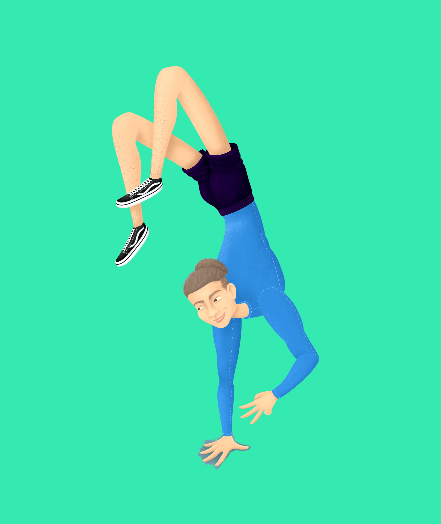
Portrait help! Why is this so bad?
-
Hello @carrieannebrown, I think the issue with this specific piece is probably the style. The man's torso and head read to me as "derivative of human anatomy" which is good, but his legs do not. His legs read as more "cartoon, exaggerated, stylized" which makes the style of this piece inconsistent.
So I am not sure which route you want to work with. Do you want to commit to a style that incorporates some rules of anatomy, or do you go full-on out with a stylized look? You cannot really have both.
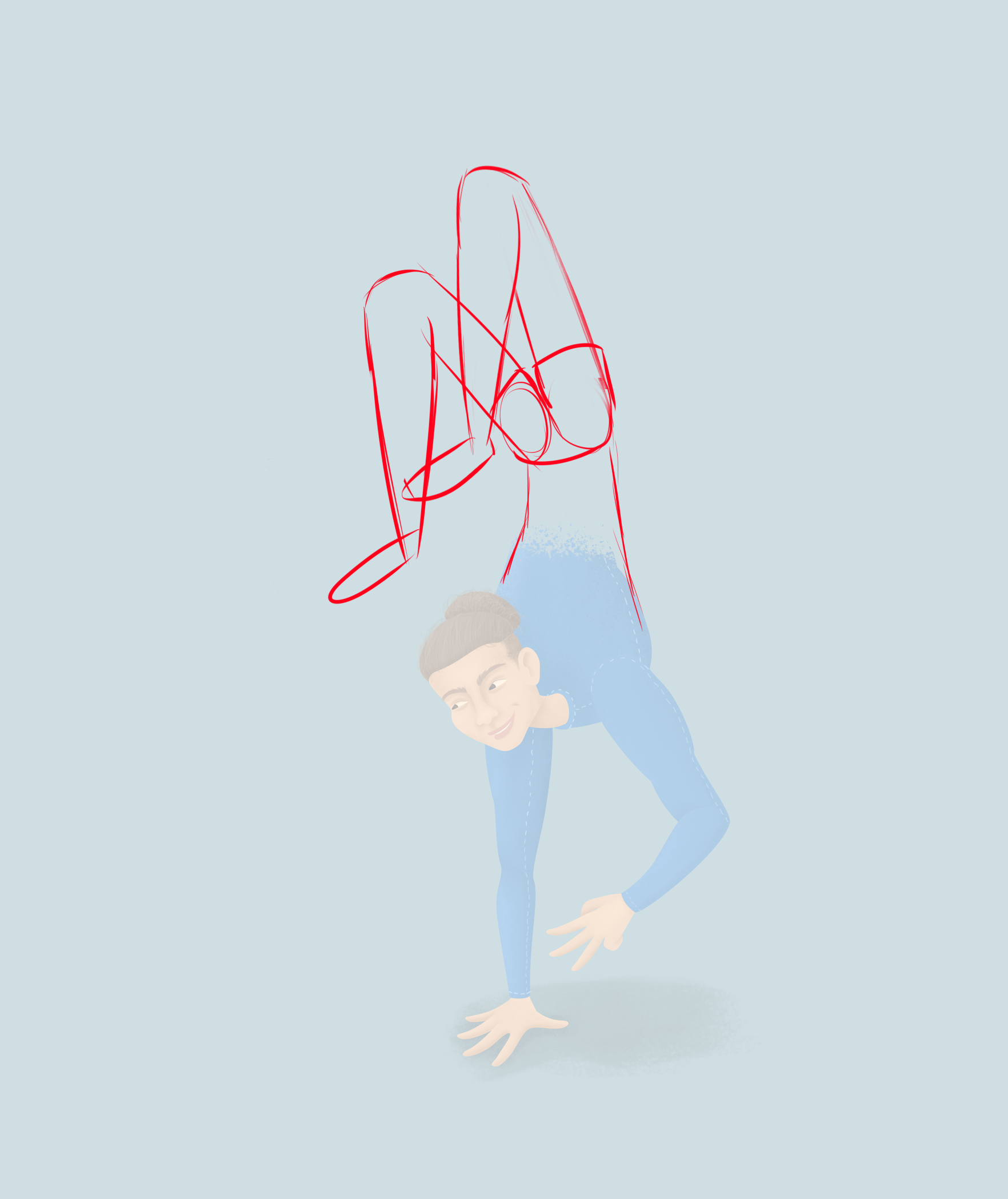
This is what I recommend if you prefer the former...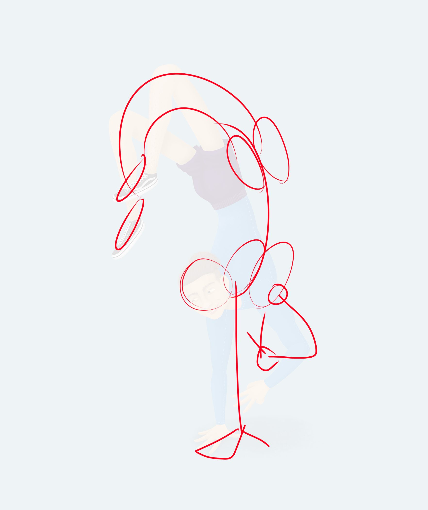
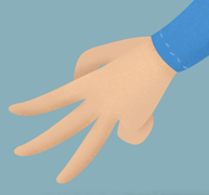
Or the latter...Also a couple of other questions. Is this supposed to be a piece sign? Why does he have three fingers out? Does it mean anything? I think he should be making a clear and recognizable gesture with this hand.
My last comment would be color scheme. While I think the color scheme is okay, could you perhaps experiment by adding a contrasting color? I think his blue shirt and indigo shorts are too monochromatic to the muted teal background, and I think experimenting with the color scheme just a little bit more will help the picture pop.
Here's some experimental colors.
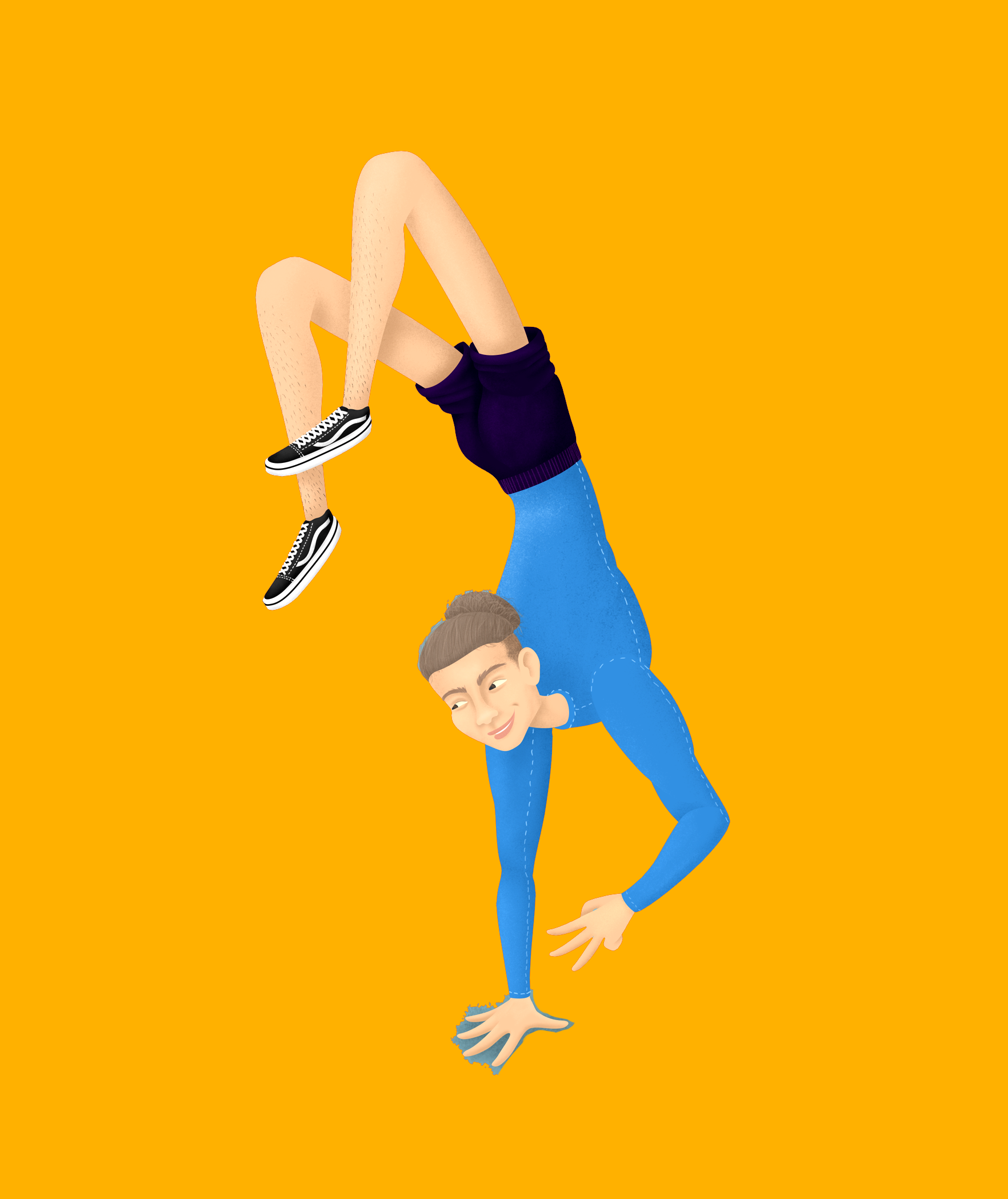
Blue goes great with orange, but since this is not a pure blue, I thought it would go great with a shade that leans towards more yellow.
Aqua green might also be a good option. Overall, I do think it's good piece, but only needs a couple of tweaks and some clear direction with your style.
-
@carrieannebrown I think maybe it's because the height, torso and head of the character are fairly realistic. So you have these more "accurate" elements but then go a lot more stylized on the execution. Whenever you go for more realistic elements, any anatomical inaccuracies tend to stick out as anomalous. However, you were going for stylized here, not accurate, so I don't agree his assessment that it's badly drawn. It's stylized in a particular way that might seem a little jarring to some, and not jarring at all to others. I wouldn't say it's bad at all, it's a stylistic choice. I personally like it! I think the legs and feet are interesting. I think it would probably go over more smoothly if the facial features were more stylized as well. Just looking at the face, it looks a lot more realistic than the rest of the body.
-
I don't think this is "drawn really bad." I regularly get crits where I'm told that my anatomy / proportions are off. Given this unique pose with out reference I have no idea if the anatomy is off. I do think some the proportions seem a little out of wack. The legs seem really long–especially from the knees to the hips. Also the hips / waist seems really tiny compared to the shoulders and rib cage. If you have reference I would take a look at it again. It also might just come down to a difference of opinions and how you have chosen to stylize the human form. I think @Kevin-Longueil nailed it. If this character was placed in a similarly stylized world it would look great.
-
@Michael-Angelo-Go thank you so much for the effort. You're right, I need to go more stylised, I think it's because I was drawing a real person that I didn't know very well I was a bit nervous that I would offend if I stylised any part of their body too much.
-
@Nyrryl-Cadiz very helpful, thank you!
-
@Michael-Angelo-Go @Nyrryl-Cadiz you're right, it's confusing because it's for a specific person and represents a situation that others won't understand. It's my gym class instructor, he's counting down 3 with his fingers. I did one for each of my class instructors but I got caught up in embarrassment and not wanting to offend real people. I think I should remove them from my portfolio and keep them private, I just don't have much work yet

-
@j-sienkowski thank you!
-
@carrieannebrown Perhaps you should've added other people or objects in the background to create more context?
But if you don't want to work on this anymore for your portfolio, that's completely fine

-
So fun!
 Could you clarify what you wanted the piece to show? Which one is the most important: the face resemblance, the fact he’s a gym instructor, or that he was counting to 3? :))
Was it necessary he be in the that pose or could you have chosen a different one that shows all 3 more effectively?
If you could give a reference picture and clarify your intent maybe We could come up with a better solution. I’m kind of curious how I would tackle this haha.
-
@donnamakesart his instagram handle is @aaronabayomi. At the start of the year I decided to start working towards a career in illustration, I have been doing it as a hobby for years but have kind of lost my style. My goal was to practice portraits of real humans but also do something he wasn't offended by. I'm still trying to figure out my style, I want to get to the point where I know how I draw something so I don't feel like I'm starting from scratch each time. I hope that answered your questions

-
@carrieannebrown oh so cool! He’s using your work as his profile picture haha. As a gift I would say you achieve your goal

As for effective art practice, it’ll be better to focus on improving in one area per piece (eg. Do a 30 day watercolor portrait challenge or 100 poses challenge). Milage is painful but it’s the best way to learn haha.
-
I don't think it's that bad. Maybe it was just a difference in taste. I'm not familiar with Charles Lively's work- I tried to google but can't find him. Personally, I find portraits to be difficult to do with a stylized illustration. Maybe one thing you can do is find people who are great at caricatures? They seem able to combine stylized drawings with likeness really well.
-
The first thing I noticed was the anatomy. It looks odd at places. Agree with comments from @Michael-Angelo-Go
Good luck!
-
@Jeannelle-Pita sorry, it auto-corrected his name, it's Charles Hively. He's not a working illustrator, he runs an illustration magazine called 3x3
-
@ABCre8ive thank you, I'll get there one day (maybe)
-
Hi carrieannbrown! Thanks for sharing your image. I like the direction of your illustration, trying to achieve a dynamic narrative. Respecting your request here are some elements worth looking. First is considering in looking at the anatomy of the legs. You made them considerablly thinner compared to the upper body and the arms which are more well toned. Legs from a design point of view have to have certain level of rubustness to support the rest of the weight of the upper body to attain stability abnd balance, and especially the feet you gave your character are very small, How will your character walk? I think that the neck and the position of the head. While I comprehend you want create the notion that the head is looking up but you made you made the neck very bendy, thin and long like a giraffe. Maybe that could be ressolved by bring the head closer to the body and the neck thicker. These are just suggestions from what I understand. I liike your colour palette. Hope that this helped. Best of luck.