Society of Visual Storytelling

    SVSLearn Forums

    • Register
    • Login
    • Search
    • Recent
    • Tags
    • Popular
    • Users
    • Groups
    • Search

    Vignetti Yeti - looking for feedback in progress

    Contest
    17
    40
    2594
    Loading More Posts
    • Oldest to Newest
    • Newest to Oldest
    • Most Votes
    Reply
    • Reply as topic
    Log in to reply
    This topic has been deleted. Only users with topic management privileges can see it.
    • Valerie Light
      Valerie Light last edited by

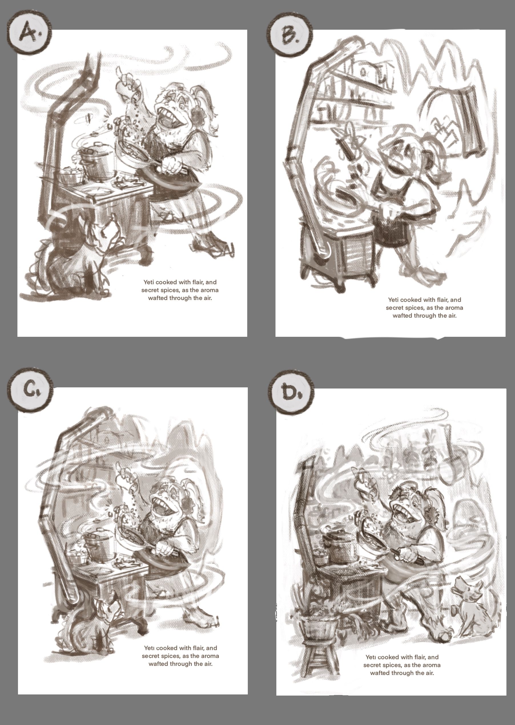
      I'm narrowing down a composition! Here's another page of roughs. I think that A is the clearest one, but if can use value to control the focus in D, I think it would be great to show as much as I can about who the yeti is and what her world is like. What do you vote?

      (side note: this past week or two is the first time I've used a forum like this to share advice on a WIP. I am LOVING all the constructive feedback and advice from this group. Thank you all for being so welcoming ๐Ÿ™‚ ).
      2.14.21_FourThumbs.jpg.jpeg

      www.valerielightillustration.com
      www.instagram.com/valerie_light_illustration

      Kevin Longueil Lindsey Pittenger Nyrryl  Cadiz Jacy13 4 Replies Last reply Reply Quote 2
      • Kevin Longueil
        Kevin Longueil SVS OG @Valerie Light last edited by

        @Valerie-Light I think they would all work well - I do like B the most for some reason...maybe the cleaner silhouette? - if you are going to have the puppy i think i like the position in A and B best

        Portfolio: kevinlongueil.com
        https://www.instagram.com/kevinlongueil/

        1 Reply Last reply Reply Quote 1
        • Lindsey Pittenger
          Lindsey Pittenger @Valerie Light last edited by

          @Valerie-Light I really like both C and D. I gravitate towards D because the puppy is so happy. I also really like the pots and herbs hanging in the background

          1 Reply Last reply Reply Quote 1
          • Nyrryl  Cadiz
            Nyrryl Cadiz SVS OG @Valerie Light last edited by

            @Valerie-Light my vote is on A. I love how simple and bare the background is. The Yetiโ€™s silhouette is very clear and just pops right off the page.

            Portfolio: nyrrylcadiz.com
            Instagram: https://www.instagram.com/nyrryl_cadiz/
            YouTube: https://www.youtube.com/channel/UCbJCF1Im8ZO7hpGWTKOJMuA

            1 Reply Last reply Reply Quote 2
            • Jeremiahbrown
              Jeremiahbrown last edited by Jeremiahbrown

              I vote A. It feels more like a typical spot illustration and keeps the focus on the characters.

              Jeremiah Brown
              www.jeremiahbrownillustration.com
              https://www.instagram.com/jeremiah.brownillustration/

              1 Reply Last reply Reply Quote 1
              • KaraDaniel
                KaraDaniel last edited by

                I vote A ๐Ÿ™‚

                instagram.com/sha_kara
                karadaniel.net

                1 Reply Last reply Reply Quote 1
                • Jacy13
                  Jacy13 @Valerie Light last edited by

                  @Valerie-Light I vote A as well ๐Ÿ˜ƒ

                  Deviantart: https://www.deviantart.com/jacy13
                  Instagram: https://www.instagram.com/jacy13draws/?hl=en
                  Portfolio: https://jacy13.artstation.com/

                  1 Reply Last reply Reply Quote 1
                  • Niels
                    Niels last edited by

                    I like D the most because of the different values in the picture. However I like how the chimney of the stove makes a natural border in image C. Maybe a mix of C and D would be an option? A stove-border like in C would probably mean that composition wise youโ€™d have to ditch the stool with veg om the lower left though. The moving of the dog towards the right lower corner works quite well and makes more of a connection with the yeti this way.

                    Instagram: www.instagram.com/novanbergen/

                    1 Reply Last reply Reply Quote 1
                    • KayPotter
                      KayPotter last edited by

                      Iโ€™m sticking with A because I think itโ€™s the most โ€˜spot illustration-yโ€™ :).

                      1 Reply Last reply Reply Quote 1
                      • shereen said
                        shereen said last edited by

                        I vote for A!

                        1 Reply Last reply Reply Quote 0
                        • E
                          Emma Echter last edited by

                          I vote A too ๐Ÿ™‚

                          www.instagram.com/bold_archer

                          1 Reply Last reply Reply Quote 0
                          • Valerie Light
                            Valerie Light last edited by

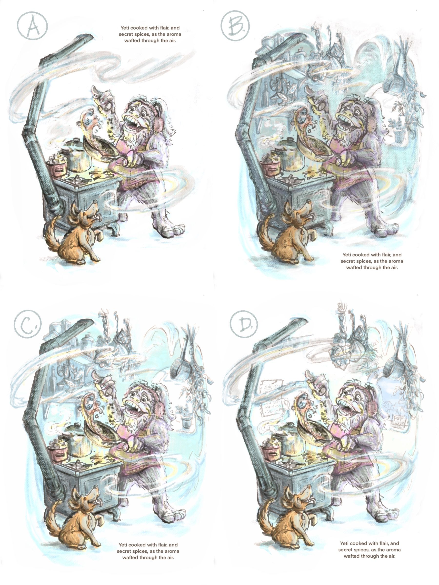
                            All right, so many of you are encouraging me to do A, and I know that you're right about it being clear and readable and a traditional spot illustration, but something like C looks like so much more fun to me (and maybe a better addition to my portfolio). I decided to try some color roughs on a couple of different composition options.
                            If you all aren't sick of helping me design this by election, here are 4 variations of how to resolve the environment.
                            (PS I hope you vote for D) 2.17.21_Yeti_line_value.jpg.jpeg
                            www.valerielightillustration.com
                            www.instagram.com/valerie_light_illustration

                            E Jacy13 miranda-hoover 3 Replies Last reply Reply Quote 3
                            • Asyas_illos
                              Asyas_illos last edited by

                              A and d are my faves I feel like with the colored background itโ€™s just a little chaotic, great work though!

                              Asyasewardillos@gmail.com
                              www.Instagram.com/asyas_illos/
                              https://asyasewardillos.wixsite.com/mysite

                              1 Reply Last reply Reply Quote 1
                              • Jeremiahbrown
                                Jeremiahbrown last edited by

                                I agree with @Asyas_illos , A and D.

                                Jeremiah Brown
                                www.jeremiahbrownillustration.com
                                https://www.instagram.com/jeremiah.brownillustration/

                                1 Reply Last reply Reply Quote 1
                                • E
                                  Emma Echter @Valerie Light last edited by

                                  @Valerie-Light I still like A. I like the silhouette, without the background it is easy to read. And, is most definitely a spot illustration.

                                  www.instagram.com/bold_archer

                                  1 Reply Last reply Reply Quote 1
                                  • chrisaakins
                                    chrisaakins last edited by

                                    @Asyas_illos I agree with @Valerie-Light that A is the one most like a spot illustration. I think it may be a winner, too. I called the last two so you better listen to me. ๐Ÿ˜‰

                                    Chris Akins
                                    www.chrisakinsart.com
                                    www.instagram.com/chrisakinsart/

                                    Valerie Light 1 Reply Last reply Reply Quote 1
                                    • Jacy13
                                      Jacy13 @Valerie Light last edited by

                                      @Valerie-Light I like D ๐Ÿ™‚

                                      Deviantart: https://www.deviantart.com/jacy13
                                      Instagram: https://www.instagram.com/jacy13draws/?hl=en
                                      Portfolio: https://jacy13.artstation.com/

                                      1 Reply Last reply Reply Quote 1
                                      • miranda-hoover
                                        miranda-hoover @Valerie Light last edited by miranda-hoover

                                        @Valerie-Light D is great! It gives it depth and detail but still feels light and open. It also looks a lot like a spot illustration to me.

                                        https://www.instagram.com/mirananemone

                                        1 Reply Last reply Reply Quote 1
                                        • Valerie Light
                                          Valerie Light @chrisaakins last edited by Valerie Light

                                          @chrisaakins Ooh, music to my ears!
                                          I think I may keep developing an A version and a D version together this week! I just feel like D is doing so much more storytelling, and I'm having a hard time giving up on that.

                                          www.valerielightillustration.com
                                          www.instagram.com/valerie_light_illustration

                                          1 Reply Last reply Reply Quote 0
                                          • Valerie Light
                                            Valerie Light last edited by

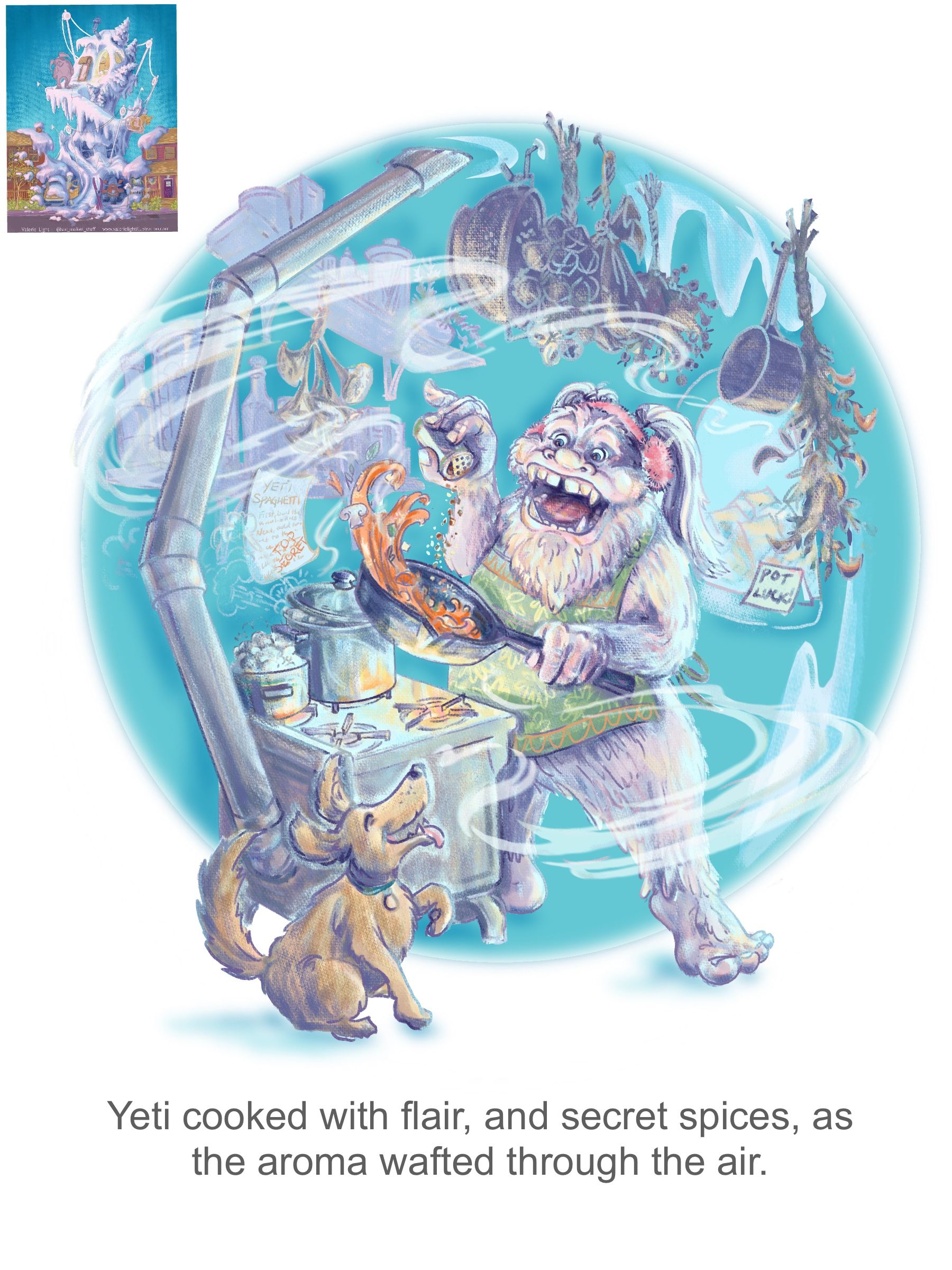
                                            Well, I stressed about this, overworked it for a while, ignored it for a bit, and then maybe figured something out today.
                                            It's looking like the light values are really blown out compared to what I see in Procreate on my ipad, so that definitely needs adjustment. (BTW the tiny image in the corner is a thumbnail of my yeti's house, and I want mood and color to coordinate between the two.)
                                            My main question is, Is the image readable? What would help that? As always, I welcome any feedback!
                                            2.25.21_Yeti_Spot_Progress.jpg.jpeg

                                            www.valerielightillustration.com
                                            www.instagram.com/valerie_light_illustration

                                            Melissa_Bailey 1 Reply Last reply Reply Quote 0
                                            • First post
                                              Last post