Society of Visual Storytelling

    SVSLearn Forums

    • Register
    • Login
    • Search
    • Recent
    • Tags
    • Popular
    • Users
    • Groups
    • Search

    Lines or no lines?

    Contest
    12
    24
    1738
    Loading More Posts
    • Oldest to Newest
    • Newest to Oldest
    • Most Votes
    Reply
    • Reply as topic
    Log in to reply
    This topic has been deleted. Only users with topic management privileges can see it.
    • hayleyannececil
      hayleyannececil last edited by

      So I’ve tried to add some more shadows to define it a bit more (hopefull there is a difference!) and next I’m going to try with more subtle line artF7C003E1-85F7-4D34-B6EB-1A71A6B76537.jpeg

      https://www.instagram.com/hayleyannececil

      Melissa_Bailey Tiffany Thomas 2 Replies Last reply Reply Quote 8
      • Melissa_Bailey
        Melissa_Bailey @hayleyannececil last edited by

        @hayleyannececil yes, those subtle changes did help a lot with readability. ❤️

        illustrator - author - smiley person
        mbaileyart.com
        instagram.com/mbaileyart/

        1 Reply Last reply Reply Quote 1
        • Julia
          Julia last edited by

          For me, no line but more contrast!
          The image is very cute 👍

          https://www.instagram.com/julia.nsw/

          1 Reply Last reply Reply Quote 0
          • Tiffany Thomas
            Tiffany Thomas @hayleyannececil last edited by

            @hayleyannececil I love them both, really nice design and composition! I think the softness & texture of this character lends itself better to the "no lines" version but there are some areas where the values of the colors are so close that you loose a but of the depth, like where the neck meets the grey smoke. I think if you just deepen that neck shadow a tiny bit it might help balance it out a bit. Soooo good though, I totally want to hang out with this Yeti!!!

            1 Reply Last reply Reply Quote 1
            • Tiffany Thomas
              Tiffany Thomas @hayleyannececil last edited by

              @hayleyannececil Haha, just saw this version. Apparently I should read through the whole thread before replying. I like the changes, it definitely gives more depth!

              hayleyannececil 1 Reply Last reply Reply Quote 0
              • hayleyannececil
                hayleyannececil @Tiffany Thomas last edited by

                @Tiffany-Thomas haha thank you! If I have time I’ll try one with lighter lines and see what it looks like vs this one, I’ve just always drawn with lines so it’s hard for me!

                https://www.instagram.com/hayleyannececil

                1 Reply Last reply Reply Quote 0
                • chrisaakins
                  chrisaakins last edited by

                  @hayleyannececil I understand the desire for no lines but also loving lines. What I sometimes do to compromise is I make a selection of my shape and on the clipping mask, just barely brush the edges with a dark analogous color to define the shape without an obvious line.

                  Chris Akins
                  www.chrisakinsart.com
                  www.instagram.com/chrisakinsart/

                  hayleyannececil 1 Reply Last reply Reply Quote 0
                  • R
                    Richard Matthews last edited by

                    @hayleyannececil when I first saw the lines I was like "oh definitely lines" but I prefer the no lines! haha. Great work! It looks so soft without the lines.

                    hayleyannececil 1 Reply Last reply Reply Quote 0
                    • hayleyannececil
                      hayleyannececil @Richard Matthews last edited by

                      @Richard-Matthews hahaha! It’s a struggle, I’ve now done a soft line version, going to post the 2 new ones below! Think I still prefer no lines!

                      https://www.instagram.com/hayleyannececil

                      1 Reply Last reply Reply Quote 0
                      • hayleyannececil
                        hayleyannececil @chrisaakins last edited by

                        @chrisaakins ohhh good tip! Thank you ☺️

                        https://www.instagram.com/hayleyannececil

                        1 Reply Last reply Reply Quote 0
                        • hayleyannececil
                          hayleyannececil last edited by hayleyannececil

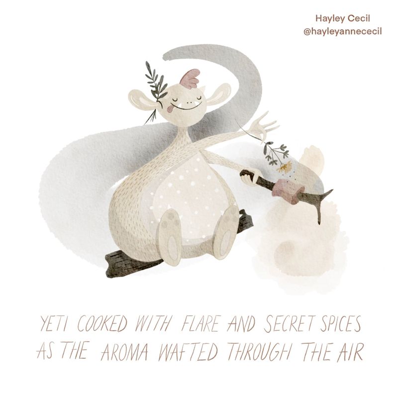
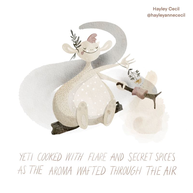
                          Ok...soooo I THINK I prefer no lines in the end! Here’s both options together :)! Edit, ignore the dark blob on foot, thought I rubbed that out 🤦🏻‍♀️

                          959BB859-B577-4FE2-9ADE-0E993BA1FC7C.jpeg F5883E05-4E28-433B-A71A-237B5655645C.jpeg

                          https://www.instagram.com/hayleyannececil

                          joosterwijk miranda-hoover Melissa_Bailey 3 Replies Last reply Reply Quote 4
                          • joosterwijk
                            joosterwijk @hayleyannececil last edited by

                            @hayleyannececil Beautiful! I love the softness of it. Still I prefer the ones with lines, it ads a little bit more readability to it. Maybe you can tone them down even more, for instance on the left foot (also the tangent there makes it a bit less clear).
                            Very nice work!

                            https://joosterwijk.nl/
                            https://www.instagram.com/joosterwijk.illustration/

                            1 Reply Last reply Reply Quote 1
                            • R
                              Richard Matthews last edited by

                              You don't have to change the words but I love making things rhyme so thought I would add "The Yeti cooked with flare and secret spices. With aroma in the air to keep it nice". No pressure at all :). I still prefer the no lines, great work!

                              1 Reply Last reply Reply Quote 0
                              • miranda-hoover
                                miranda-hoover @hayleyannececil last edited by

                                @hayleyannececil Super cute! I agree with @joosterwijk , the lines make it more readable and a bit sharper/finished. Great work; I love how gentle it feels.

                                https://www.instagram.com/mirananemone

                                1 Reply Last reply Reply Quote 0
                                • Melissa_Bailey
                                  Melissa_Bailey @hayleyannececil last edited by

                                  @hayleyannececil beautiful! Of the two, I prefer the one with lines, for the readability reason like everyone else. 😉

                                  But both are great -- you do you and go with the one you like best!

                                  illustrator - author - smiley person
                                  mbaileyart.com
                                  instagram.com/mbaileyart/

                                  1 Reply Last reply Reply Quote 0
                                  • Asyas_illos
                                    Asyas_illos last edited by

                                    Your last one nailed it I think the subtle non black looks amazing.

                                    Asyasewardillos@gmail.com
                                    www.Instagram.com/asyas_illos/
                                    https://asyasewardillos.wixsite.com/mysite

                                    1 Reply Last reply Reply Quote 0
                                    • hayleyannececil
                                      hayleyannececil last edited by

                                      Haha seems like people are liking the lines, maybe I need to emphasise certain parts with lines and have some parts without lines to satisfy both my likes 😂

                                      https://www.instagram.com/hayleyannececil

                                      1 Reply Last reply Reply Quote 0
                                      • First post
                                        Last post