Narnia part 3--which rough works best?
-
I'm also voting for 5! All beautiful work, but the witch in 5 looks dominating and powerful.
-
These are all pretty fantastic! Purely from a design perspective I LOVE #3, it's such an interesting perspective and it reminds me a bit of Talouse-Lautrec and some of his unique compositions. However, I think the design and perspective in #5 makes the White Witch look the most intimidating. First she is staring straight at the viewer, which is very confrontational and the POV is from a lower angle looking up at her which seems to imply she is above/greater than the viewer (which I'm assuming is the child shown in the other sketches). Love seeing your process here! Looking forward to seeing which you choose to develop.
-
3 and 5 get my vote. In three I like that she looks large and imposing physically and emotionally with the boy small and weak. In five I really like the queen but I think the driver is getting too much attention and could be much smaller and slightly hidden by dragon head. Nice work!
-
Thanks for your feedback, everyone! Five it is, and I'll work on the driver, dragonhead, gutter, etc.
P.S. I am having a lot of fun with that Medusa hair!
-
@LauraA 26 is my personal favorite but if you want intimidating, I think 5 is the one.
-
I'm so glad I thought about it and chose a favourite before reading the comments! My choice is 5 too
 You could have a lot of fun with the detail of her garb in 5. She looks super cool and intimidating.
 -
I love 5 too!!
-
This post is deleted! -
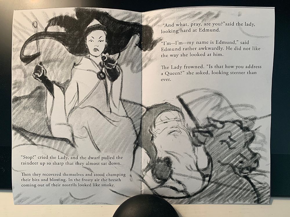
So, I moved that dwarf and dragon head all over the place, and finally decided on this size and placement for foreshortening and drama. He's still in the gutter, but at least he's not in a tangent with the dragon head and he could believably peer over it. I printed out the page full-size and folded it, and the gutter doesn't really bother me. What do you guys think?
(Obviously, there are still lots of details to work out! But for now just I'm going for placement and overall impression.)
-
@LauraA This looks great to me! I know this is an early sketch and many details are yet to be hammered out but i thought i might mention a thought that popped into my head which is to possibly tilt her head back a tiny bit to reinforce that we are looking up at her?(or more importantly that she is looking down on us) - i know this could be a thing you've already considered or discarded but just wanted to throw it out there - Beautiful line quality as usual!!
-
@Kevin-Longueil Yes, today her head went back and I'm experimenting with facial expressions and different features to see which one gets the idea best. I'll make the dwarf look more like he's pulling the reins up short as well. This is the fun part!
-
@LauraA Good choice. I also Like number 5