Feedback for a new illustration
-
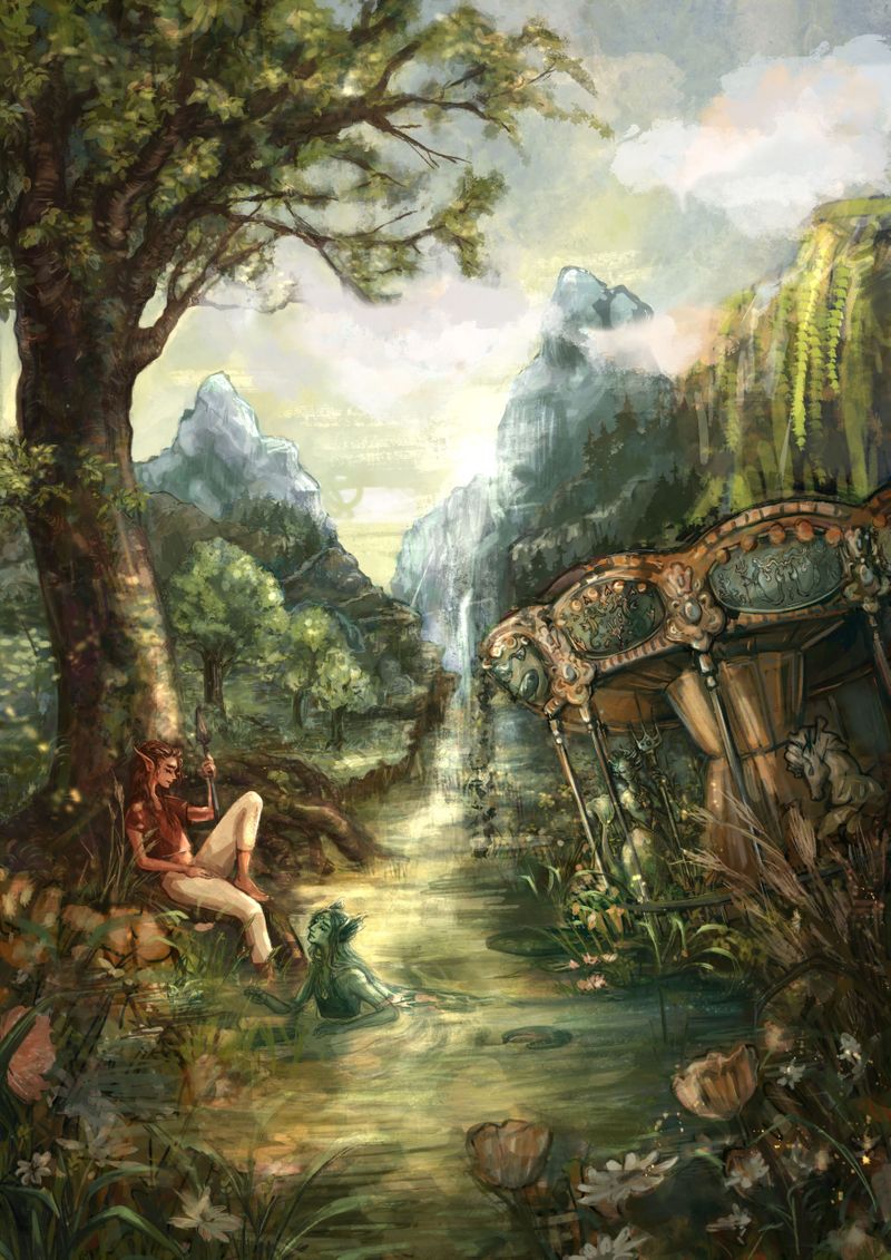
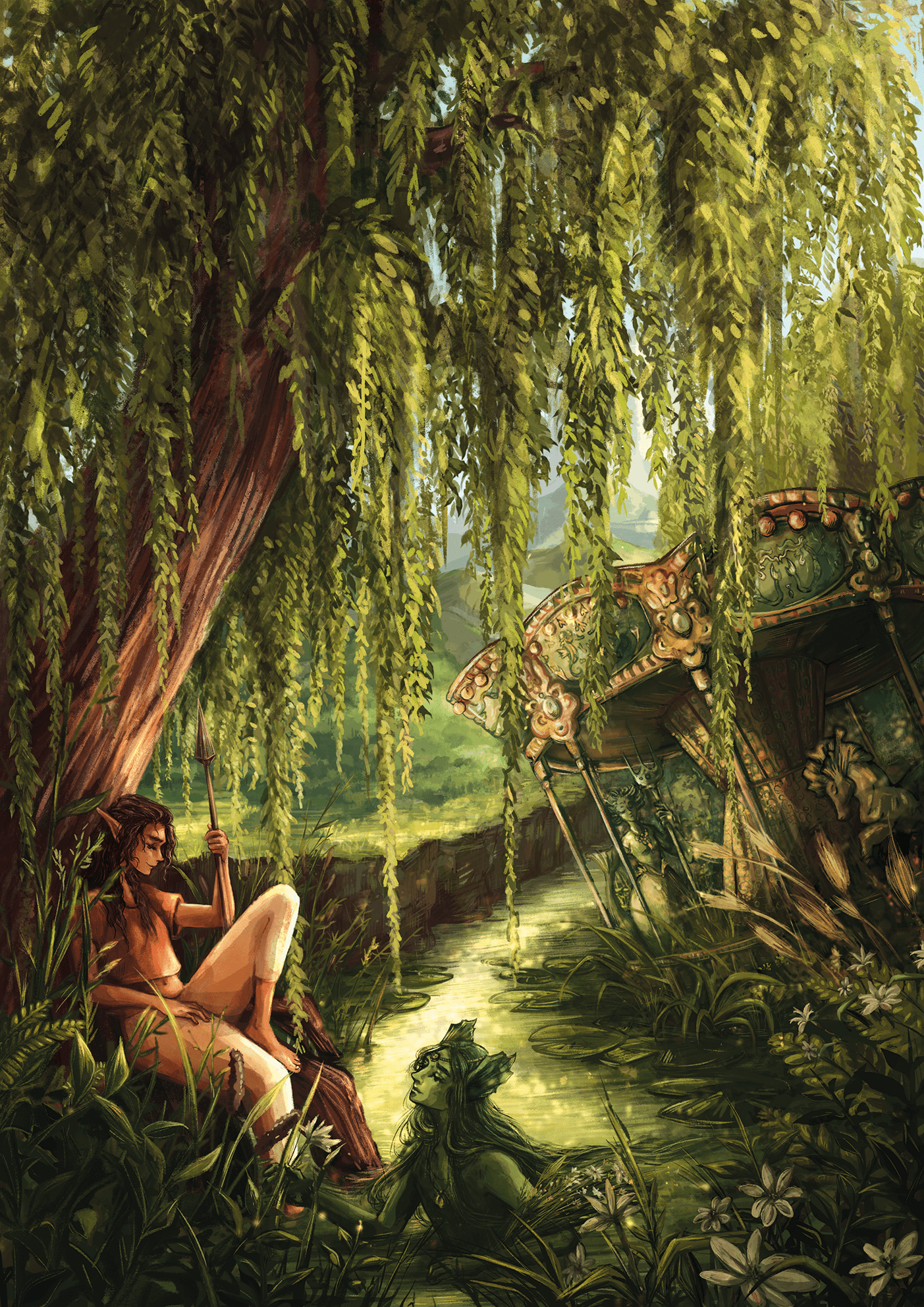
Hi! So I'm working on a new illustration and I really need some fresh eyes on this. hope you can help me out. I have two versions right now, one with the roller coaster the other without. Which do you prefer and why?
alsooooo anything else you are spotting on coloring or composition you think I could do better would be great to know") I'm prepared to rework this! (there is also still a lot to be rendered, so parts are still super sketchy)
I'm prepared to rework this! (there is also still a lot to be rendered, so parts are still super sketchy)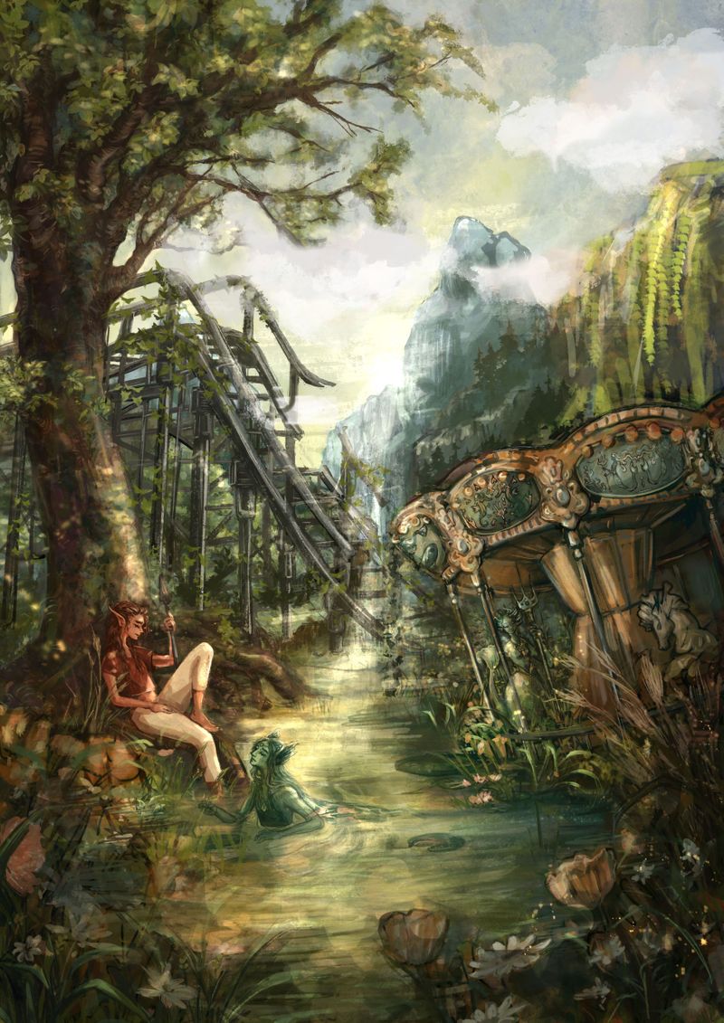
-
@Freya-Chakour
Hi Freya,
Beautiful piece - you've clearly put a lot of good work into it.What are you trying to say with the piece - what's the message for the viewer?
There is a lot going on in the picture and I'm not sure where to look. So perhaps take another look at your values and consider which direction you want the eye to go around the painting.
What do you think?
Adam
-
@Adam-Thornton-0 hi Adam! Thank you so much for your feedback. I have been thinking a lot a this, tried out some different approaches for the composition and the colors,still not quite there yet I think but it helped me very much to hear that the focal point is not clear. That is something I totally need to work on as I got this feedback also for my last piece. But now I know clearly where my focus for improving for the next few month will lie. (Also... sorry for my broken English, hope you can make some sense of my words
-
I like the coaster track as it helps show that it’s an over grown carnival of sorts, but it is distracting. Maybe If you put atmosphere in front of it to fade it, and push it further into the background. Shrink it, push it up a bit to show more ground in front of it, as well as the mountain behind it. It would still look large with the atmosphere in front of it to denote depth/distance.
All my links: https://APHOTICMOTH.carrd.co/
-
did a quick black and white to try bring more focus to the characters at the front for you only a small change, you could probably push it further. I personally prefer your one with the roller coaster.

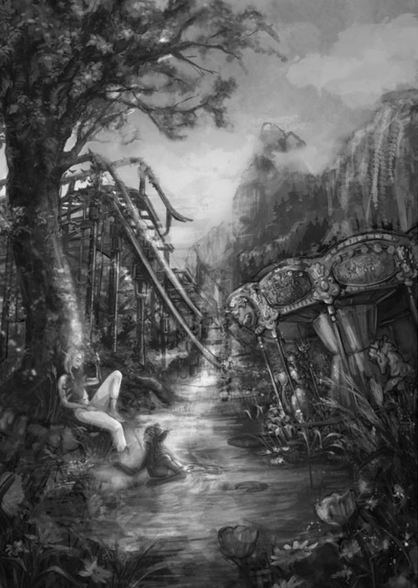 image url)
 -
I agree with Adam, I like it in because it adds to the atmosphere of an entire broken carnival but I am getting a bit stuck when my eyes insist on "riding" it down to the carousel and that's where I stay.
I really like your style and the atmosphere you are able to put in to your art! -
Your painting is really great, and it looks like you have put a lot of work into it. I always hate to make suggestions for changes on anyone's work when it is clear that they have put in a lot of time. But I am also trying to be more active in the forum here, because I believe critiquing the work of others helps me learn, as well as helps others.
With all of that being said, I have a few suggestions.
First, if your story needs to show the character in a ruined carnival ground, leave the Rollercoaster. I don't think the carousel really expresses this on its own, because it could be taken for a fancy garden gazebo.
Second when I look at the photo my eye is drawn first to the sky where the sun is setting behind the mountains. From there my eye wanders through the forest and finds the character and rides. I know it would be a considerable amount of work, but I think moving the sun so it is setting behind the viewer and off to the left a bit, you could have it lighting the character, tree and carousel nicely, leaving the Rollercoaster in the shadows a bit, so you can still see it enough to have the information in the setting, but it won't stand out so much.
I hope that this helps. -
@Freya-Chakour Very beautiful piece! I love the colors and the textures you used; it has a nice soothing feel to it. I would definitely keep the rollercoaster since it makes it clear what the setting is (and not just a merry-go-round somehow dropped by a lake).
As others have mentioned, I think the main critique is the focus of the image. It took me a second or two to find both the characters, and my eye tends to be pulled away to the brighter areas. I think it's a good idea that one of your characters has a red shirt, but maybe you can introduce more light in the area as well. I don't know if this is the direction you'd want to go, but a possible solution would be to darken the sky a little, then add a lantern (or another glowing object) next to the characters.
Very beautiful piece! I love all the details

-
Beautiful palette and landscape! It leads you right into the illustration.
As everyone else has said, if you're trying to show a ruined carnival, the roller coaster should stay in, but perhaps make it fade into the background just a bit more? It does draw the eye.
And as others have said, my eye doesn't know where to focus. The one character's legs stand out because they're such a light color, but her top half blends into the tree, making her difficult to read. And I didn't even see that there was more than one character until it was pointed out in the comments!
Is the landscape intended to be the focus? Or are the characters? If your characters are helping tell the story of what's going on in this illustration, I would suggest making them stand out more. Perhaps with value, color, lighting, or a mix of all three.
This is a really beautiful piece! Looking forward to seeing it finished!
-
@Freya-Chakour Hi Freya,
Yes, I understood perfectly. Thank you.To help you further, may I recommend Marco Bucci's videos. He explains values, edges and light very well. Here is the link to a short YouTube video where he briefly explains: https://www.youtube.com/watch?v=BTYGWfiZnMA&ab_channel=MarcoBucci
If you can get hold of Marco's Art of Colour and Light course, it is excellent! I completed it recently and it has helped me immensley.
Best wishes,
Adam
-
I like where this is going. I love the atmosphere. I would like to see the background edges blurred a bit, to have less focus and then more focus on the edges of the characters and foreground. I feel like the left side of the piece is heavy with interest and and right not so much so, so add in a point of interest to the right side, maybe a magical animal exploring the ruins or their pet. Also check levels like the guys have said above. Really like this piece and hope this is useful!
-
as a bunch of people already mentioned, it lacks focus since everything is sameish in term of value and saturation.
here a quick overpaint to show in which direction you can push things. desaturated background, bringing the blue from the sky into the shadows in the forgeground. some sharpening/blur and light changes. you already played around with that image a lot so keep pushing it and try to differentiate things more. its digital, you cant break anything as lon as you have a backup
left original - right overpaint - click to see full size

-
@CLCanadyArts @HeatherBouteneff @jenithornhill @Thestyledare-Singh @Melissa-Bailey-0 @Judy-Elizabeth-Wilson
First of all, thank you all so much for your feedback! this is really so helpful and so interesting to read how the piece is received so far and where the problems may lay. it helped me realize that its really difficult to navigate through the piece. also that the lines of the rollercoaster and the slightly tilted carousel make a super strong focal point in a place where nothing happens and its also the middle of the paper as well as the point where the river is going and parting the mountains. also I realized that I kind of divided the composition into a left and a right half.
I tried out lot of changes, and came up with a new approach. sadly I had to remove the rollercoaster, because even smaller or more faded it leads the eye very strongly, as the only very industrial thing in the piece, to a point where I didn't want the viewers to look.so I made the scene a bit smaller, a bit more intimate I hope, and changed the oak into a big willow tree, also I added way more diagonal lines, and tried to fill up the middle of the piece a bit more.
@miranda-hoover thank you so much for all of your ideas, I loved the one with the lantern, im thinking of creating a second piece in this direction, maybe a night or evening setting with lots of blues, and the rollercoaster, like a mini series with these characters or this world.
@James-Toogood @Molambo thank you both a ton for your draw overs! I appreciate it very much and found it super helpful to see!
-
A lot of changed later... this is where I am right now with this piece, I hope very much I could improve some of the points that where difficult about the former version and that it read better now.
Would love to hear what you think.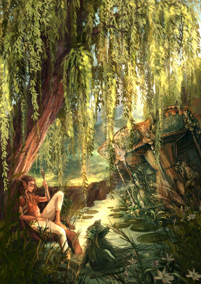
-
@Freya-Chakour Oh, this is a nice start. Could be a nice book cover.Really beautiful.
-
in term of readability and composition i think its better than the previous one.
-
@Freya-Chakour great job! The lighting is so lovely especially the willow
-
@CLCanadyArts @HeatherBouteneff thank you so much for your feedback :3 it is greatly appreciated and helped me a lot to hang on to this piece and finish it! I will post the final in a moment (still need to do some test printing and sometimes after seeing the print I go back and change a few things here and there, but for now I am happy with the result)
-
soo that's the final! it was definitely a challenging piece for me, but also I learned a ton. Thank you all again for your feedback!
-
@Freya-Chakour This is gorgeous!! The textures and colors are magical.