March traveler First approach!! Would love some feedback!
-
@Jacy13 thanks!!
-
@Georgios-Christopoulos said in March traveler First approach!! Would love some feedback!:
Heyo team!
Need some opinions on this one colourwise!!
Which one do you prefer??A The idea behind this colour choice is that the character is an Albino demon!
B.This is the regular coloured Demon.
C.This is the more "human like"demon, so he can blend more with humans in his travels(personally it is the least preferable one)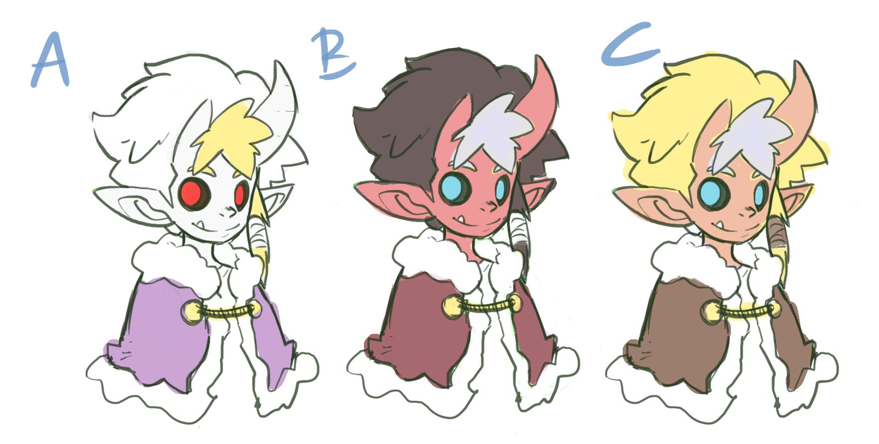
If you're going for a devilish vibe I think B is definitely the options. The blue eye looks great in option C. Could you try green eyes in option B? Have a nice spot of complimentary colour?
-
@Braden-Hallett yes, green eyes on B are a good idea. What is your thoughts on A? With a bit more grayish (I mean really light gray) for the skin, would you think it works?
-
@Georgios-Christopoulos said in March traveler First approach!! Would love some feedback!:
@Braden-Hallett yes, green eyes on B are a good idea. What is your thoughts on A? With a bit more grayish (I mean really light gray) for the skin, would you think it works?
My order would go B-C---A for myself. A just doesn't ring with me for some reason
")
-
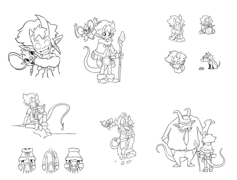
Hey fellas!
Working on inks,general layout and colour flats!Critique is always neat!
-
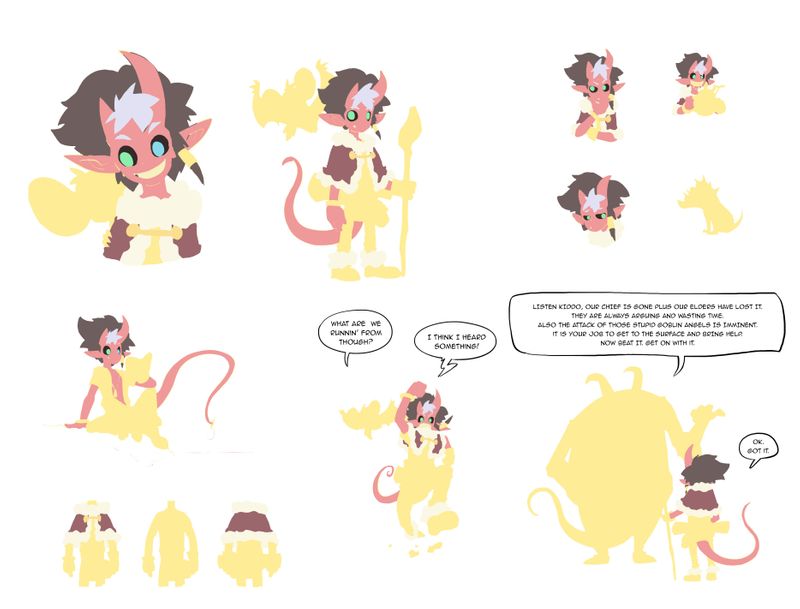
More basic colours!
-
@Georgios-Christopoulos In the grand scheme of things i'm pretty sure it doesn't matter, but the boss there having a tie and button up seems very out of place.
-
@jaepereira you mean, bureaucracy doesn't affect fantasy adventures with demons and angels???

-
@Georgios-Christopoulos touché
-
This post is deleted! -
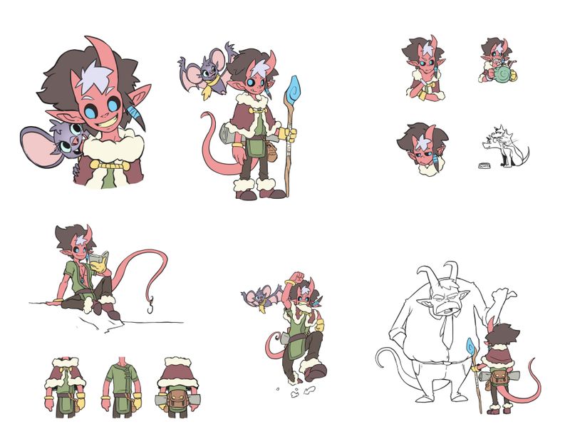
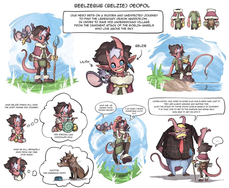
Almost there. I am sure I ll tweek some more with this character design sheet but let's leave it to rest now for a couple of days.
Made two versions,one with plain white and one with grainy paper texture.What do you think guys?
-
@Georgios-Christopoulos I prefer the grainy paper texture! It lets the word balloons pop a bit compared to the plain white
-
@Braden-Hallett thanks man! that's what I was thinking. Though I have some thoughts that maybe it becomes "too much".