Society of Visual Storytelling

    SVSLearn Forums

    • Register
    • Login
    • Search
    • Recent
    • Tags
    • Popular
    • Users
    • Groups
    • Search

    hey friends! need advice and critique for this one

    Artwork
    8
    17
    728
    Loading More Posts
    • Oldest to Newest
    • Newest to Oldest
    • Most Votes
    Reply
    • Reply as topic
    Log in to reply
    This topic has been deleted. Only users with topic management privileges can see it.
    • Peter Anton
      Peter Anton last edited by

      The first thing I see is that the scaling is off with the characters. Either they are too big or the door is too small. There's also not really anything going on in the top 1/3 of the painting...maybe you could add something interesting (but subtle) in the window to reward the viewer for exploring that area

      Manuel Mal 1 Reply Last reply Reply Quote 2
      • Manuel Mal
        Manuel Mal @Peter Anton last edited by

        @Peter-Anton hmm yeah. ill work on it that. thanks!

        1 Reply Last reply Reply Quote 0
        • RachelArmington
          RachelArmington last edited by

          You could also try cropping it a bit. Even just trimming off the top a bit, half or a third of the top window down would help it feel less top heavy.

          I like the looseness of this piece...except the small window next to the porch door seems to go to far, where the loose perspective stands out too much.

          Did you want the fireflies to show up more?

          You've done wonderfully with a challenging piece.

          Manuel Mal 1 Reply Last reply Reply Quote 2
          • Melissa_Bailey
            Melissa_Bailey last edited by

            Agreeing with Peter and Rachel: some cropping would really help bring focus to this piece.

            Another thing to think about: what is the story you're telling here? The middle character seems to be looking off into the foreground, maybe at a firefly or a plant? Why are the other two characters' eyes closed? Perhaps makings some adjustments there might help with the storytelling.

            Really love your loose rendering and lighting. Really sets a nice mood!

            illustrator - author - smiley person
            mbaileyart.com
            instagram.com/mbaileyart/

            Manuel Mal 1 Reply Last reply Reply Quote 1
            • Asyas_illos
              Asyas_illos last edited by Asyas_illos

              This is really lovely. Aside from the tiny door I think the amount of reflective light on the two musicians is a bit distracting it seems like there should be a porch light it’s coming from as opposed to the little window. In other words it seem doesn’t accurate to the light source. But like I said it’s still a beautiful piece, great work!

              Asyasewardillos@gmail.com
              www.Instagram.com/asyas_illos/
              https://asyasewardillos.wixsite.com/mysite

              Manuel Mal 1 Reply Last reply Reply Quote 1
              • Declan Konesky
                Declan Konesky last edited by

                I love the actual way it's painted. Really nice. My initial thoughts are that the lighting isn't carried through the porch to go with the characters. On one hand that does emphasize the characters but on the other I think it could be a nice way to guide viewers eyes when they zoom in.

                Otherwise, I'm with the cropping, except maybe zoom out? Give some space. Just an option.

                And the expression of the girl in the middle is a little cross eyed.

                This falls under nit picky for sure, but I would add frets and a nut on the guitars. As a guitar player I notice stuff like that. So that's a me thing 😅

                But like I said, the technique and style is actually really lovely. The characters have personality. They hold the instruments well and you get a good sense of the mood.

                Declan Konesky Manuel Mal 2 Replies Last reply Reply Quote 1
                • Declan Konesky
                  Declan Konesky @Declan Konesky last edited by

                  @Declan-Konesky I take back the frets thing! I couldn't see them well earlier 😬 sorry!

                  1 Reply Last reply Reply Quote 1
                  • Kim Hunter
                    Kim Hunter last edited by

                    My eye first landed on the tangent between the corner of the porch roofline and the house. Fun pic though. It has a happy feel.

                    Manuel Mal 1 Reply Last reply Reply Quote 1
                    • Manuel Mal
                      Manuel Mal @RachelArmington last edited by

                      @RachelArmington thank you! ill try and fix it up and adjust some things

                      1 Reply Last reply Reply Quote 0
                      • Manuel Mal
                        Manuel Mal @Melissa_Bailey last edited by

                        @Melissa-Bailey-0 i made the eyes closed because i wanted them to look like they're really enjoying playing music. ill try to add a bit more clarity to that. thank youuu!!

                        1 Reply Last reply Reply Quote 1
                        • Manuel Mal
                          Manuel Mal @Asyas_illos last edited by

                          @Asyas_illos hmm a porch light! great idea, ill try to see what i could do. Thank you tho!

                          1 Reply Last reply Reply Quote 0
                          • Manuel Mal
                            Manuel Mal @Declan Konesky last edited by

                            @Declan-Konesky those are fair points! thanks for that! i wanted the girl in the middle to focus at her guitar but didnt know that she came out looking kinda cross-eyed. oof. ill try to adjust that one then.

                            Thank you!

                            1 Reply Last reply Reply Quote 0
                            • Manuel Mal
                              Manuel Mal @Kim Hunter last edited by

                              @Kim-Hunter huh. i guess that needs adjusting then. thank you!!

                              1 Reply Last reply Reply Quote 0
                              • Morten Christiansen
                                Morten Christiansen last edited by

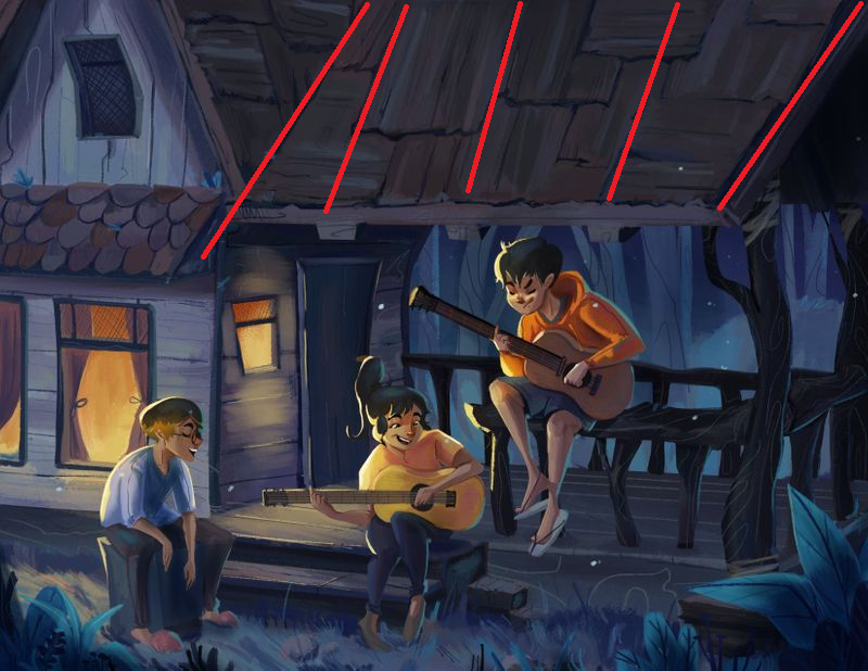
                                The perspective of the roof on the right hand side seems a bit off. Of course the roof "tiling" could be intentionally misaligned, but my gut reaction is that all the lines would converge on the same point, since roofs are usually straight. I've drawn the lines which I would expect to converge:

                                96f00da1-9292-492a-93bf-d67561e3c52c-image.png

                                Instagram: https://www.instagram.com/mortenchristiansenart/
                                DeviantArt: https://www.deviantart.com/mortenchristiansen

                                1 Reply Last reply Reply Quote 1
                                • Morten Christiansen
                                  Morten Christiansen last edited by

                                  I realize that your style may not require super realistic perspective, it just jumped out at me.

                                  Instagram: https://www.instagram.com/mortenchristiansenart/
                                  DeviantArt: https://www.deviantart.com/mortenchristiansen

                                  Manuel Mal 1 Reply Last reply Reply Quote 1
                                  • Manuel Mal
                                    Manuel Mal @Morten Christiansen last edited by

                                    @Morten-Christiansen hmm yeaa. thanks for pointing that out man, really appreciate it

                                    1 Reply Last reply Reply Quote 0
                                    • First post
                                      Last post