Feedback wanted! Children's book illustration
-
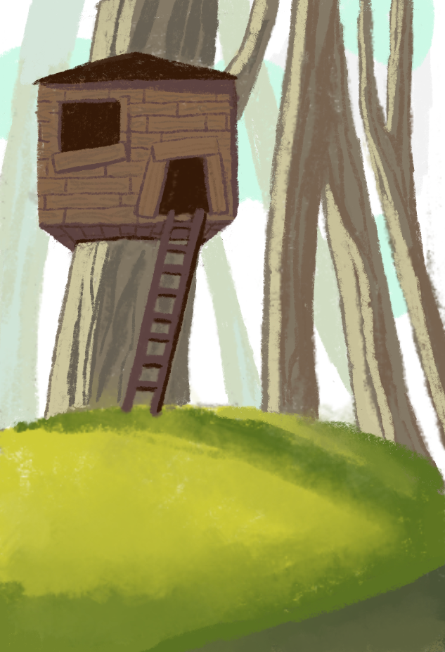
Hey guys I'm starting a new project with a squirrel and I was wondering if you guys could give me some feedback on my first image I made.
Is this too rough? Should I sharpen it more? What about the atmosphere? Does it feel likeable and safe?
-
@evelyn-schepens I think the colors are friendly and I like the softness of the texture in the grass and tree trunks. I feel that the house might look a little lonely or abandoned because it is completely dark and empty. Is this the squirrel's house? Maybe a little something in a window might make it look more welcoming, like a curtain, flowerpot, or a little light shining through the house from an unseen window on one of the sides. I like the atmosphere that you created by varying the saturation and brightness around the trees.
-
@evelyn-schepens i would agree with @jenn
at the first sight it looked abandoned and i guess you could easily fix this.Maybe do a quik search for tree houses illustration, get an idea of how to breath life into it.
While you have some good lightning on the bottom (and beautiful green colors) i miss it a little bit in the upper part. The trees look all the same and there is just these two layers of trees without real shadows it looks plane.
actually when i saw it, it reminded me of a picture i saw, it feels not so safe though...
-
@evelyn-schepens Good start, and good thoughts from the others. I don't know if this is the kind of feedback you were looking for but when I saw this I felt like the ladder was going to slip at any moment. Maybe it's just how my eyes are seeing it? Good luck, look forward to seeing more.
-
Right now I would focus on creating a balanced composition with placement and shape language. Try to keep in mind the rule of 3rds and 5ths. The grass is taking up a lot more space than it needs to. Bring the grass down and the trees will look bigger and help create a bigger sense of scale for the forest.
Another way to push the composition is using the small, medium, huge rule. Have some tiny things like rocks and bugs, medium shapes like bushes, and the trees and the treehouse could be the biggest. At the moment a lot of what we are seeing is roughly the same size.
I think the treehouse could be much larger in relation to the tree because right now it feels a little too close to being the same width as the tree. Creating greater shape contrast can really help guide the eye through an illustration.
Hope this helps! -
Hi Evelyn,
I think it looks really nice but somehow I feel that the treehouse is too far.
It seems to me that there is too much green in front of it.