Riley... a mess
-
I agree with @AngelinaKizz its really great! I love the concept and although it’s a bit cluttered, it totally works for this prompt so, good job, it’s definitely past the “that’s nice” area.
-
@jeremiahbrown This is a beautiful image! Busy, but that's by design. I think you could play with the lighting to help you put into focus what's important, and that would also make the illustration feel a bit more "wow". With a solid base like this, it doesn't take much to take this to the next level
") It's all in the small details! Like I demonstrated adding a little spattering of dust in the light to give a quiet magical effect.
It's all in the small details! Like I demonstrated adding a little spattering of dust in the light to give a quiet magical effect.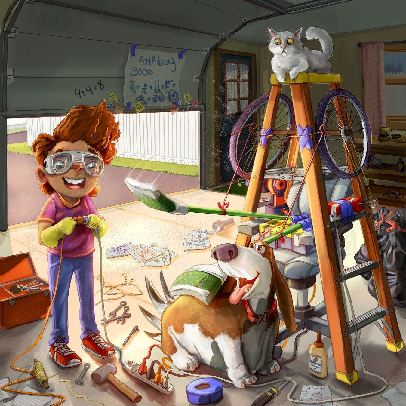
vanessastoilova.com
instagram.com/vanessa.stoilova/Check out my Youtube channel for tips on how to start your career in illustration! www.youtube.com/c/ArtBusinesswithNess
-
@jeremiahbrown ok, I’m gonna get super nitpicky after starring at it for a while
#1. The extension cords are all very well defined, except for over the screwdriver. Where it crosses it looks flat to me it could use a shadow or a defined edge to separate it from being one with the driver if that makes sense.
#2. The wheel on the chair feels a little out of place to me, I get why it’s there, but maybe it’s the perspective on it. Maybe it’s how it sits right up against the pup. Maybe it’s too dark that it’s drawing too much attention to it.
#3. I absolutely adore the cat and his worried expression, but I find that the top of his head gets a little lost in the ceiling of the garage. Could you take either the ceiling or the just a bit darker? Or turn the cat into a blonde/ginger?
-
@nessillustration oooh yesss, I love the dust, and the lighting adjustments.
-
Great work! So much detail..the sense of light change on the back of the space is very subtle.
Take a look at all of the feet, the kid, the dog, the ladder...they are all on the same plane that runs parallel to the bottom of the image. This can create a very static composition, sometimes it feels like just a presentation of the elements. You have such great depth with your light and rendering, you might think about tweaking the composition (I know it's late in the game for that). Also, your horizon line is about the level of an average standing observer. By making the horizon a little less expected the image can gain some unexpected interest.
That dog is fantastic!
-
@jeremiahbrown Technically and rendering-wise, this looks excellent! The thing that could take this piece over the top for me is if you clarified the concept, and maybe the focus. Even though the garage is a mess, I should know where to look first, and 2nd and 3rd... and I should understand what's happening. I look first at Riley, then the dog, then the cat, the ladder, then the brooms, then the blueprint on the garage door, and then I'm stuck wondering what Riley's cool invention is meant to do. Is that white paint on the brooms? Perhaps I'm just slow in understanding the concept and you need to hit me over the head a bit harder:) to figure it out? Is it a petting machine? If so, maybe you can omit the white edges of the brooms and replace the broom ends with soft stuff, like feathers or pillows or the dogs favorite soft toys? Also, I'm a bit nervous about the electrical cords near the dog's feet. Maybe he could be wearing rubber boots?
-
Excellent work.
-
@NessIllustration Thank you so much for taking the time to do that great draw over, it's a great guide to get me on the right track. I think the lighting you suggest unifies it more which is where my greatest struggle was.
@ThomCharles after reading your comment and looking at my image I just couldn't help but say out loud, "Holy cow, I can't believe I didn't see that!" I'm going to have to address that because I can't unsee it, haha.
@AngelinaKizz Definitely going to implement those "nitpicky" things, it's important! Thank you.
@Johanna-Kim On the plus side, your progression through the image is almost exactly what I wanted your eyes to do. On the downside I was hoping it was clear that Riley was making an attaboy pat machine that would simulate a person patting a dog in the way people do when they say, "gooood boy" or "attaboy." I'll work on making that clearer and great point about the electrical cords.
@DoodleMick Thanks!
@Asyas_illos Thank you for the grade of passing the "that's nice" score It's difficult to get things to work together nicely
 -
@jeremiahbrown This way more than nice! I am sure it will get the portfolio sticker. There is so much detail, so many funny details to find and the dog is just a fantastic character.
-
@jeremiahbrown I think it was just me being slow to figure the concept out. But now that's you've confirmed my guess, it's crystal clear. Love this idea, and the dog's loving expression.
-
@nessillustration Love the dog! Cool concept!
-
This is great! So beautifully rendered. And I love the dog!! I think it's just a question of getting the focus right, at the moment everything is grabbing my attention because everything has the same level of detail and there's maybe not enough contrast? Darkening the background of the garage really helps. You could probably go quite dark in order to make Riley and the dog really stand out. Maybe even lightening the outside slightly? Anyway, I think it's great and I don't think you're far off. Definitely way past the "that's nice" level
-
Thanks for all of the kind words, I was seriously thinking about abandoning it but love all your suggestions. I implemented most of them but still have a little bit of tweaking to do. Thank y'all so much!
-
@jeremiahbrown I think you’ve nailed it! I love all of the changes you made.
-
@jeremiahbrown this is looking pretty great to me, you’ve already got some great feedback from others on what can take this to the next level. Personally what stands out to me is Riley. Maybe this is just preference because I haven’t see anyone else mention this but Riley sort of looks like an animal to me and it’s been pretty distracting. His nose looks like the nose of a cat or a dog and I kept feeling my attention brought back to that.
-
@jeremiahbrown very fun! I love rube goldberg machines!
-
@jeremiahbrown That's it!! I think you've got it! Awesome!
-
@griffin Thank you, I see what you mean. For some reason I love to illustrate weird noses in most of my images and it can be a bit off-putting. Usually, I am mostly blind to it... who nose why? Is this version more appealing?
-
@jeremiahbrown yeah, that totally fixes it!
-
@jeremiahbrown I actually feel it ages Riley, I preferred the first nose. I think unless there’s something technically wrong with it, you should stay true to your style. Your style makes you unique, and some will love and some will not, and that’s ok.