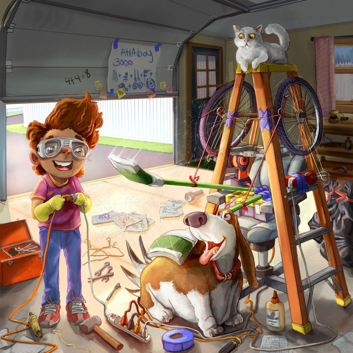
Society of Visual Storytelling

    SVSLearn Forums

    • Register
    • Login
    • Search
    • Recent
    • Tags
    • Popular
    • Users
    • Groups
    • Search

    Riley... a mess

    Artwork
    13
    26
    1185
    Loading More Posts
    • Oldest to Newest
    • Newest to Oldest
    • Most Votes
    Reply
    • Reply as topic
    Log in to reply
    This topic has been deleted. Only users with topic management privileges can see it.
    • Jeremiahbrown
      Jeremiahbrown last edited by

      Thanks for all of the kind words, I was seriously thinking about abandoning it but love all your suggestions. I implemented most of them but still have a little bit of tweaking to do. Thank y'all so much!
      Riley05.jpg

      Jeremiah Brown
      www.jeremiahbrownillustration.com
      https://www.instagram.com/jeremiah.brownillustration/

      AngelinaKizz ruth 2 Replies Last reply Reply Quote 1
      • AngelinaKizz
        AngelinaKizz @Jeremiahbrown last edited by

        @jeremiahbrown I think you’ve nailed it! I love all of the changes you made.

        www.evarartistry.com
        www.Instagram.com/evarartistry/

        1 Reply Last reply Reply Quote 1
        • Griffin McPherson
          Griffin McPherson @Jeremiahbrown last edited by

          @jeremiahbrown this is looking pretty great to me, you’ve already got some great feedback from others on what can take this to the next level. Personally what stands out to me is Riley. Maybe this is just preference because I haven’t see anyone else mention this but Riley sort of looks like an animal to me and it’s been pretty distracting. His nose looks like the nose of a cat or a dog and I kept feeling my attention brought back to that.

          Jeremiahbrown 1 Reply Last reply Reply Quote 1
          • chrisaakins
            chrisaakins @Jeremiahbrown last edited by

            @jeremiahbrown very fun! I love rube goldberg machines!

            Chris Akins
            www.chrisakinsart.com
            www.instagram.com/chrisakinsart/

            1 Reply Last reply Reply Quote 1
            • ruth
              ruth @Jeremiahbrown last edited by

              @jeremiahbrown That's it!! I think you've got it! Awesome!

              1 Reply Last reply Reply Quote 1
              • Jeremiahbrown
                Jeremiahbrown @Griffin McPherson last edited by

                @griffin Thank you, I see what you mean. For some reason I love to illustrate weird noses in most of my images and it can be a bit off-putting. Usually, I am mostly blind to it... who nose why? Is this version more appealing?
                Rileynonanimal.jpg

                Jeremiah Brown
                www.jeremiahbrownillustration.com
                https://www.instagram.com/jeremiah.brownillustration/

                Griffin McPherson AngelinaKizz 2 Replies Last reply Reply Quote 2
                • Griffin McPherson
                  Griffin McPherson @Jeremiahbrown last edited by

                  @jeremiahbrown yeah, that totally fixes it!

                  1 Reply Last reply Reply Quote 0
                  • AngelinaKizz
                    AngelinaKizz @Jeremiahbrown last edited by

                    @jeremiahbrown I actually feel it ages Riley, I preferred the first nose. I think unless there’s something technically wrong with it, you should stay true to your style. Your style makes you unique, and some will love and some will not, and that’s ok.

                    www.evarartistry.com
                    www.Instagram.com/evarartistry/

                    Jeremiahbrown 1 Reply Last reply Reply Quote 2
                    • Jeremiahbrown
                      Jeremiahbrown @AngelinaKizz last edited by

                      @angelinakizz Aww, thanks! Good avice

                      Jeremiah Brown
                      www.jeremiahbrownillustration.com
                      https://www.instagram.com/jeremiah.brownillustration/

                      1 Reply Last reply Reply Quote 0
                      • chrisaakins
                        chrisaakins last edited by

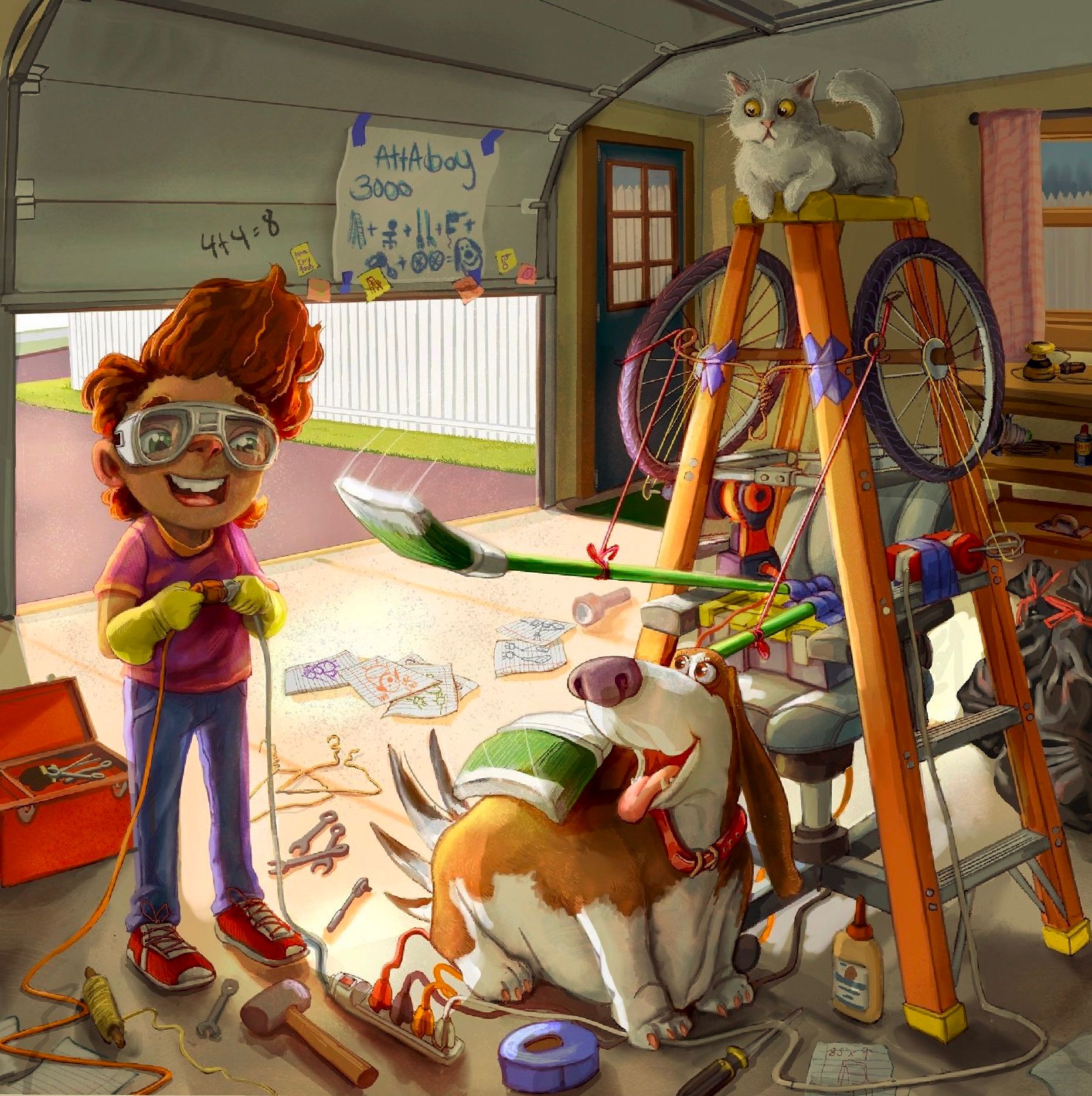
                        @Jeremiahbrown This is looking so good. I wonder if you should increase the contrast between the dog and the stuff around it. When I was looking at it today I immediately noticed the cat but it took me a minute to see the dog. I think the whole thing could benefit from a multiply layer of shadows to increase contrast and guide the eye.
                        I did a quick draw over to show what I mean.
                        1D99D561-5D12-482E-8946-0A7B6809C23A.jpeg

                        Chris Akins
                        www.chrisakinsart.com
                        www.instagram.com/chrisakinsart/

                        F 1 Reply Last reply Reply Quote 2
                        • F
                          Frogpunzel @chrisaakins last edited by

                          @chrisaakins That really does help guide the eye to the dog. @Jeremiahbrown This is great! However, I must admit that without reading the poster on the garage door I first thought it was a cat smacker, and that's why the dog was so happy...😅 Putting more shadow on the cat fixes that for me and I know the focus is on the dog, so the gadget is for the dog.

                          Jeremiahbrown 1 Reply Last reply Reply Quote 1
                          • Jeremiahbrown
                            Jeremiahbrown @Frogpunzel last edited by

                            @chrisaakins I think that looks much better! Thanks
                            @frogpunzel Hahaha! The cat smacker is a fun idea 😋
                            I'll keep tinkering around with it ☺

                            Jeremiah Brown
                            www.jeremiahbrownillustration.com
                            https://www.instagram.com/jeremiah.brownillustration/

                            1 Reply Last reply Reply Quote 1
                            • First post
                              Last post