Society of Visual Storytelling

    SVSLearn Forums

    • Register
    • Login
    • Search
    • Recent
    • Tags
    • Popular
    • Users
    • Groups
    • Search

    Treehouse feedback

    Contest
    7
    12
    718
    Loading More Posts
    • Oldest to Newest
    • Newest to Oldest
    • Most Votes
    Reply
    • Reply as topic
    Log in to reply
    This topic has been deleted. Only users with topic management privileges can see it.
    • Asyas_illos
      Asyas_illos @Griffin McPherson last edited by

      @Griffin hey Griffin I think this looks great there are just a few things that I would tweak that would help the overall silhouette, but that’s just me. You can take it or leave like I said it looks great already!
      37566E27-507D-424B-94CD-9CDFF4CA2D87.jpeg

      Asyasewardillos@gmail.com
      www.Instagram.com/asyas_illos/
      https://asyasewardillos.wixsite.com/mysite

      Griffin McPherson 1 Reply Last reply Reply Quote 1
      • Kristen Lango
        Kristen Lango @Griffin McPherson last edited by

        @Griffin This is awesome! It's more of a tree villiage isn't it? I think it's a neat concept, but I'd be a little concerned about all the houses kind of getting lost in the whole thing... maybe that's something that can fixed with values and rendering though 🤔

        https://www.kristenlango.com/
        https://www.instagram.com/kristendraws/

        Griffin McPherson 1 Reply Last reply Reply Quote 1
        • Griffin McPherson
          Griffin McPherson @Kristen Lango last edited by

          @Kristen-Lango I don’t mind them looking pretty meshed in with the tree but I think color and value will prevent the buildings from getting lost.

          1 Reply Last reply Reply Quote 1
          • Griffin McPherson
            Griffin McPherson @Asyas_illos last edited by

            @Asyas_illos that bit of variation at the top really helps the silhouette, thanks!

            Asyas_illos 1 Reply Last reply Reply Quote 0
            • jenn
              jenn @Griffin McPherson last edited by

              @Griffin I like how you included a power source

              studiojcd.com
              she/her/hers
              Insta/Twitter: @chengdesautels

              1 Reply Last reply Reply Quote 1
              • Asyas_illos
                Asyas_illos @Griffin McPherson last edited by

                @Griffin yah it’s not much but I think so too, can’t wait to see how it comes along!

                Asyasewardillos@gmail.com
                www.Instagram.com/asyas_illos/
                https://asyasewardillos.wixsite.com/mysite

                1 Reply Last reply Reply Quote 0
                • Heather Boyd
                  Heather Boyd @Griffin McPherson last edited by

                  @Griffin

                  I think this looks awesome! Though I feel it's a little heavy on the left. But the triangle composition is nice! Maybe if you pulled out the round house of the right a tad more, not sure.

                  🙂

                  Instagram: www.instagram.com/heatherboyd.illustration/
                  Website: https://heatherboydillustration.ca
                  Shop: https://www.inprnt.com/search/products?q=HeatherBoydIllustration
                  Ko-Fi: https://ko-fi.com/heatherboydillustration

                  Be blessed,

                  Griffin McPherson 1 Reply Last reply Reply Quote 1
                  • Griffin McPherson
                    Griffin McPherson @Heather Boyd last edited by

                    @Heather-Boyd lol, I wrote down this exact note to myself for adjustments to make so I’m glad you’ve confirmed that.

                    1 Reply Last reply Reply Quote 1
                    • Larue
                      Larue last edited by

                      @Griffin said in Treehouse feedback:
                      Very cool, looking forward to what you do with color.

                      1 Reply Last reply Reply Quote 0
                      • Griffin McPherson
                        Griffin McPherson last edited by

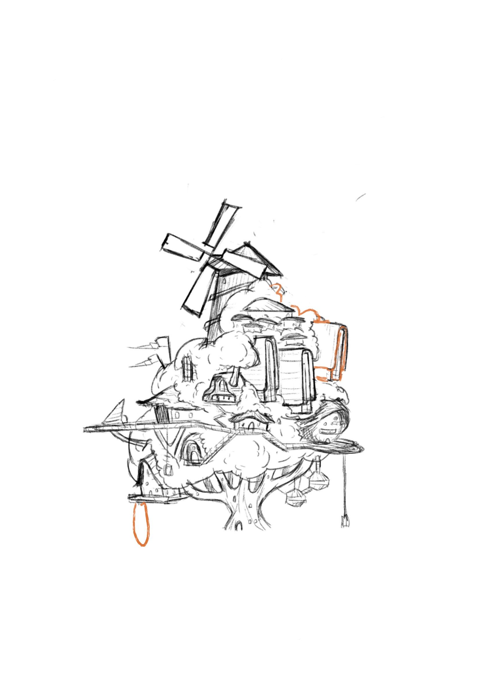
                        Update: here’s the more or less finished drawing. Just looking for any more feedback before I move onto color.

                        One concern I have is the building in the center. The perspective looks a bit awkward to me but before it was just a straight on perspective so maybe I’m just not used to it. Let me know what you think

                        BE1D41AC-9433-4833-B5B3-72694CA48866.jpeg

                        Patricia Dishmon 1 Reply Last reply Reply Quote 1
                        • Patricia Dishmon
                          Patricia Dishmon @Griffin McPherson last edited by

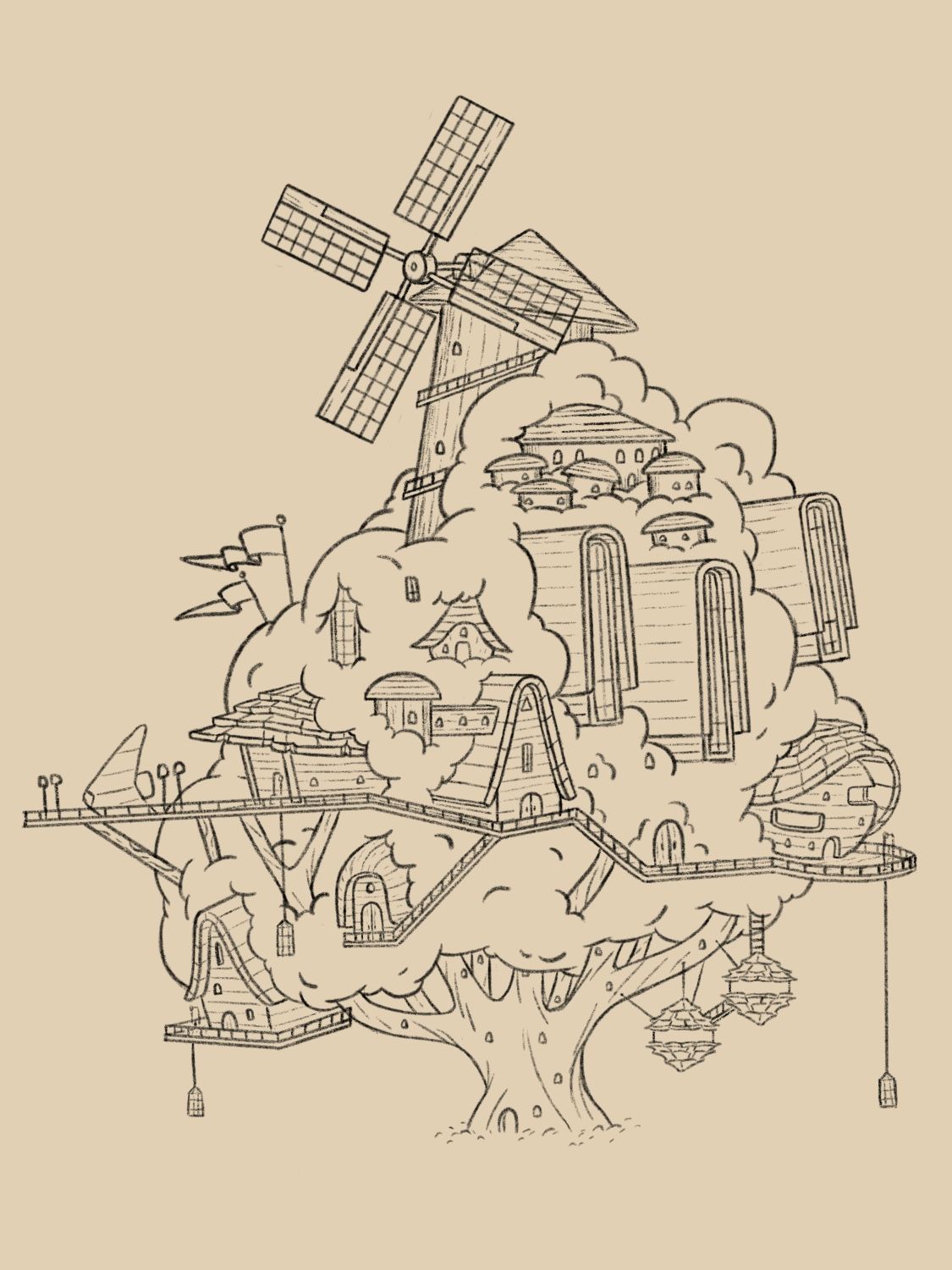
                          @Griffin The buildings being in perspective definitely gives the piece more life. I think overall the piece looks great! I cant wait to see it once it's done.
                          One thing I'm noticing is that the perspective isn't consistent throughout. While I believe it's fine to have certain elements be flat, it looks like those flat elements are a bit random. Maybe you're noticing that and it's throwing off your perception?

                          1 Reply Last reply Reply Quote 0
                          • First post
                            Last post