May Storm WIPs
-
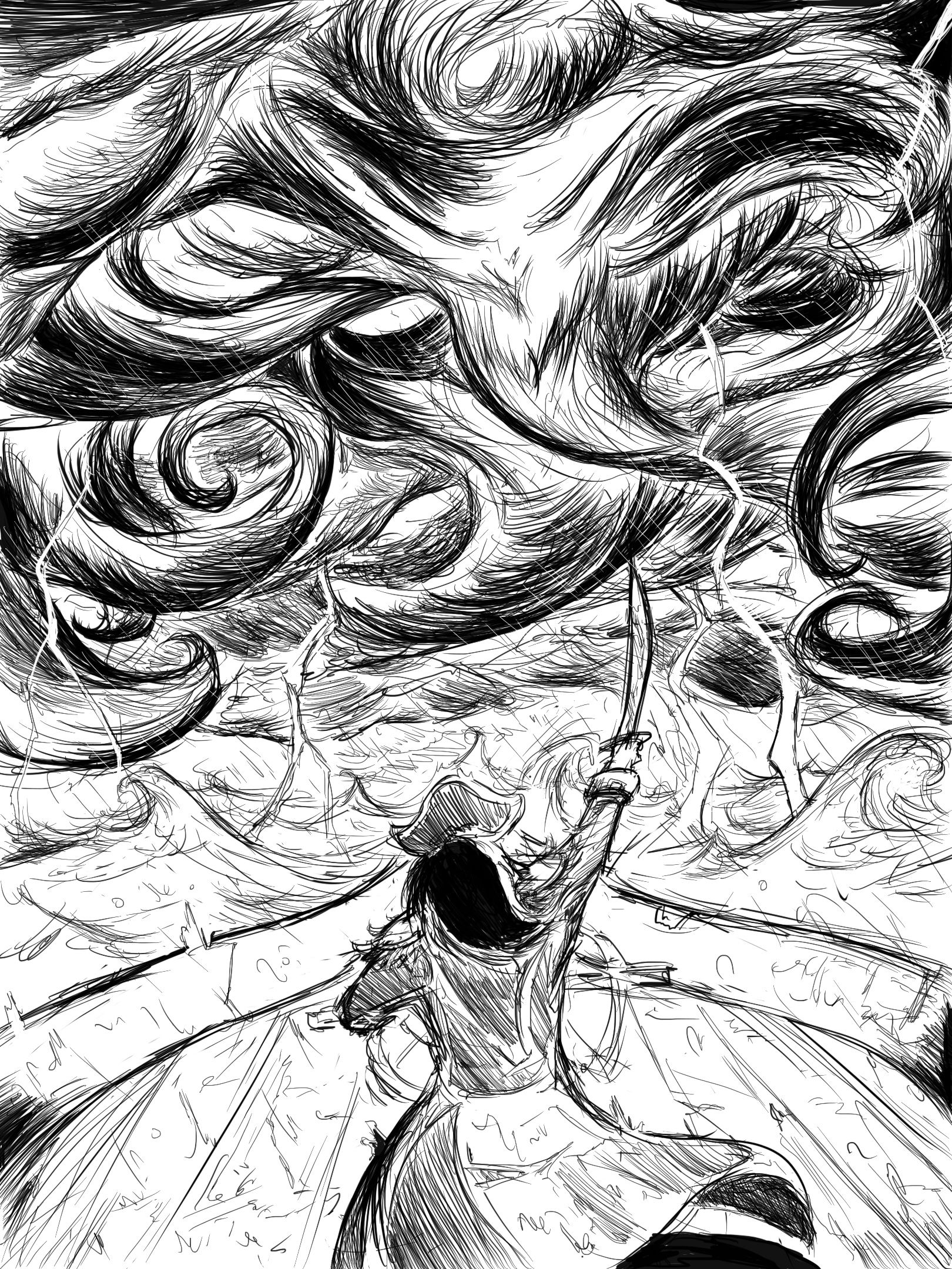
My May WIP. Was going for a comic book-ish style to anthropomorphise the storm, and will probably be in black n' white. Might work on something else if I get another idea.
-
@Eugene-Tan I love this! But I gotta say, it would look awesome in color!
-
@Eugene-Tan looks good but I don’t see the anthropomorphic-ness in the storm, I see two eyes maybe. Great concept though
-
@Eugene-Tan I think that you successfully created drama and movement with your lines and shapes. And my eye goes first to the pirate character, then the sword. Until it was mentioned, I have to admit that didn't catch the anthropomorphism of the clouds either. Perhaps if you did some selective spot color, or contrast to make the eyes glow (like darken the clouds toward the top so the value contrasts with the eyes), that could do it. Your lines are very dynamic and confident.
-
@Eugene-Tan Really like this idea. Suggest making the face in the storm more clear. Like others have mentioned, some color might help to clarify things and draw the viewer's eye to important parts. I can actually see this as a cool pencil drawing, or a more delicate ink drawing, with the transition into the face of the storm being more gradual and smooth. The lightning strikes are all pointed straight down. It might help to connect the figure to the storm if you have the lightning angled towards the figure, framing them. Since this image is so symmetrical, it almost reads like a book cover.
-
I love this concept – turning the clouds into a character is actually my second idea, too. I love your execution of it so far. Very intense and the pirate character and his ship are fun, too.
Right now, I’m also struggling to see the entire face. I think I can see the eyes, but I might not be right, since I only see eyes outside of the hurricane funnels.
-
Aight, what I'm getting here is I need to work on the anthropomorphic features of the storm. I can see how the current features in the clouds can get lost in the details, and the talons needed work.
Thanks for the feedback!