Society of Visual Storytelling

    SVSLearn Forums

    • Register
    • Login
    • Search
    • Recent
    • Tags
    • Popular
    • Users
    • Groups
    • Search

    SCBWI masthead feedback wanted

    Projects
    5
    21
    998
    Loading More Posts
    • Oldest to Newest
    • Newest to Oldest
    • Most Votes
    Reply
    • Reply as topic
    Log in to reply
    This topic has been deleted. Only users with topic management privileges can see it.
    • Asyas_illos
      Asyas_illos last edited by

      Hey guys been while since I’ve posted! Hope everyone is having a great summer😊 
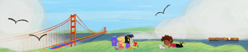
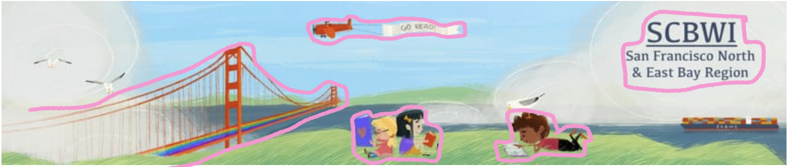
I’ve got about another week before entries are due for a new regional masthead for SCBWI here in northern ca, and I’d like some feedback on what I’ve got so far in terms of composition and color choices. The black birds are place holders for where’d I’d like to put some seagulls. The characters and cargo ship are on a separate layer, so are easily moved. Please let me know your thoughts and ideas on how this is turning out! Thanks!
      801CB260-55C3-4964-8B8A-9798F5B5524A.jpeg

      Asyasewardillos@gmail.com
      www.Instagram.com/asyas_illos/
      https://asyasewardillos.wixsite.com/mysite

      Johanna Kim 1 Reply Last reply Reply Quote 2
      • Johanna Kim
        Johanna Kim SVS OG @Asyas_illos last edited by

        @Asyas_illos Looking great! Would there be words somewhere?

        http://www.johannakim.com
        http://instagram.com/johannahkim/

        Asyas_illos 1 Reply Last reply Reply Quote 0
        • Asyas_illos
          Asyas_illos @Johanna Kim last edited by

          @Johanna-Kim yes I intentionally left a couple spaces open for them to place their text I was wondering if I should omit the seagulls on the left to leave another…

          Asyasewardillos@gmail.com
          www.Instagram.com/asyas_illos/
          https://asyasewardillos.wixsite.com/mysite

          Johanna Kim 1 Reply Last reply Reply Quote 0
          • Johanna Kim
            Johanna Kim SVS OG @Asyas_illos last edited by

            @Asyas_illos Hmm, it's hard to know for sure. It might help to place the text they usually put on their masthead (like a place holder). I find it easier to design a page or cover if I put place holders for the text at about the same size font they usually use. For the two seagulls on the left, maybe it would add depth to make one smaller?

            http://www.johannakim.com
            http://instagram.com/johannahkim/

            Asyas_illos 1 Reply Last reply Reply Quote 0
            • Asyas_illos
              Asyas_illos @Johanna Kim last edited by

              @Johanna-Kim here’s the original and a mark up of the ideas for the placement .2FA9419C-47AB-44C4-B16E-5E8C9D1EAE43.jpeg

              Asyasewardillos@gmail.com
              www.Instagram.com/asyas_illos/
              https://asyasewardillos.wixsite.com/mysite

              Johanna Kim 1 Reply Last reply Reply Quote 0
              • Asyas_illos
                Asyas_illos last edited by

                Should I limit the amount spaces to use for text to just one?

                Asyasewardillos@gmail.com
                www.Instagram.com/asyas_illos/
                https://asyasewardillos.wixsite.com/mysite

                1 Reply Last reply Reply Quote 0
                • Johanna Kim
                  Johanna Kim SVS OG @Asyas_illos last edited by

                  @Asyas_illos I think the text would fit perfectly in the top right corner in front of the cloud. Now in term of composition, I wonder if you could play with the composition a bit, vary scale and/or perspective, to create more of a dynamic composition? See how energetic the upper example is? Your eye moves around and around. Right now, yours feels very left-right, calm, except for the bridge and the seagulls. But maybe that's the feeling you're aiming for?

                  http://www.johannakim.com
                  http://instagram.com/johannahkim/

                  Asyas_illos 1 Reply Last reply Reply Quote 0
                  • Asyas_illos
                    Asyas_illos @Johanna Kim last edited by

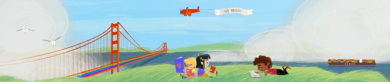
                    @Johanna-Kim yes I didn’t want it to feel too busy which in my opinion the top one (original) is. I would’ve like to add some color to the top somehow but didn’t want to do too many of things they used previously like the kite and hot air balloon. Maybe I could do like a red plane with a banner trailing behind it…

                    Asyasewardillos@gmail.com
                    www.Instagram.com/asyas_illos/
                    https://asyasewardillos.wixsite.com/mysite

                    1 Reply Last reply Reply Quote 1
                    • Asyas_illos
                      Asyas_illos last edited by Asyas_illos

                      7F90729F-B6F7-4E25-9EDC-A9B0A49290B4.jpeg
                      so here’s where I am currently, I know the birds kind of disappear into the fog but other than that does the composition look ok?

                      Asyasewardillos@gmail.com
                      www.Instagram.com/asyas_illos/
                      https://asyasewardillos.wixsite.com/mysite

                      1 Reply Last reply Reply Quote 0
                      • Asyas_illos
                        Asyas_illos last edited by Asyas_illos

                        Ok I think I’m going sit on this for a bit before submitting… but I am still interested in hearing any thoughts you might have on it!844C517C-77EB-4A1B-AE34-C0CA4B334751.jpeg

                        Asyasewardillos@gmail.com
                        www.Instagram.com/asyas_illos/
                        https://asyasewardillos.wixsite.com/mysite

                        ajillustrates Melissa_Bailey 2 Replies Last reply Reply Quote 2
                        • ajillustrates
                          ajillustrates @Asyas_illos last edited by

                          @Asyas_illos I have just one little note: maybe rase the grass tufts up a bit on the left hand side (specifically the second from the left). Right now, the one o bridge continues right into the grass, so you're losing some of your depth. Love the overall illustration.

                          https://ajillustrates.com
                          https://www.instagram.com/aj.illustrates/

                          Asyas_illos 1 Reply Last reply Reply Quote 0
                          • Melissa_Bailey
                            Melissa_Bailey @Asyas_illos last edited by Melissa_Bailey

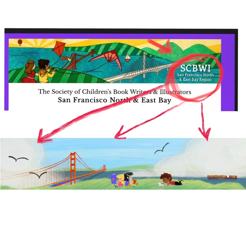
                            @Asyas_illos very cute! Love the colors, the reading, the engaging characters, and how you've worked in SF landmarks.

                            Here's something to think about: what is your focal point in this illustration? Do you want the landscape to dominate (which it's doing now), the focus on SF, or on the kids reading?

                            I took a screenshot and circled the areas where things are happening -- notice all that "dead" space? Instead of what's basically a cute landscape as a banner, why not showcase the kids, the heart of why SCBWI does what it does?
                            a1d237ee-171b-41de-ac12-2c5745eaf5a7-AS banner.png

                            Here's a drawover, just a suggestion of what you could do to increase the impact of this sweet banner:
                            c6b4c7c4-9fd3-4451-a783-71b1af3bd662-AS drawover.jpg

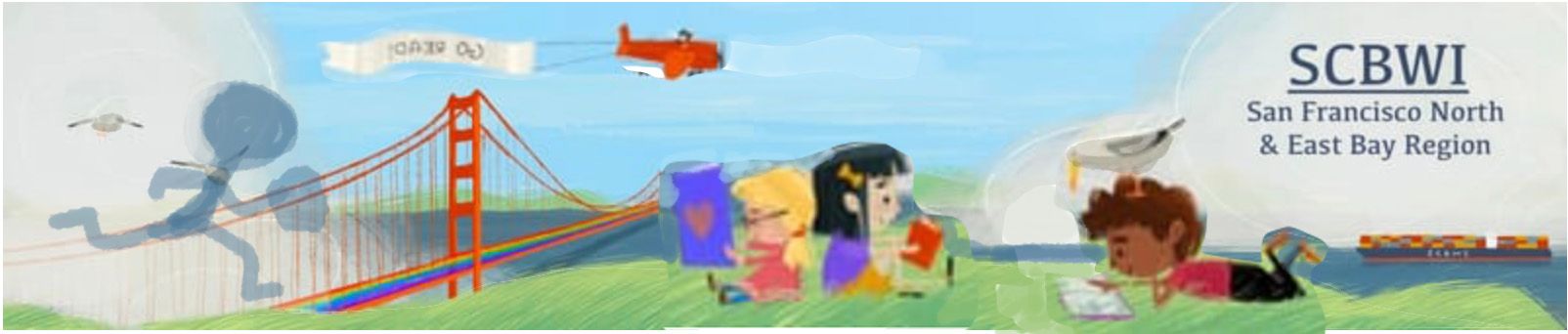
                            Here are suggestions based on the drawover:

                            • Increase the size of the characters, giving them more visual weight.

                            • Balance out the composition -- think about adding a kid or two running to join the group -- adds some life and interest to a static scene.

                            • Switch the direction of the plane, so it's flying toward the action, leading the eye to the characters and text. (Also consider increasing its size so that "go read" is legible.

                            • Play with your values even more. Darken the seagulls so they're more visible. You may also want to play with the values on the characters so that they stand out more from the midtown background.

                            • Consider shrinking the Golden Gate Bridge so that it's more in the background -- it will still be there, but the focus will be squarely on the kids and banner text.

                            Of course, these are only suggestions. This is YOUR art and you get to do what you want with it! ❤️

                            illustrator - author - smiley person
                            mbaileyart.com
                            instagram.com/mbaileyart/

                            Asyas_illos 1 Reply Last reply Reply Quote 2
                            • Asyas_illos
                              Asyas_illos @ajillustrates last edited by

                              @ajillustrates thank you for the feedback! yes things get a bit hazy in that corner don’t they? I will look into fixing that!

                              Asyasewardillos@gmail.com
                              www.Instagram.com/asyas_illos/
                              https://asyasewardillos.wixsite.com/mysite

                              1 Reply Last reply Reply Quote 0
                              • Asyas_illos
                                Asyas_illos @Melissa_Bailey last edited by

                                @Melissa_Bailey thank you for all the wonderful suggestions! I love the increased size of the characters! I had considered adding a fourth character on left but I wanted to keep it an odd number but seeing how the girls are somewhat grouped I guess I could try it? Thanks again!

                                Asyasewardillos@gmail.com
                                www.Instagram.com/asyas_illos/
                                https://asyasewardillos.wixsite.com/mysite

                                1 Reply Last reply Reply Quote 0
                                • Asyas_illos
                                  Asyas_illos last edited by Asyas_illos

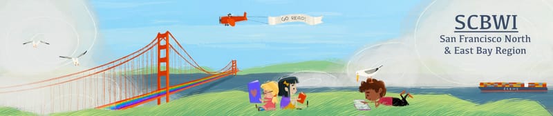
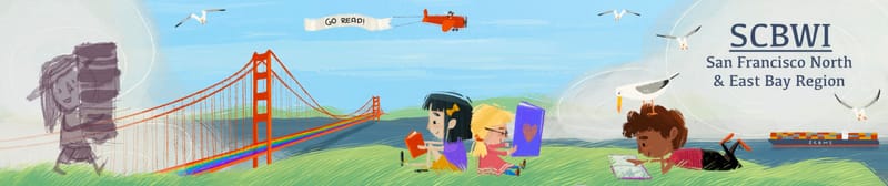
                                  Ok I took some of everyone’s awesome suggestions and reworked it a bit, what are your thoughts? I enlarged the characters, moved the plane, added some grass, also moved the gulls and added a few more, and I’m going to work on another character. Does this feel better compositionally or is it getting to busy?
                                  89013814-5790-4CED-801E-A7A89AB1B2D1.jpeg

                                  Asyasewardillos@gmail.com
                                  www.Instagram.com/asyas_illos/
                                  https://asyasewardillos.wixsite.com/mysite

                                  1 Reply Last reply Reply Quote 2
                                  • Melissa_Bailey
                                    Melissa_Bailey last edited by

                                    @Asyas_illos your so welcome! Regarding your changes and if it seems too busy, I don't think it will be too busy at all. Plus, if you want to give that feeling of community coming together to read, then a busier scene will do that.

                                    You might want raise the grass even more on the left side -- it almost looks like the new character is walking on the clouds or the bridge. Separating those even more will help the readability.

                                    Looking good! Looking forward to seeing the finished piece!

                                    illustrator - author - smiley person
                                    mbaileyart.com
                                    instagram.com/mbaileyart/

                                    Asyas_illos 1 Reply Last reply Reply Quote 0
                                    • Asyas_illos
                                      Asyas_illos @Melissa_Bailey last edited by

                                      @Melissa_Bailey haha I actually just did that! Here’s where it’s going…
                                      09DD55E6-3E6B-442A-947E-8512CCEC158D.jpeg

                                      Asyasewardillos@gmail.com
                                      www.Instagram.com/asyas_illos/
                                      https://asyasewardillos.wixsite.com/mysite

                                      jenn 1 Reply Last reply Reply Quote 1
                                      • jenn
                                        jenn @Asyas_illos last edited by

                                        @Asyas_illos I always love your cute characters! The overall look and feel of this are very welcoming and fun. I just have one small observation which is that the gull on the kid's head is lost in the cloud/fog a little, light-on-light. Perhaps the cloud/fog could go slightly darker behind the gull. Also I like how you added the kid on the left. If you consider the gull to be your '5th character' that would make it an odd number, haha. Or... you could say there are 3 groupings of characters.

                                        studiojcd.com
                                        she/her/hers
                                        Insta/Twitter: @chengdesautels

                                        1 Reply Last reply Reply Quote 0
                                        • Asyas_illos
                                          Asyas_illos last edited by

                                          @jenn Thank you! And thanks for the feedback! I lightened the fog a little hopefully that helps a bit.

                                          Asyasewardillos@gmail.com
                                          www.Instagram.com/asyas_illos/
                                          https://asyasewardillos.wixsite.com/mysite

                                          jenn 1 Reply Last reply Reply Quote 1
                                          • Asyas_illos
                                            Asyas_illos last edited by Asyas_illos

                                            Here’s the final! I have til the 10th to enter so I’ll let sit for another few days, still open to feedback! Thanks to those who gave super awesome feedback!
                                            F1881CB0-B9EE-427E-8D54-8ED25824A33C.jpeg

                                            Asyasewardillos@gmail.com
                                            www.Instagram.com/asyas_illos/
                                            https://asyasewardillos.wixsite.com/mysite

                                            1 Reply Last reply Reply Quote 1
                                            • First post
                                              Last post