Critique Arena Journal
-
I'm working on another piece for Rabbit Road Race, again based on Chinese mythology, though in this case the cultural reference should be more familiar globally, especially since it's shared by many other Asian cultures - it's the 12 animals of the zodiac, which includes a rabbit amongst them.
Although concept-wise I feel this risks elimination because it may not be rabbit-y enough to the judges, once again I thought it was a cool concept that I wanted to execute. It's also a chance for me to play with a different style. I'm going to try a flatter, textured style featuring traditional Chinese paper cut motifs. I'm also going to try something different this time - working over a value underpainting.
If anything I think it'll be a good portfolio piece as it's compositionally complex (featuring 10-12 stories in one picture, depending on how you count it) and will hopefully be stylistically interesting. There will eventually be story text weaved into the picture too.
Hope I manage to pull it off; in the meantime here are some WIPs:
- Rough sketch
- Cleaned-up line work
- Value underpainting
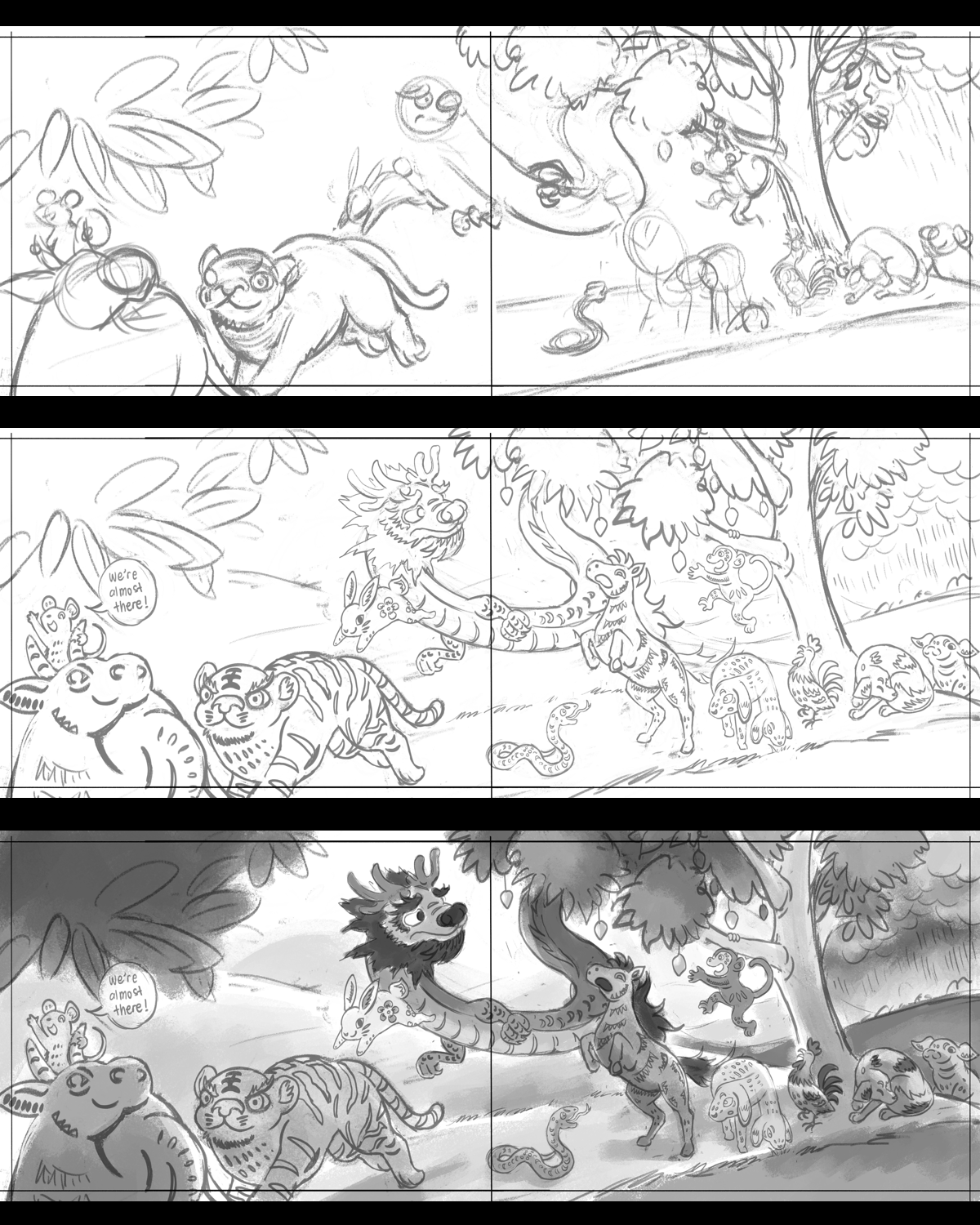
-
Initial colours followed by text + colour and composition adjustments to accommodate text. It was quite challenging trying to fit all that text in

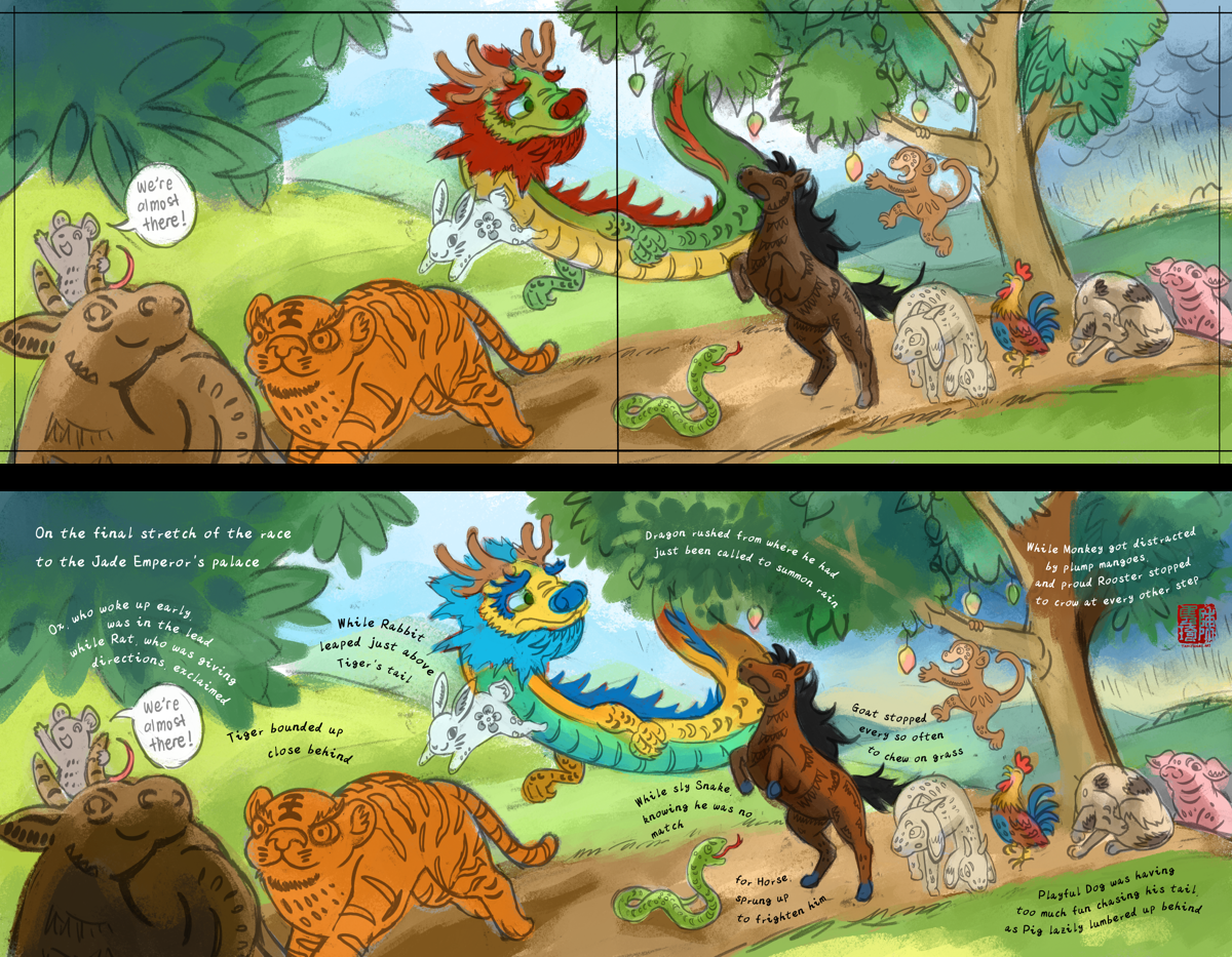
-
@JQ Looking amazing! But it seems to me that you have trouble to transition from your initial idea of black and white to color. Have you tried to put a color layer with white above your painting so you can check your values after adding the colors? I think you messed up a bit the values when you added the color, the black and white composition looks really strong and amazing to me, but it gets lost in the color version.
-
@Eliana-Bastidas Thank you! Yes I get what you mean, I think the contrast was lost because I darkened the animals especially relative to the foliage. To be honest doing the value underpainting didn't quite work out as planned as overall the colors of the animals turned out way lighter than I wanted, so I saturated and darkened them but didn't darken the foliage equally. I think I'm still used to working mostly in color and adjusting values in color directly.
No worries though, it's still WIP and an experimental style, I will continue to keep the values in mind as I work on it!
-
As I figure out how to effectively weave the Chinese papercut motifs in, I dug out some photos of my old papercuts. I have been doing these every Chinese New Year since 2020, which was the Year of the Rat and the start of a new cycle. If I can keep it up till 2032 I will have all 12 animals climbing along my wall

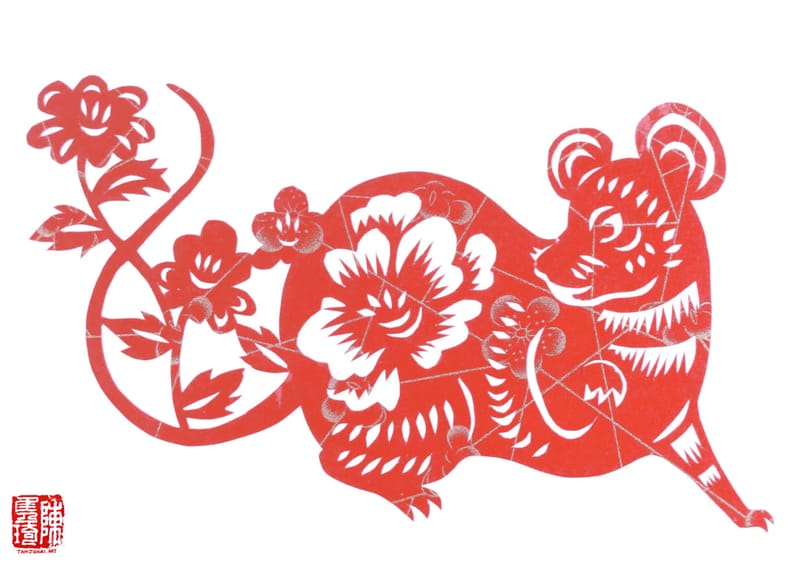
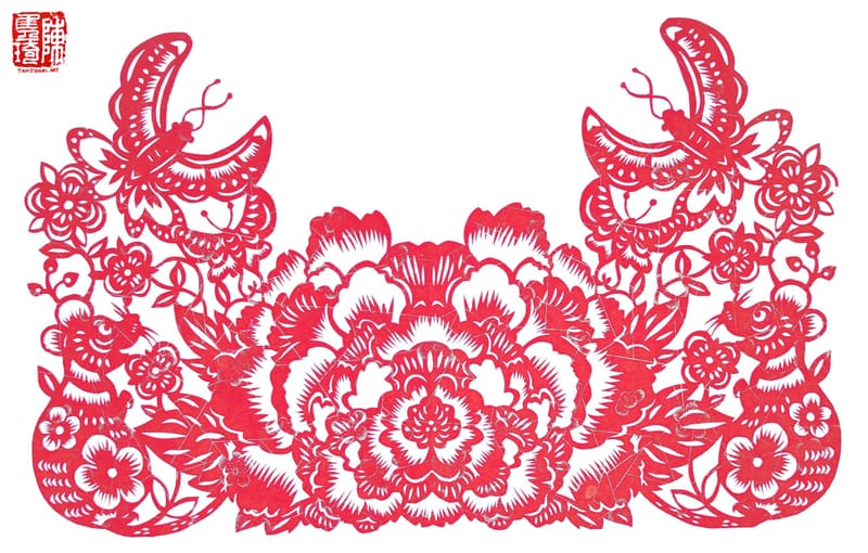
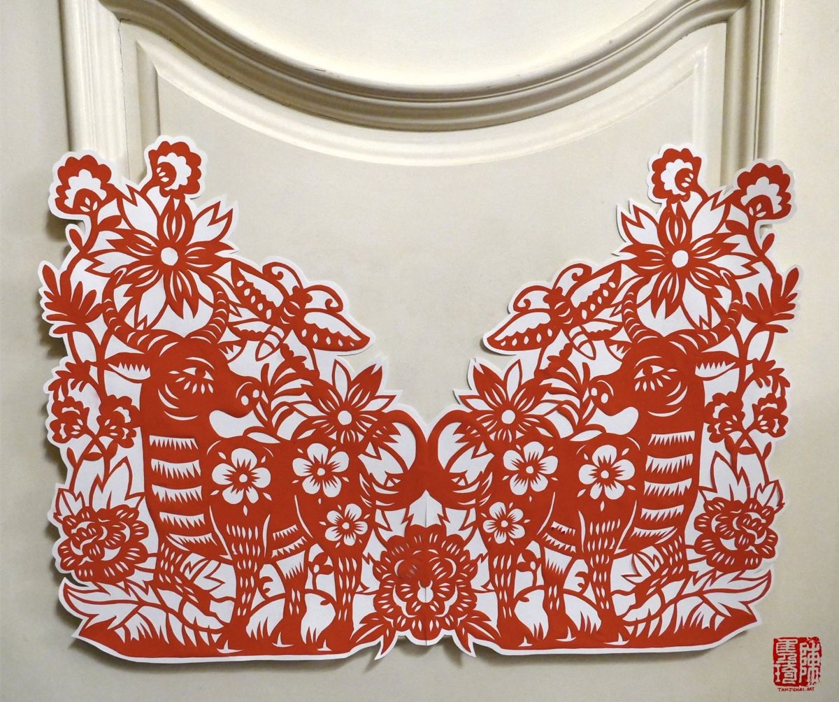
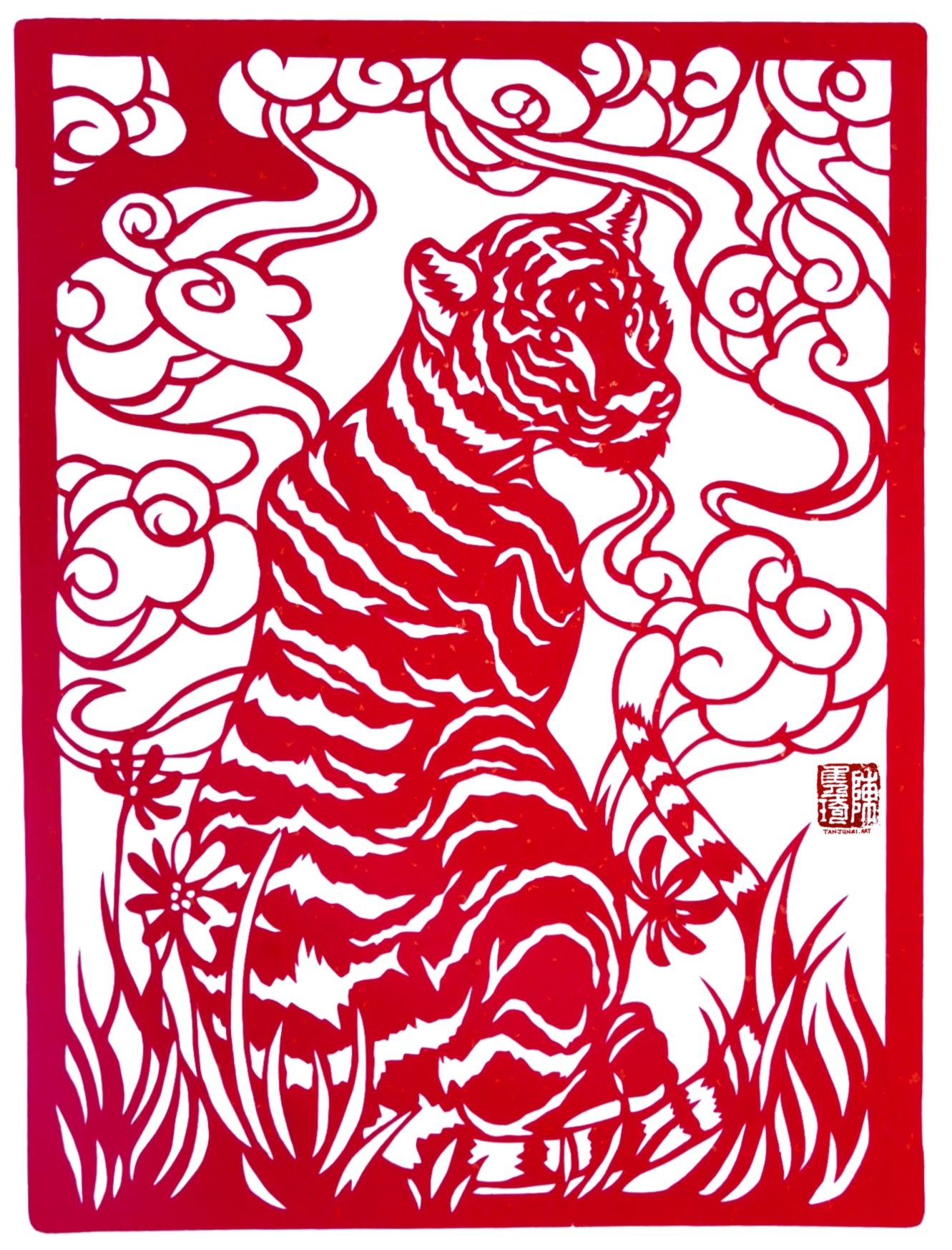
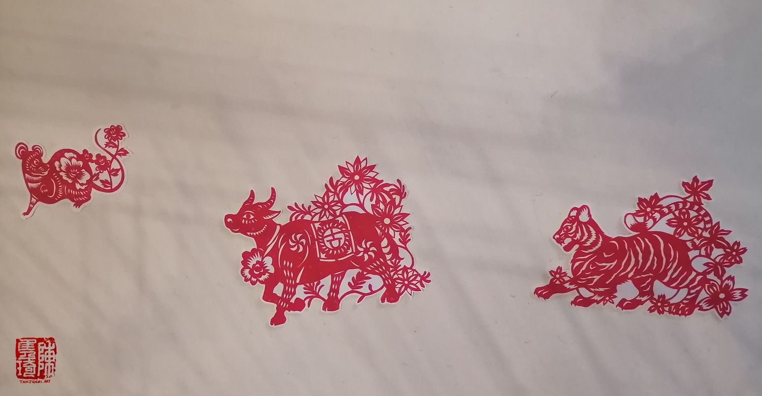
Still playing around with how to translate motifs in a negative-positive space aesthetic to one with multiple shades and colors
-
-
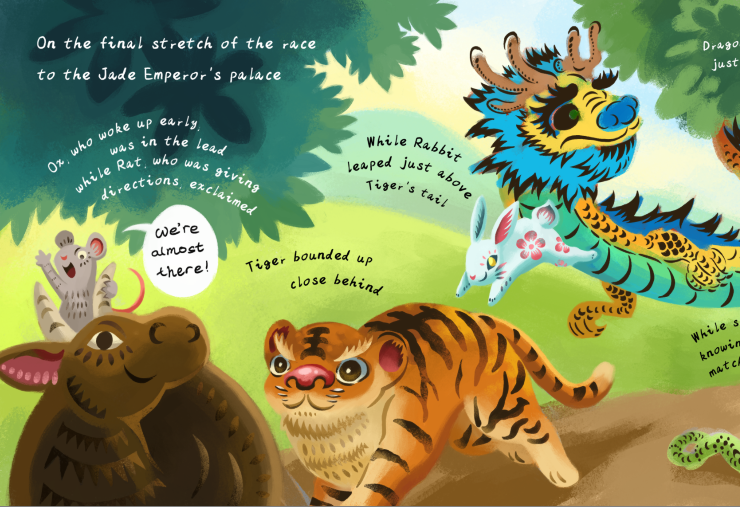
WIP after "cutting out" the motifs
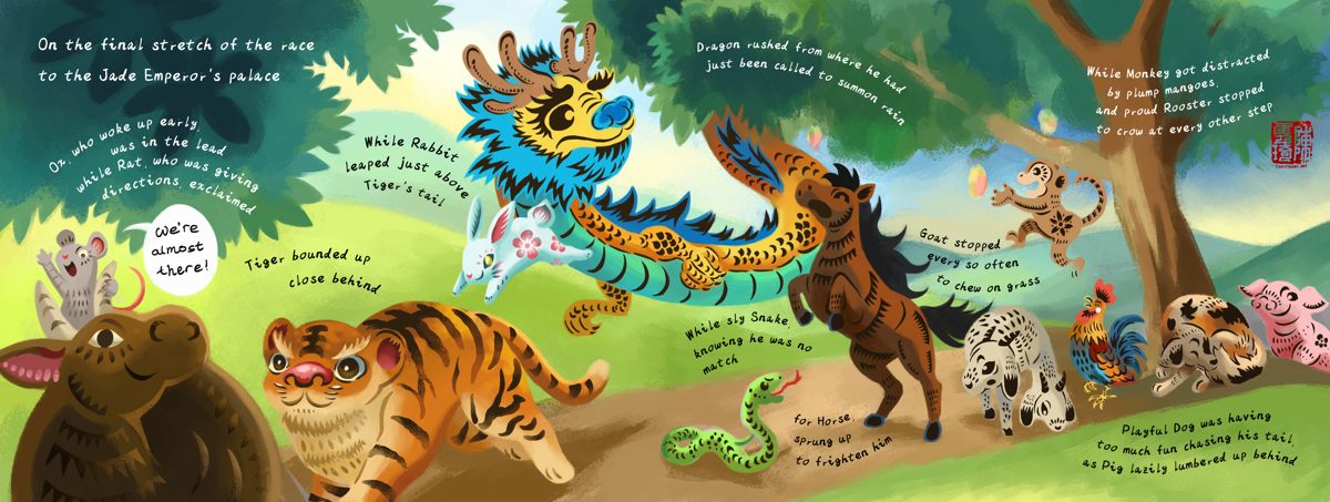
And the finished piece
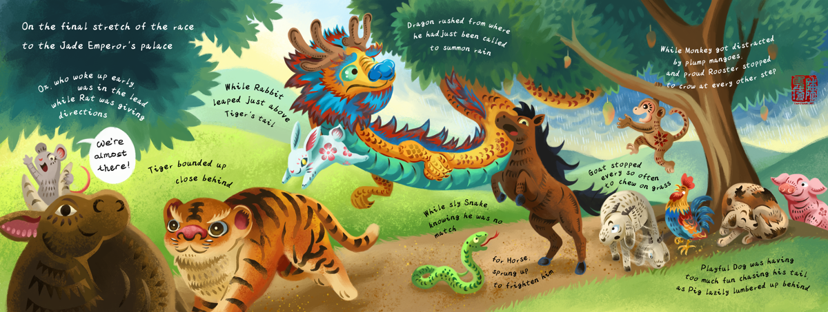
-
@JQ Wow, another finished contest piece! This one is so colourful and detailed. I can hear that Chinese zodiac song playing in my head, hahaha, kuai pao, kuai pao!!
I love your ideas and your rendering style -- and your super fast working speed! My goodness!! I'm barely going to be able to turn one piece in, haha!

-
@JQ it is so enjoyable seeing your process and all the ideas that you created for the contest. Your papercut skills are out of this world. I think the zodiac animal race idea is delightful, and I love the expressions on all of the animals.
-
@Meekipink Thanks for the compliments! And what is this zodiac song that I've never heard of?
 The accompanying video is funnily cute.
Re: the working speed, I wish it was like that all the time, but it's more like I I got lucky with this piece - I could visualize the concept and composition quite clearly at the start and got in a flow fairly easily, and even though the style was experimental it "clicked" readily after a while.
This was totally not the case for the first two pieces though; there were some points where I felt like I hit the wall or just wasn't in the mood to continue - I'm sure every artist knows that feeling. And sometimes I'm able to keep at it, but sometimes not. Being able to regularly enter a flow state is probably a skill in and of itself and I'm still struggling!
I hope you'll be able to find your flow with your current piece and your art, and keep at it even when you can't always do it

-
@jenn Thank you! ^^
-
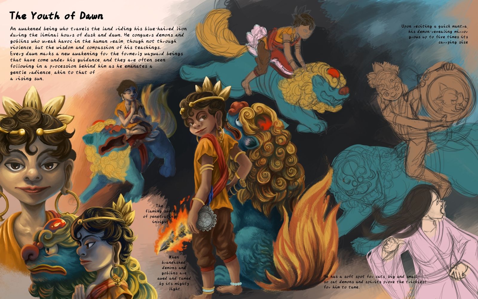
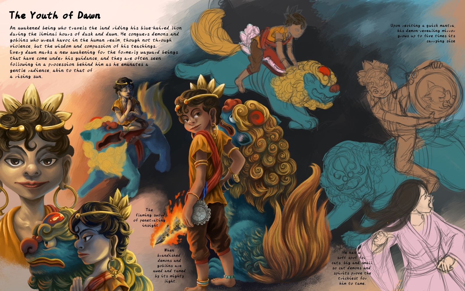
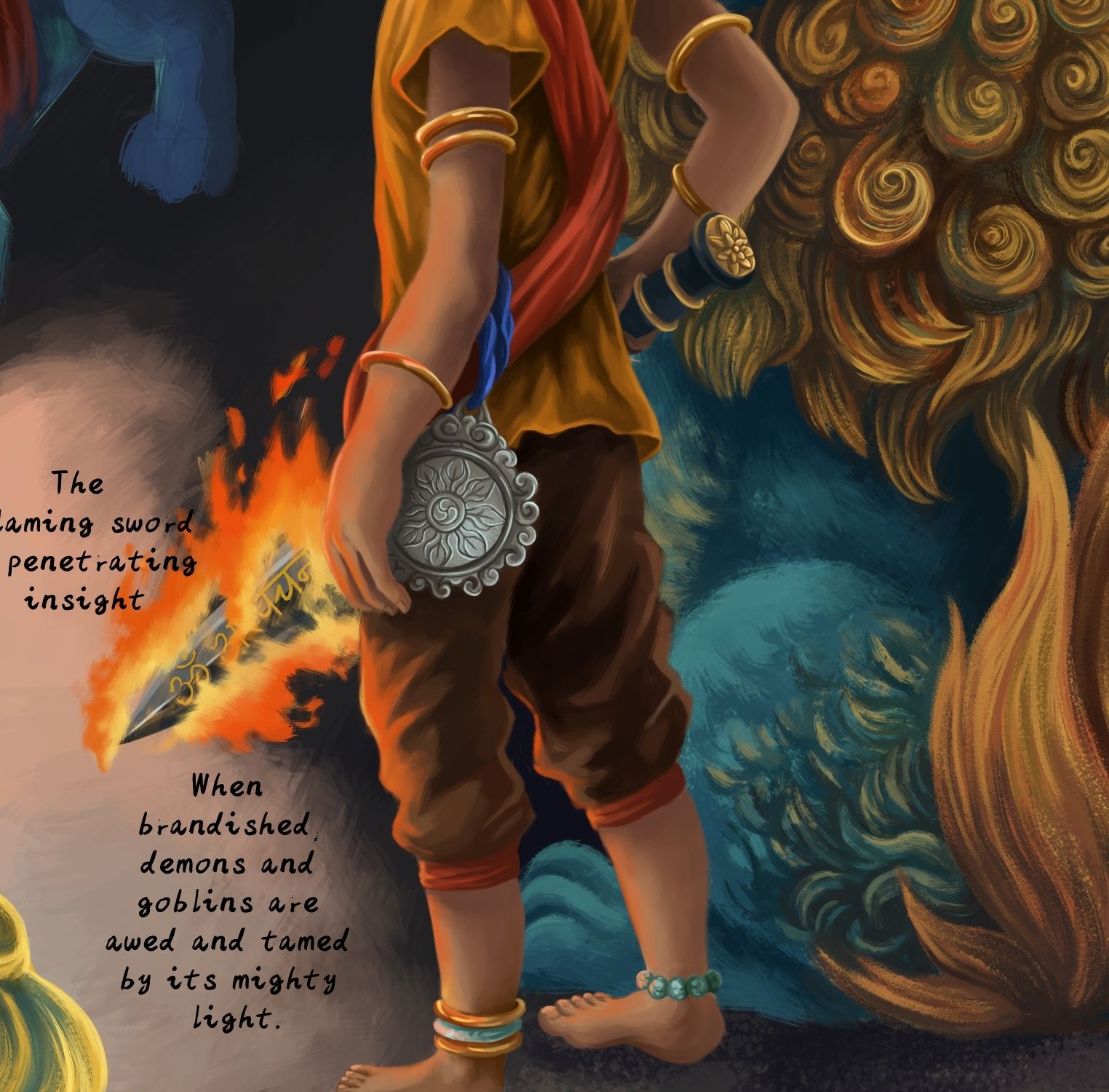
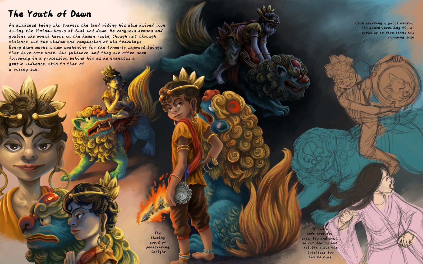
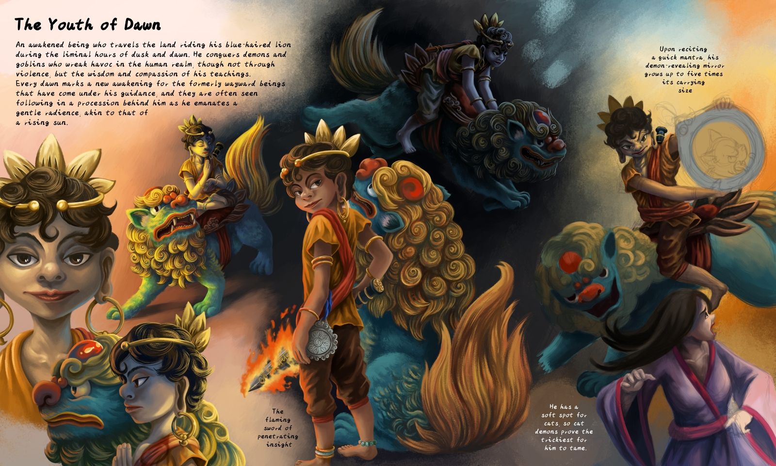
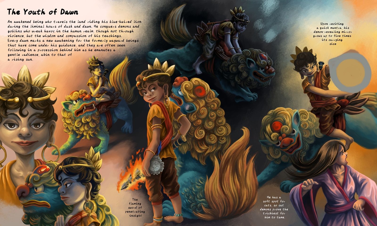
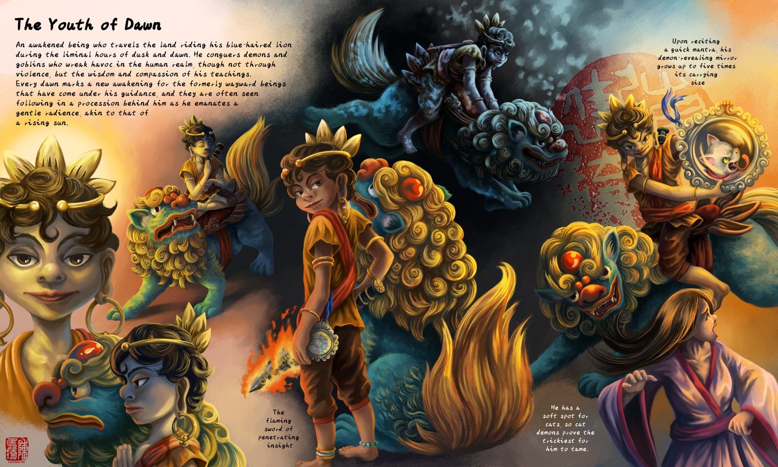
WIP for my superhero character sheet. I'm not much into the modern-day pop culture superhero genre. imho stories from fantasy and mythology are more interesting and fascinating to me, and as far as I'm concerned the gods and demons from mythology were the superhero OGs before the term "superhero" became a thing. They certainly check the box of having super-human powers (though whether they always use it to do "good" is another question).
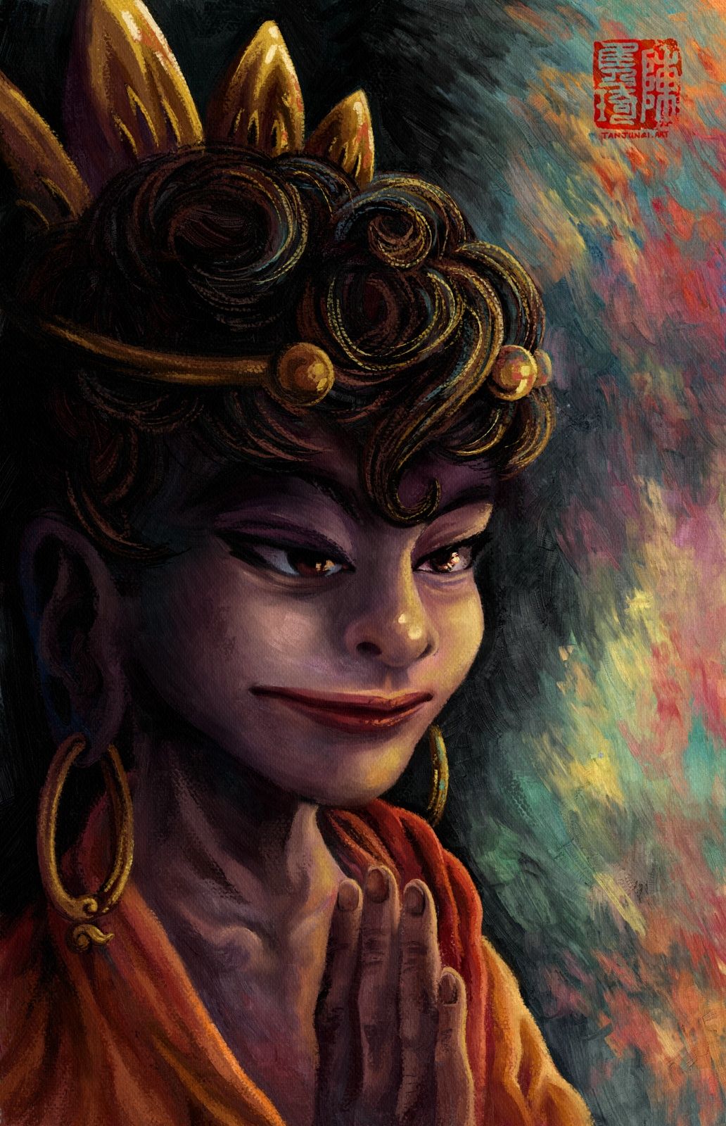
This character is inspired by bodhisattva Manjusri, one of the well-known bodhisattvas (awakened beings who hold off from attaining buddha-hood to fulfill their vow to deliver all beings from suffering) in various Buddhist traditions and one of the four great bodhisattvas in the Chinese one.
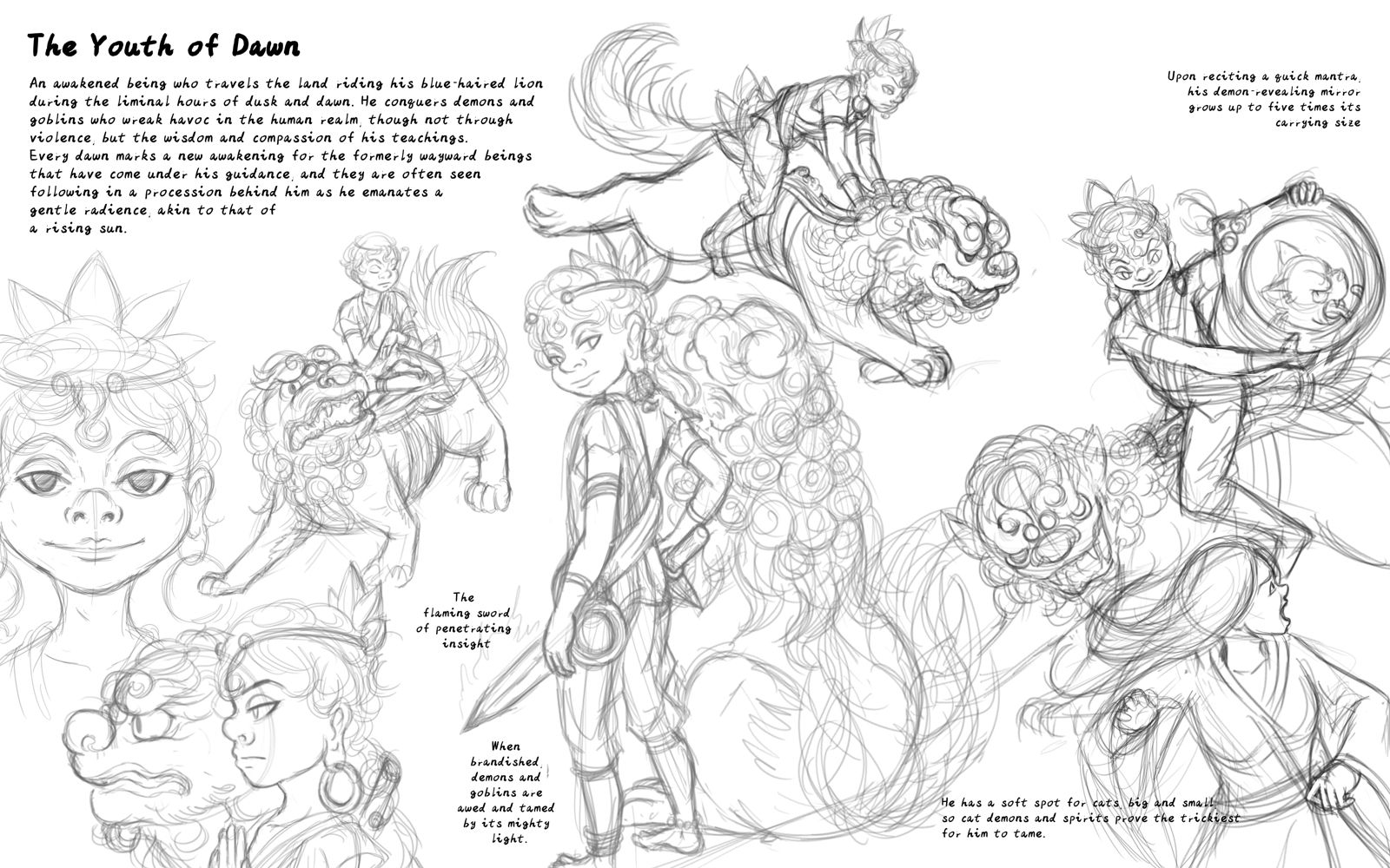
Rough initial sketches and text layout.
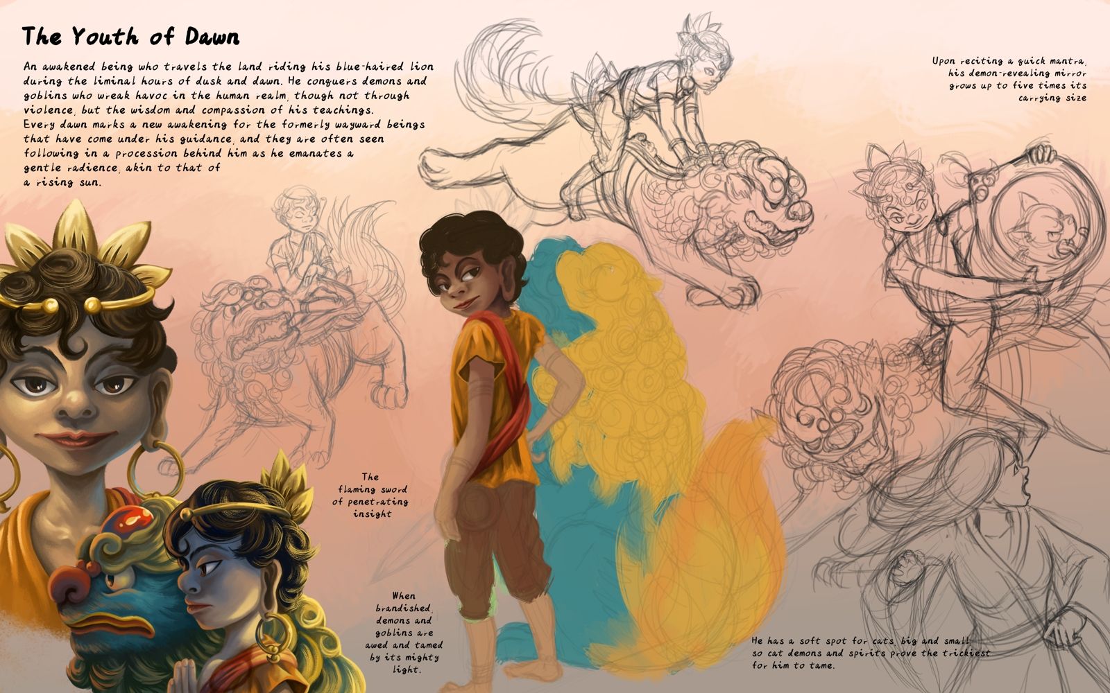
Initial colours and some finished rendering. Going for fantasy semi-realism.
-
-
@JQ Wow! Your artwork is spectacular!
-
@Maureen-Henry-Artist Thanks very much!

-
-
It would probably have been better if I had another day to look at this with fresh/non-tired eyes and do more touch-ups/value-tweaking, but I'm out of time and will have to call this done.
Overall I am a weird mixed of satisfied yet unsatisfied with this piece. I jumped into it not really thinking too much about the complexity, and was just happy to be able to paint in a different style after doing so much children's book-ish work recently. After that it proved to be a trial of patience rendering the details (though always satisfying when done!), and then not being quite happy with the fact that it did not turn out as "painterly" as I would have liked, and that I didn't manage to nail the right values and right amount of contrast at the start - kind of feel like I've abused overlay/dodge layers, and spent more time layering and tweaking values then I should have needed to working digitally. I did decide to challenge myself lighting-wise though (dawn-ish, dusk-ish, moonlight) and think it turned out decently.
I've practised starting photo study pieces with 3-value paintings first to think more in a painterly/sculpting way vs flatting a line drawing (eg. https://tanjunqi.art/portfolio/studies), but it's clearly going to take more study and practice before I figure out how to smoothly incorporate that into my process, especially for more complex pieces and when drawing from imagination.
-
Fresh eyes now make me really dislike the piece for being too flat and "digital", so I had to play around with Krita 5's wet impasto brush bundle. Should have tried it out sooner...
-
@JQ even more stunning after the update!
-
@ArtMelC Thank you! ^^