Personal projects feedback please:|
-
@Asyas_illos This is looking great!

-
@Nyrryl-Cadiz thanks

-
This post is deleted! -
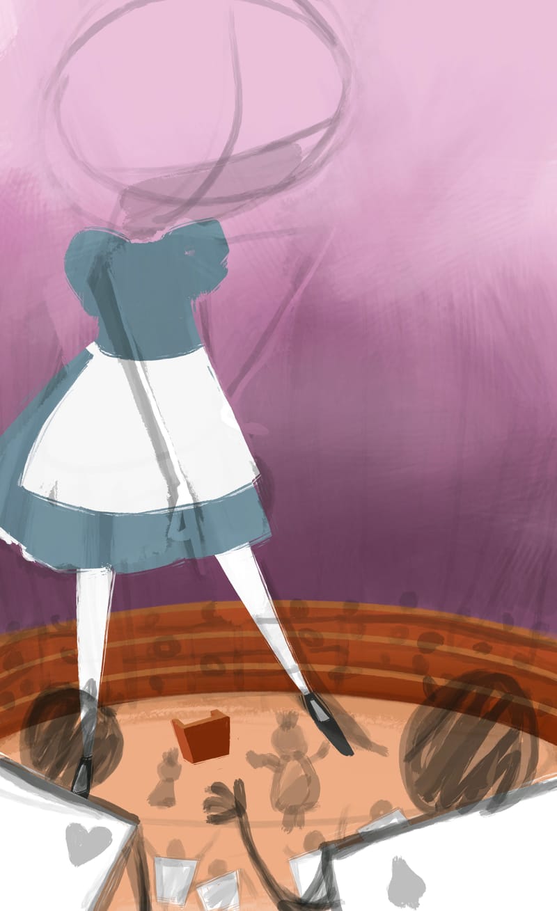
-
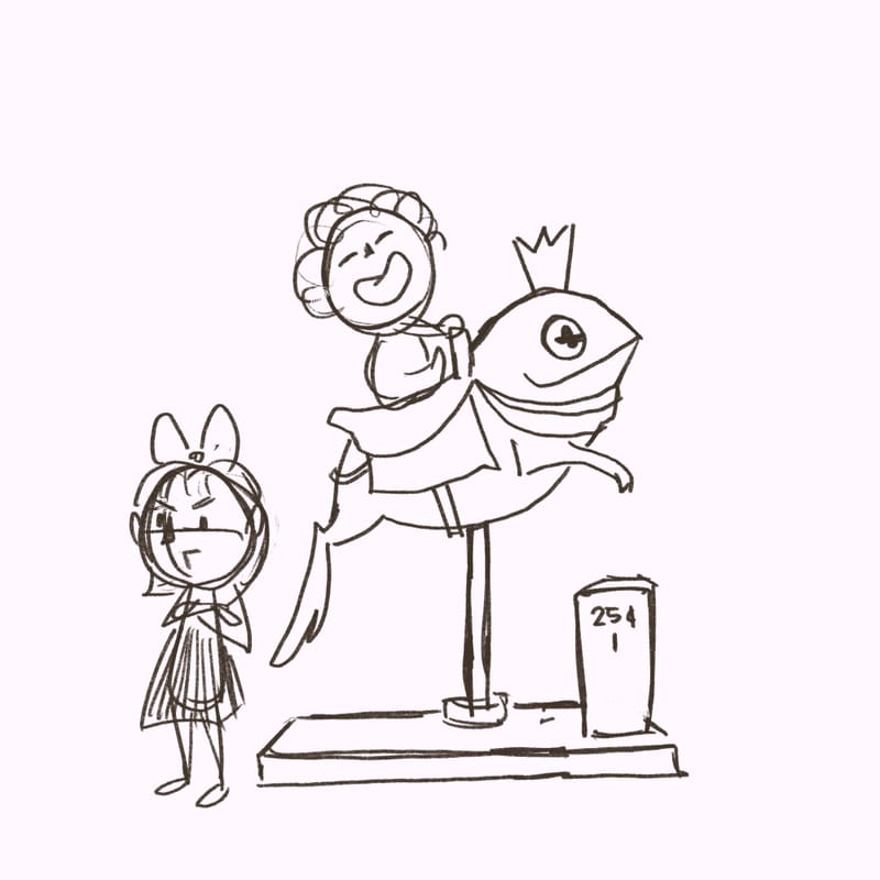
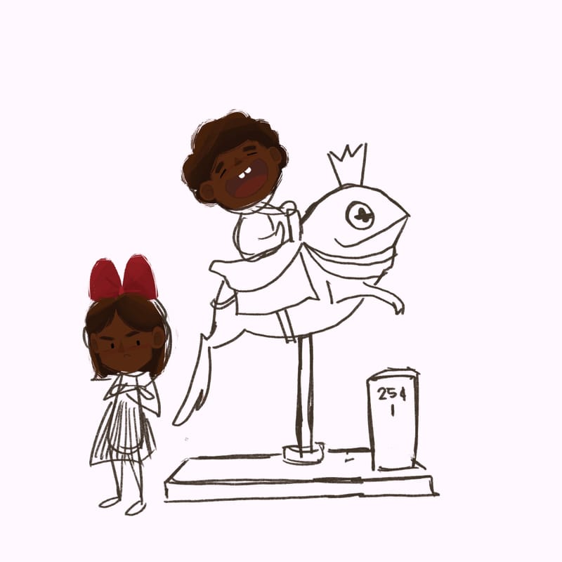
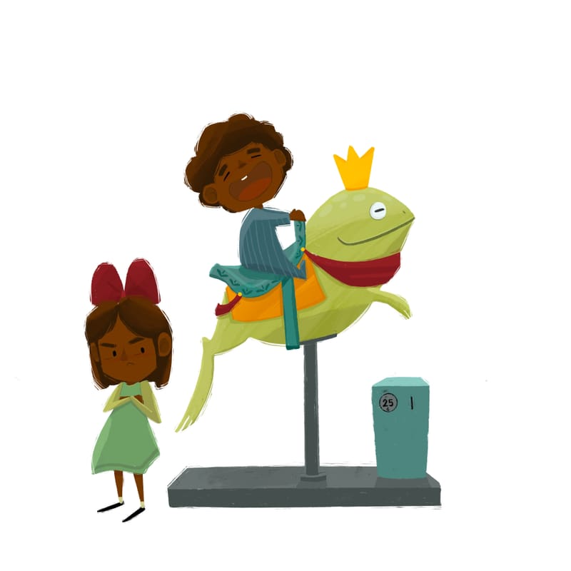
So i did away with the carousel and went with this instead. I need to do more spot illustrations I realized, for my portfolio… so here we are… again… lol
-
-
Ok finished with this one do You think it’s portfolio material?
-
This post is deleted! -
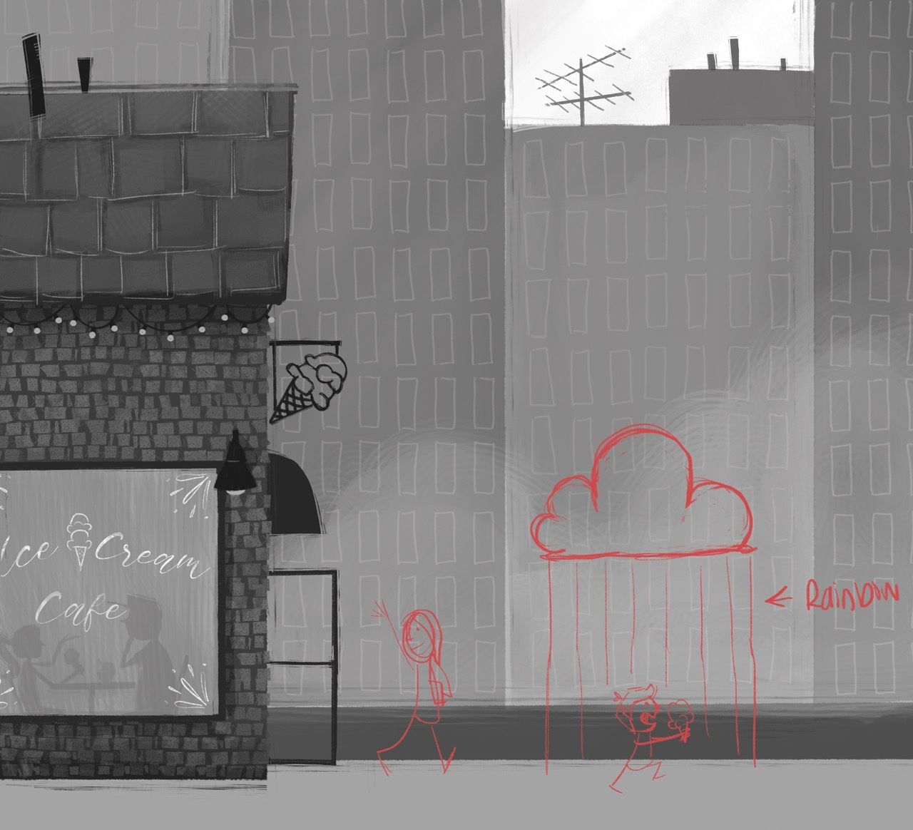
I was doing this piece for my portfolio but I read up on the upcoming critique arenas and thought I could amend my original concept a tiny bit to fit the prompt cloud. Does anything stand out as far as composition or story, etc.? I plan to add rain in the last steps.
-
@Asyas_illos I like the simplified buildings in the background. The main thing is that I am not sure of the concept. Why is there a cloud? Does he have a cloud/rain over him because of the ice cream? Was he angry but becoming happy because of the ice cream? If so, to me it doesn't read that way yet. I also see that you wrote rainbow off to the side, what story are you trying to tell with that?
-
@Kim-Rosenlof so my concept is that instead of a grumpy rain cloud it’s going to be a bright cloud with a rainbow shining upon him, the rain I mentioned earlier will be be everywhere except his happy little bubble, does that work? there will be color only in that area.
-
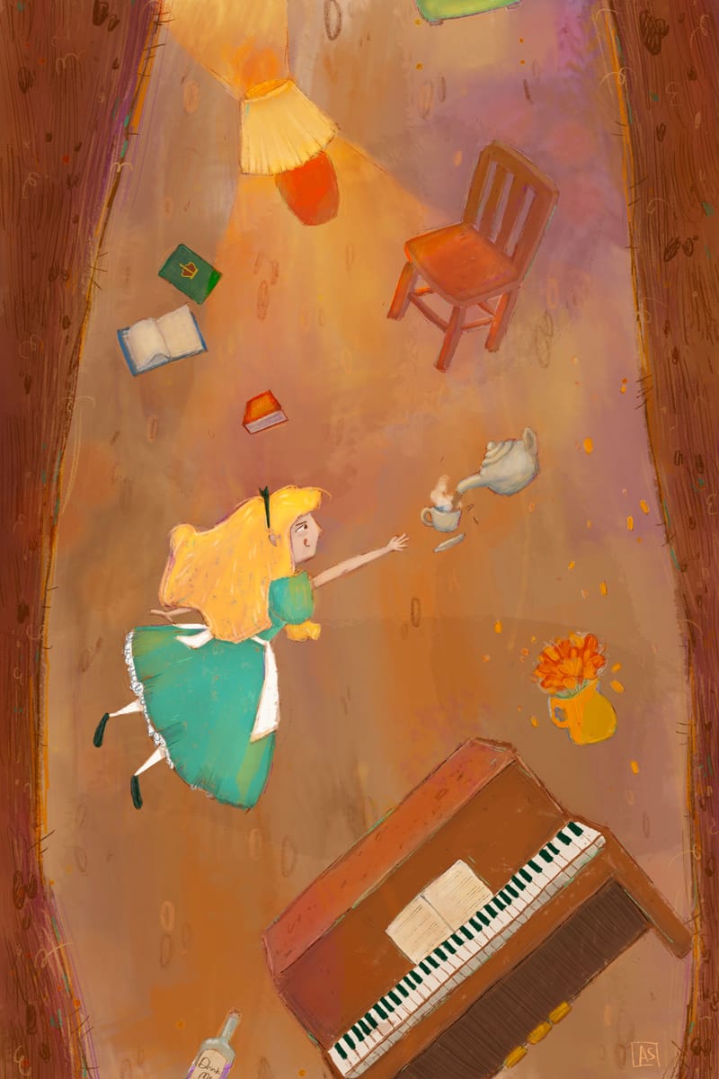
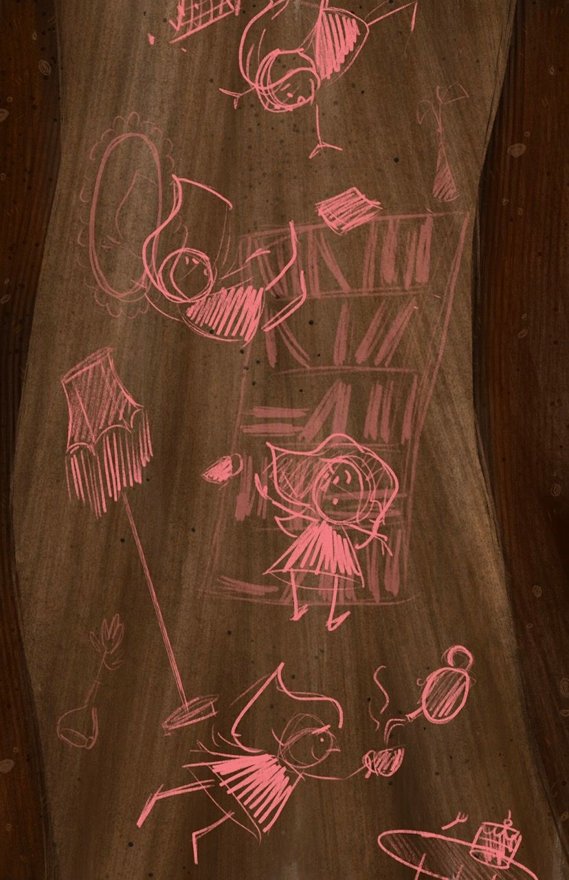
So I’m revisiting some older illustrations and giving them a makeover, lol, first up is this “down the rabbit hole”. I really like it already but there are a few things that can be fixed and updated.
-
I just love all of these ideas and it is great that you are revisiting them. I find that so difficult to do.
So I'm just looking at the most recent post (Down the Rabbit Hole), just because the other images have some feedback already. My first thought is her hair should be streaming above her a little, or separating into more than one section, to indicate the tumbling movement. That would also let you show her left arm. Right now the arm is a little hidden by the hair. Also maybe her legs shouldn't be parallel, like her right leg could kick backward as if she is trying to 'swim' through the air toward the teacup. I like how you included a piano, because it is funny. The other objects look a little generic, and modern compared to Alice, wearing the apron and all. It would add interest if they had some antique-y shapes to them. Of course, it's a fun concept already, nonetheless I know you have the capability to push it and look forward to seeing where it goes

-
@jenn thanks for the feedback! Yes I plan on giving her a completely different gesture, so I’ll keep those things in mind. And I like the idea of older things, I didn’t think of that the first time. So far I’ve only done the background…
-
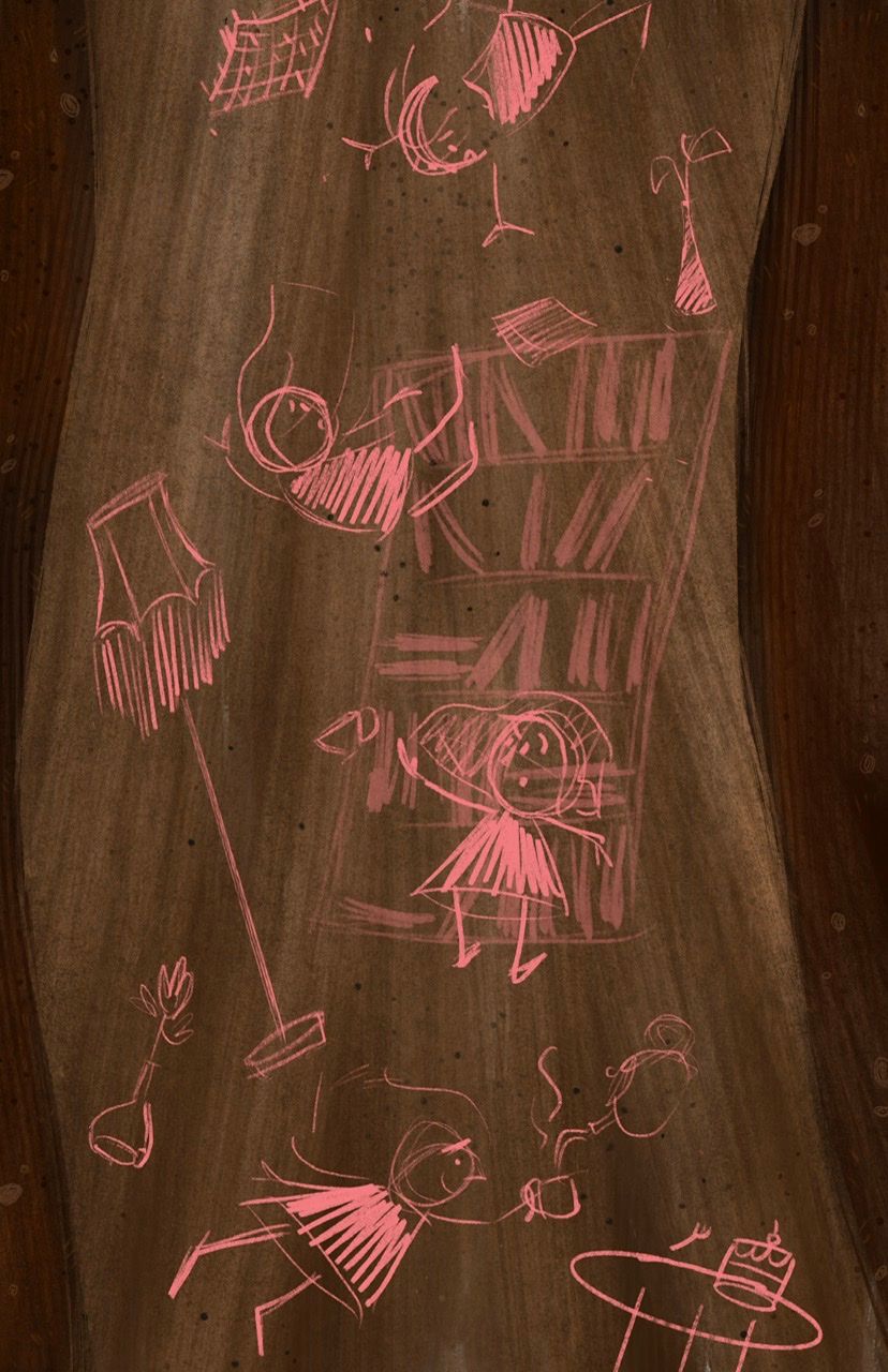
I’m wondering if I can make it sort of an action sequence? What are your thoughts on this composition? I know it’s a bi crowded at the moment but once I color, some things will fade back like the bookcase.
-
I went through and made brighter those that will be in the foreground
-
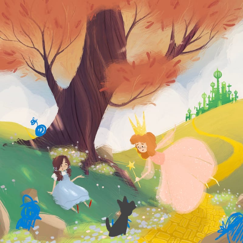
@Asyas_illos with the autumn tree colors, I personally think pumpkinhead is a cute idea you don’t see too often. But maybe the others fill the space better, so I guess just pick your absolute favorite.
-
@kayleenartlover thank you for the feedback! I had sort of put that on the back burner but I recently did some work on it and decided to go with Glinda, here’s an update on that one

-
@Asyas_illos the action sequence could be a really interesting concept, and super challenging too.
-
@Asyas_illos Wow, Asya, you have really hit your stride, cranking out stylistically consistent and charming pieces. Super cute stuff!