Personal projects feedback please:|
-
So I’m currently working on another book idea
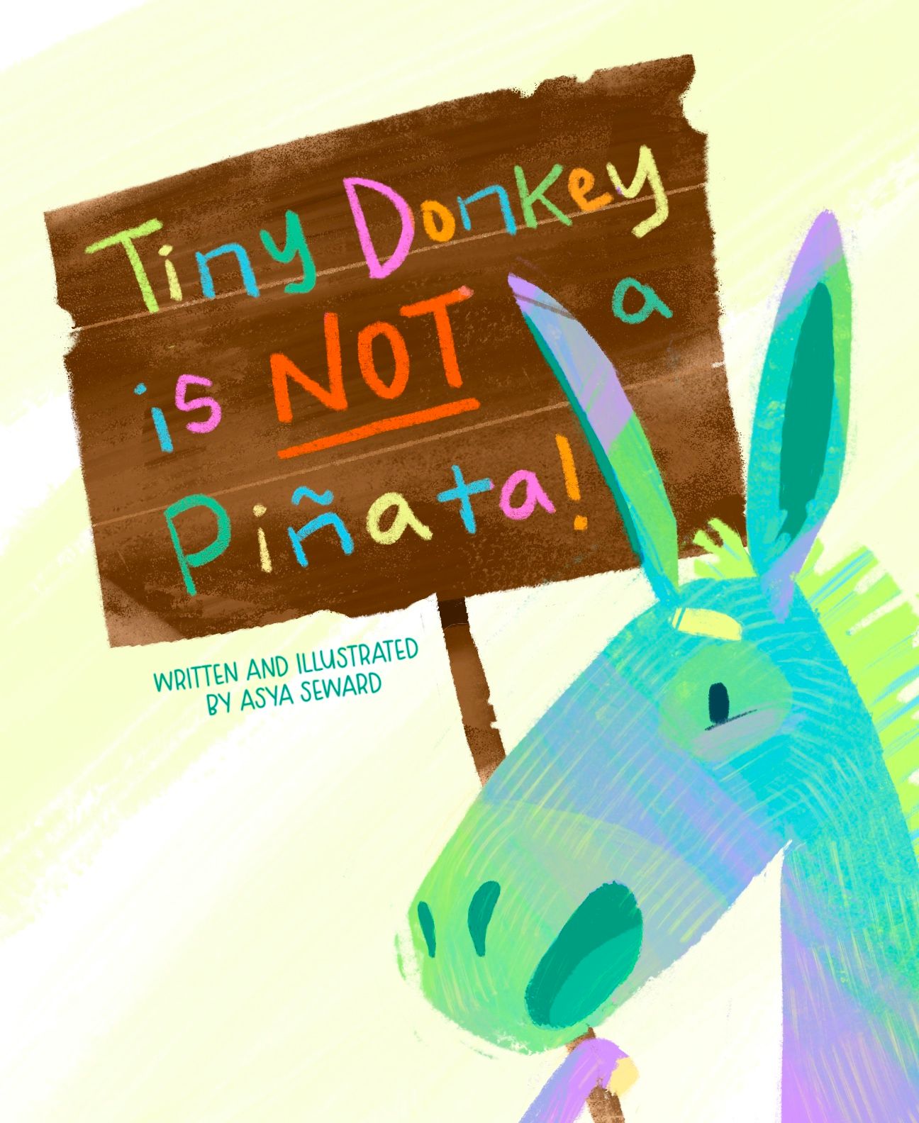
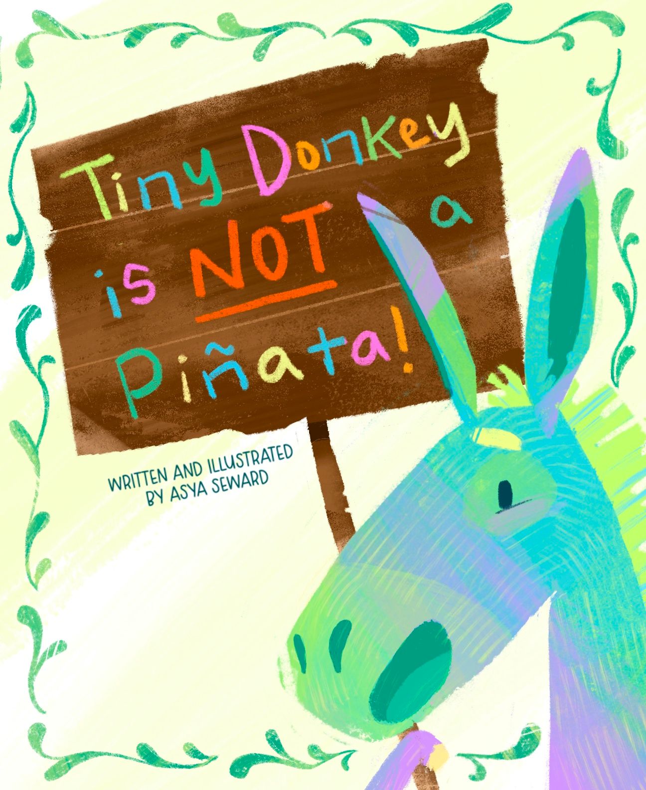
 (I know) but feel really good about it so far! I’m looking for some feedback regarding the cover, is the filigree too much? Should it be smaller/thinner? Composition working ok? Also, I wasn’t sure about the placement of my name, I know that lower left seems a bit bare. And, title is subject to change, but I think this one quite catchy. Thanks in advance!
-
@Asyas_illos Hi! Beautiful work. I love the color and texture. My suggestion is to not separate the "a" from the other words. Maybe move the ear backwards and the "a" forwards. Overall, I think this is a professional level piece and should definitely go into your portfolio.
edit: I think the vine borders look amazing. Definitely keep them.
-
@Nyrryl-Cadiz thanks nyrryl! I was wondering about that a haha.
-
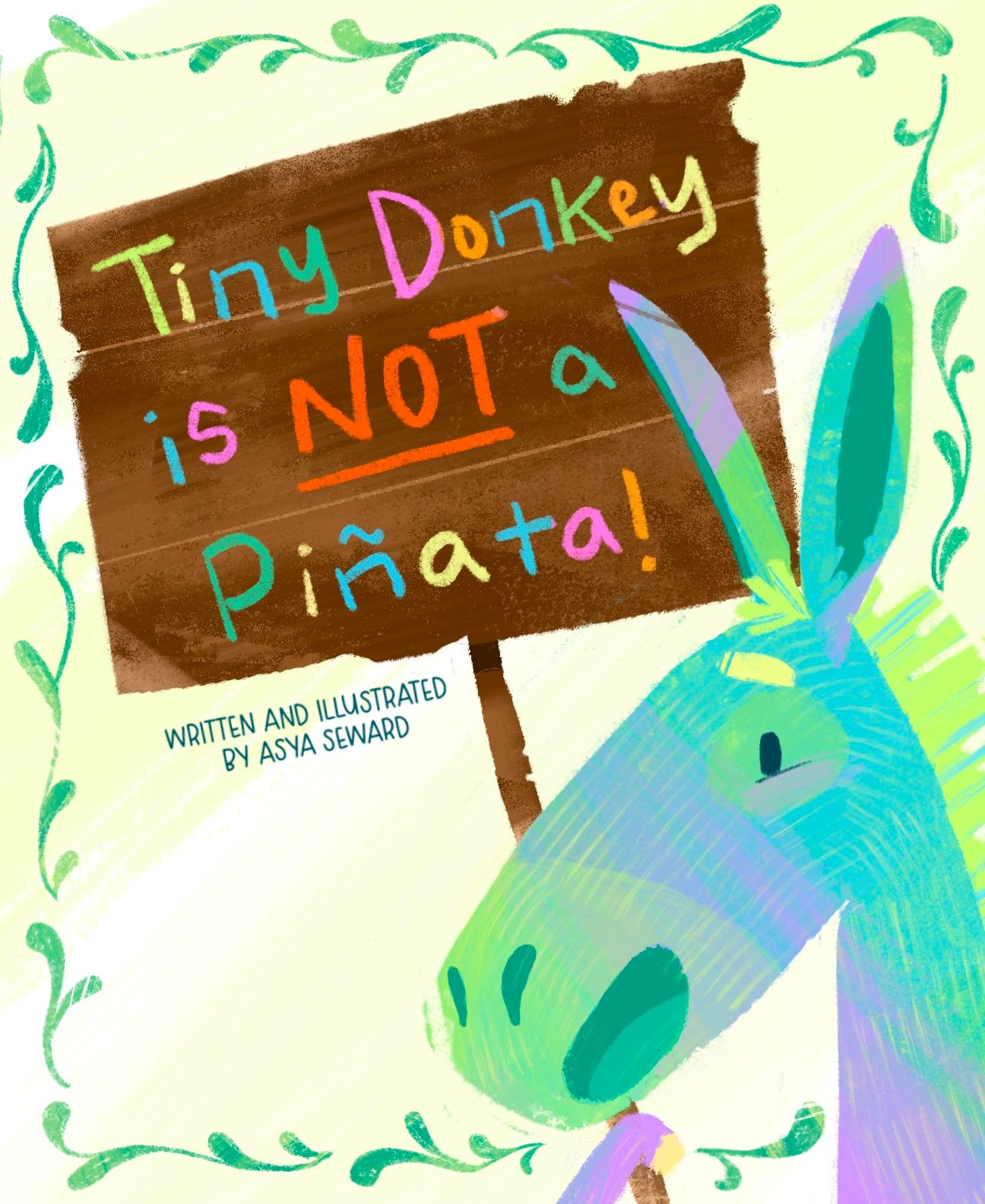
@Nyrryl-Cadiz is this better?
-
@Asyas_illos what if the filigree varied in width? Or maybe it should go behind the top right corner of the sign? I like how it adds interest to the background but it does compete a little. However just making it thinner might not fit the scale of the rest of the shapes.
-
@jenn thanks I’ll probably play with it a little more and see what works.
-
I just love all of these! Little Alice, the donkey!
The cover design is very well done! I would absolutely have to pick up this book if I saw it on a shelf. You've got nice open space in the design for the eyes to rest and the colors work great. Moving the "a" was a needed and you managed to do it with compromising anything. Yay!
I would like to see if you could bring the sign in front of the border on the right side and definitely try varying the scale of the individual border elements - just for fun. Differing sizes of the swashes might look great with those yummy textures you've got going!
-
@Asyas_illos this would be such a FUN book to read! Love the colors and rendering.
Yes, I think that the design would look more balanced if your name was in the bottom left corner. (Just FYI, some books by author-illustrators say "written and illustrated by", but the vast majority just have the author-illustrator's name.)
I really like the hand lettered title. Why is the filigree added? Does it have anything to do with the story? My personal preference is the design without it; it's stronger, in my opinion, because there are already a lot of colors going on!
This will depend on your story and character, but just going on the cover, I feel a discrepancy between the title and the character's expression. The feeling I get from the title is that this is a grumpy or fed-up character that is misunderstood and keeps getting hit with sticks. But the character's expression feels happy and welcoming. So is Tiny Donkey ok with the mix-up and torture? If they're happy, why do they feel the need to clear up the misconception?
Again, LOVE the character and your rendering! Really nice design and story idea!
-
@Melissa_Bailey haha thanks for the feedback, I tried moving that darn eyebrow all over the the place to give him a bit of irritation but nothing was feeling right, it was like he was an old man and I didn’t want that. But I will play with it some some more. As for the border I only added it because it seemed a little too, bare. I like the border but I think I need to make it thinner/smaller. I will also play around with the name thanks again Melissa!
-
@lidia-ull thanks for the feedback! I’m going to work the border a bit more and see if I can pull something off.

-
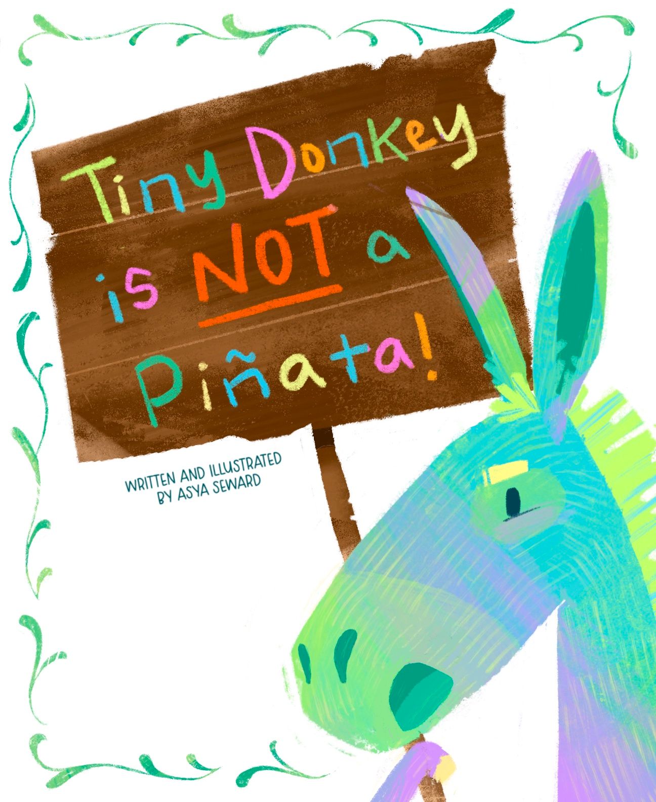
@Asyas_illos I like the changes so far. My suggestion for the border is to cut out the pieces right next to the donkey (under the nose, next to the hoof, & beside the ear). I think that will simplify it and keep it from competing with the character.
I think the title is a little long. Consider shortening it to "Donkey is NOT a Piñata!" It will come out in the story that it's a tiny donkey & that's the reason people think it's a piñata.
Good luck with all your story ideas!
-
Ok I thinned out the border and fixed his expression also removed the yellow that was in the background. I tried moving my name around and just have my name but to me it just didn’t look right. So this is where it’s at currently I’m gonna let sit for a while while continue to work on the story and sketches. Thank you @Miriam for your suggestions, but I really like the title as it is for now, we’ll see when I come back to it again later. Thanks for the feedback everyone!
-
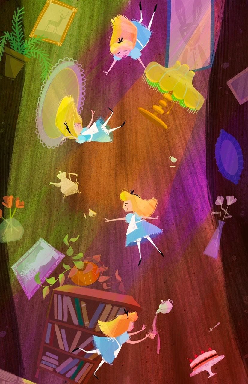
Wondering what you guys think about this lighting? Is it too much? To chaotic, busy?
-
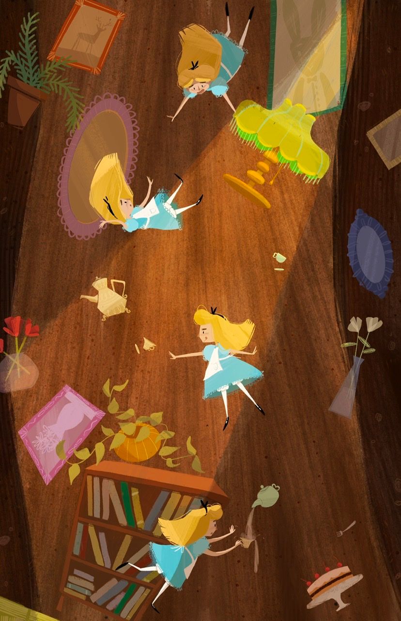
@Asyas_illos I love scenes like this where the same character is shown multiple times to crate movement! I'm curious what it would look like if you reduced the saturation of the lights a little, but left Alice and the other objects more saturated. I can't decide if its too much or not, and I feel like looking at two versions side by side would help!
-
@kirsten-mcg I didn’t do a toned down version yet but I have this alternative lighting too
-
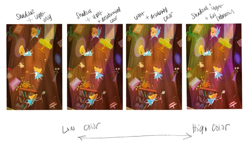
Ok made some side by side comps thoughts?
-
@Asyas_illos I like #1
-
@Asyas_illos I agree on preferring the left side (1 and 2). I could just be missing the light source, but I'm just not sure where the purple light is coming from. There's nothing distracting on 1. Love the image overall.
-
@KevinTreaccar thanks for the feedback! my mind was just playing off the scene where she’s falling and there are flashing colors but they never came any specific light source.
-
@Asyas_illos number 2, the middle right one, I think has just the right amount of colored lighting