Society of Visual Storytelling

    SVSLearn Forums

    • Register
    • Login
    • Search
    • Recent
    • Tags
    • Popular
    • Users
    • Groups
    • Search

    Personal projects feedback please:|

    Projects
    22
    122
    12710
    Loading More Posts
    • Oldest to Newest
    • Newest to Oldest
    • Most Votes
    Reply
    • Reply as topic
    Log in to reply
    This topic has been deleted. Only users with topic management privileges can see it.
    • lidia-ull
      lidia-ull @Asyas_illos last edited by

      @Asyas_illos

      I just love all of these! Little Alice, the donkey!

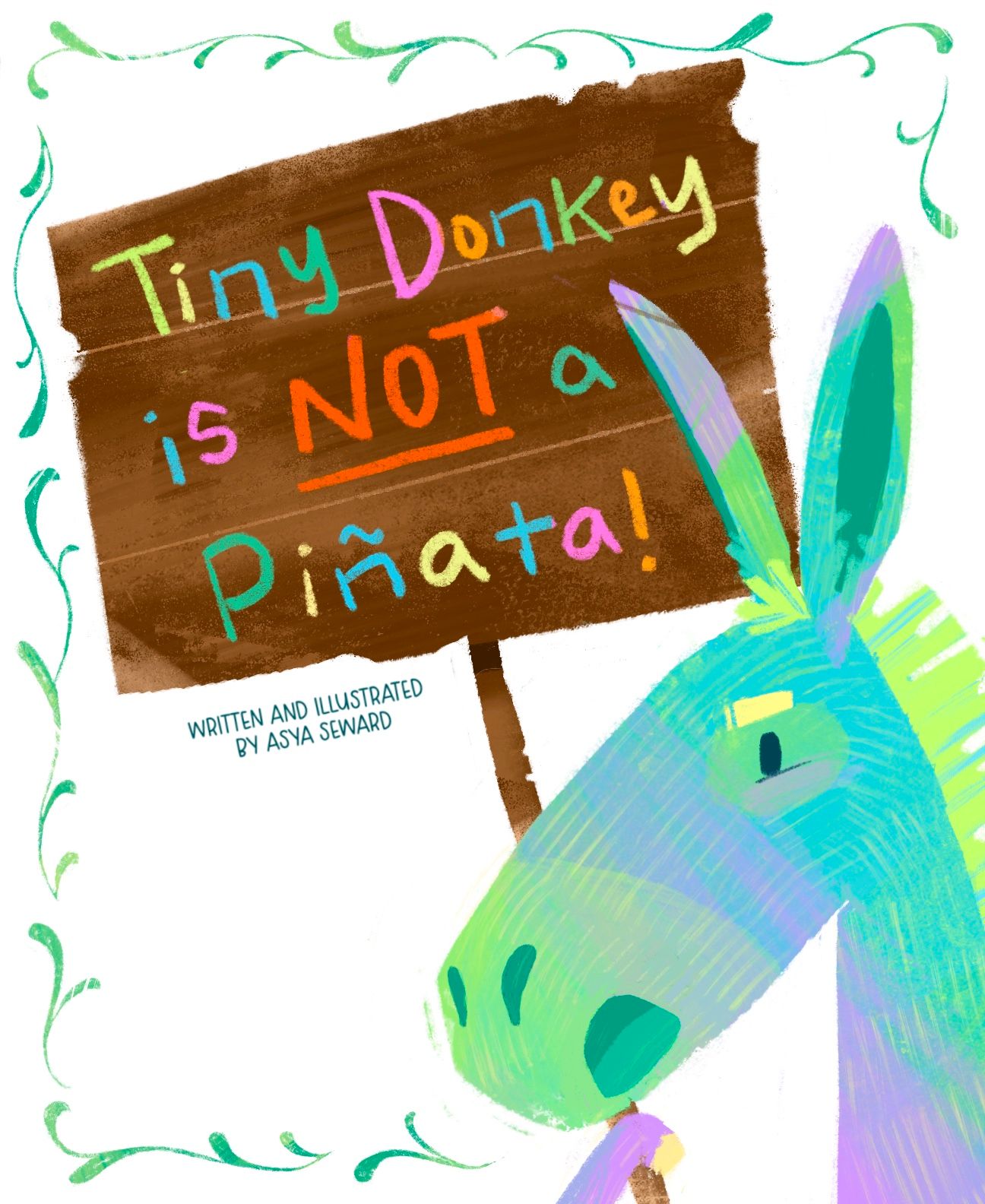
      The cover design is very well done! I would absolutely have to pick up this book if I saw it on a shelf. You've got nice open space in the design for the eyes to rest and the colors work great. Moving the "a" was a needed and you managed to do it with compromising anything. Yay!

      I would like to see if you could bring the sign in front of the border on the right side and definitely try varying the scale of the individual border elements - just for fun. Differing sizes of the swashes might look great with those yummy textures you've got going!

      Asyas_illos 1 Reply Last reply Reply Quote 0
      • Melissa_Bailey
        Melissa_Bailey @Asyas_illos last edited by

        @Asyas_illos this would be such a FUN book to read! Love the colors and rendering.

        Yes, I think that the design would look more balanced if your name was in the bottom left corner. (Just FYI, some books by author-illustrators say "written and illustrated by", but the vast majority just have the author-illustrator's name.)

        I really like the hand lettered title. Why is the filigree added? Does it have anything to do with the story? My personal preference is the design without it; it's stronger, in my opinion, because there are already a lot of colors going on!

        This will depend on your story and character, but just going on the cover, I feel a discrepancy between the title and the character's expression. The feeling I get from the title is that this is a grumpy or fed-up character that is misunderstood and keeps getting hit with sticks. But the character's expression feels happy and welcoming. So is Tiny Donkey ok with the mix-up and torture? If they're happy, why do they feel the need to clear up the misconception?

        Again, LOVE the character and your rendering! Really nice design and story idea!

        illustrator - author - smiley person
        mbaileyart.com
        instagram.com/mbaileyart/

        Asyas_illos 1 Reply Last reply Reply Quote 0
        • Asyas_illos
          Asyas_illos @Melissa_Bailey last edited by

          @Melissa_Bailey haha thanks for the feedback, I tried moving that darn eyebrow all over the the place to give him a bit of irritation but nothing was feeling right, it was like he was an old man and I didn’t want that. But I will play with it some some more. As for the border I only added it because it seemed a little too, bare. I like the border but I think I need to make it thinner/smaller. I will also play around with the name thanks again Melissa!

          Asyasewardillos@gmail.com
          www.Instagram.com/asyas_illos/
          https://asyasewardillos.wixsite.com/mysite

          1 Reply Last reply Reply Quote 1
          • Asyas_illos
            Asyas_illos @lidia-ull last edited by

            @lidia-ull thanks for the feedback! I’m going to work the border a bit more and see if I can pull something off.👍🏼

            Asyasewardillos@gmail.com
            www.Instagram.com/asyas_illos/
            https://asyasewardillos.wixsite.com/mysite

            1 Reply Last reply Reply Quote 0
            • Miriam
              Miriam @Asyas_illos last edited by

              @Asyas_illos I like the changes so far. My suggestion for the border is to cut out the pieces right next to the donkey (under the nose, next to the hoof, & beside the ear). I think that will simplify it and keep it from competing with the character.

              I think the title is a little long. Consider shortening it to "Donkey is NOT a Piñata!" It will come out in the story that it's a tiny donkey & that's the reason people think it's a piñata.

              Good luck with all your story ideas!

              1 Reply Last reply Reply Quote 1
              • Asyas_illos
                Asyas_illos last edited by Asyas_illos

                Ok I thinned out the border and fixed his expression also removed the yellow that was in the background. I tried moving my name around and just have my name but to me it just didn’t look right. So this is where it’s at currently I’m gonna let sit for a while while continue to work on the story and sketches. Thank you @Miriam for your suggestions, but I really like the title as it is for now, we’ll see when I come back to it again later. Thanks for the feedback everyone!
                53708B16-875A-458B-A3C2-85B768BC7723.jpeg

                Asyasewardillos@gmail.com
                www.Instagram.com/asyas_illos/
                https://asyasewardillos.wixsite.com/mysite

                1 Reply Last reply Reply Quote 3
                • Asyas_illos
                  Asyas_illos last edited by

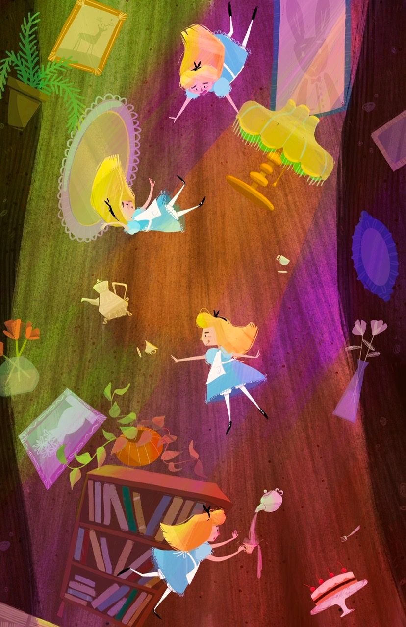
                  Wondering what you guys think about this lighting? Is it too much? To chaotic, busy?
                  BE7EED07-00BA-4B80-AAB5-2D0D592B86FA.jpeg

                  Asyasewardillos@gmail.com
                  www.Instagram.com/asyas_illos/
                  https://asyasewardillos.wixsite.com/mysite

                  kirsten-mcg Nyrryl  Cadiz 2 Replies Last reply Reply Quote 4
                  • kirsten-mcg
                    kirsten-mcg @Asyas_illos last edited by

                    @Asyas_illos I love scenes like this where the same character is shown multiple times to crate movement! I'm curious what it would look like if you reduced the saturation of the lights a little, but left Alice and the other objects more saturated. I can't decide if its too much or not, and I feel like looking at two versions side by side would help!

                    Instagram: https://www.instagram.com/kirsten.mcgonigal.art/
                    Portfolio Site: www.kirstenmcgonigalart.com

                    Asyas_illos 1 Reply Last reply Reply Quote 0
                    • Asyas_illos
                      Asyas_illos @kirsten-mcg last edited by

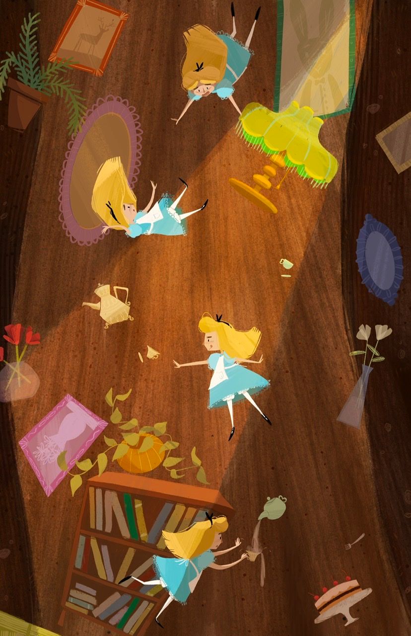
                      @kirsten-mcg I didn’t do a toned down version yet but I have this alternative lighting too
                      850A5836-9A24-4F0E-9990-BC3D15557FCB.jpeg

                      Asyasewardillos@gmail.com
                      www.Instagram.com/asyas_illos/
                      https://asyasewardillos.wixsite.com/mysite

                      1 Reply Last reply Reply Quote 1
                      • Asyas_illos
                        Asyas_illos last edited by

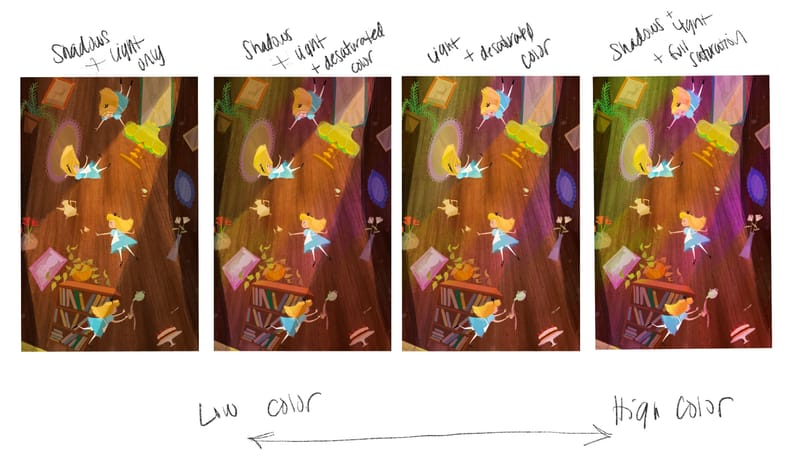
                        Ok made some side by side comps thoughts?
                        1C206B0B-DABA-481B-AF0D-00EC47C74CCE.jpeg

                        Asyasewardillos@gmail.com
                        www.Instagram.com/asyas_illos/
                        https://asyasewardillos.wixsite.com/mysite

                        Miriam KevinTreaccar kayleenartlover 3 Replies Last reply Reply Quote 0
                        • Miriam
                          Miriam @Asyas_illos last edited by

                          @Asyas_illos I like #1

                          1 Reply Last reply Reply Quote 1
                          • KevinTreaccar
                            KevinTreaccar @Asyas_illos last edited by

                            @Asyas_illos I agree on preferring the left side (1 and 2). I could just be missing the light source, but I'm just not sure where the purple light is coming from. There's nothing distracting on 1. Love the image overall.

                            kevintreaccar.com
                            instagram.com/kevintreaccar

                            Asyas_illos 1 Reply Last reply Reply Quote 0
                            • Asyas_illos
                              Asyas_illos @KevinTreaccar last edited by

                              @KevinTreaccar thanks for the feedback! my mind was just playing off the scene where she’s falling and there are flashing colors but they never came any specific light source.

                              Asyasewardillos@gmail.com
                              www.Instagram.com/asyas_illos/
                              https://asyasewardillos.wixsite.com/mysite

                              1 Reply Last reply Reply Quote 0
                              • kayleenartlover
                                kayleenartlover @Asyas_illos last edited by

                                @Asyas_illos number 2, the middle right one, I think has just the right amount of colored lighting

                                Asyas_illos 1 Reply Last reply Reply Quote 1
                                • Asyas_illos
                                  Asyas_illos @kayleenartlover last edited by

                                  Thanks @kayleenartlover 😊

                                  Asyasewardillos@gmail.com
                                  www.Instagram.com/asyas_illos/
                                  https://asyasewardillos.wixsite.com/mysite

                                  1 Reply Last reply Reply Quote 1
                                  • Nyrryl  Cadiz
                                    Nyrryl Cadiz SVS OG @Asyas_illos last edited by

                                    @Asyas_illos hi! i think the first lighting is perfect. it's psychedelic and imo is perfect for Alice in Wonderland

                                    Portfolio: nyrrylcadiz.com
                                    Instagram: https://www.instagram.com/nyrryl_cadiz/
                                    YouTube: https://www.youtube.com/channel/UCbJCF1Im8ZO7hpGWTKOJMuA

                                    Asyas_illos 1 Reply Last reply Reply Quote 0
                                    • Asyas_illos
                                      Asyas_illos @Nyrryl Cadiz last edited by

                                      @Nyrryl-Cadiz thanks for the feedback!

                                      Asyasewardillos@gmail.com
                                      www.Instagram.com/asyas_illos/
                                      https://asyasewardillos.wixsite.com/mysite

                                      1 Reply Last reply Reply Quote 1
                                      • Asyas_illos
                                        Asyas_illos last edited by

                                        Hey guys I’ve been working on setting up a website using wix. It’s been frustrating! But I think I’ve got it I plan on switching to a personal domain soon, but for now just borrowing the wix site one. It’s VERY simple. I’d like some feedback on it please, accessibility, design, illustrations I should remove or rearrange, etc . Thanks guys😊

                                        https://asyasewardillos.wixsite.com/mysite

                                        Asyasewardillos@gmail.com
                                        www.Instagram.com/asyas_illos/
                                        https://asyasewardillos.wixsite.com/mysite

                                        AngelinaKizz Kim Rosenlof Miriam mag 4 Replies Last reply Reply Quote 0
                                        • AngelinaKizz
                                          AngelinaKizz @Asyas_illos last edited by

                                          @Asyas_illos great job! I really struggled with learning how to builds mine through Wordpress, and now that I understand what I’m doing, it’s much easier to work with. I think the one thing I would vary up, is at the bottom you have a cluster of black and white images. I think I would shift them to be sprinkled throughout the colored pieces.

                                          www.evarartistry.com
                                          www.Instagram.com/evarartistry/

                                          Asyas_illos 1 Reply Last reply Reply Quote 0
                                          • Asyas_illos
                                            Asyas_illos @AngelinaKizz last edited by

                                            @AngelinaKizz awesome thanks! Yes I’m not very good with computers in general and I was creating it with my iPad, so let’s just say it was my fifth attempt. 😂

                                            Asyasewardillos@gmail.com
                                            www.Instagram.com/asyas_illos/
                                            https://asyasewardillos.wixsite.com/mysite

                                            AngelinaKizz 1 Reply Last reply Reply Quote 0
                                            • First post
                                              Last post