Personal projects feedback please:|
-
@Asyas_illos I like #1
-
@Asyas_illos I agree on preferring the left side (1 and 2). I could just be missing the light source, but I'm just not sure where the purple light is coming from. There's nothing distracting on 1. Love the image overall.
-
@KevinTreaccar thanks for the feedback! my mind was just playing off the scene where she’s falling and there are flashing colors but they never came any specific light source.
-
@Asyas_illos number 2, the middle right one, I think has just the right amount of colored lighting
-
Thanks @kayleenartlover

-
@Asyas_illos hi! i think the first lighting is perfect. it's psychedelic and imo is perfect for Alice in Wonderland
-
@Nyrryl-Cadiz thanks for the feedback!
-
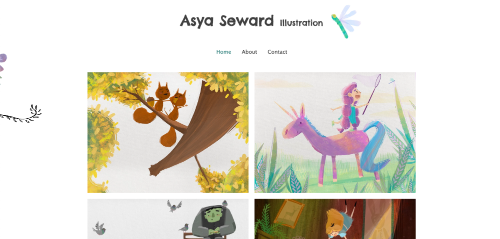
Hey guys I’ve been working on setting up a website using wix. It’s been frustrating! But I think I’ve got it I plan on switching to a personal domain soon, but for now just borrowing the wix site one. It’s VERY simple. I’d like some feedback on it please, accessibility, design, illustrations I should remove or rearrange, etc . Thanks guys

-
@Asyas_illos great job! I really struggled with learning how to builds mine through Wordpress, and now that I understand what I’m doing, it’s much easier to work with. I think the one thing I would vary up, is at the bottom you have a cluster of black and white images. I think I would shift them to be sprinkled throughout the colored pieces.
-
@AngelinaKizz awesome thanks! Yes I’m not very good with computers in general and I was creating it with my iPad, so let’s just say it was my fifth attempt.

-
@Asyas_illos oh man, me either! I find that it's easier going through the web browser rather than the app for WordPress. The app I was ripping my hair out. Are you using an app?
-
@AngelinaKizz no it was web based still a major pain. I tried at first with square space only to find it wasn’t compatible with my iPad and I could not transfer any of my pictures, good grief!
-
@Asyas_illos brutal!!! You've done a great job so far though
-
@AngelinaKizz lol thanks

-
@Asyas_illos I think your site looks good. It is good to have a site that starts with the gallery of illustrations, so people don’t have to search for it. I didn’t see anything that I would remove or rearrange, but I am also not a portfolio expert so I am not sure the best way to arrange things. The only thing I have heard is to put your best piece first. You have a lot of great pieces so it is hard to choose.
-
@Asyas_illos Your website looks good. I agree that it's nice to have the gallery of images right away.
One thing that looks odd (at least on my browser) is that there's a bit of an image on the left side at the top (a leafy design & on the home page there's also a bit of a flower or wing or something, so it really looks cut off).

I would remove that image, or move it to make it visible.
Check the links at the top of the "About Me" page. None of them worked for me.
Also, I would recommend using a larger font size for your "About Me" info, as well as separate it into paragraphs. I think people are less likely to actually read it if it's all one big paragraph.
Breaking it up (something like this) could make it easier to view. (Also, please note some editing suggestions in red.):
"Hello! I’m Asya (pronounced Asia)
.I’m a freelance author/illustrator located in Northern California along with my husband and three children.I have been making art in one form or another for 35 years, (thinking back to watching Bob Ross with my grandma while making tiny fruits from clay). After re-reading my childhood favorites to my own children, I realized children’s literature was where I wanted to take my passion for art.
I’ve been studying online at the Society of Visual Storytelling while discovering and developing my style. I joined SCBWI in April 2022, and recently won the SF North and East Bay regional masthead update contest
.I love everything magical and whimsical. I also adore nature and animals. Let’s not forget fall and Halloween
!(It’s my favorite time of the year.) All of which I love bringing to my illustrations." -
@Asyas_illos hi! I love the simple design and how the illustrations are displayed, they are big enough to see them properly and small enough to create a nicely looking gallery

I would add some sequential art, since this is something most art directors are looking for.
And I don’t know why, but when I click on the about page, it will not allow me to click back on the home page or contact page.
Good luck, creating an online portfolio usually is a pain in the bee. I’m still working on mine, so…
-
@mag it certainly is! I have really been struggling with it! Thanks for the feedback
 ️
️ -
@Miriam thanks for the feedback on editing, I will look into it. I was hoping those darn things would be not be visible on the side I can’t for the life of me figure out how to delete the darn things so I tried just moving them as far off the page as I could lol
 well looks like I’ve got some more work to do…
 -
@mag and yes the tabs are glitchy I don’t know why. If use the back button then choose again it will work but I don’t know what the deal is with that?!