Personal projects feedback please:|
-
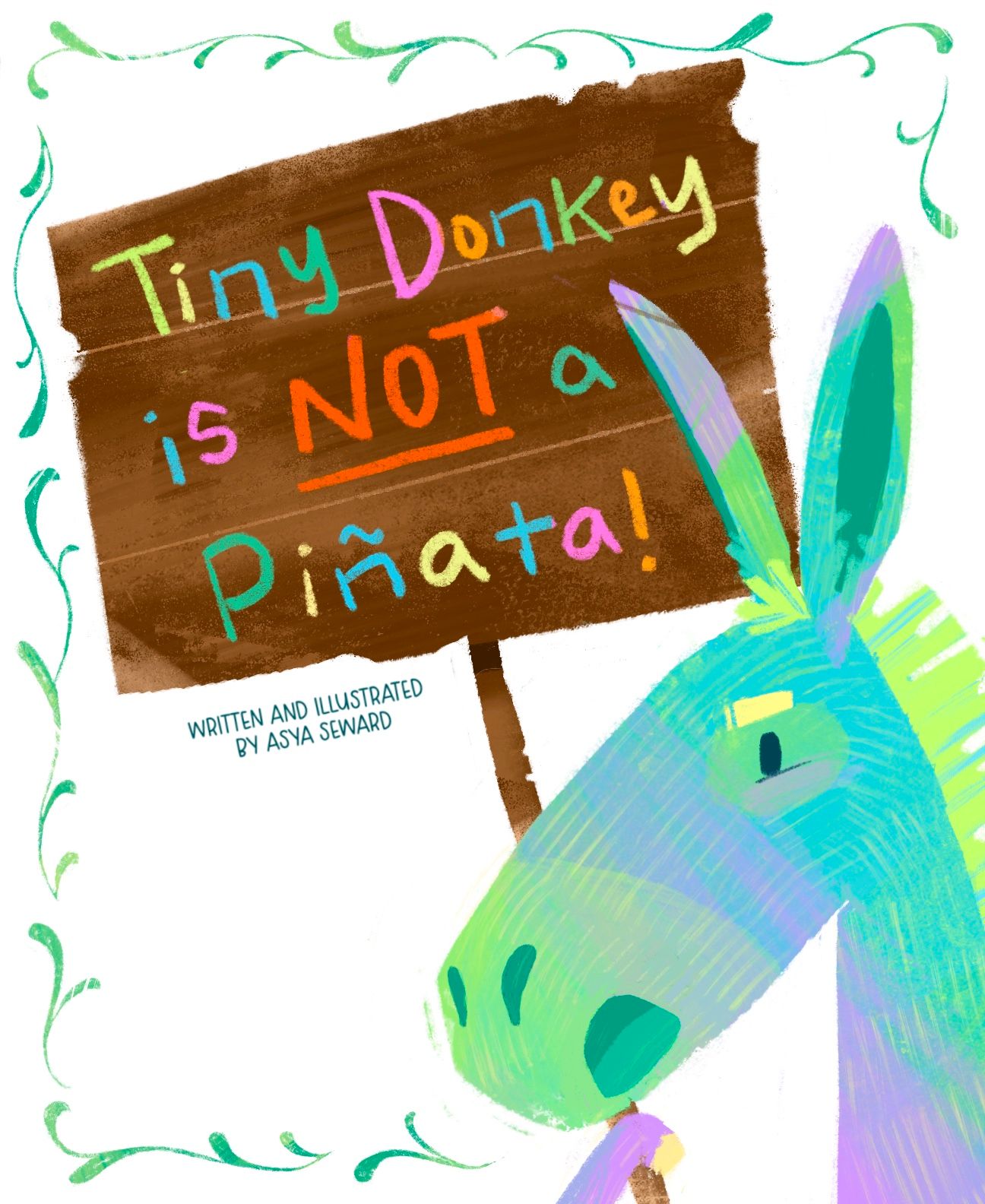
Ok I thinned out the border and fixed his expression also removed the yellow that was in the background. I tried moving my name around and just have my name but to me it just didn’t look right. So this is where it’s at currently I’m gonna let sit for a while while continue to work on the story and sketches. Thank you @Miriam for your suggestions, but I really like the title as it is for now, we’ll see when I come back to it again later. Thanks for the feedback everyone!

-
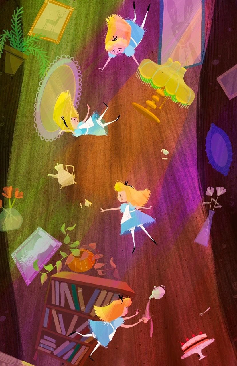
Wondering what you guys think about this lighting? Is it too much? To chaotic, busy?

-
@Asyas_illos I love scenes like this where the same character is shown multiple times to crate movement! I'm curious what it would look like if you reduced the saturation of the lights a little, but left Alice and the other objects more saturated. I can't decide if its too much or not, and I feel like looking at two versions side by side would help!
-
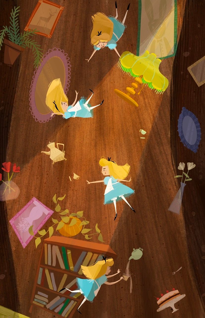
@kirsten-mcg I didn’t do a toned down version yet but I have this alternative lighting too

-
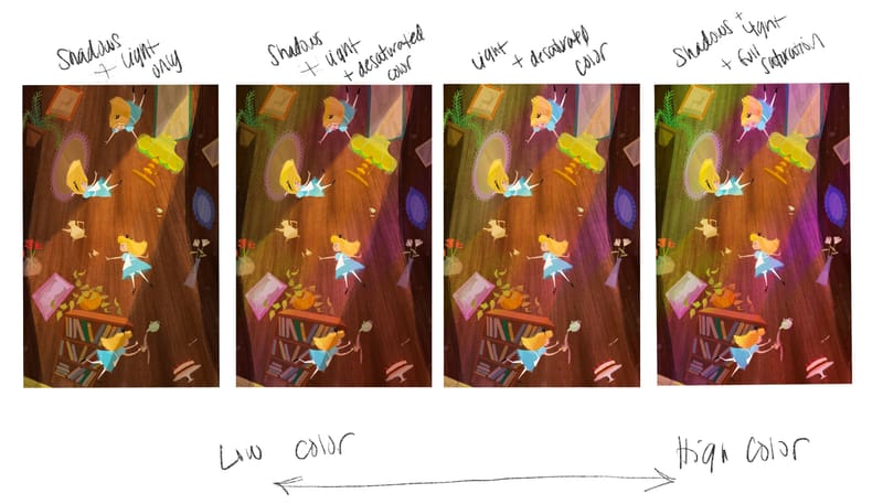
Ok made some side by side comps thoughts?

-
@Asyas_illos I like #1
-
@Asyas_illos I agree on preferring the left side (1 and 2). I could just be missing the light source, but I'm just not sure where the purple light is coming from. There's nothing distracting on 1. Love the image overall.
-
@KevinTreaccar thanks for the feedback! my mind was just playing off the scene where she’s falling and there are flashing colors but they never came any specific light source.
-
@Asyas_illos number 2, the middle right one, I think has just the right amount of colored lighting
-
Thanks @kayleenartlover

-
@Asyas_illos hi! i think the first lighting is perfect. it's psychedelic and imo is perfect for Alice in Wonderland
-
@Nyrryl-Cadiz thanks for the feedback!
-
Hey guys I’ve been working on setting up a website using wix. It’s been frustrating! But I think I’ve got it I plan on switching to a personal domain soon, but for now just borrowing the wix site one. It’s VERY simple. I’d like some feedback on it please, accessibility, design, illustrations I should remove or rearrange, etc . Thanks guys

-
@Asyas_illos great job! I really struggled with learning how to builds mine through Wordpress, and now that I understand what I’m doing, it’s much easier to work with. I think the one thing I would vary up, is at the bottom you have a cluster of black and white images. I think I would shift them to be sprinkled throughout the colored pieces.
-
@AngelinaKizz awesome thanks! Yes I’m not very good with computers in general and I was creating it with my iPad, so let’s just say it was my fifth attempt.

-
@Asyas_illos oh man, me either! I find that it's easier going through the web browser rather than the app for WordPress. The app I was ripping my hair out. Are you using an app?
-
@AngelinaKizz no it was web based still a major pain. I tried at first with square space only to find it wasn’t compatible with my iPad and I could not transfer any of my pictures, good grief!
-
@Asyas_illos brutal!!! You've done a great job so far though
-
@AngelinaKizz lol thanks

-
@Asyas_illos I think your site looks good. It is good to have a site that starts with the gallery of illustrations, so people don’t have to search for it. I didn’t see anything that I would remove or rearrange, but I am also not a portfolio expert so I am not sure the best way to arrange things. The only thing I have heard is to put your best piece first. You have a lot of great pieces so it is hard to choose.