Portfolio/website feedback wanted
-
Hi svs!
I've been planning my move away from the IT business for a couple of years now, and I've finally reached the point where I've assembled a portfolio to start sharing with publishers. My stretch goal is to be able to make a living as a full-time children's book illustrator, but in the short term almost any paid gig in the right direction will do.
I've been going back and forth on what pieces to include in my portfolio, and at first I felt quite pleased with the result, but the more I look at it, the less sure I feel. I would really value a fresh eye, and thus I turn to you.
So please help. Does this portfolio make sense to you? Is the work coheisive enough? Are there any sore thumbs sticking out anywhere? Should I remove anything?
(The portfolio is assembled for the Swedish market, where I have been advised to not focus on character pages or spots, but to go for full illustrations throughout. If you have experience with the Swedish market and have adifferent opinion, then I'd love to know more about that as well!)
Thanks so much!
-
@mia-clarke the illustrations of the boy and the monster I think are a bit too fuzzy and and hard to see, having cleaner edges could help that but for right now I think they should be removed. The compositions of the girl and the fox don’t read very well to me. I think they could be balanced by having a wider variety of objects of different sizes, right now everything in those images is relatively similar in size. Unfortunately I think those 3 should be removed as well which I know sucks to hear but seeing how could your other work is just makes me feel like these pieces aren’t at their level yet.
I like your style especially in the umbrella girl pieces and the main image on your website is gorgeous but I do think it should be moved down in favor of putting your portfolio front and center instead. Hope this helps!
-
@Griffin-McPherson Thank you so much for your thoughtful reply, I appreciate the time and effort you put into this!
 You’ve given me plenty to think about, since what you’re saying is the direct opposite to what I was thinking before I asked this question (I was about to scrap the umbrella series and go for more of the boy/monster type illos 🫠)… Goes to show how important it is to get other perspectives! I will take your feedback to heart!
 -
@mia-clarke Oh definitely don't scrap the umbrella girl pieces! To me they are the most beautiful and interesting of your work. I also love the image you've used for the header of your website. It feels mysterious and soft, and I LOVE the textures you've used in it. I think that and the 4 images with the girl and the umbrella are your strongest pieces. To me the others feel a little unfinished. My suggestion would be to work on creating more pieces at and above the level of these, focusing on diversifying shapes, subject matter, etc.
Will has a list of 100 things that should be in a portfolio. I've found that it's very helpful for generating ideas you wouldn't normally come up with. I've played a game with myself by with numbering all the items in each catigory on that list and rolling several dice to sort of mix and match things to try to include in a new portfolio illustration. I've come up with some interesting new ideas that way, and my portfolio is slowly fleshing out.
On 3 Point Perspective they have talked several times about how when you're first starting out your portfolio should be completely changing every 6 months. I know that might not be quite possible for those of us with kids, full time jobs, etc, but I think that the general principle is sound. Always be thinking about what the next step is for your portfolio, and keep shooting higher. Keep working and you'll get there! You've got some beautiful things going on already.
-
There’s a clear variation to your style, which feels a little disconnected. While most is loose and textured I feel that the girl in the tube is unfinished and too raw to be portfolio. I like your monster and boy, but it’s much looser and more vivid in color palette than your other images.
I feel like if I were shown your illustrations mixed in with someone else’s anonymously, I wouldn’t be able to easily pull out which pieces belonged to you. If they all had similar color palettes, even the looseness compared to the tighter umbrella girls, would fit together more cohesively and be easier to identify as belonging to you. Otherwise I’d maybe create 3 sub headers to your illustrations where you have style 1, style 2, and style 3 as their own groupings.
I think the biggest goal is finding that thing that makes you easily identifiable amongst a collection of other illustrations… and I think your style is lovely, and distinct enough that you just need to lean in a bit more.
-
@kirsten-mcg @AngelinaKizz Kirsten and Angelina, thank you both so much! I feel so much surer about what to do now, and it's the exact opposite of what I thought I'd do.
 ️
️Combining your advice with that of @Griffin-McPherson, I now have a plan. I'llswap out the pieces that are more loose and vivid (bye-bye forest monster and tube-woman), and focus my work on the more textured umbrella-style. I reckon I should be able to pull that off within a week or three. From there, I'll work on swapping out the weakest pieces (where the summer and fox series will be the first to go) for better ones (somethinh which, as you say Kirsten, will be an open-ended project).
Thank you all so, so much for your gentle but clear critique. I feel validated, guided, and know what to work on next. Couldn't have done it without you.
 ️
️ -
@mia-clarke In picture books, the goal of our illustration is storytelling and it's very important to show the characters' emotions. But in your portfolio, a signification portion of the illustrations show a big detailed background with tiny characters, or an image where the character is turned away and we can't see their face, or covered by a mask, or the facial features are not drawn in at all.
Even when we can see their faces, the features are small and expressions neutral, like it's an afterthought. The only exception is the little boy being pulled by a balloon.
Your artwork is gorgeous, but if you want to get picture book work I think you'll have to show that you can tell the the stories and express the emotions from the script
")
-
@NessIllustration Oh, no! You're absolutely right, but I haven't seen it before you pointed it out.

Ok, the next pieces will absolutely need to show more close-ups. I've been doing realistic portrait painting in oils for the past five years, and maybe on a subconcious level I'm a bit tired of faces, and that's why everyone is turned away or wearing buckets.
 Thank you for pointing this out, I'll definitly fix this!
 -
@mia-clarke feel free to show us updates as you work! I love seeing illustrators evolve and grow. It always encourages me to keep doing the same!

-
@kirsten-mcg Thanks Kirsten! I've made 4 pieces since I last posted but i'm not wild about any of them, so not sure if I should put any of them in my portfolio or not... They're in the style of the umbrella girl, but I'm not sure unifying the portfolio style with weak pieces is a good idea. If you have any thoughts on this, I'd love to hear them!
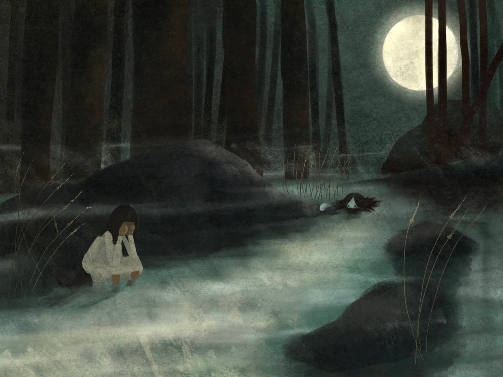
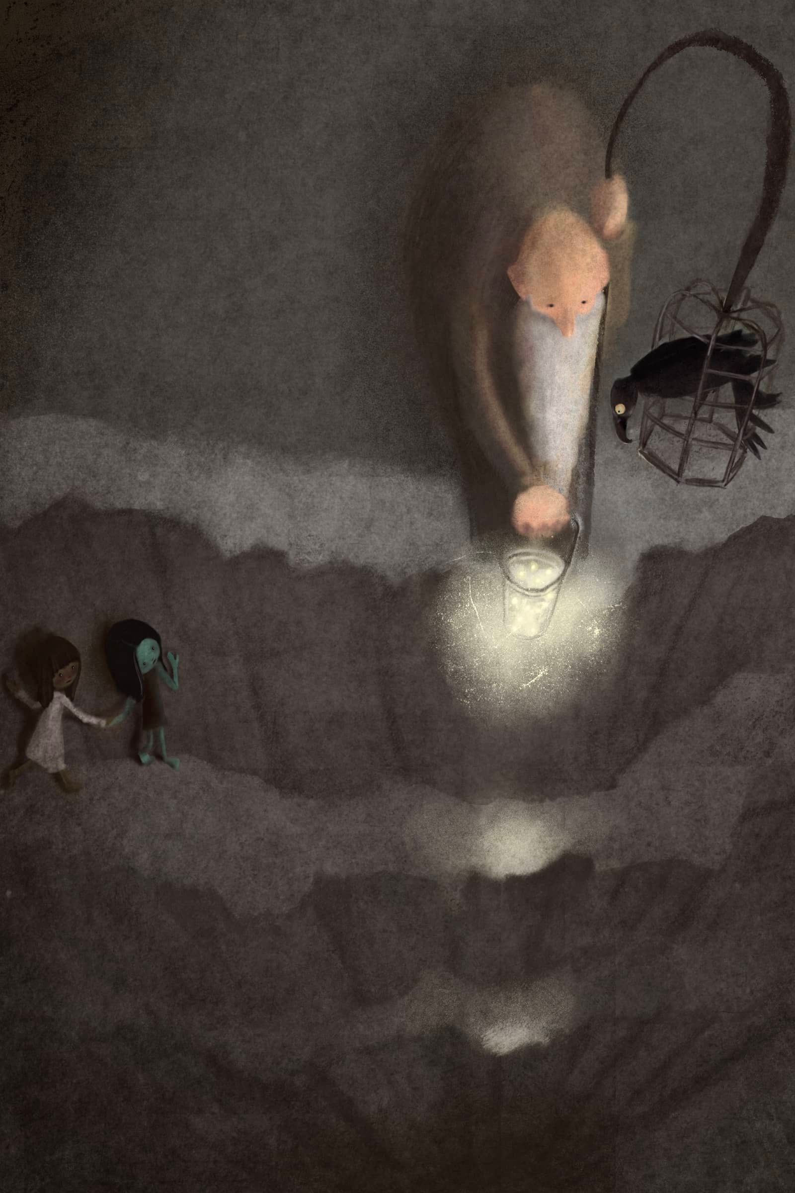
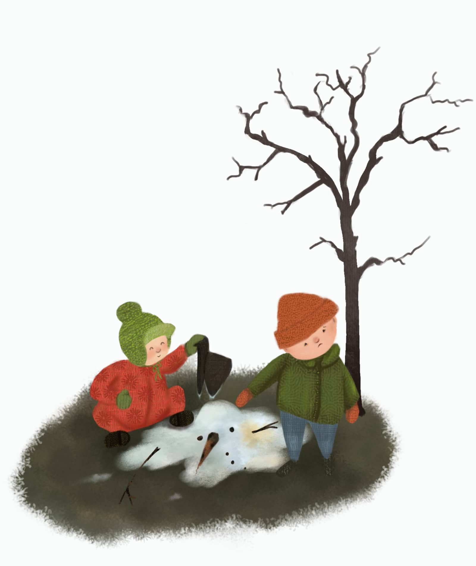
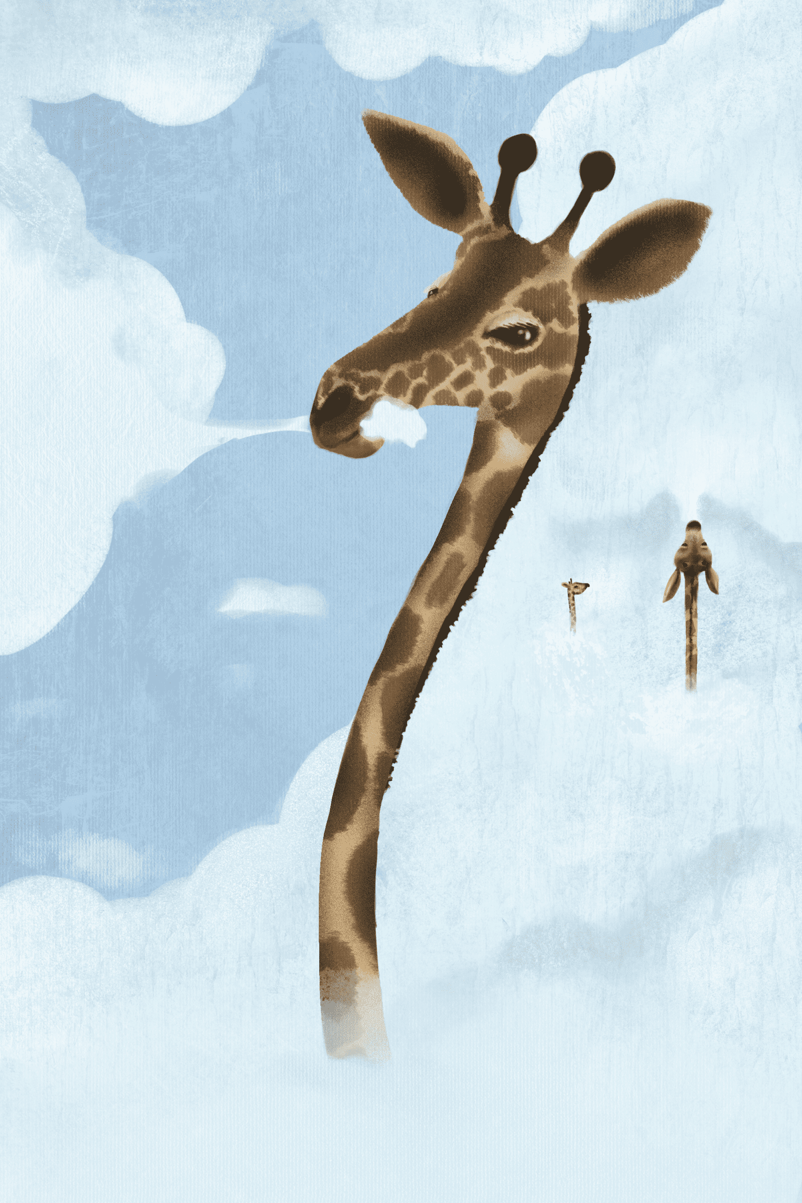
Here are the new pieces:
-
@mia-clarke Wow you're fast! I wish I could crank out pieces so quick!
I actually feel like all of these are making good progress. I especially love the first image of the girl in the swamp/creek, and the last on of the giraffe eating the cloud. I think both of these, at least would go well in your portfolio. And the 2nd one is nice too. I'm guessing it goes with he first? I'm a little unclear as to the story in the melted snow man one. But they all feel finished to me. Some of your other work seemed a little rough still, but with these you've managed to get a good mix of looseness, but still have them feel "done." I really like the way you're headed! -
@kirsten-mcg Thanks so much for your input on this, Kirsten, I appreciate it!
 I’ve added the three you suggested to the portfolio, and will try to crank out a few more tomorrow in a slightly brighter colour scheme to avoid the portfolio feeling too doom and gloomy.