Society of Visual Storytelling

    SVSLearn Forums

    • Register
    • Login
    • Search
    • Recent
    • Tags
    • Popular
    • Users
    • Groups
    • Search

    Cover design feedback

    Artwork
    feedback cover book cover
    8
    21
    2113
    Loading More Posts
    • Oldest to Newest
    • Newest to Oldest
    • Most Votes
    Reply
    • Reply as topic
    Log in to reply
    This topic has been deleted. Only users with topic management privileges can see it.
    • kirsten-mcg
      kirsten-mcg @Griffin McPherson last edited by

      @Griffin-McPherson I like how clean all the silhouettes are without additional background objects. I also love the reflections in the sword! Super cool idea! You're right that the deck of the ship is a little confusing, but I also think you're right about color and lighting helping that. I'm excited to see it finished!

      Instagram: https://www.instagram.com/kirsten.mcgonigal.art/
      Portfolio Site: www.kirstenmcgonigalart.com

      1 Reply Last reply Reply Quote 1
      • ArtistErin
        ArtistErin last edited by

        I too feel there is so much going on in the image, if you add anything more it could make it too busy.

        Looking forward to see your process 🙂

        Erin Richardson
        instagram.com/erinrichardsondesigns21
        www.erinrichardsondesigns.com

        1 Reply Last reply Reply Quote 0
        • ?
          A Former User last edited by

          I agree about the deck, but think that color and lighting could resolve the issue as well.
          I do like the title placement you went with and the reflections in the sword are really nice!

          1 Reply Last reply Reply Quote 0
          • Asyas_illos
            Asyas_illos last edited by

            I can’t see any issues, can’t wait to see the final!

            Asyasewardillos@gmail.com
            www.Instagram.com/asyas_illos/
            https://asyasewardillos.wixsite.com/mysite

            1 Reply Last reply Reply Quote 0
            • Griffin McPherson
              Griffin McPherson last edited by

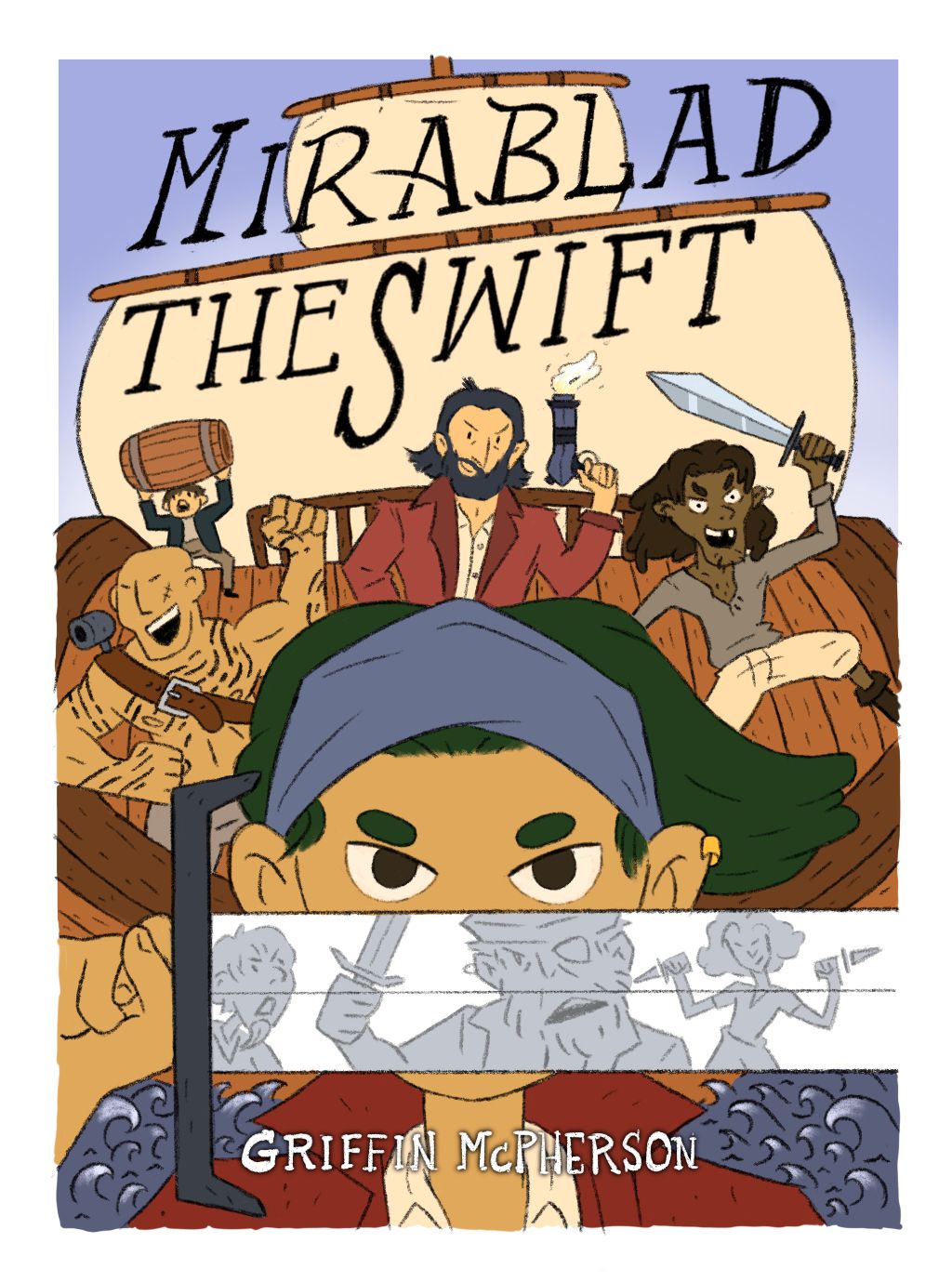
              Update: added in my flat colors and I think I’m going to try this warmer overlay on my second image here and then I’ll erase away the spots where I want shadow. Everything always looks wrong to me in the flat color stage so I’m just going to keep pushing forward and hope it all works out lol.

              Let me know your thoughts. One thing in particular that I’m wondering is if the tattoos look weird in the guy on the left. Can’t quite decide. 49FD4AC9-5C55-4885-BEA7-793C9A634240.jpeg 4C48BFA2-5E14-4451-8CD4-7BC429892974.jpeg

              susanhowarth.art ? Nyrryl  Cadiz 3 Replies Last reply Reply Quote 1
              • susanhowarth.art
                susanhowarth.art @Griffin McPherson last edited by

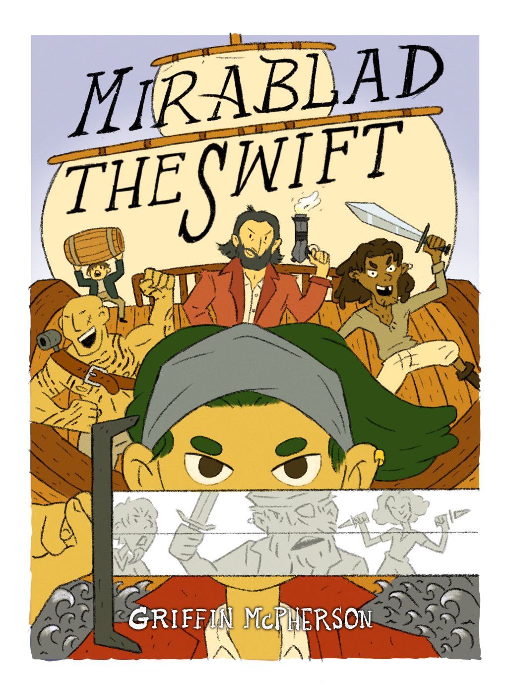
                @Griffin-McPherson Hi! I love the reflection in the sword. It really stands out in the coloured version.

                If you go with the second overlay option, I would alter the colour of the water. It’s so grey that on quick glance it doesn’t look like water.

                I agree that the tattoos look a bit odd, but I’m not sure what to suggest.

                Griffin McPherson 1 Reply Last reply Reply Quote 0
                • Griffin McPherson
                  Griffin McPherson @susanhowarth.art last edited by

                  @susanhowarth-art I might just have to play around with more designs for the tattoos. I agree the water doesn’t look right. The bandana also doesn’t look great with this overlay so I’ll be tweaking both of these. Thanks for for the feedback!

                  1 Reply Last reply Reply Quote 1
                  • Asyas_illos
                    Asyas_illos last edited by

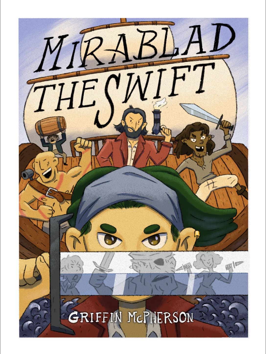
                    @Griffin-McPherson i like first color option better and yes at first glance I didn’t read them as tattoos.

                    Asyasewardillos@gmail.com
                    www.Instagram.com/asyas_illos/
                    https://asyasewardillos.wixsite.com/mysite

                    1 Reply Last reply Reply Quote 1
                    • ?
                      A Former User @Griffin McPherson last edited by

                      This post is deleted!
                      Griffin McPherson 1 Reply Last reply Reply Quote 1
                      • Griffin McPherson
                        Griffin McPherson @Guest last edited by

                        @Stephanie-H no the tattoos aren’t meant to be anything specific really. Maybe I should just make it into larger, more readable shapes

                        ? 1 Reply Last reply Reply Quote 0
                        • von_Nimmermehr
                          von_Nimmermehr last edited by

                          I also like the first one more.

                          as for the Tattooed guy. I get, that its just a Cover but maybe you should dig in to some styles. Whats his ethnicity? When you get into shapes it could end up looking like Maori? So i would consider to put some thougths into it...But don't want to make it to complicated here.

                          I didnt recocnize them as tattoos at first and still find them not odd in a way.

                          Website: www.von-Nimmermehr.com
                          Instagram: https://www.instagram.com/von_nimmermehr_illustration/

                          1 Reply Last reply Reply Quote 0
                          • Nyrryl  Cadiz
                            Nyrryl Cadiz SVS OG @Griffin McPherson last edited by

                            @Griffin-McPherson I personally like the first one. Maybe just add shadows?

                            Portfolio: nyrrylcadiz.com
                            Instagram: https://www.instagram.com/nyrryl_cadiz/
                            YouTube: https://www.youtube.com/channel/UCbJCF1Im8ZO7hpGWTKOJMuA

                            1 Reply Last reply Reply Quote 0
                            • ?
                              A Former User @Griffin McPherson last edited by

                              @Griffin-McPherson Agreed changing and size and shape could definitely help.

                              1 Reply Last reply Reply Quote 0
                              • Griffin McPherson
                                Griffin McPherson last edited by

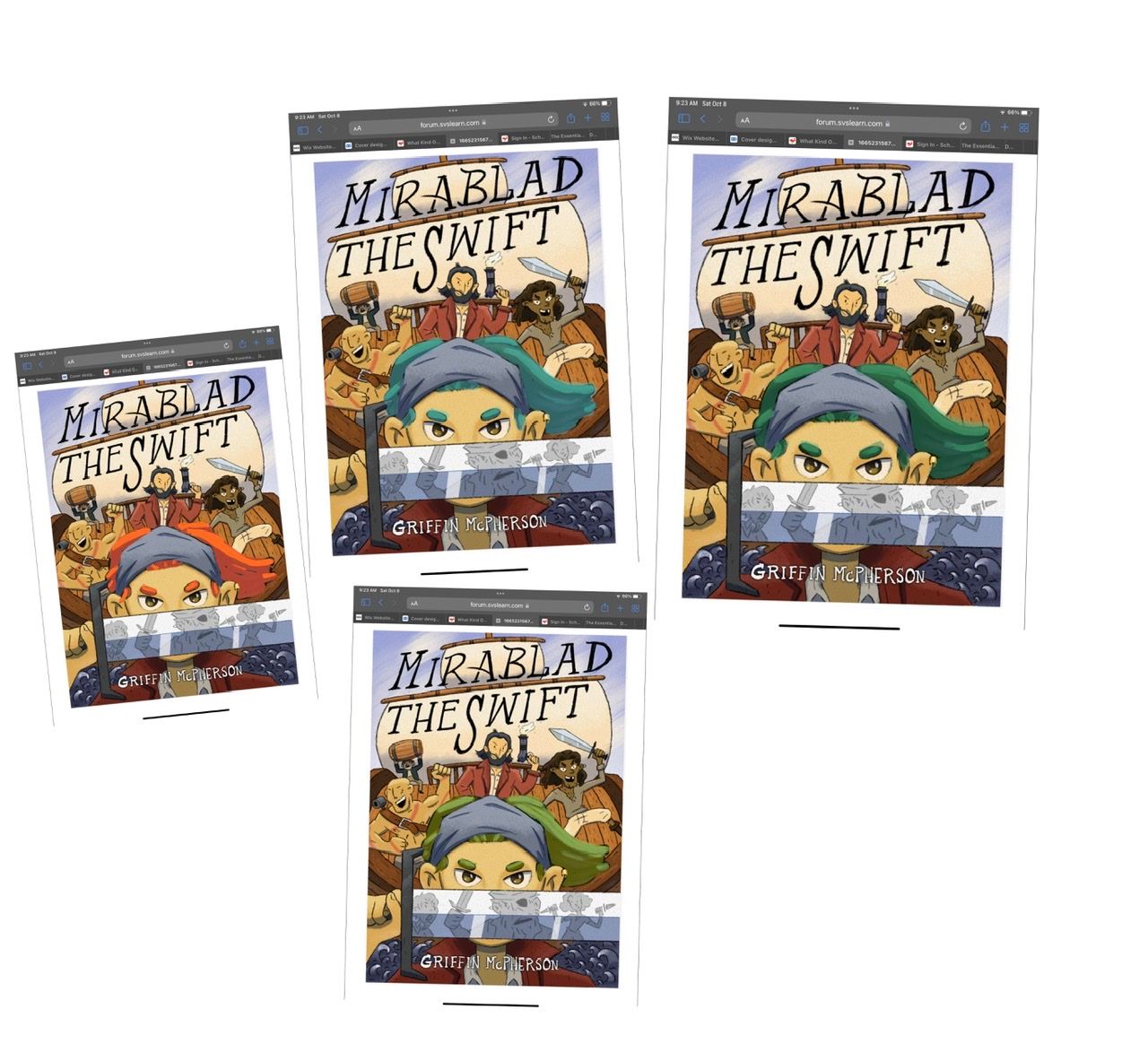
                                Update: I’m done with everything except the lettering at this point. Still open to feedback of course. Let me know if anything could use fixing or is visually confusing 8B1FDEC7-87BB-49CA-8BD8-DAB9AC60ECC1.jpeg

                                Asyas_illos Nyrryl  Cadiz kirsten-mcg ? 4 Replies Last reply Reply Quote 0
                                • Asyas_illos
                                  Asyas_illos @Griffin McPherson last edited by

                                  @Griffin-McPherson wow it really turned out great!

                                  Asyasewardillos@gmail.com
                                  www.Instagram.com/asyas_illos/
                                  https://asyasewardillos.wixsite.com/mysite

                                  Asyas_illos 1 Reply Last reply Reply Quote 0
                                  • Asyas_illos
                                    Asyas_illos @Asyas_illos last edited by Asyas_illos

                                    @Asyas_illos I’m not sure the green is really working well with the rest of the color palette though could try doing an overlay layer and play around with some different colors? I think some thing a little more on blue#green side would tie it together a bit more. Just my personal pref. and opinion.
                                    6B8AE2A0-20F8-4452-A206-7156D6645BF1.jpeg

                                    Asyasewardillos@gmail.com
                                    www.Instagram.com/asyas_illos/
                                    https://asyasewardillos.wixsite.com/mysite

                                    Nyrryl  Cadiz 1 Reply Last reply Reply Quote 1
                                    • Nyrryl  Cadiz
                                      Nyrryl Cadiz SVS OG @Griffin McPherson last edited by

                                      @Griffin-McPherson This is just me but I find the figures on the sword to be distracting and unneeded. I think it will look better without. Overall, I think it's looking great

                                      Portfolio: nyrrylcadiz.com
                                      Instagram: https://www.instagram.com/nyrryl_cadiz/
                                      YouTube: https://www.youtube.com/channel/UCbJCF1Im8ZO7hpGWTKOJMuA

                                      1 Reply Last reply Reply Quote 1
                                      • Nyrryl  Cadiz
                                        Nyrryl Cadiz SVS OG @Asyas_illos last edited by

                                        @Asyas_illos @Griffin-McPherson i like that green on that bottom piece better.

                                        Portfolio: nyrrylcadiz.com
                                        Instagram: https://www.instagram.com/nyrryl_cadiz/
                                        YouTube: https://www.youtube.com/channel/UCbJCF1Im8ZO7hpGWTKOJMuA

                                        1 Reply Last reply Reply Quote 1
                                        • kirsten-mcg
                                          kirsten-mcg @Griffin McPherson last edited by

                                          @Griffin-McPherson overall this is an amazing cover design! It looks like a book my kids would be really into. I like the different colors @Asyas_illos tried with her hair. To me, the green you've used stands out a bit too much and doesn't seem to go with the other colors. I really like the one with red hair, and the blue/green one is nice too.

                                          Instagram: https://www.instagram.com/kirsten.mcgonigal.art/
                                          Portfolio Site: www.kirstenmcgonigalart.com

                                          1 Reply Last reply Reply Quote 0
                                          • ?
                                            A Former User @Griffin McPherson last edited by

                                            @Griffin-McPherson Wow it's really coming together! It seems like you just have some final details to just play around with like some color options for the hair and such.

                                            1 Reply Last reply Reply Quote 0
                                            • First post
                                              Last post