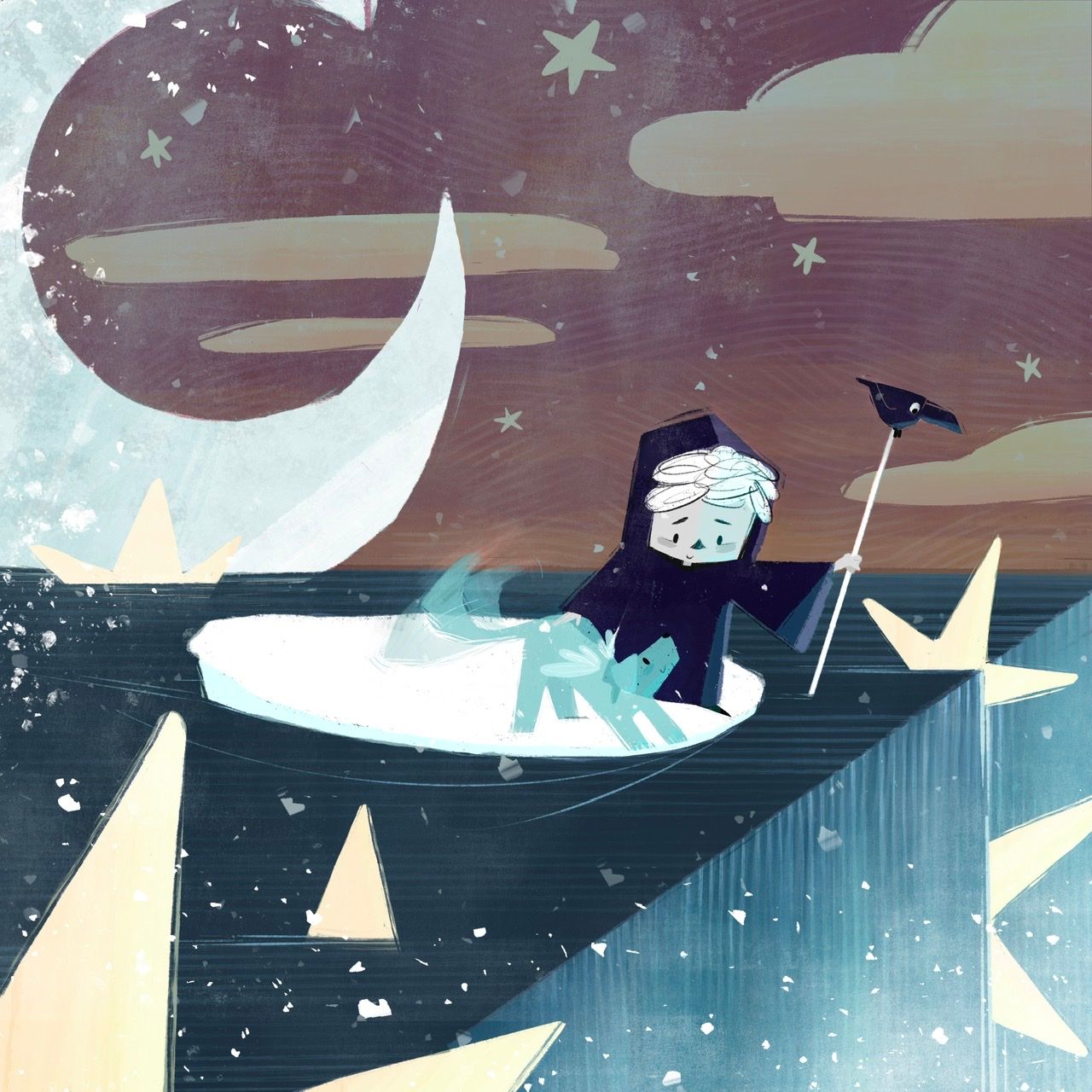
End of the line…wip ^_^
-
@Miriam I wasn’t sure I wanted to add that or not. I was thinking of ways I make it look like one without actually being one, like having a crow buddy who sits on the end. Also I wanted it doubling as his paddle stick or whatever they are called in Italy, to push the boats around? I guess we’ll see how it comes out, thanks for the feedback!

-
@Asyas_illos According to a Google search leading to https://adventure.howstuffworks.com/gondola2.htm, they are paddles (which is necessary where the water is deeper).
-
@Miriam oh nice, good to know! Thanks for checking that out

-
Gonna sit on this for a bit while work on the other…
-
@Asyas_illos I totally got that! At the first one I was thinking they were coming to the edge of the world, but then with the stars and moon and stuff I wasn't sure...
But with the angel wings and stuff right away I was thinking, "Did they pass away? Or one of them?" But they look happy... but then they're right beside this precipice... kind of looks like they're about to fall off something, maybe needs something to show that it isn't them falling off into oblivion? That it's a good thing, that they're falling into a new beginning like you mentioned? Up to you. It is a little complex but I love it. -
@beccabee_draws thank you, yes it turned out to a lot more complex than I originally thought, hopefully one of the judges will understand the symbology and concept.
-
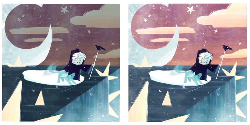
Darker or lighter?
-
@Asyas_illos I am drawn more to the lighter version!
-
@AngelinaKizz thanks, knowing the prompt, do you think the sign is necessary? I know to someone unaware of the prompt, they would likely need explanation.
-
@Asyas_illos They are both beautiful (what a great palette!), but I prefer the darker one because it more clearly divides the picture into a before and after. However, the darker one might have a contrast issue that takes away from the focal point (if you’re not careful), so the lighter might be easier to pull off in a good way.
So that’s my extremely unhelpful answer.
 Sorry.
 -
@Asyas_illos I think I like the lighter one.
Your creatures are so cute! I like the wagging effect on the dog's tail.
-
@Miriam @Mia-Clarke thank you for sharing your views!
-
I added one more option lighter sky but kept the water dark on top
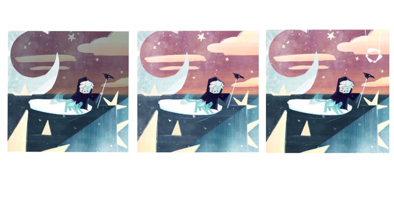
Oops ignore the sign unless you like it


-
@Asyas_illos I still like the middle one. It looks happier to me. Also, the ones with the darker water lose the edge of the rope.
Also, can you try moving your character up a little? the line of the stretched out arm is right along the horizon line. -
@Miriam thanks for catching that I thought it was raised enough, but at a distance it’s totally on there.
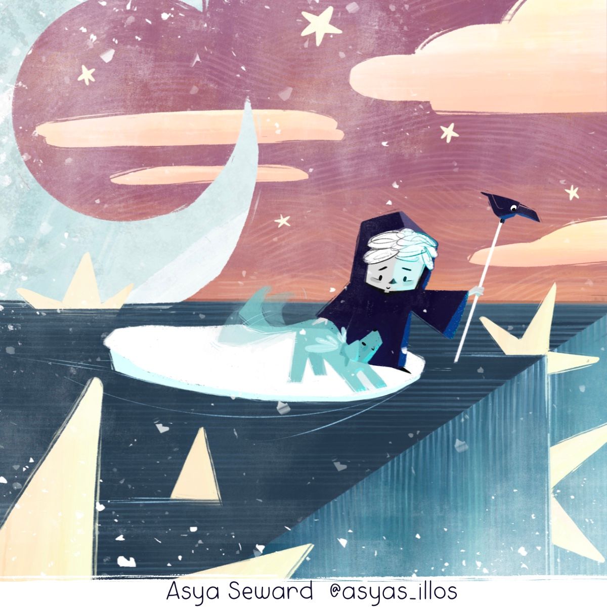
I think I’m going to call it on this but let me know if anything else stands out.
-
Love this composition @Asyas_illos!
-
@Jeremy-Ross thank you!
-
@Asyas_illos I love how this turned out! And in looking through your earlier versions I didn't even notice the recycling sign in the one until I read your comment about it, but I still got the concept immediately! I think you did a great job of making this complex story come through!
-
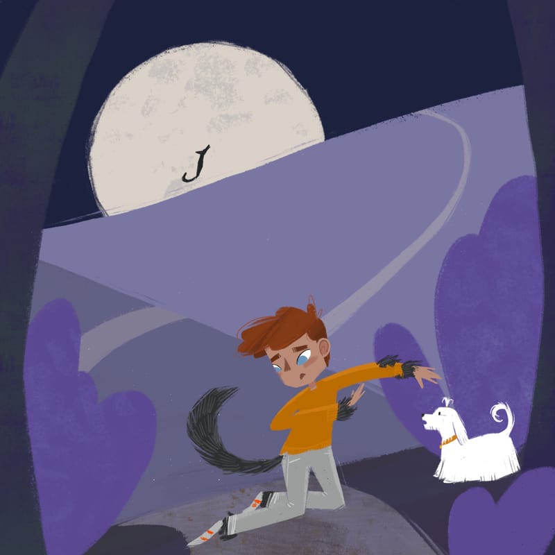
So I’m still messing with colors and comp, but here’s how this werewolf Kamari is settling up. I’m not sure if I like the dog style, I may try other breeds too.
-
@Asyas_illos I like this idea very much and how the transition is playing out!
I just noticed the white dog might be a bit off? It looks like he's watching something behind the kid, maybe if you move him front a bit?
Other wise, your ideas are brilliant and I admire how many different illustrations you are able to come up with each month!!