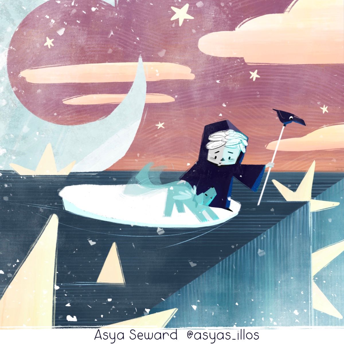
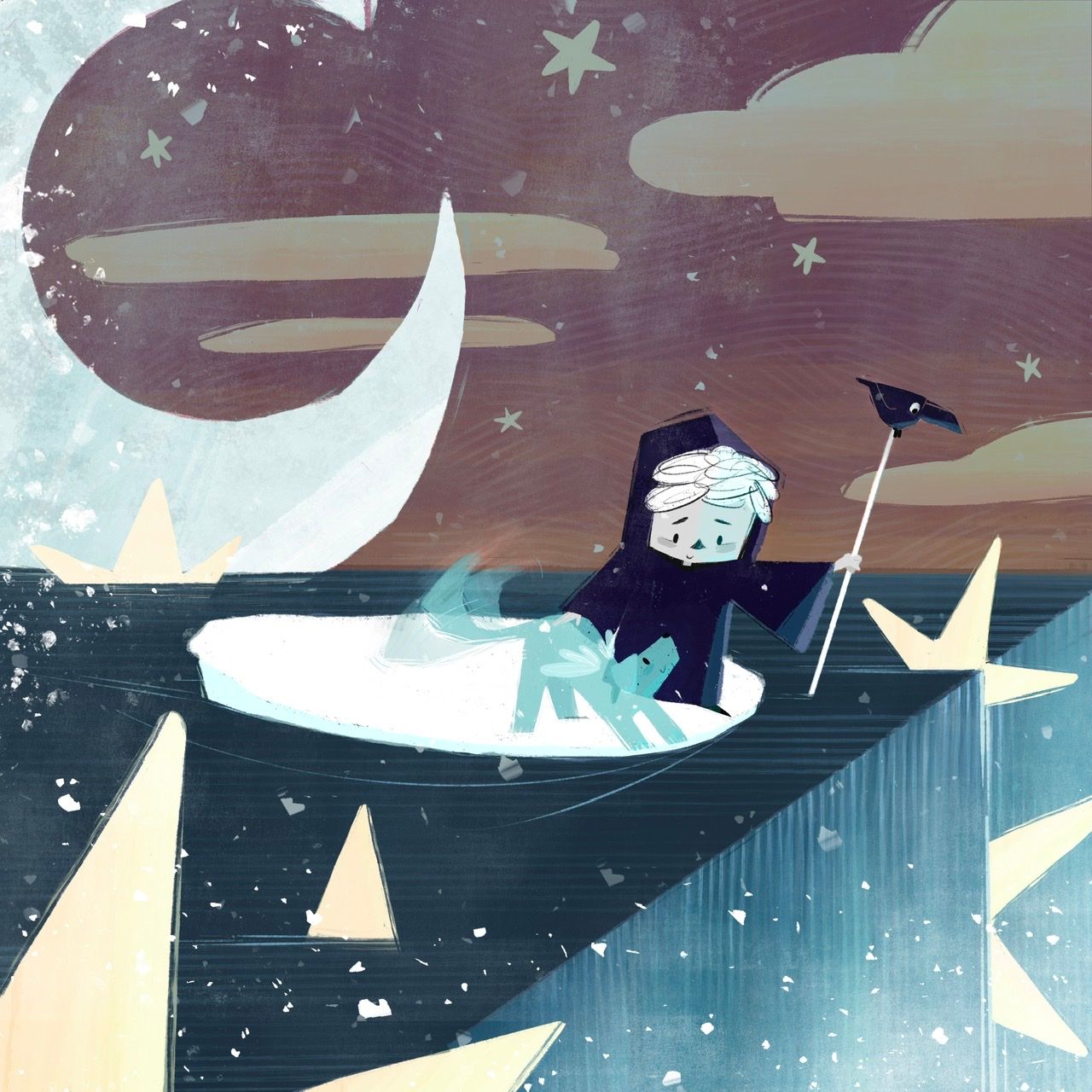
End of the line…wip ^_^
-
Alright some of you might call this a cop out, but I used a sign. (Sighs) I know not always the way to go but I really love this one and I just could t figure out how to convey my story better, oh well. Also I’m thinking I want the child to be a cute child-friendly version of death, instead of angel. But that can be as easy as a wardrobe change if not.
Anyway that’s where I’m at now…
-
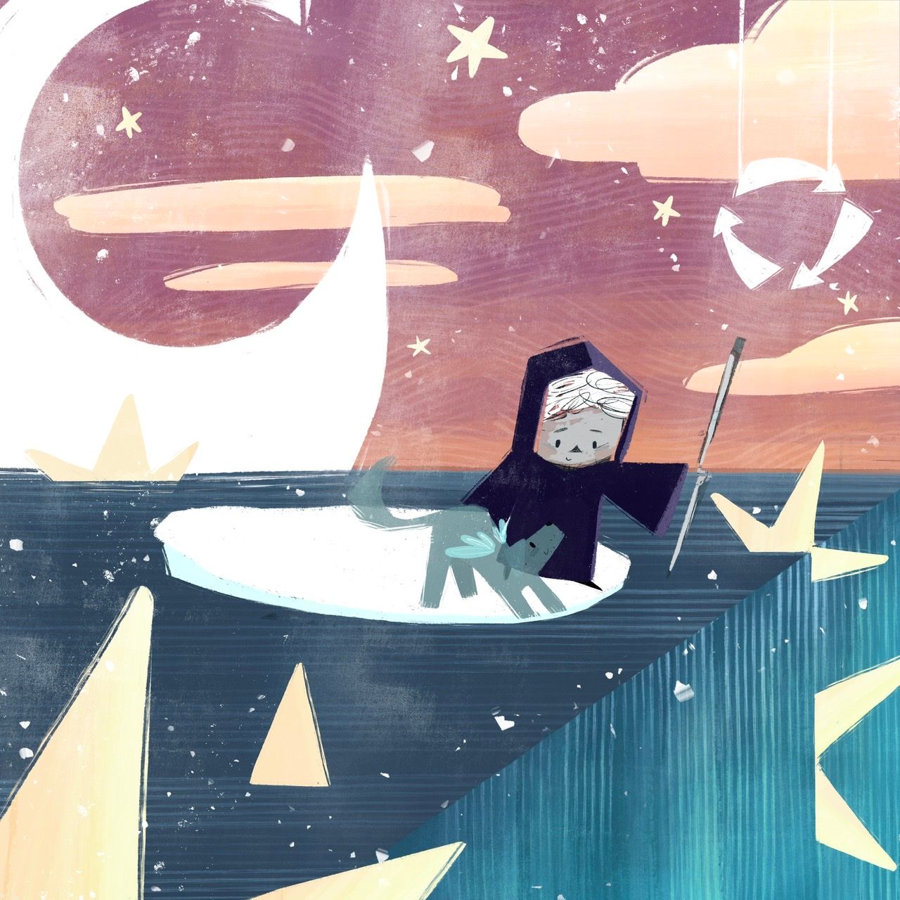
@Asyas_illos I don't think your sign is the same as an in your face "reincarnation here" sign. I like that it makes you think about what it means.
-
@Asyas_illos with the dog being more ghost and the kid dressed like that it is much clearer! I'm wondering if the sign is really needed, but it can give additional clues. I think you're going to make this one work.
-
@Asyas_illos plus I like your textures
-
@Asyas_illos I like both of your ideas.
I didn't get the werewolf one at first, since there wasn't a bite mark that I could see, but the finished version would have made that clear, so I think it would come across easily then.
This angel pup one is really developing well.
You might want to consider adding a scythe blade to the baby-angel-of-death's staff, unless you want to stay further away from the Grim Reaper. (I had to look up the difference between sickle and scythe to make sure I got the right one!)

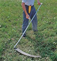
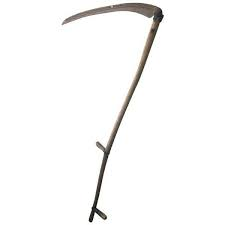
(These are all scythes. The sickle is the curved one that was on the old USSR / Russian Flag.)Since you want him to be friendlier, you could also change the scythe to a shepherd's crook — or just stick with the current staff.
The edge of the waterfall is very straight. Are you doing that to emphasize the "end of the road" concept?
I agree with @AngelinaKizz that the recycle sign isn't the same as a written sign. And with @Chantal-Goetheer that you may not need it at all anymore. Either way, I think it works.
-
@Miriam I wasn’t sure I wanted to add that or not. I was thinking of ways I make it look like one without actually being one, like having a crow buddy who sits on the end. Also I wanted it doubling as his paddle stick or whatever they are called in Italy, to push the boats around? I guess we’ll see how it comes out, thanks for the feedback!

-
@Asyas_illos According to a Google search leading to https://adventure.howstuffworks.com/gondola2.htm, they are paddles (which is necessary where the water is deeper).
-
@Miriam oh nice, good to know! Thanks for checking that out

-
Gonna sit on this for a bit while work on the other…
-
@Asyas_illos I totally got that! At the first one I was thinking they were coming to the edge of the world, but then with the stars and moon and stuff I wasn't sure...
But with the angel wings and stuff right away I was thinking, "Did they pass away? Or one of them?" But they look happy... but then they're right beside this precipice... kind of looks like they're about to fall off something, maybe needs something to show that it isn't them falling off into oblivion? That it's a good thing, that they're falling into a new beginning like you mentioned? Up to you. It is a little complex but I love it. -
@beccabee_draws thank you, yes it turned out to a lot more complex than I originally thought, hopefully one of the judges will understand the symbology and concept.
-
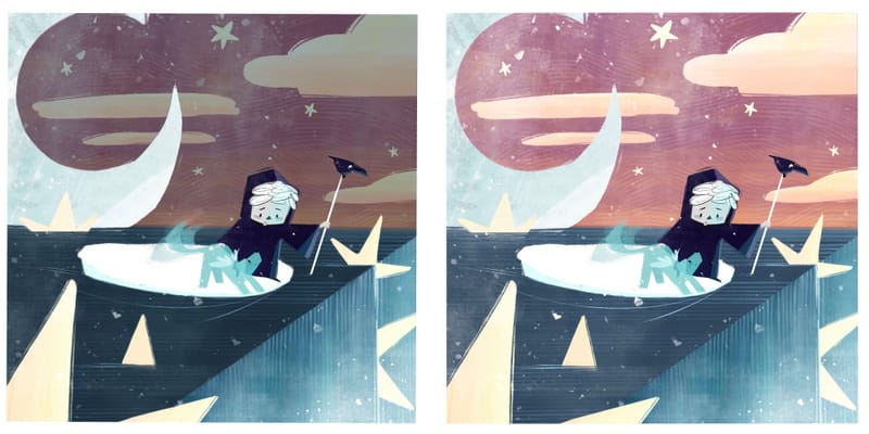
Darker or lighter?
-
@Asyas_illos I am drawn more to the lighter version!
-
@AngelinaKizz thanks, knowing the prompt, do you think the sign is necessary? I know to someone unaware of the prompt, they would likely need explanation.
-
@Asyas_illos They are both beautiful (what a great palette!), but I prefer the darker one because it more clearly divides the picture into a before and after. However, the darker one might have a contrast issue that takes away from the focal point (if you’re not careful), so the lighter might be easier to pull off in a good way.
So that’s my extremely unhelpful answer.
 Sorry.
 -
@Asyas_illos I think I like the lighter one.
Your creatures are so cute! I like the wagging effect on the dog's tail.
-
@Miriam @Mia-Clarke thank you for sharing your views!
-
I added one more option lighter sky but kept the water dark on top
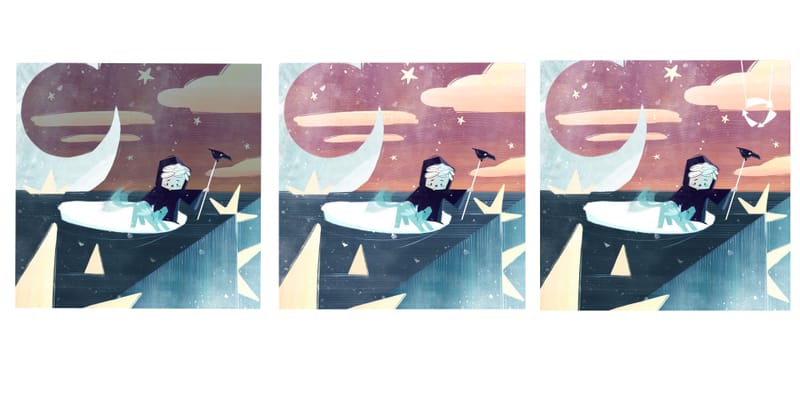
Oops ignore the sign unless you like it


-
@Asyas_illos I still like the middle one. It looks happier to me. Also, the ones with the darker water lose the edge of the rope.
Also, can you try moving your character up a little? the line of the stretched out arm is right along the horizon line. -
@Miriam thanks for catching that I thought it was raised enough, but at a distance it’s totally on there.
I think I’m going to call it on this but let me know if anything else stands out.
