Society of Visual Storytelling

    SVSLearn Forums

    • Register
    • Login
    • Search
    • Recent
    • Tags
    • Popular
    • Users
    • Groups
    • Search

    Kumari WIP

    Contest
    11
    25
    1726
    Loading More Posts
    • Oldest to Newest
    • Newest to Oldest
    • Most Votes
    Reply
    • Reply as topic
    Log in to reply
    This topic has been deleted. Only users with topic management privileges can see it.
    • Asyas_illos
      Asyas_illos @ArtistErin last edited by

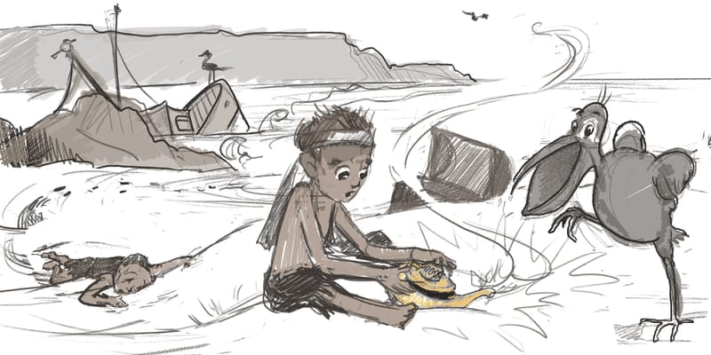
      @ArtistErin I don’t think seeing the genie is necessary, great concept, though at first I didn’t notice the body back there and assumed Kamari was one of the birds. Maybe he could be reaching out for it? Or it may unfold better as you color.

      Asyasewardillos@gmail.com
      www.Instagram.com/asyas_illos/
      https://asyasewardillos.wixsite.com/mysite

      ArtistErin 1 Reply Last reply Reply Quote 0
      • ArtistErin
        ArtistErin @Asyas_illos last edited by

        @Asyas_illos Good point, thank you, I want to give the impression this genie wants out, and Kamari (ha I misspelled it in the title) doesn't know yet but the birds do. Will post as more color helps outline everything.

        Erin Richardson
        instagram.com/erinrichardsondesigns21
        www.erinrichardsondesigns.com

        1 Reply Last reply Reply Quote 1
        • beccabee_draws
          beccabee_draws @ArtistErin last edited by

          @ArtistErin I thought Kumari was inside of the lamp at first. Just with the contrast, I think that area of the picture really caught my eye. It's in the foreground too, so feels like it's the focus of the image... but I agree w Asyas, maybe with colour and lighting you can make Kumari stand out more.

          1 Reply Last reply Reply Quote 0
          • ArtistErin
            ArtistErin last edited by

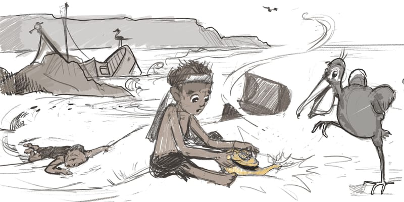
            Thoughts on this development?

            Wanted Kamari to be the focal point and figured out you guys were confused about who Kamari is.

            Hope this reads clearer...
            🙂

            kamari2 copy.jpg

            Erin Richardson
            instagram.com/erinrichardsondesigns21
            www.erinrichardsondesigns.com

            Eric Castleman AngelinaKizz 2 Replies Last reply Reply Quote 1
            • Eric Castleman
              Eric Castleman @ArtistErin last edited by

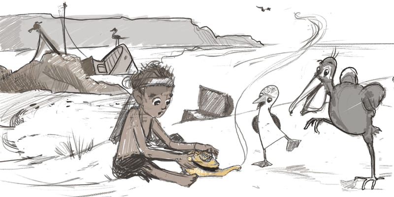
              @ArtistErin I like where this concept has moved towards. My only tidbit to add is that the bottom of the pelicans beak needs to be in better perspective. Make the circle flatter a bit.

              EricCastleman.com

              SCBWI profile
              https://www.scbwi.org/members-public/eric-castleman

              ArtistErin 1 Reply Last reply Reply Quote 0
              • AngelinaKizz
                AngelinaKizz @ArtistErin last edited by

                @ArtistErin the new one is better, though I think you could lose the person in the background. It feels too dark.

                www.evarartistry.com
                www.Instagram.com/evarartistry/

                ArtistErin 1 Reply Last reply Reply Quote 1
                • ArtistErin
                  ArtistErin @Eric Castleman last edited by

                  @Eric-Castleman Awesome. Yes, I see that.

                  Here's a redraw of the pelican... So much better thank you. Your thoughts on this new development?

                  kamari2 copy.jpg

                  Erin Richardson
                  instagram.com/erinrichardsondesigns21
                  www.erinrichardsondesigns.com

                  Pamela Fraley 1 Reply Last reply Reply Quote 1
                  • ArtistErin
                    ArtistErin @AngelinaKizz last edited by

                    @AngelinaKizz Ahhh like he died and he's just a dead body! EW yep ok losing the comatose friend.

                    LMAO

                    Erin Richardson
                    instagram.com/erinrichardsondesigns21
                    www.erinrichardsondesigns.com

                    1 Reply Last reply Reply Quote 1
                    • Pamela Fraley
                      Pamela Fraley SVS OG @ArtistErin last edited by

                      @ArtistErin I like this concept. I agree with the others that the body is a bit dark. Maybe you could take it out and add the other bird back in. It was such a acute bird, I was a little sad to see him taken out.

                      instagram.com/fraleycreates

                      ArtistErin 1 Reply Last reply Reply Quote 0
                      • K
                        katsuds last edited by

                        I absolutely love this concept! I agree about taking out the background character. Loving the idea of adding the original bird back in and also keeping the boy. He adds more depth to the story. I don't think you need to fully see the genie but just having a hint of a genie is a good idea. We can definitely tell from the lamp what is about to happen. Love where you are going with this and I can't wait to see the finished piece. And side note, this could also work for the glow prompt. having the genie with a slight glow could be interesting. Excited for this.

                        1 Reply Last reply Reply Quote 1
                        • ArtistErin
                          ArtistErin @Pamela Fraley last edited by

                          @Pamela-Fraley I took him out initially because it seemed too busy with the friend laying there ha ha and looking at this again I see I can try it. It helps to have fresh eyes today:) I like this Blue Footed booby!

                          kamari2 Booby.jpg

                          Erin Richardson
                          instagram.com/erinrichardsondesigns21
                          www.erinrichardsondesigns.com

                          mag Pamela Fraley 2 Replies Last reply Reply Quote 4
                          • mag
                            mag Pro SVS OG @ArtistErin last edited by

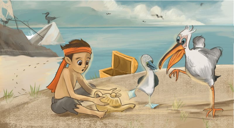
                            @ArtistErin I think this is awesome! 🤩and I do like it better without the second character lying on the beach, I must say 😊
                            Maybe I would crop the image a little bit (loose a bit of the left side of your illustration), cause all the action is on the right side and it seams a bit off balance? But maybe that's just me. Great job!

                            Mag
                            https://www.instagram.com/mag_takac/
                            http://mag.takac.name

                            ArtistErin 1 Reply Last reply Reply Quote 2
                            • ArtistErin
                              ArtistErin @mag last edited by

                              @mag COOL! Thank you 🙂

                              Erin Richardson
                              instagram.com/erinrichardsondesigns21
                              www.erinrichardsondesigns.com

                              1 Reply Last reply Reply Quote 0
                              • Pamela Fraley
                                Pamela Fraley SVS OG @ArtistErin last edited by

                                @ArtistErin LOVE!! Your birds are adorable. 😊

                                instagram.com/fraleycreates

                                ArtistErin 1 Reply Last reply Reply Quote 0
                                • ArtistErin
                                  ArtistErin @Pamela Fraley last edited by

                                  @Pamela-Fraley AWW thank you 🙂

                                  Erin Richardson
                                  instagram.com/erinrichardsondesigns21
                                  www.erinrichardsondesigns.com

                                  LittleRaven 1 Reply Last reply Reply Quote 0
                                  • ArtistErin
                                    ArtistErin last edited by

                                    Kamari color...

                                    Feeling hesitant to submit! Hope I'm making progress here. Wondering if this looks alright and clear, good rendering?

                                    Thoughts welcome...

                                    kamari2Color.jpg

                                    Erin Richardson
                                    instagram.com/erinrichardsondesigns21
                                    www.erinrichardsondesigns.com

                                    Kim Rosenlof 1 Reply Last reply Reply Quote 1
                                    • Kim Rosenlof
                                      Kim Rosenlof @ArtistErin last edited by

                                      @ArtistErin This is looking good. I like your concept and the characters. I think that the ship is lost in this version. I think you need to make sure it is more visible since it tells us the "end" part of the prompt. Also, watch for the tangent of the right bird and the ocean horizon line. I also like that you are using a limited pallet.

                                      Instagram: https://www.instagram.com/kiminyrose/

                                      1 Reply Last reply Reply Quote 0
                                      • LittleRaven
                                        LittleRaven @ArtistErin last edited by

                                        @ArtistErin I really like your concept. As for my feedback, my attention is really drawn to the bird on the right. I think this is because it has the most colour contrast on its beak (the bright saturated orange against the blue background), maybe make the orange a little less saturated. And I think the other bird should also look at the lamp, now it's just looking at the birds feet and nothing is going there. Keep up the good work!

                                        ArtistErin 1 Reply Last reply Reply Quote 0
                                        • ArtistErin
                                          ArtistErin last edited by ArtistErin

                                          Kamari update...

                                          Needed to make the shipwreck more clear and also show Kamari just discovered a hidden treasure chest. What do think about the crabs I added? Trying to avoid over rendering the sand but do you think it needs something?
                                          @Kim-Rosenlof thank you for your feedback! So much appreciation 🙂 I see the eyes on the blue footed booby need to be more clear but otherwise I think I'll go ahead and submit this.
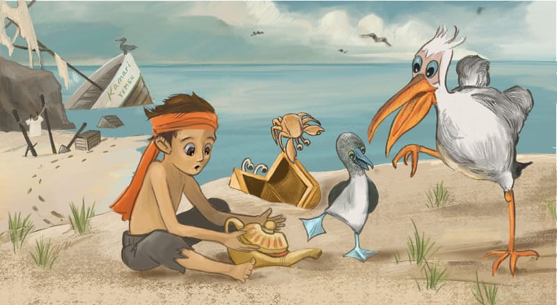
                                          kamari2 copy.jpg

                                          Erin Richardson
                                          instagram.com/erinrichardsondesigns21
                                          www.erinrichardsondesigns.com

                                          Asyas_illos ArtMelC 2 Replies Last reply Reply Quote 3
                                          • Asyas_illos
                                            Asyas_illos @ArtistErin last edited by

                                            @ArtistErin this looks really good I’m glad you did away with “the body” lol. I do think the crabs clutter it a bit though.

                                            Asyasewardillos@gmail.com
                                            www.Instagram.com/asyas_illos/
                                            https://asyasewardillos.wixsite.com/mysite

                                            ArtistErin 1 Reply Last reply Reply Quote 0
                                            • First post
                                              Last post