Society of Visual Storytelling

    SVSLearn Forums

    • Register
    • Login
    • Search
    • Recent
    • Tags
    • Popular
    • Users
    • Groups
    • Search

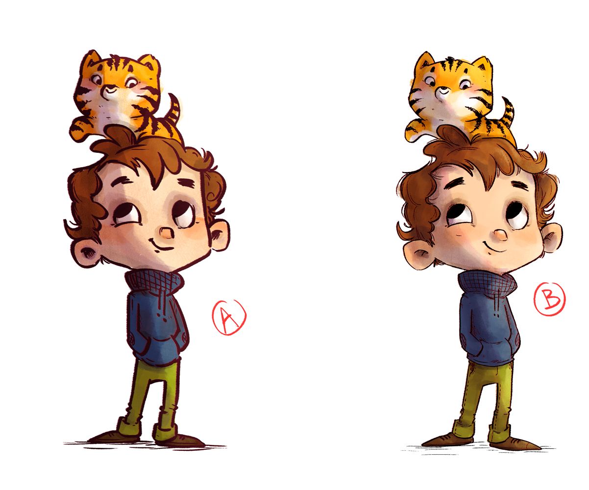
    Help me choose the proper line thickness, please?

    Artwork
    10
    10
    483
    Loading More Posts
    • Oldest to Newest
    • Newest to Oldest
    • Most Votes
    Reply
    • Reply as topic
    Log in to reply
    This topic has been deleted. Only users with topic management privileges can see it.
    • mag
      mag Pro SVS OG last edited by mag

      Hi art folks!

      I am working on some character art for a possible book project of mine and cannot decide, what line thickness would go better with my art?
      Do you prefer character A or B?
      It's going to be a humorous early readers book, with illustrations on every page, some full bleed, some just spots, some in color, some B&W. And I'm not sure how thick my ink lines should be...

      Pip.jpg
      tigr_barva.jpg
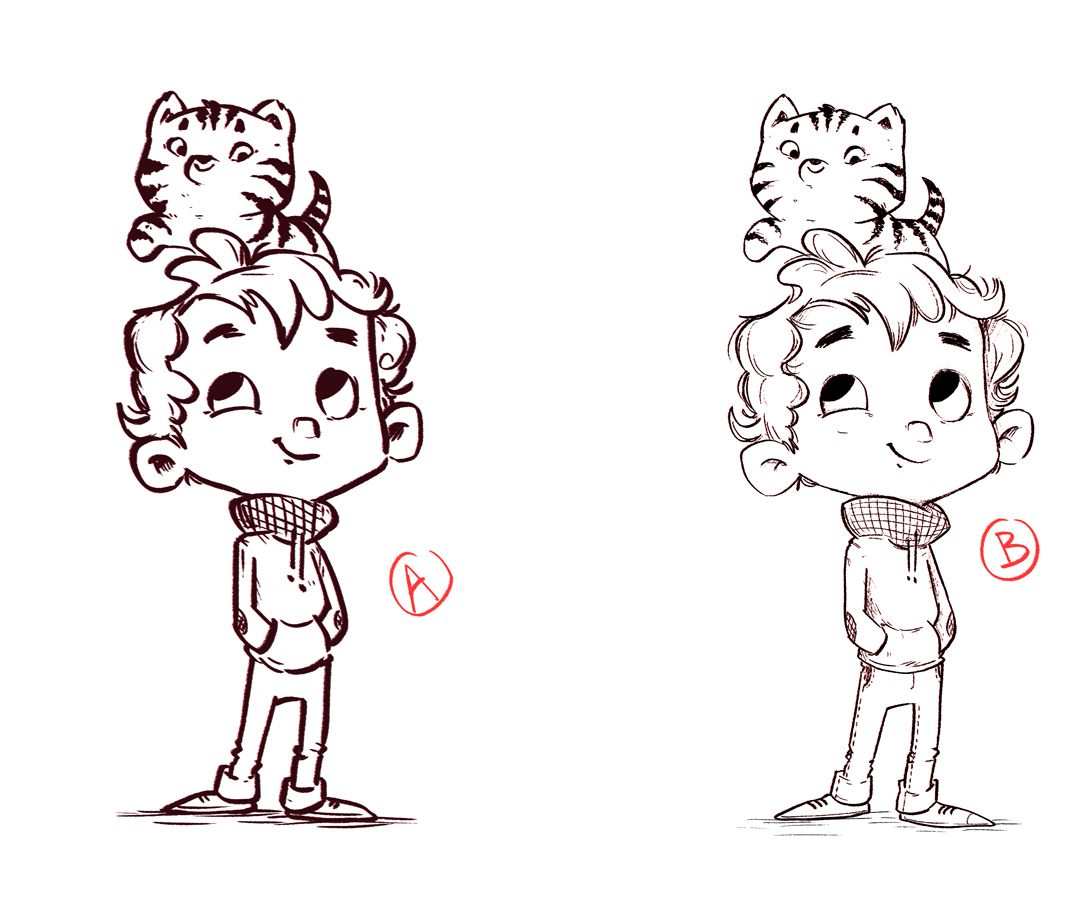
      Thank you so much! It might sound silly, but believe me, it's hard to decide! 😅

      Mag
      https://www.instagram.com/mag_takac/
      http://mag.takac.name

      tomparsonsart KevinTreaccar Chantal Goetheer kirsten-mcg Jeremy Ross 5 Replies Last reply Reply Quote 0
      • tomparsonsart
        tomparsonsart @mag last edited by tomparsonsart

        @mag I like the thinner one, B. The thicker one seems like it was added afterward which makes it look kind of blurry to me. There seems to be more variation in the thinner one. Really nice drawing!

        www.tomparsonsart.com
        https://www.instagram.com/tomparsonsart/

        1 Reply Last reply Reply Quote 1
        • KevinTreaccar
          KevinTreaccar @mag last edited by KevinTreaccar

          @mag I agree on B. The line work feels a little dominant to me with A.

          I like A. If you were pairing A with a simpler rendering style – such as no shading or a minimal color scheme – I think it would work real well.

          But with the rest of your work on A and B, I prefer A (edit: I meant B here).

          kevintreaccar.com
          instagram.com/kevintreaccar

          1 Reply Last reply Reply Quote 2
          • Chantal Goetheer
            Chantal Goetheer @mag last edited by

            @mag my son voted for A

            1 Reply Last reply Reply Quote 1
            • Rachel Horne
              Rachel Horne last edited by

              I would say B too

              www.rachel-horne.com
              instagram.com/rachel_horne_art

              1 Reply Last reply Reply Quote 1
              • kirsten-mcg
                kirsten-mcg @mag last edited by

                @mag I think B. For some reason to me A feels a little unfinished, like it's a concept sketch. B feels finished. I especially like it with the color added.

                Instagram: https://www.instagram.com/kirsten.mcgonigal.art/
                Portfolio Site: www.kirstenmcgonigalart.com

                1 Reply Last reply Reply Quote 1
                • Asyas_illos
                  Asyas_illos last edited by Asyas_illos

                  I prefer b also, I agree that a feels A bit blurred, makes my eyes struggle.

                  Asyasewardillos@gmail.com
                  www.Instagram.com/asyas_illos/
                  https://asyasewardillos.wixsite.com/mysite

                  1 Reply Last reply Reply Quote 1
                  • ArtistErin
                    ArtistErin last edited by

                    I tend to like B better, it feels more refined and easier to see characters.

                    Erin Richardson
                    instagram.com/erinrichardsondesigns21
                    www.erinrichardsondesigns.com

                    1 Reply Last reply Reply Quote 1
                    • Jeremy Ross
                      Jeremy Ross @mag last edited by

                      Hi @mag , I like B rendered, but A is better for B&W if you plan to accompany the book with some coloring pages for kiddos.

                      https://www.instagram.com/jeremyrayross
                      https://www.jeremyrayross.com/
                      https://twitter.com/jeremyrayross
                      https://jeremyrayross.substack.com/

                      1 Reply Last reply Reply Quote 2
                      • Sarah VanDam
                        Sarah VanDam last edited by Sarah VanDam

                        I can see why this is tough to decide—I could see a place for both styles. “A” looks a little more like it belongs in a comic, maybe, and B feels slightly more geared toward a picture book. I will say, though, that even though I see what people mean when they say that “A” feels “blurrier,” it does, at the same time, seem to lend itself well to a humorous, silly story, maybe slightly more so than B, which feels more quiet and sweet.

                        https://sarahvandam.art/
                        Instagram: @sarahvandam.art and @artistsandbox.etsy

                        1 Reply Last reply Reply Quote 1
                        • First post
                          Last post