Making my first Portfolio
-
@Geoffrey-Mégardon I think this is really nice! Interesting shapes and lots of personality. My only concern (perhaps it's personal choice so feel free to disregard) is that the only character that looks appealing is the dad. The children look kind of gross (especially the snotty girl) so it's hard to feel emotionally connected to them and worried for their well being
-
@carlianne this is a good point. Looking at other children’s books the kids are made to be very cute most of the time but if not cute then they’re simple to a point that makes them a sort of blank canvas for them to project themselves onto. You mentioned you’re interested in comics too though so the same rules may not apply in comics
-
@Griffin-McPherson yeah that may be true. I think it might be okay for them not to be traditionally cute if they were more engaging personality wise? If the girl was more spunky and excited and they boy confident or something? They are a little bland personality wise and not very appealing to look at. I think we might need Something that we can connect with as a viewer.
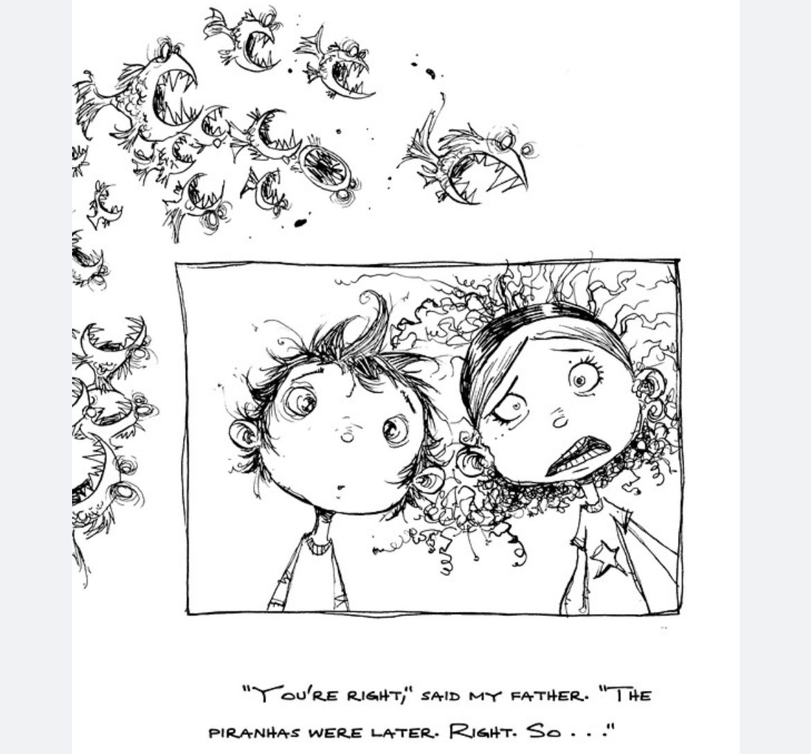
I think Skottie Young does this with a really good balance.
-
@Geoffrey-Mégardon I agree with what other people have said about the kids not being very cute. I think it might be an easy fix though! Sometimes just playing around with the positioning and size of the features is all it takes to make cuteness come across. In the example @carlianne shared, notice how the kids eyes are not only large, but very wide set. They are also cross eyed, which, for some reason, tends to look cute! Their noses are almost in line with the bottom of their eyes, and their mouths are a bit further down. You could try moving the kid's eyes in your character sheet down on their faces a little, or try making them wider set. Your shapes overall are very diverse and appealing, so I think if you just worked on the kids expressions a little this would be a knock out character lineup!
-
@Geoffrey-Mégardon After reading other people's critiques, I think the reason why the kids seem off is because they don't have facial proportions like children. Hansel looks too old even though he is short.
In the fairytale, it was based on a time in history where people were starving and the parents would be so desperate they would choose to feed themselves and abandon their children. Kinda grim. That's why you usually want the audience to root for the kids but also make it believable that they would fall for the witch's trap of providing sweets for them.
I am curious how your adaptation will make the story "a modern tale." Are the kids starving? Are they bratty and need to learn a lesson? Lots of potential but hard to tell from how the kids look of what their personalities are like.
-
That’s a lot of feedback! Thanks you very much for taking the time to give me this feedback, it is very much appreciated!
@Griffin-McPherson yes I have tried multiple designs for the stepmother. She is meant to be mystical, magical, manipulative and threatening. Her hair breaks her human, seductive silouhette with threatening random spikes, while still making a high contrast frame for her face. So it might not be perfect, but I like it

@carlianne that’s funny because I wanted the dad to also look rather normal. Only the stepmother and witch are meant to look unusual.
In terms of the kids being ugly.
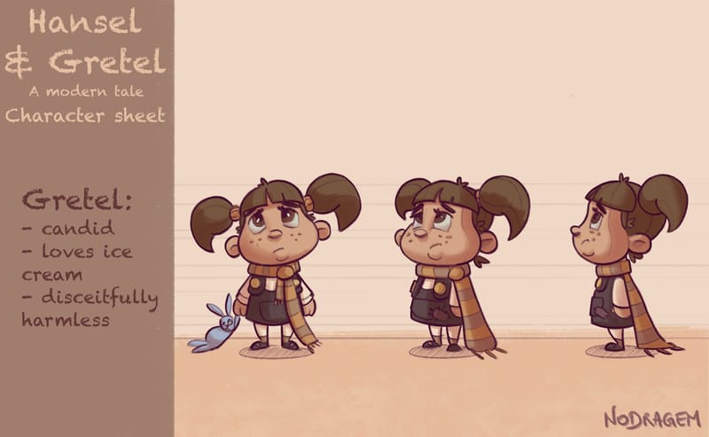
Concerning Gretel, I have changed a little bit her design now, so she doesn’t have a snotty nose and she has cuter eyes. My initial idea was to give her some Tim Burton-esque eyes (small dots) to make her look a bit creepy, as she is going to kill a witch in cold blood in the story. But I guess I can change her eyes during the story, when she is on the way to snap.Portfolio piece 2/15
Concerning Hansel, note that I already reviewed his proportion and changed his design when I’ve worked on porfolio piece 1. He was much more ugly initially, with black ring under his eyes from lack of sleep.
Here is how Hansel looked like before:
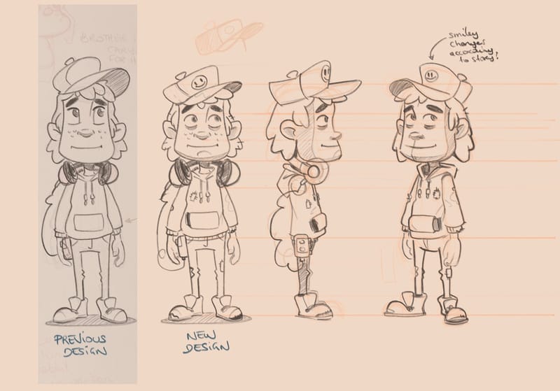 (note the « new design » is an old one)
So all in all, in porfolio piece 1 I already brought his eyes closer to his nose (to answer @kayleenartlover and @kirsten-mcg ). What I’ve tried in the following turnaround is to give him rounder cheeks and slightly wider pupils.
Portfolio piece 3/15
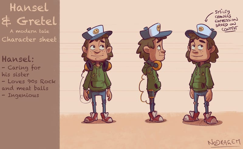
Generally speaking, I want the kids to not be over designed, and just serve as vessel for the story. I wanted to make them look poor and not well looked after, but I stepped back a lot from that idea. Only the fabric patches and holes in Hansel clothes remain as a clue.
@kayleenartlover concerning the « modern tale » bit, I may change that subtitle. The thing is that I use the script given by Jake, Will, and Lee in the CBP course. I did not want to make any changes to the script, and just play with how much the illustration can deviates from the traditional interpretation of the text. For instance, in the script there is nothing told about the stepmother being a magical being that manipulates the dad with some sort of magical mind control. But I add this idea in the visual story telling and I try to hint to that the witch is the stepmother. She is a sort of parasite that zombifies lonely Dads and eat their kids.
And you are right, Hansel and Gretel is a grim story and so it is hard to sell it as a Children Book to be honest. Maybe a children book for 12+? But anyway
 here it just serves as a good opportunity to make portfolio pieces.
 -
@Geoffrey-Mégardon I'm so sorry! I didn't mean to stay they were ugly!!! Just not traditionally appealing, which could work fine if in your story you want to be highlighting that it's actually super creepy that these kids straight up murder a witch. It just depends on what your story is and what you're trying to communicate.
That said i do think these look better but the boy does still look a bit old to me (late teens early 20s). Might be worth showing it around and having people guess the age.
-
@Geoffrey-Mégardon the stepmother looks fine, it was the ole woman/witch I was talking about with the silhouette
-
@carlianne that's a good idea, I will ask some friends to guess his age.
-
@Geoffrey-Mégardon Hi! This is just my opinion so feel free to disregard but I think it's more important to see narrative illustrations than character designs in a CB portfolio. Don't get too caught up in character designs, instead do more narrative illustrations.
-
@Geoffrey-Mégardon I’m going to step up and offer a different opinion than the others. My very first impression when I saw your characters, and I still feel this way even after reading the other comments, is that your characters are unique (from each other, meaning they don’t look like they came from the same mold as each other) and appealing (appealing doesn’t always mean cute) and I feel you nailed the look for a modern approach to the Hansel and Gretel story. I think you did a great job in conveying personality in your original designs just as they are even with the snot under Gretel’s nose . To me, that little detail adds to her character which I think you may have intended. The bunny adds to her innocence and youth, but the pigtails, freckles, and snot add that she could be a little sassy and bratty (and/or entitled) which in todays world, a lot of kids can relate to. Hansel looks to be more of a teen with his hoodie and unlaced high top sneakers. Keep the earphones and you nailed the boy teen with some attitude. I think the old lady witch looks cool and creepy with her large glasses and eyes, kinda like a mix between a Harry Potter and motorcycle grandma character. She is frumpy and low to the ground at kid-level height, all at once trying to relate to them but be devious and creepy. If this is what you intended, then I think you nailed it. But if I’m off, then maybe I gave you some ideas, lol. To me, the current trend of the way “cute” is drawn above is cookie cutter in my opinion. It is nice to see characters that don’t all look the same as each other which in of itself is appealing to me. Different shapes for different characters give off different personalities. Your lines are strong and confident which further adds to the appealing nature of your character designs.
-
@Maureen-Henry-Artist Thank you, your interpration is indeed what I wanted to communicate! it feels great that you described them as I see them.
This being said @carlianne was right. I showed around Hansel without his family and people's guess is between 13 and 40 years old! Something in the face, they say. He looks like a teenager but his face is that of an aldult. However, when he is showed with the rest of the line-up, they see him as 10-15 years old. Interesting... Not sure what to do though

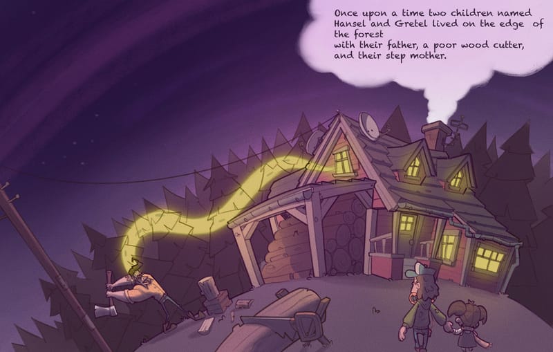
Anyway. Here are the pages, I have worked on. So that the portfolio starts to get some narrative illustrations as suggested by @Nyrryl-Cadiz.
Portfolio piece 4/15 (Page 1 and 2)
Portfolio piece 5/15 (Page 3 and 4)
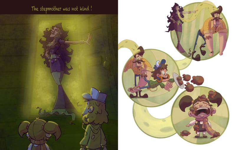
I struggled with the color of page 3, and I am not sure yet if I will keep it like that or adjust the green a little.
I was going to make a facial expression sheet of Hansel next, but I think I should focus on narrative illustrations now. Maybe something else than Hansel and Gretel. We will see

-
@Geoffrey-Mégardon I really like your spread of the cabin, dad, and kids on the top. Is the evil step mom controlling dad? I love the visual you've used to show her controlling power. The color on page 3 is tricky. Have you tried lightening up the background behind the step mom a little more, so that she's even more of a silhouette? Right now I feel like she's blending into the doorway a little more than she should.
-
@Geoffrey-Mégardon your Hansel doesn't look that old here, maybe because his eyes enlarged significantly so he looks more goofy/younger. I think you can do away with the character turnarounds and just show these pages.
-
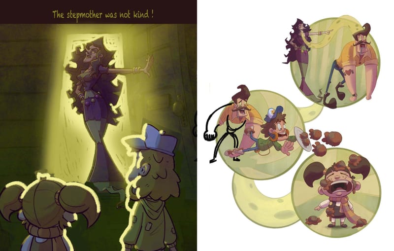
@Geoffrey-Mégardon Hi! I don't have a lot of time to explain this but here is what I think you can work on more with this piece. I think you need the Stepmother to pop out more and I think you should also change the pose of the Dad as he yanks Hansel. Overall, I think everything is looking great. I hope this was helpful
-
Thank you for the feedback! Yes I will definitely make the door frame lighter, and make the stepmother silhouette pop out. I had difficulties to change the mask opacity in the software I’ve used.
-
@Geoffrey-Mégardon Your characters are great. I like the colors and silhouettes. I do agree with @Nyrryl-Cadiz with the changes she made on page 3 and 4. The composition feels better and it is easier to see the stepmother now. I do like the modern twist on the Hansel and Gretel story. Can't wait to see how this progresses.
-
Here is an update of the page 3 where I tried to make the silouhette stand out and get rid of the noise.
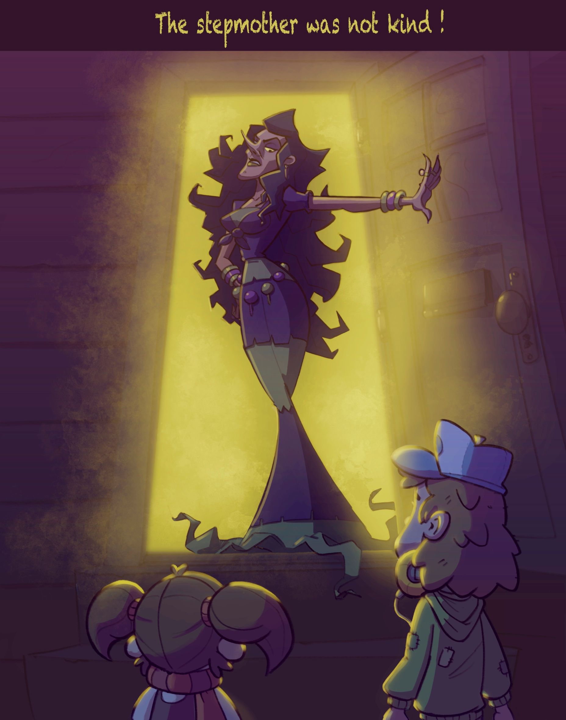
I will call it done for now as I spent way too much time on the color of this piece!
Meanwhile I started to work on a new piece that is the Candy House scene. It’s 90% complete but I hesitate between going for a pinkish background or a blue background.
I like the pink because it makes the trees look like candy clouds, but I like the blue as well because it implicitly hints to a dark turn in the story.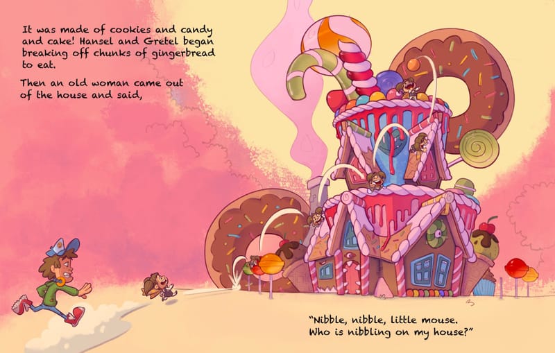
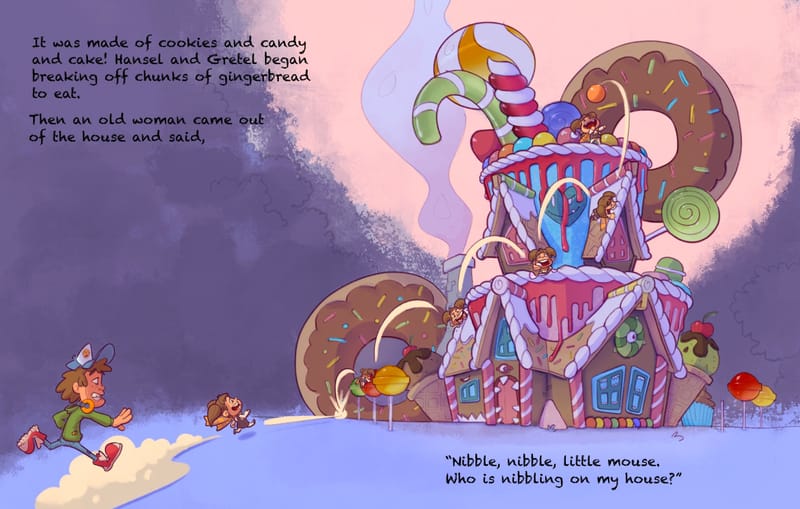
Which one do you prefer?
Edit: how do I resize a picture so that it only takes 50% of the available width?
-
@Geoffrey-Mégardon Why not both? You can have a layer that’s the pink overlay, mask it to just show the house/trees/etc, and then you can control how strong the pink is relative to the dark background with the opacity or blending modes.
-
@Geoffrey-Mégardon I love your candy house! I'm trying to create a candy world but struggle a lot and yours seems so fun, effortless and simply awesome.
Colour wise my first instinct is the darker one but I would also turn it to gray scale to check how the character and house stand out best in terms of contrasting values.