Society of Visual Storytelling

    SVSLearn Forums

    • Register
    • Login
    • Search
    • Recent
    • Tags
    • Popular
    • Users
    • Groups
    • Search

    Ready to put in my portfolio?

    Questions & Comments
    feedback portfolio spread
    6
    20
    1850
    Loading More Posts
    • Oldest to Newest
    • Newest to Oldest
    • Most Votes
    Reply
    • Reply as topic
    Log in to reply
    This topic has been deleted. Only users with topic management privileges can see it.
    • Griffin McPherson
      Griffin McPherson @Nyrryl Cadiz last edited by

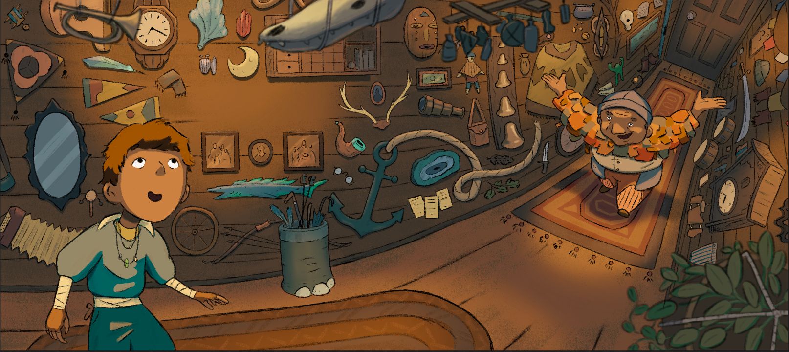
      @Nyrryl-Cadiz hmm, I worry that having both of the text spots right next to each other might look a little weird because I think they’re usually more staggered. However, I can’t find any examples of illustrations with room for text! I’ve looked through a bunch fi the picture books I have and I’ve searched google but I just can’t find examples to see how others do it 😩

      1 Reply Last reply Reply Quote 0
      • Griffin McPherson
        Griffin McPherson last edited by

        Revisions! Used a bit of everyone’s suggestions so thank you to all of you! The only thing I’m still wondering about it the room fort text. Though I do think they look better I still think they feel a bit odd, maybe compute the texture of the wood in those areas but still keeping any line art out of those spots would work? Let me know!86278BF2-C5BB-46A0-B16D-476E3D68055C.jpeg

        von_Nimmermehr AngelinaKizz 2 Replies Last reply Reply Quote 0
        • von_Nimmermehr
          von_Nimmermehr @Griffin McPherson last edited by

          @Griffin-McPherson i don't think they look odd, the text is misssing and thats why i guess. If it still fells odd with text, maybe we can brainstorm again?

          i really like the illustration! I admire how you are able to just make the changes. i mostly feel if its done its done and i will think about what i got as critique for the next piece. I should work on that though.

          Website: www.von-Nimmermehr.com
          Instagram: https://www.instagram.com/von_nimmermehr_illustration/

          Griffin McPherson 1 Reply Last reply Reply Quote 1
          • AngelinaKizz
            AngelinaKizz @Griffin McPherson last edited by

            @Griffin-McPherson looks great! I think once you put some text in, it'll feel right. If not, then you could add some of the line work underneath at a reduced opacity. Great piece!

            www.evarartistry.com
            www.Instagram.com/evarartistry/

            1 Reply Last reply Reply Quote 1
            • Griffin McPherson
              Griffin McPherson @von_Nimmermehr last edited by

              @von_Nimmermehr it’s hard to go back and do revisions once you get in the mindset of being done with it. I don’t usually go back and do revisions like this but it’s rewarding to be able to improve it from the point of what I thought was completion. I haven’t actually had to deal with someone telling me I need to make revisions since art school I’m trying to get more comfortable with revisions again.

              1 Reply Last reply Reply Quote 1
              • Griffin McPherson
                Griffin McPherson last edited by

                I know I’m getting into nitpicking territory but can the room for text spots still work with the lines of the woods boards running through them or should I have them faded out?FE31737A-34D3-427A-910A-C49861BCBC71.jpeg 86F728EC-B244-465D-94ED-F06111EDBF52.jpeg

                AngelinaKizz NessIllustration 2 Replies Last reply Reply Quote 0
                • AngelinaKizz
                  AngelinaKizz @Griffin McPherson last edited by

                  @Griffin-McPherson have you tried placing text over top and seeing how it looks?

                  www.evarartistry.com
                  www.Instagram.com/evarartistry/

                  Griffin McPherson 1 Reply Last reply Reply Quote 1
                  • Griffin McPherson
                    Griffin McPherson @AngelinaKizz last edited by

                    @AngelinaKizz I have, it kind of works both ways but of course the faded lines adds a bit more clarity

                    von_Nimmermehr 1 Reply Last reply Reply Quote 1
                    • von_Nimmermehr
                      von_Nimmermehr @Griffin McPherson last edited by

                      @Griffin-McPherson i would go with the faded lines then

                      Website: www.von-Nimmermehr.com
                      Instagram: https://www.instagram.com/von_nimmermehr_illustration/

                      1 Reply Last reply Reply Quote 2
                      • NessIllustration
                        NessIllustration Pro @Griffin McPherson last edited by

                        @Griffin-McPherson I like the very faded lines!

                        vanessastoilova.com
                        instagram.com/vanessa.stoilova/

                        Check out my Youtube channel for tips on how to start your career in illustration! www.youtube.com/c/ArtBusinesswithNess

                        1 Reply Last reply Reply Quote 2
                        • First post
                          Last post