Tight Deadline! New Book Project. Feedback Much Appreciated!
-
@Elizabeth-Rose oh WOW this is so pretty! The rim lighting adds a nice touch it’s really good! I love it

-
And More rim lighting!
I’m still chugging away on the illustrations!And. . . Finally got my edits and suggestions back from my Beta Readers. So many good suggestions! Hiring others to edit and give suggestions for a book in progress is sooooo worth it!
-
@Pamela-Fraley Me too
-
@Elizabeth-Rose I have just found this thread and I have to say I am absolutely in awe! It is so cool to see the project evolve from it's very first edition to this finalized form! Thank you for sharing!
-
This has been amazing to see! So darn inspiring
 I love your colors and the whimsical vibes

-
@agathe Awe! Thanks Agatha! That’s so encouraging to hear! I’ll keep on sharing this project!
@AjugaBee Yey! Thanks for sharing that! And in turn, you all on here are one of the reasons I’ve kept chugging along on this project
")
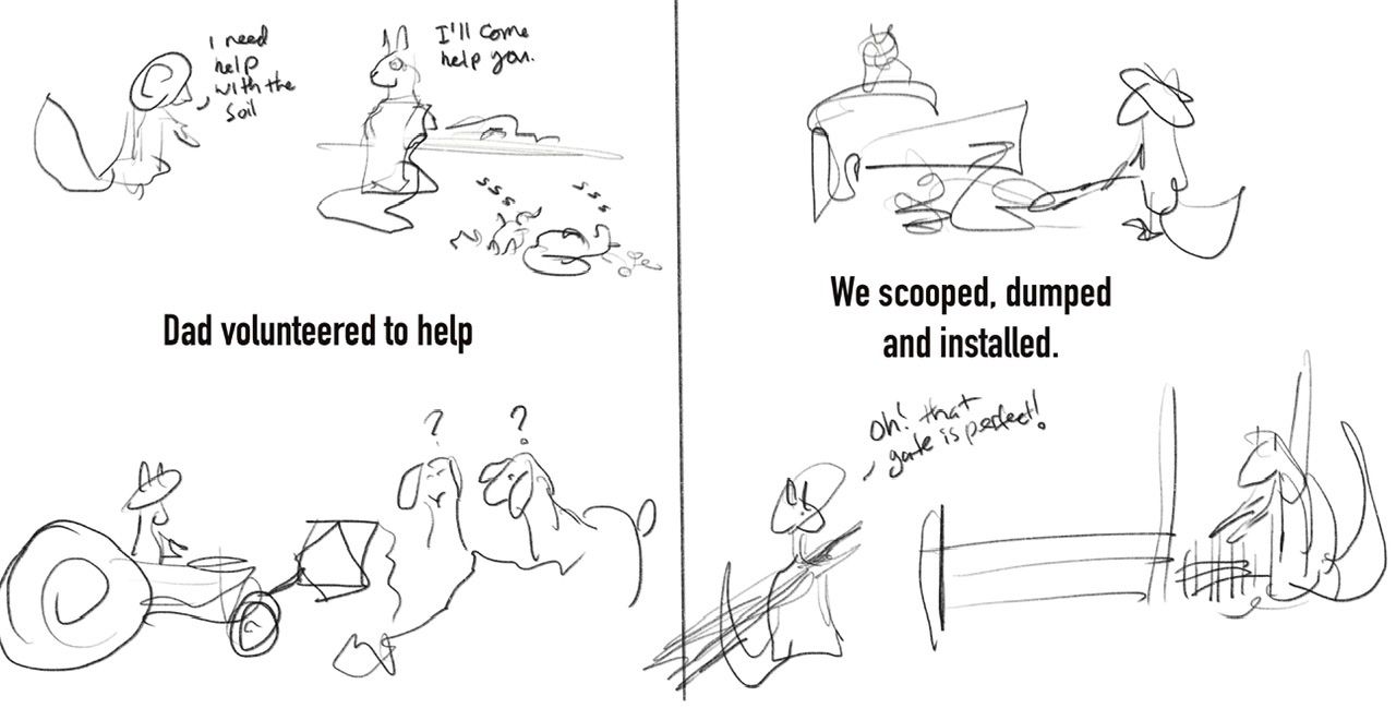
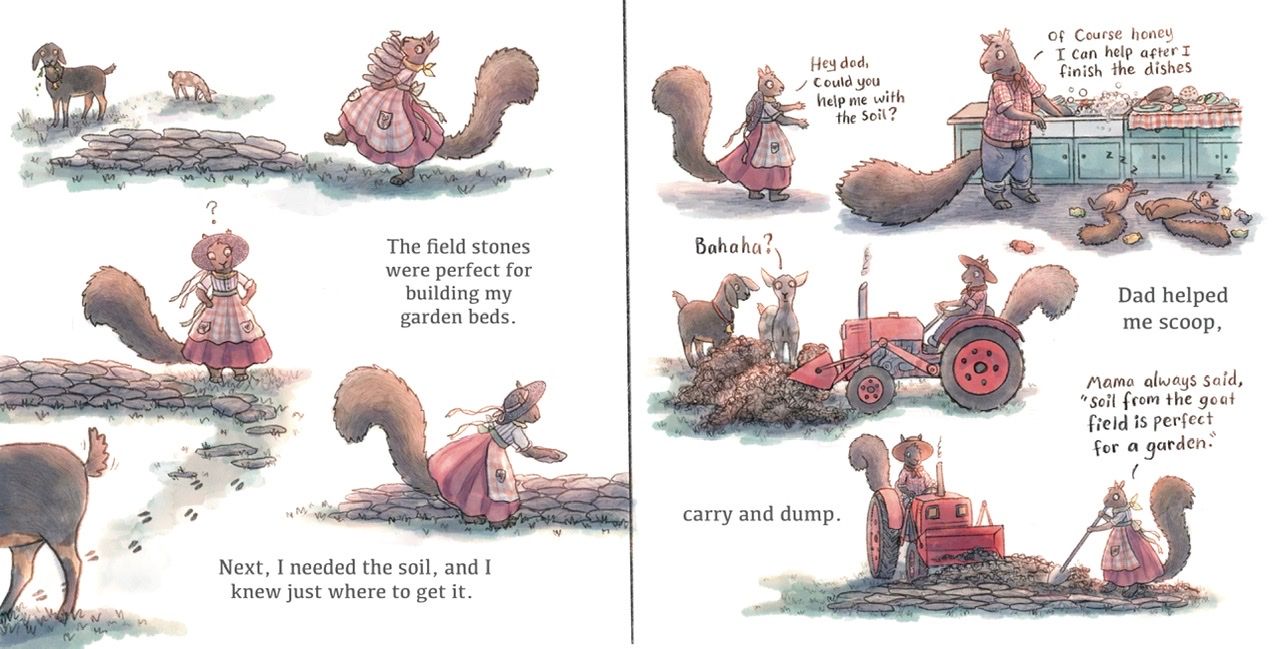
Also, finished the rendering on another spread:
The before:
A lot of the spreads are not colored yet. Most are in various stages of the final drawing render. And as of today, I’m sitting on three weeks to go before I need to submit the final for print. Looks like I’m still managing to cut it close!
My goal is to illustrate 3 hours a day, for five days a week until then. Fingers crossed!Comments wanted (and please, suggestions, thoughts and comments are always welcome).
-
@Elizabeth-Rose you have a lovely project here, it's nice to watch how it grows.
i just have one thought, when i look at your pages.
The font dont seem to fit well. Its a bold font that draws my attention to the words. In combination with the handwritten dialogs, for me it doesn't work. Also because its so bold and black, and everything else is so muted.The postition you choose, also looks okayish, but could be a little bit better, in my very own opinnion.
I don't know if the finished pages are mostly finishesd or if the Font is something you still work on. sometimes people point out something, that is still a bit in progress.
its just a very hard and bold font, i guess you need two types because of the handwriting. but since the story is kind of lovely and floral, i would go for a serif font. It cold also be a medium bold one, it just draws my attention so much. i don't know.
I hope leaving my thought here is okay. I don't want to sound mean.
-
@Elizabeth-Rose congratulations on this great accomplishment! I’ve just been skimming through this thread and I so admire the commitment, and I love the aesthetic of this project. Well done!
-
@von_Nimmermehr I love this! I believe you are the first to say anything about the font. I do agree with you. I had played around with keeping that font and just lightening it up a bit, but yeah, I don’t think it suits. I’ll have to play around with some serif fonts.
You say the position is okayish, are you saying it’s not quite centered? Page 2 of the last finished spread is indeed a bit awkward, I’ve not found a way to make it not so as of yet. I’ve considered taking out the wreath, but I have other wreaths in pages later down in the story and it doesn’t seem consistent to not have any wreaths in the beginning of the story as well. Thanks so much for your suggestions
And again, feel free for more comments!@skeletortoise I’m glad your enjoying it! Thank you!
-
Here are some font types I’ve been playing with. Thoughts @von_Nimmermehr. Anyone feel free to chime in
Font (below): Gill Sans
Font (below): Kefa

Font (below): Optima (I like this one too, but I feel like it might be too thin, Procreate doesn’t seem to have this in Medium/Reg, only light. I should be able to get other thicknesses for that font type when formatting in Indesign).

The Original Font (below): Din Condensed

-
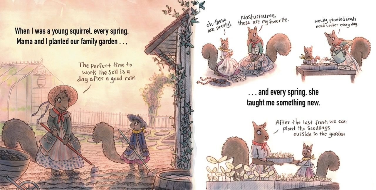
@Elizabeth-Rose Hi! Just looked through from the beginning. Really fun to see how it's evolved. The outfits and old-fashionedy look really bring the story to a whole new level.

Regarding the font, the last one is definitely too bold and clashes with your hand-written style, and the one above (Optima) is - as you said - too fine, though pretty. The first 2 get my vote... Though that doesn't really help you choose...
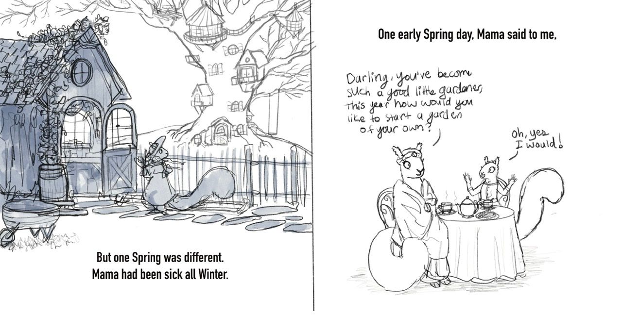
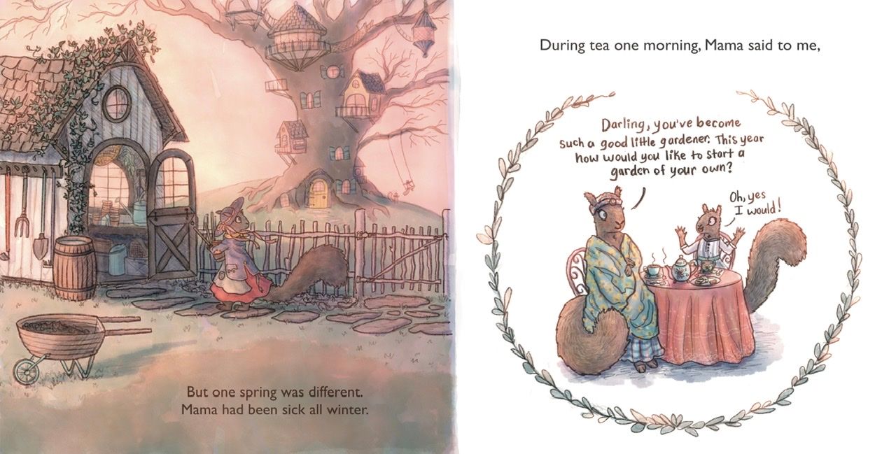
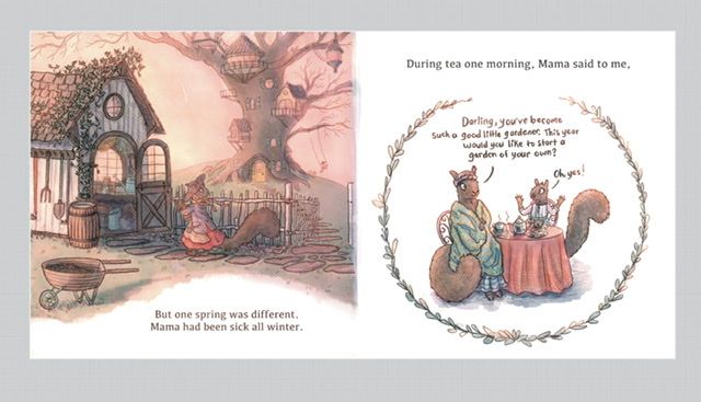
One question regarding the image: is the fence there for a reason? To me it looks like the squirrel is looking over to the neighbour's tree.
Also something that bugs me a bit is that the little squirrel replies "yes, I would" to the question "how would you like..." which doesn't quite make grammatical sense. Though maybe it's an Americanism?
Anyway, sorry for my nitpicking. I'm really enjoying this and looking forward to seeing how it all comes together.
-
@Elizabeth-Rose Optima is perfectly fine i think, since it's good readable but also dont take away the attantion. Kefa works too
Also i like how you changed the position of the text on the left page. it looks way better now
-
@Robyn-Hepburn Oh my thank you for all those golden nuggets! Yeah, Beatrix Potter and Bramble Hedge really got me into the old fashioned clothing style.
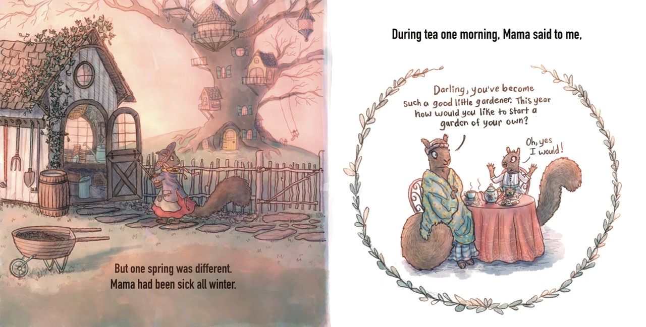
Later in the story the fence will make sense, but I didn’t notice till you mentioned that it does look like she is looking at the neighbor’s house. I made some adjustments below to help with that, even adding a sign on the tree that says: “Mr. & Mrs. Squirrel Family.” It will be visible when printed in book form. Its kinda small now.
Yeah, I see what you mean about the grammatical sense with the conversation on the 2nd page. I simplified it a bit, I’m not sure it it completely fixed it though (I will need to re-align Mama Squirrel’s convo wording, I left it as is temporarily). Do you have any suggestions?@von_Nimmermehr Yeah, I think Kefa might by my favorite so far
And you’re right, the new position does seem to work a lot better.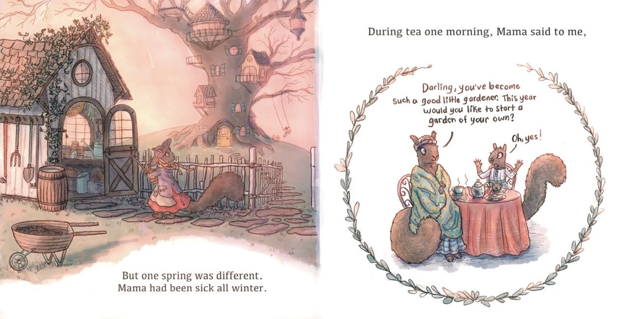
-
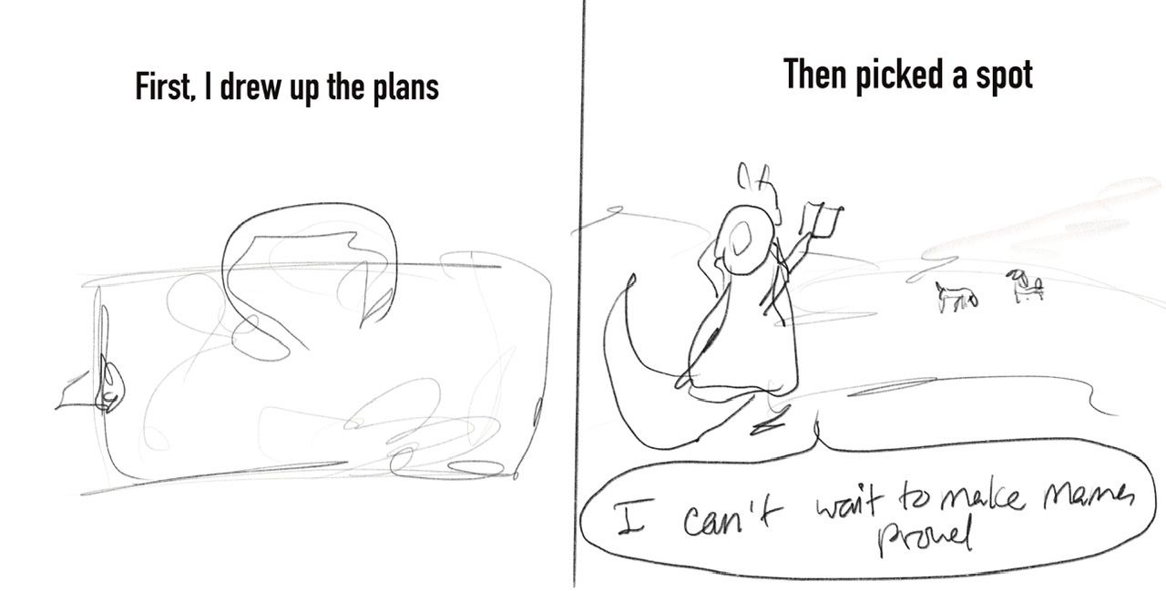
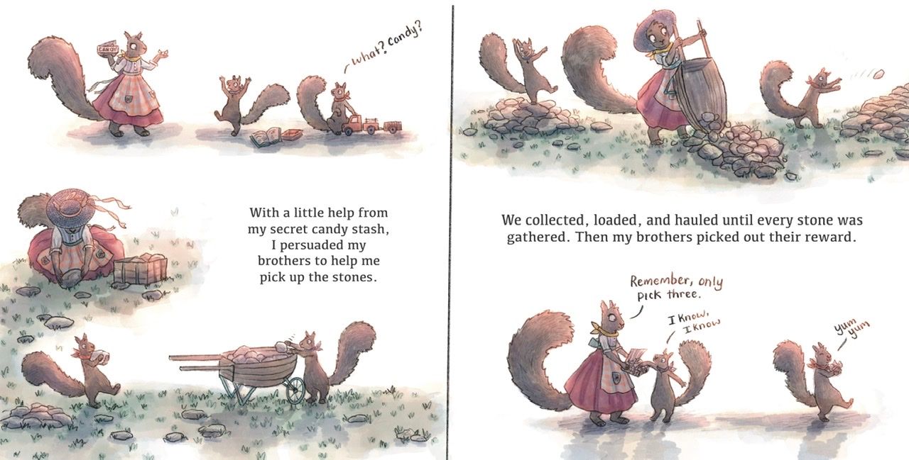
The first chicken scratch to the final render:
-
@Elizabeth-Rose So, i wondered why you would go for the white space now on the first left page.
I would just make the space a bit lighter if you want, but the white....it seems just so so brigt for the left page.
What was your thoughts here?
-
@Elizabeth-Rose That open gate makes a huge difference!

Ooh, you're trusting me with dialogue suggestions? I'm honoured! But I will not be offended if you ignore them completely.
How about:
"Would you like to start a garden of your own this year?"
"Oh, yes! I'd love to!"
or
"This year, what do you think about starting a garden of your own?"
"I would love that!"
There are many possibilities, but each character probably has their own voice in your head, so it will depend on that really. For example, something like "Darling, you've become such a good little gardener. Do you think you could handle the garden yourself this year?" maybe sounds a bit like the mother doesn't have full faith in her.
(I'm just rambling now, sorry!)
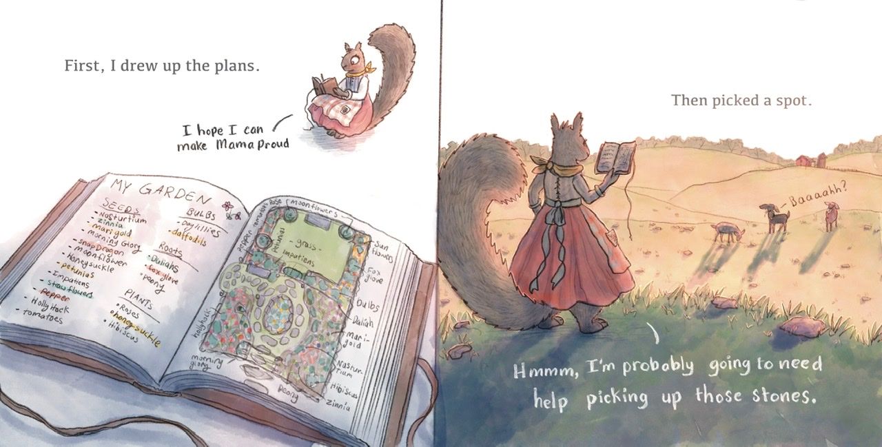
By the way, I love that notebook on the left page of your latest post.
-
Yey, More feedback!
@von_Nimmermehr Thanks for your thoughts here, and that’s a good question indeed. My thoughts are mostly about legibility. I played around with it for a while and settled on the cleanses of the white space. I feel like it adds movement and diversity from the previous spread and consistency throughout the book. Several other pages/spreads have that half page illustration style (Part illustration and part white page). Perhaps it looks funny cause it’s hard to see where the actual page ends and the website background begins in the photo above.
Does this help? Thoughts?
@Robyn-Hepburn Yey! I can’t thank you enough for helping me fix that! It’s cracks me up every time I make a book. Some pages/spreads get changed and fixed multiple times while other pages/spreads seemingly are created just right and don’t need hardly any tending too.
And yes, I trust you with dialogue! If anything, its a great spring-board to hear what your thoughts and suggestions are. And those are great! I’ll play around with the dialogue some more! -
This post is deleted! -
The Next Spread!
The Before and After:
-
And The next spread: